
Initial exploration
Through my time in Interaction Design I have explored many avenues with my work. A prevailing theme I have noticed upon a small part of reflection on my own practice is a way to communicate a sense of unease, curiosity and change / evolution to the viewer. My work on strava anxiety in 3rd year and menacing earthworks in 2nd year I feel display this best. I especially enjoy the field of Nuclear Semiotics as it discusses measures to communicate with cultures thousands of years from now.
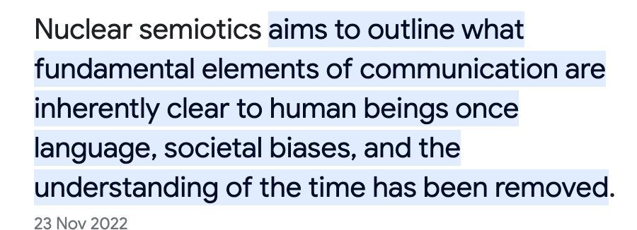
The structures and monuments made up by this field of study convey a sense of unease and to deter people from the area. Although this is something I enjoy I don’t intend to make my project all about this, just as a jumping off point for the emotions and feelings the iconography and art evokes.

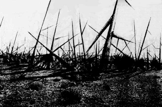
There are similar feeling evoked in the work from GEOMETRY OF FEAR which includes work such as THE SCULPTOR and BLACK CRAB. This was a post war movement of British sculptors who’s work is a product of their time at the front and other anxieties and stresses relating to the war.

After looking back at my own work, I took a list of my projects that I felt carried a strong theme, I looked at what I was communicating with these works. The most common included:
Stress
Anxiety
Lack of control
Change
Feeling trapped
Fear
I believe my work has been a way for me to express these emotions in a way that is seen to be productive, thus helping me process the feelings and use them as a drive and motivate myself for my various projects.
Looking into different art / design movements such as anti art and brutalist design. With brutalism being directly inspired from the architecture movement of the same name. With use of bold colour and stark imagery and a very deliberate plainness. It can evoke feelings of discomfort in the viewer. Anti art can be traced back to dadaism with its focus on the nonsensical and rejecting the notion that artists and designers had to be the ones to bring the world together, especially after the war. Emerging as a critique of consumer culture and capitalism as a whole.


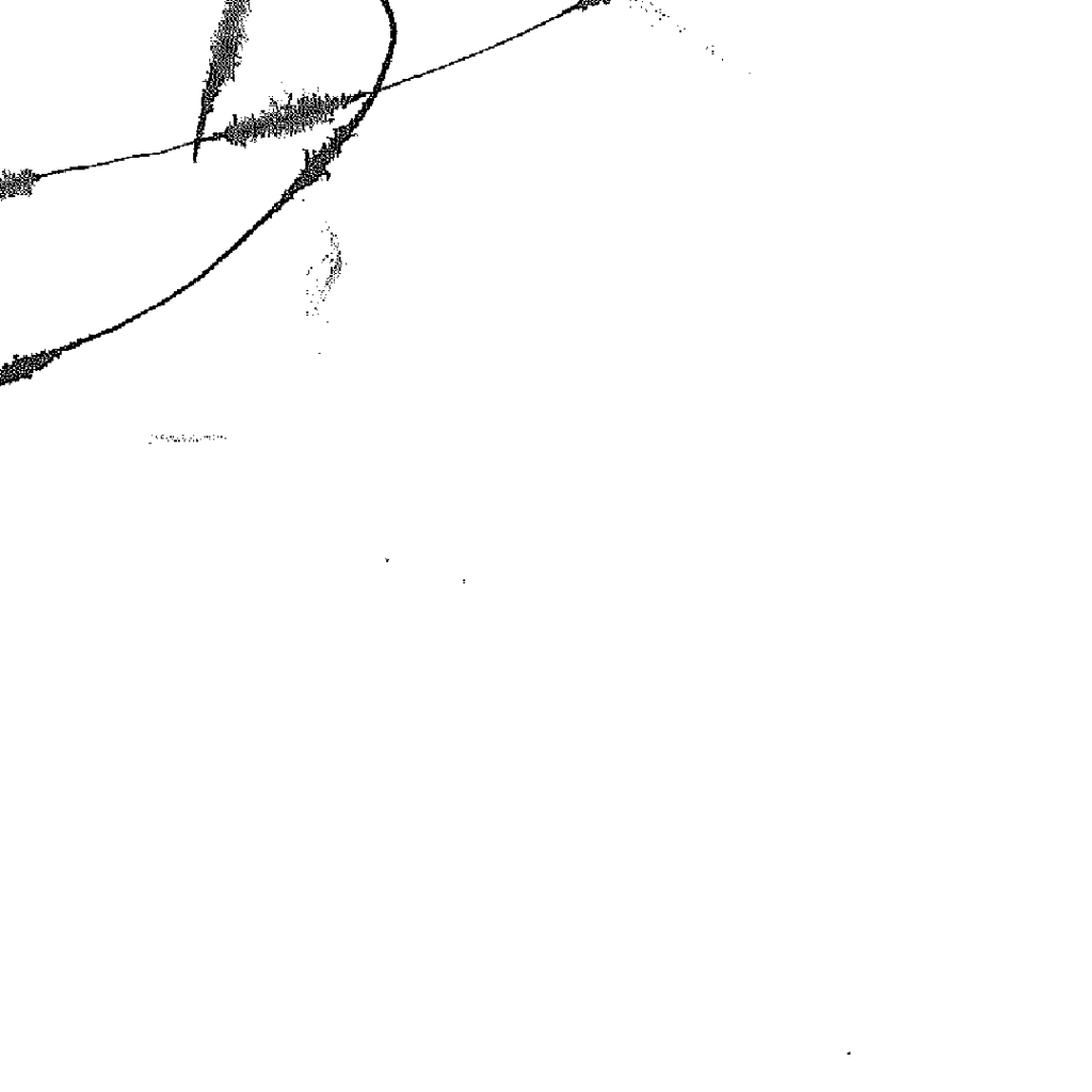
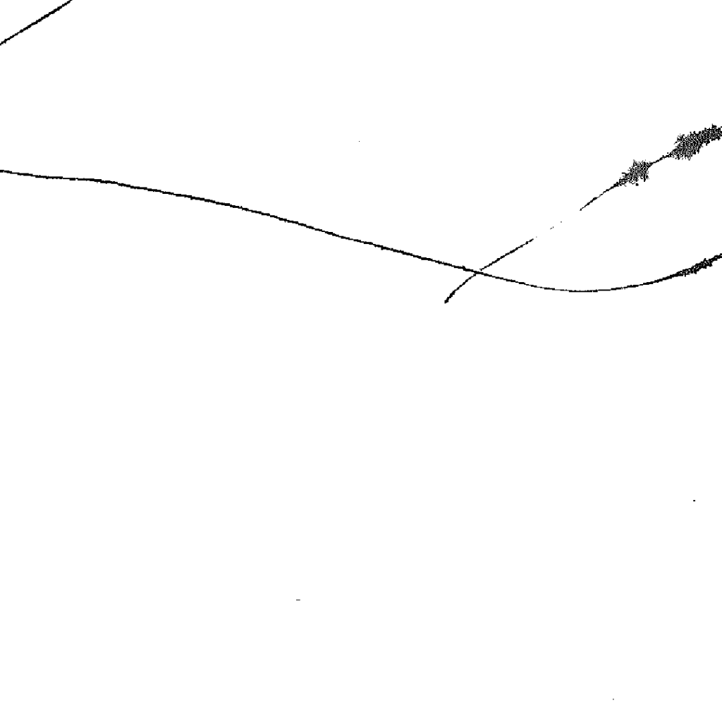
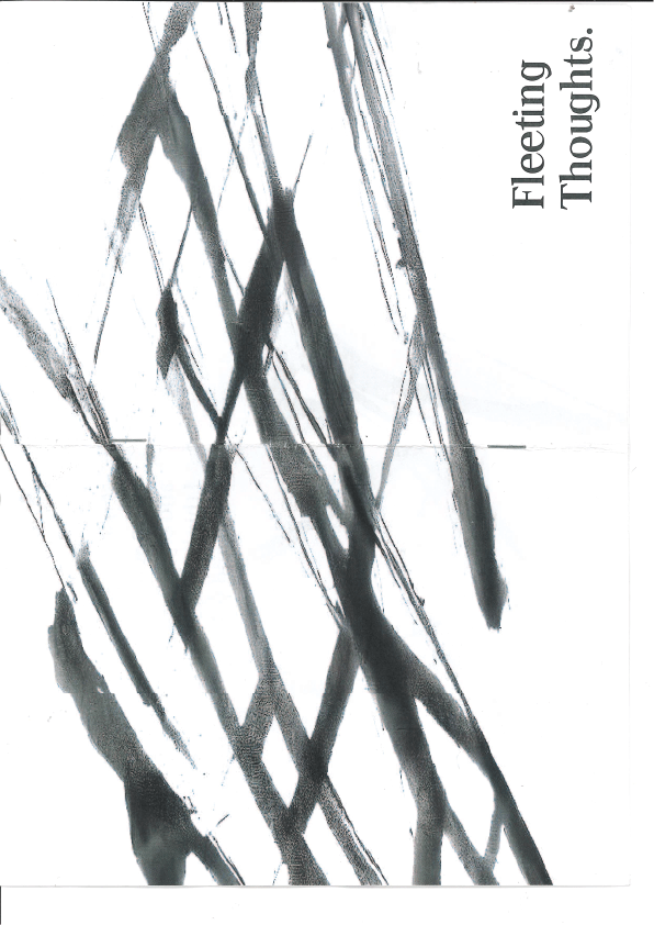
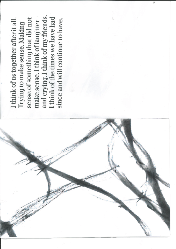
Looking into the idea of formative experiences and how these experiences shape us into the people we are today. How negative experiences once processed can lead to more positive developments in life. I want to make my early stages of this project line up with the rawness of the feelings one may feel after experiencing an event like this. Looking into expressive mark making and how to convey these feelings. Giving others an input as well as myself to mark on paper using charcoal, ink etc their feelings at specific points in time to do with events that they feel are significant to them.
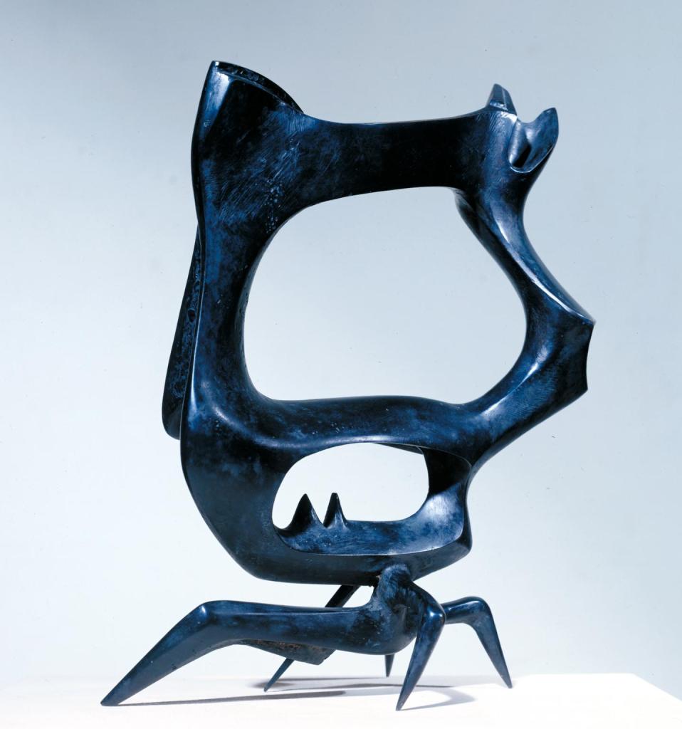
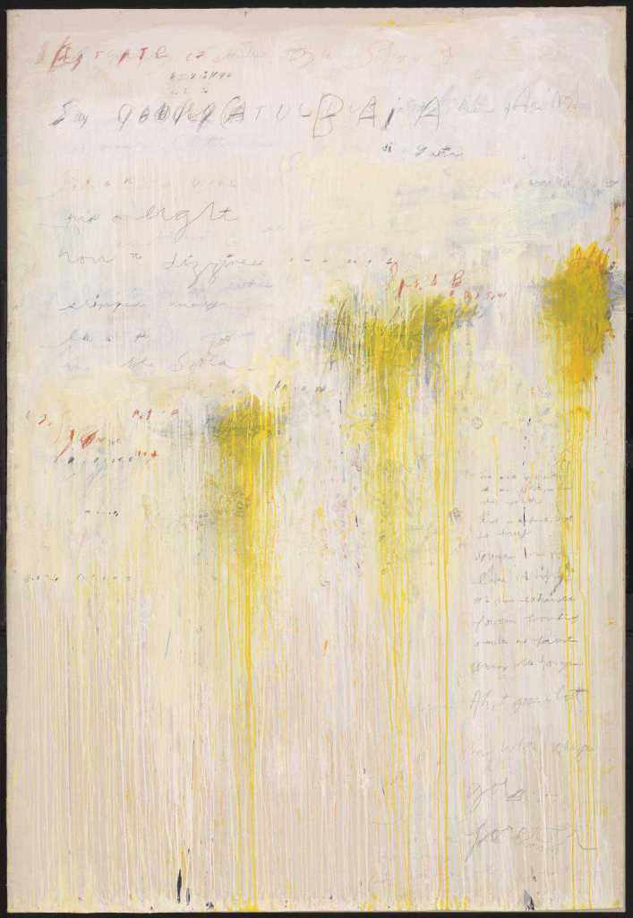
I also have been inspired by Zhang Huan’s family tree in which calligraphers paint names, places and stories over Zhang’s face, continuously obscuring his identity.
This work was inspired by his move from China to New York and his struggles he found adapting to his new environment. The marks that would usually define ones character and features are the very same that obscure his face.
Mark Making


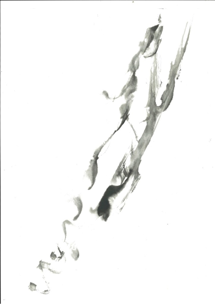
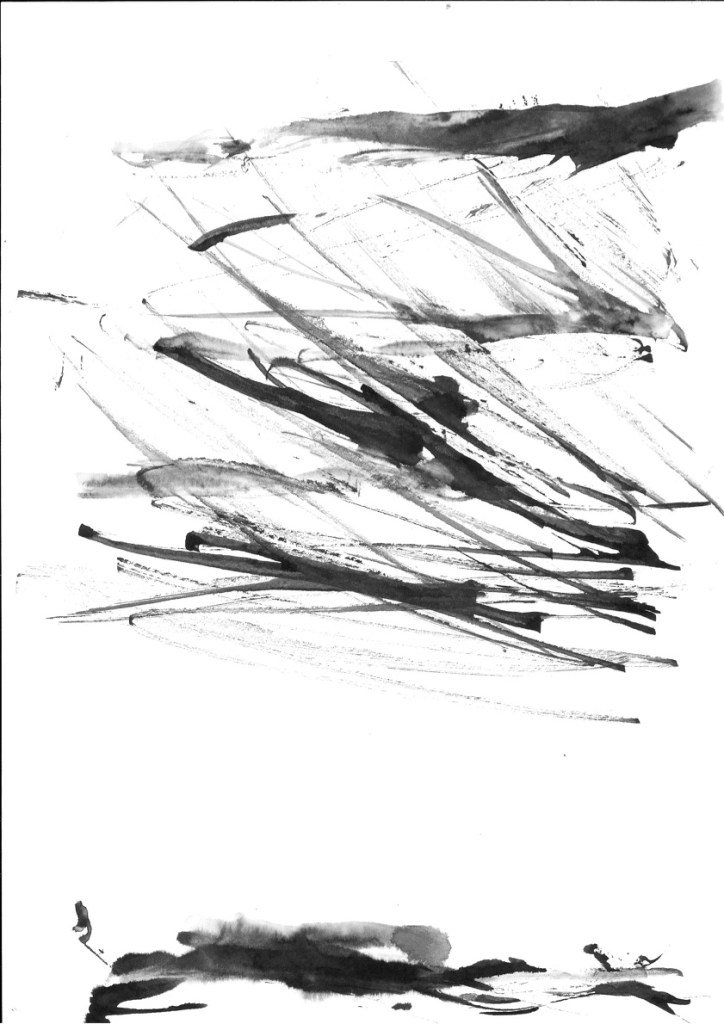
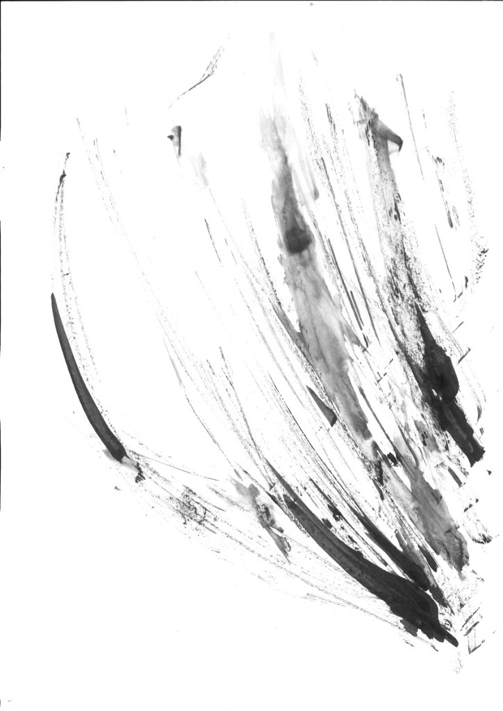
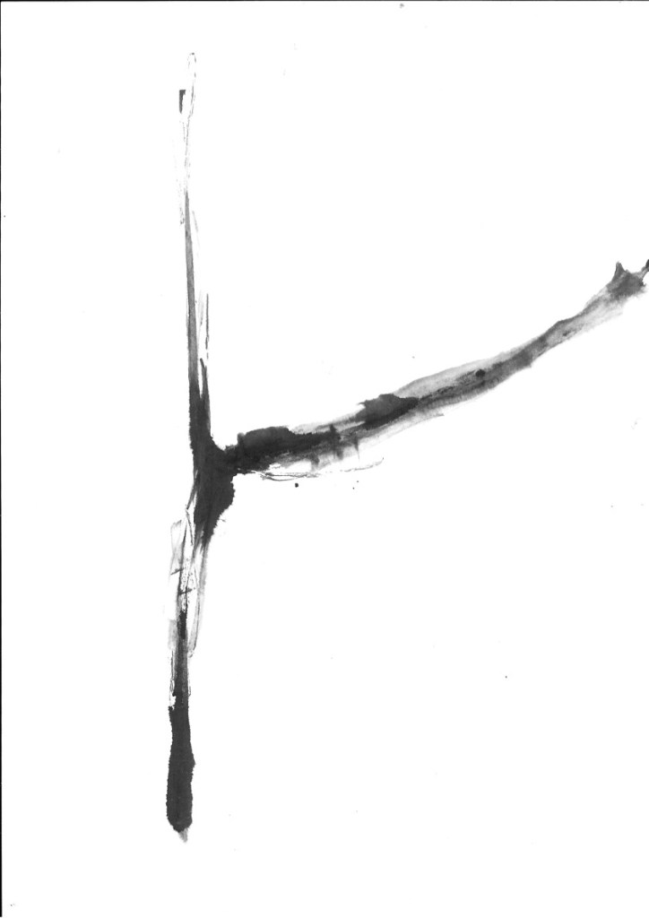
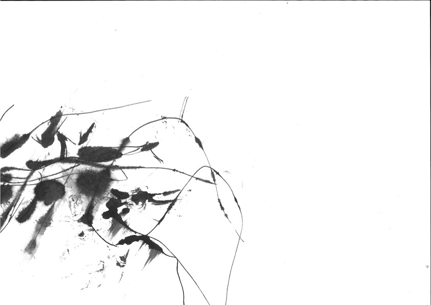
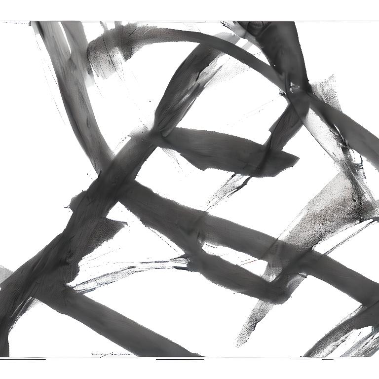
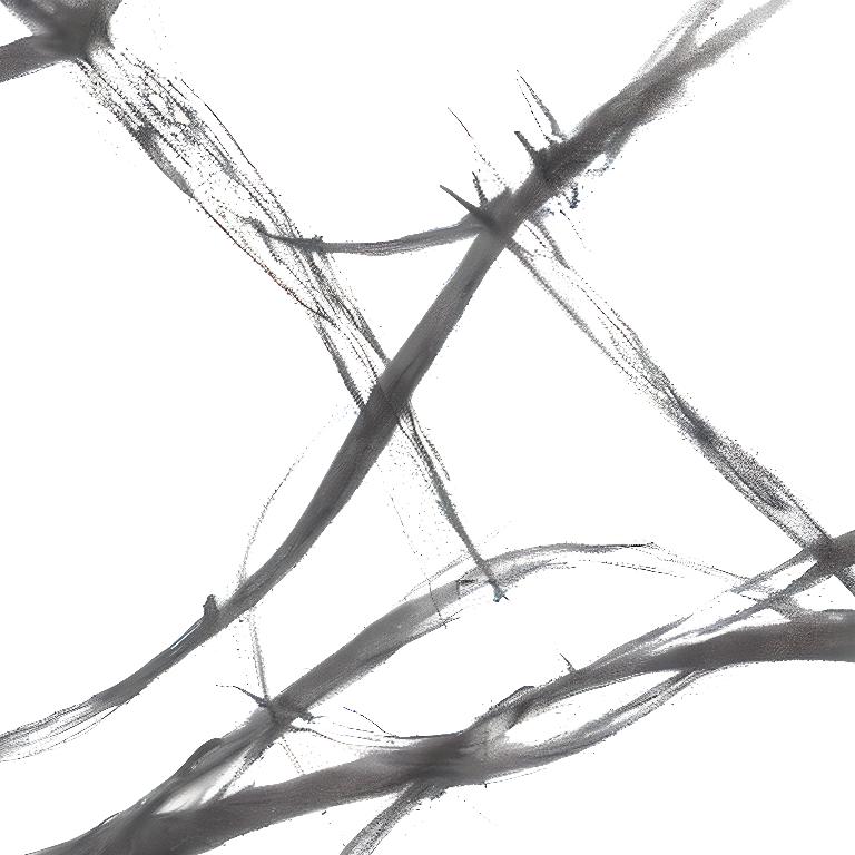
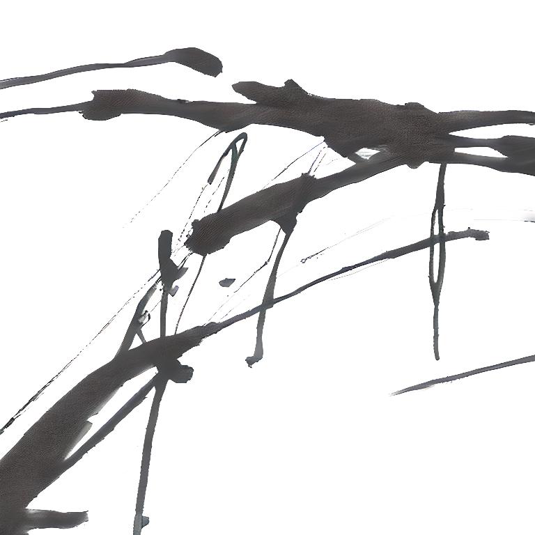
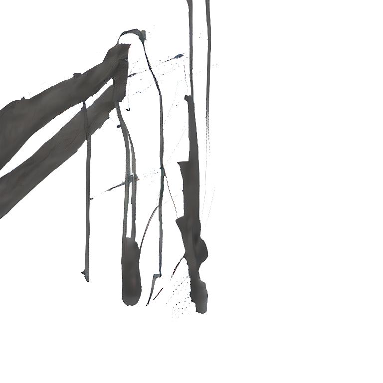
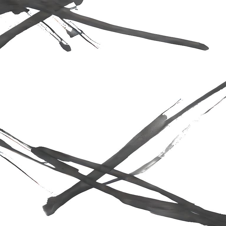
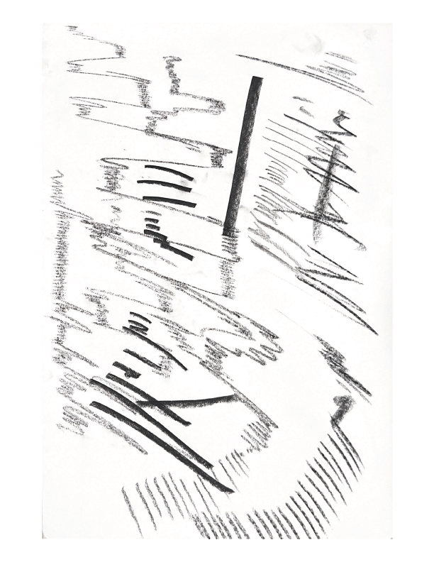
Looking into expressive mark making and how it captures form and movements. I feel like mark making is a good avenue to explore at this point in time as it helps explore texture, feel mood etc. This goes in hand with my initial ideas of conveying a senes of rawness that comes with some experiences. I feel that mark making especially with materials such as charcoal provides an almost cathartic experience, whereas using ink and water you almost take the form of the medium. Creating marks that follows the flow, join together on their own and spill over each other.
https://jennyfinnigan.wordpress.com/tag/mark-making/
I’ve came across these videos on youtube, with their focus on non preciousness and mixed mediums, ink, charcoal, oil, etc. I have the plan to invite my friends to make their own marks with a specific event in mind. They don’t all have to be the same but it will be interesting to see what similar themes come through. Other options would be to mark make to a song of their choice.
My Own Marks


I created these marks then used illustrator to split them up into squares to be better used by runwayML
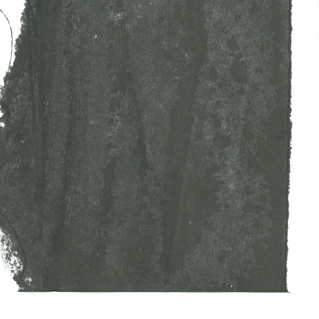
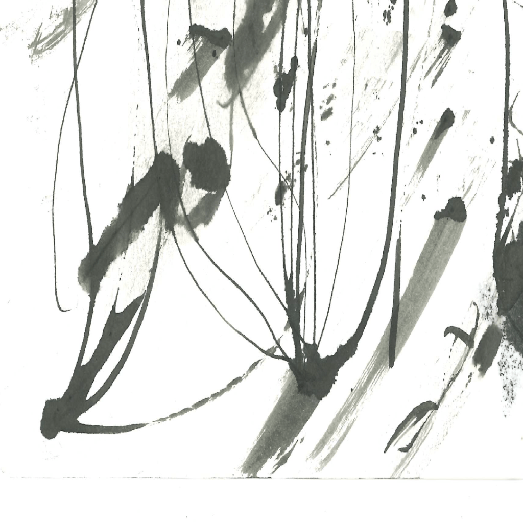


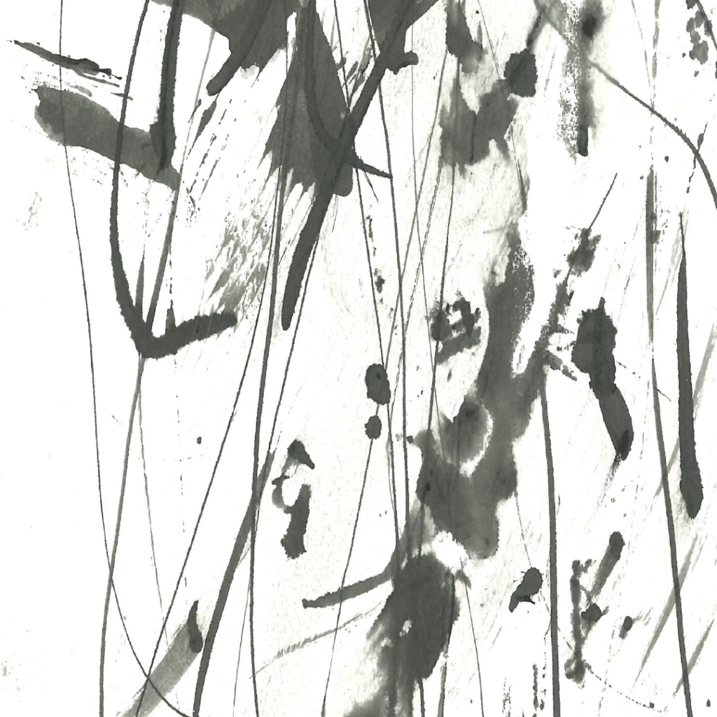
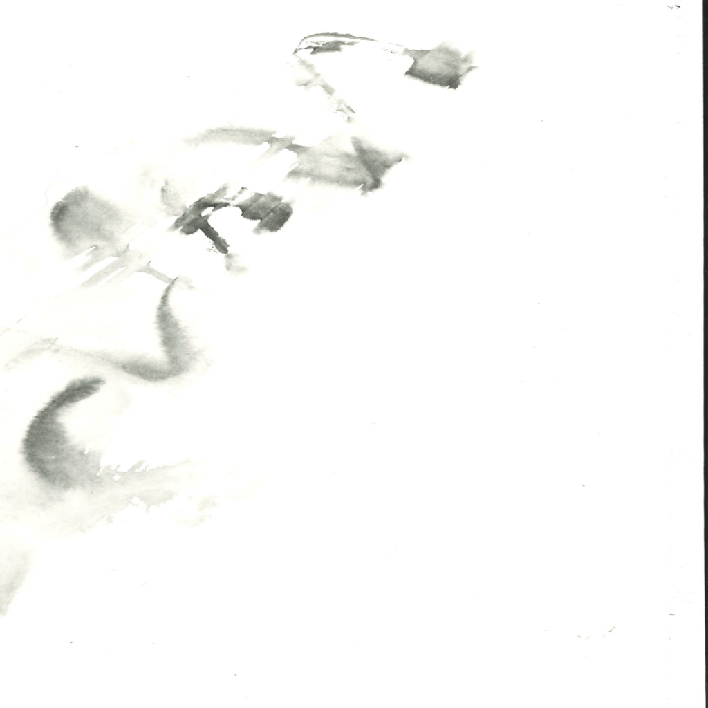
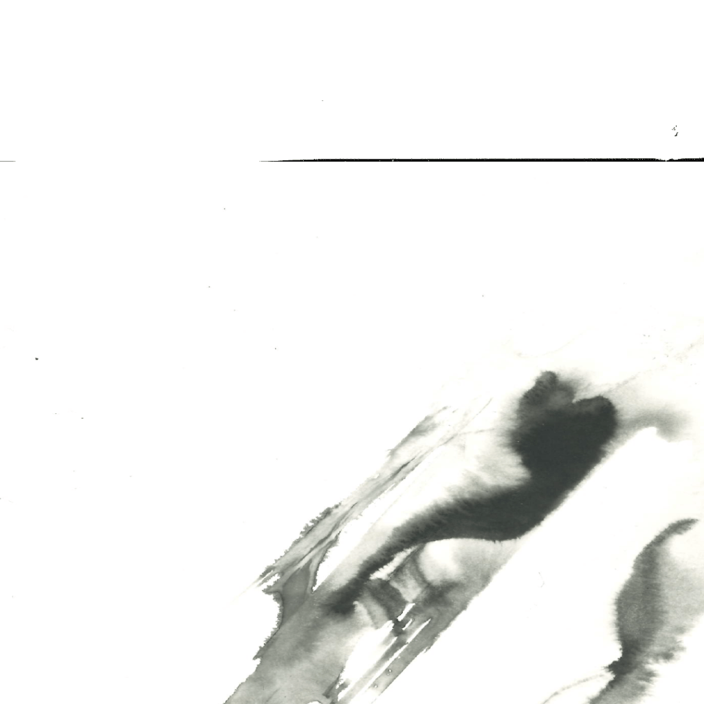
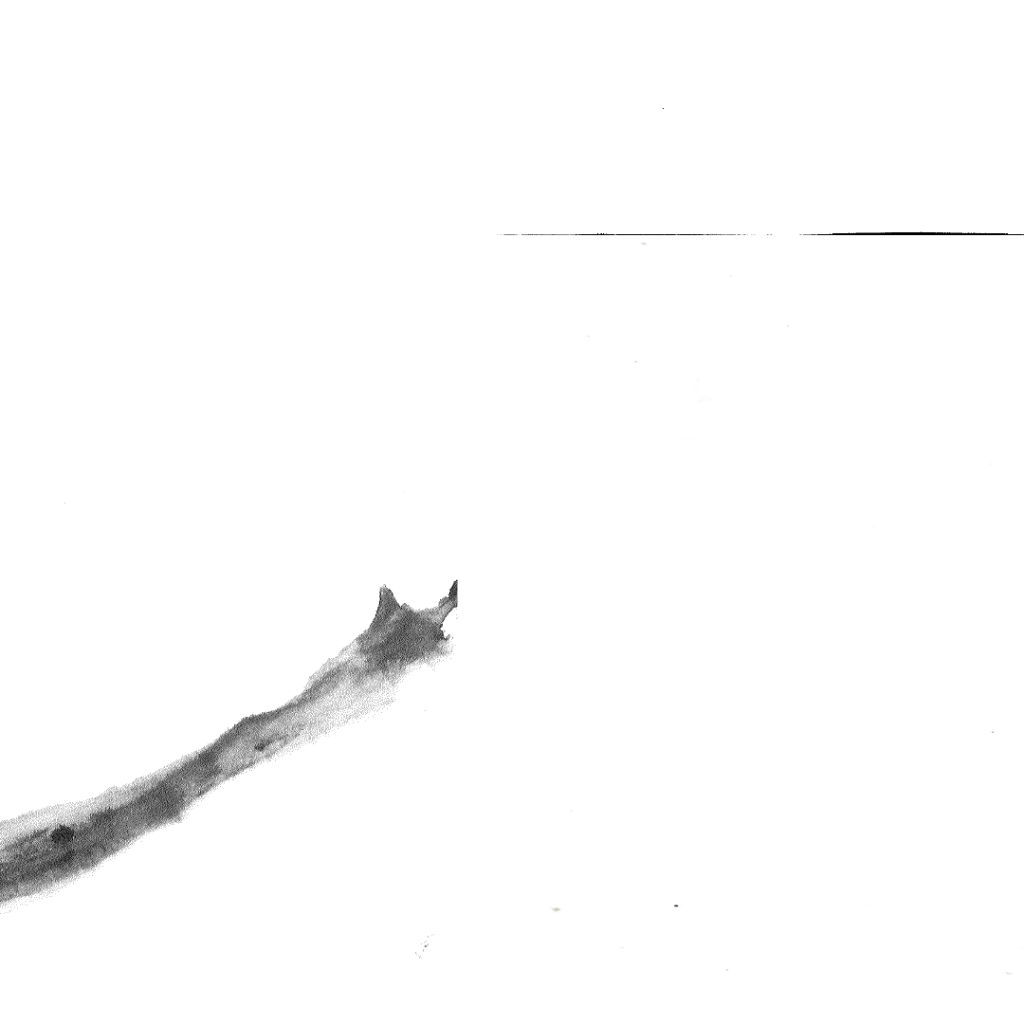
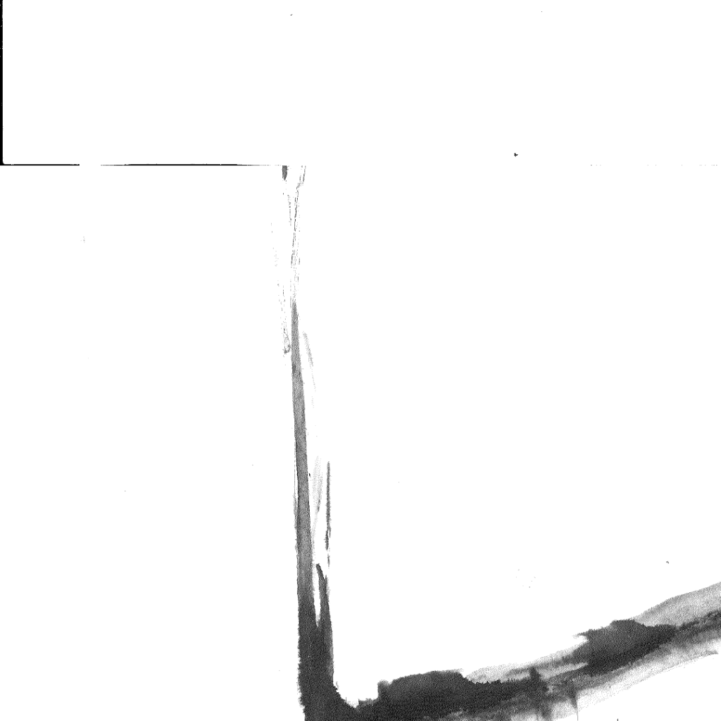


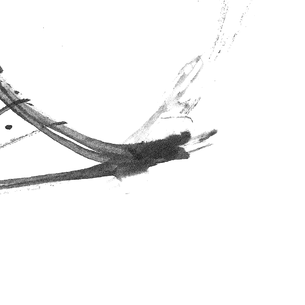
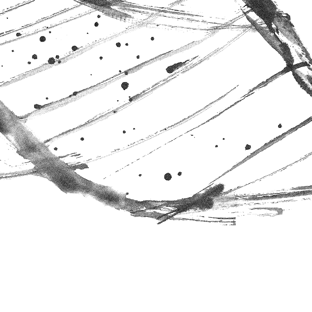
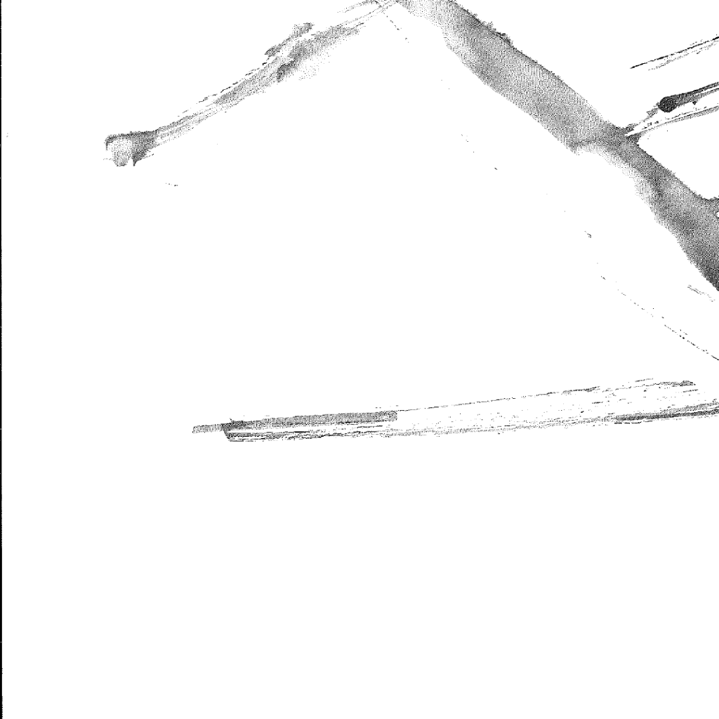

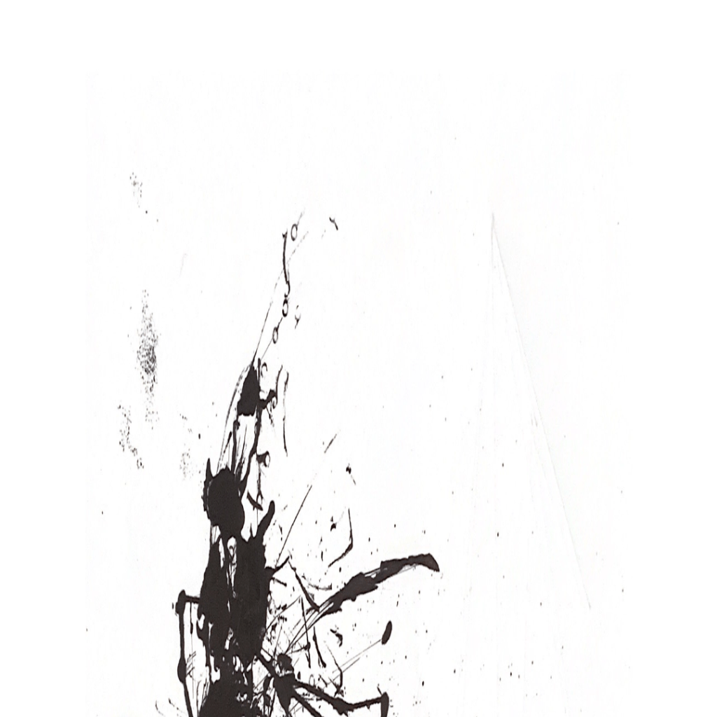

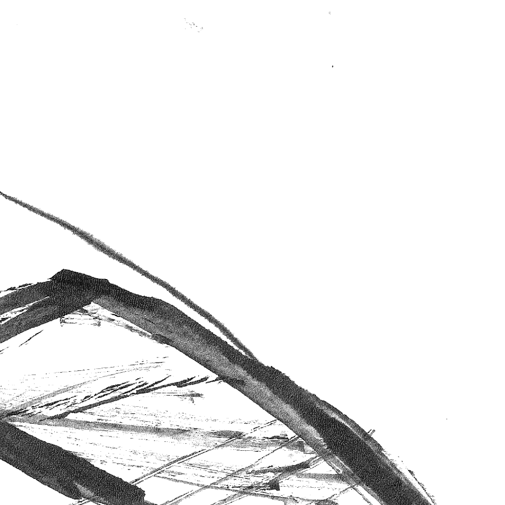


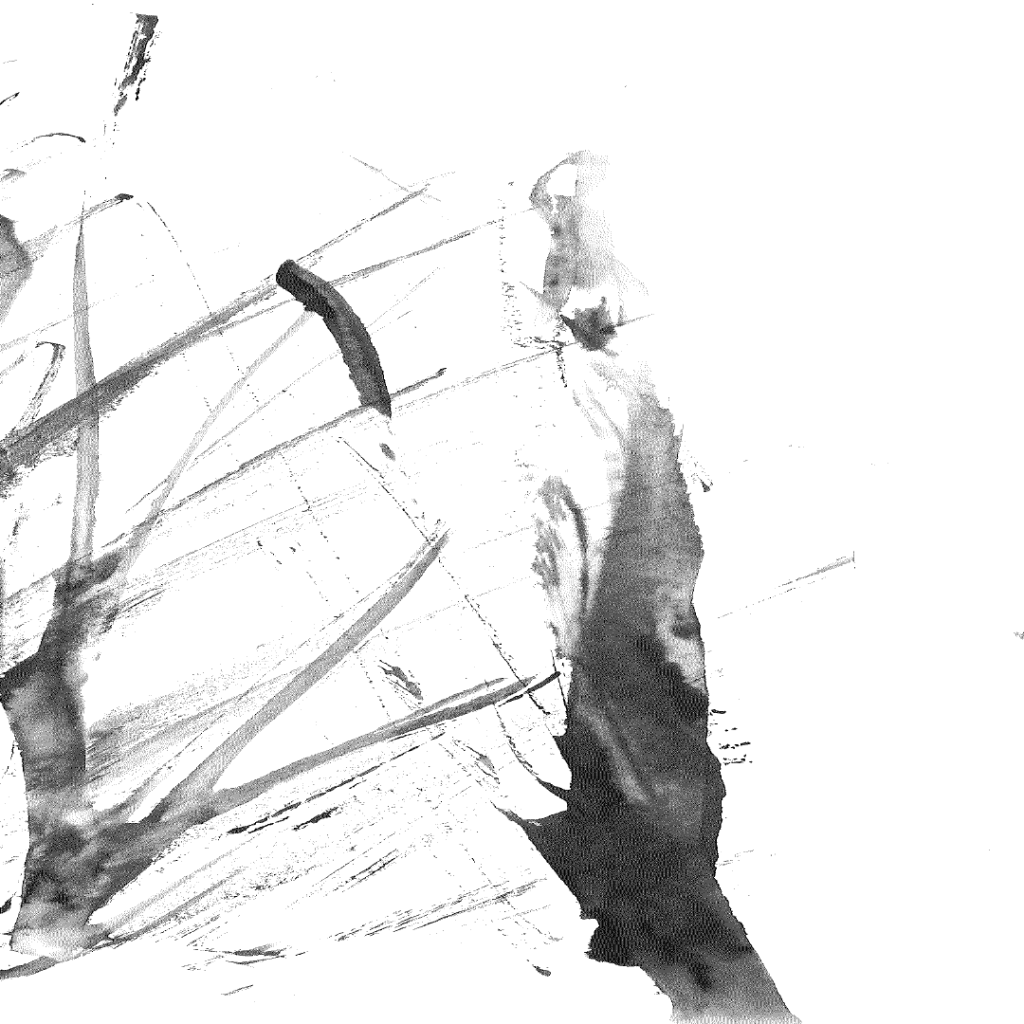
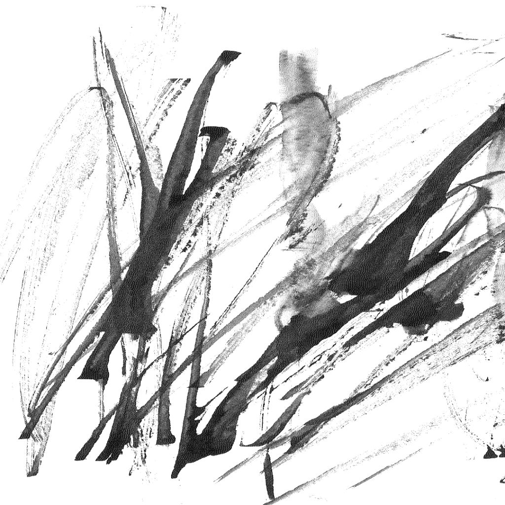
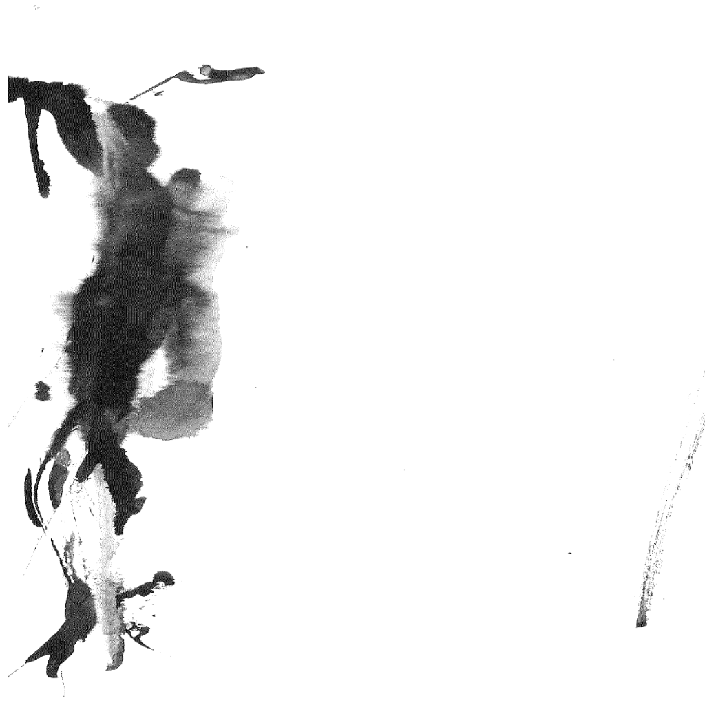
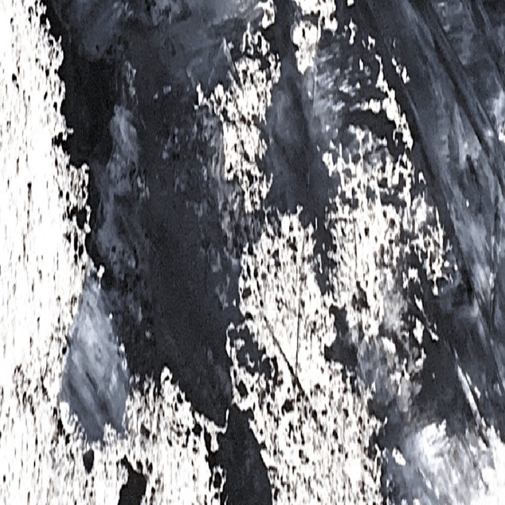
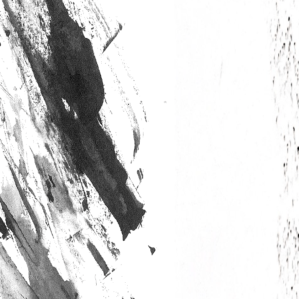
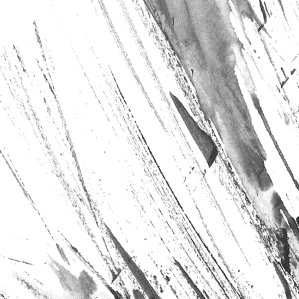

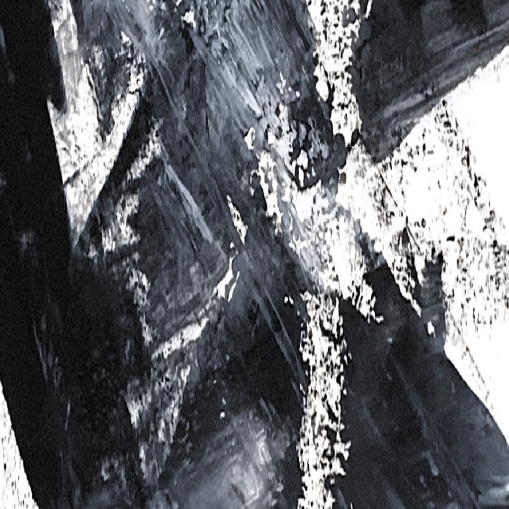


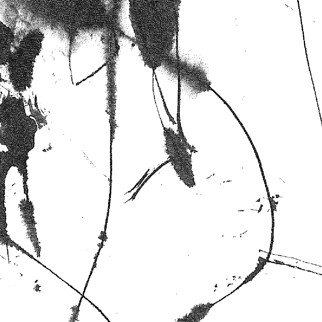


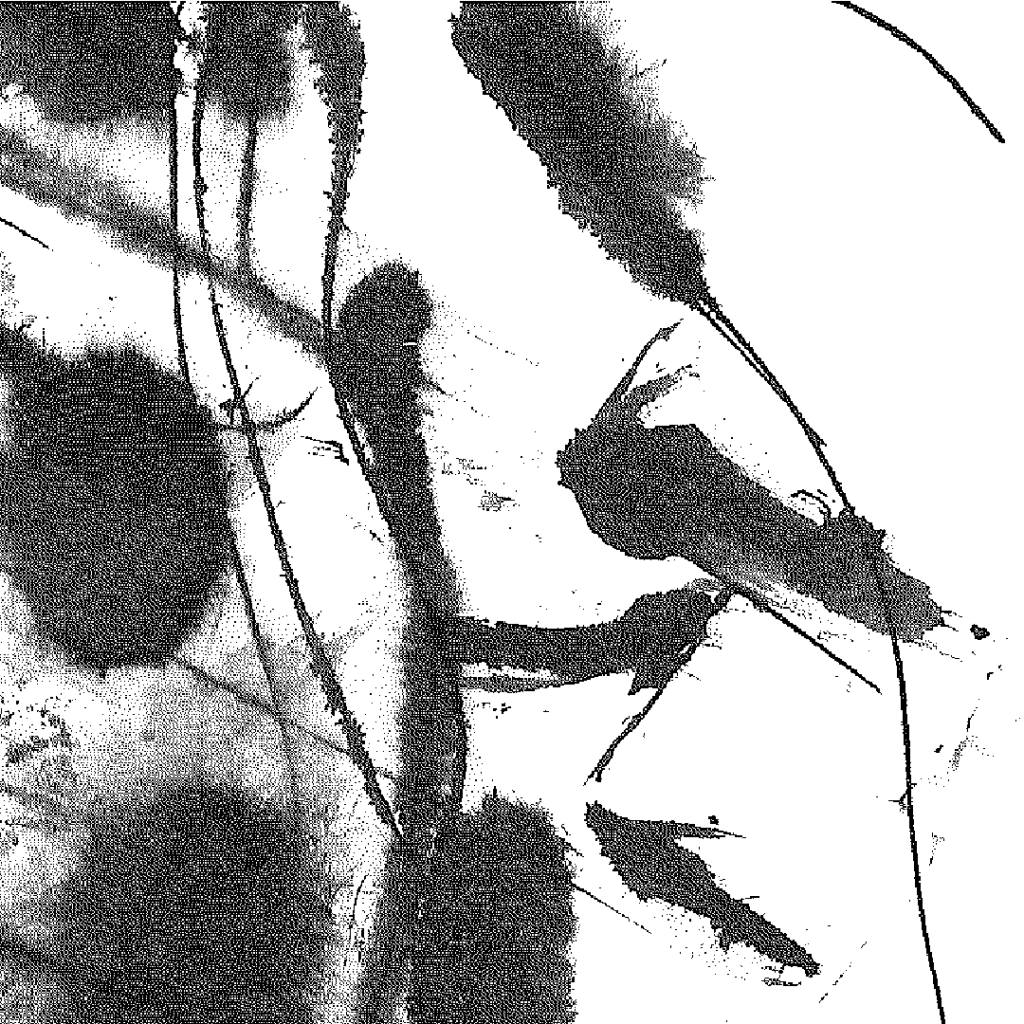
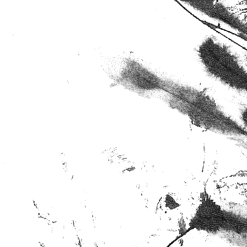
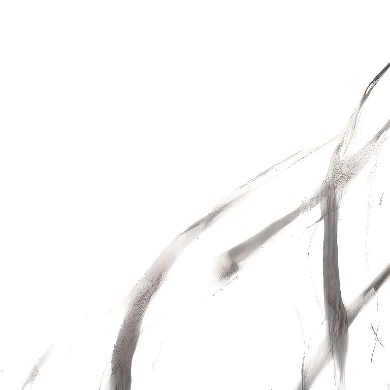
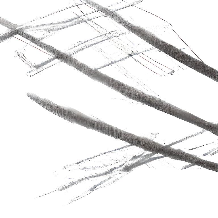
I created a series of marks using Indian ink and water. These materials provided a flow to the mark making process allowing spontaneity. I then scanned the marks and placed them into illustrator creating square art boards to ensure they cover more than one page each. I want to experiment with runway at this stage to interrogate the formation of these marks. These specific marks were something I had great control over. However generating an image model will take away that control and give it an air of uncertainty. Removing the agency and control from the process.
Generated Marks
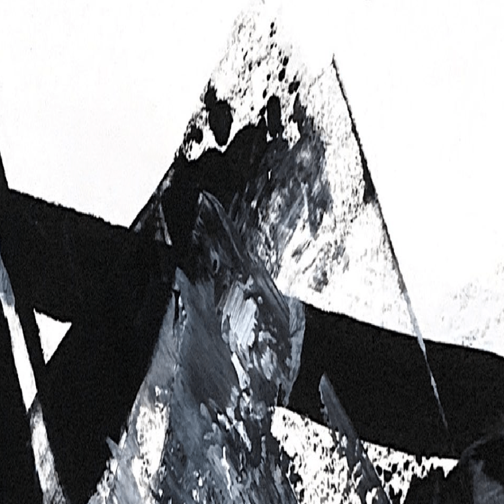
I felt that AI is a tool that helps convey one of the feelings I want to convey. This in particular feeling is the idea of a lack of control, the ink takes the path of the water layed out, this lets the maker draw in conjunction with the medium. The AI removes the agency from the creator. This best sums up my experience as I felt as though everything happened so fast, that nobody was in control of what happened.

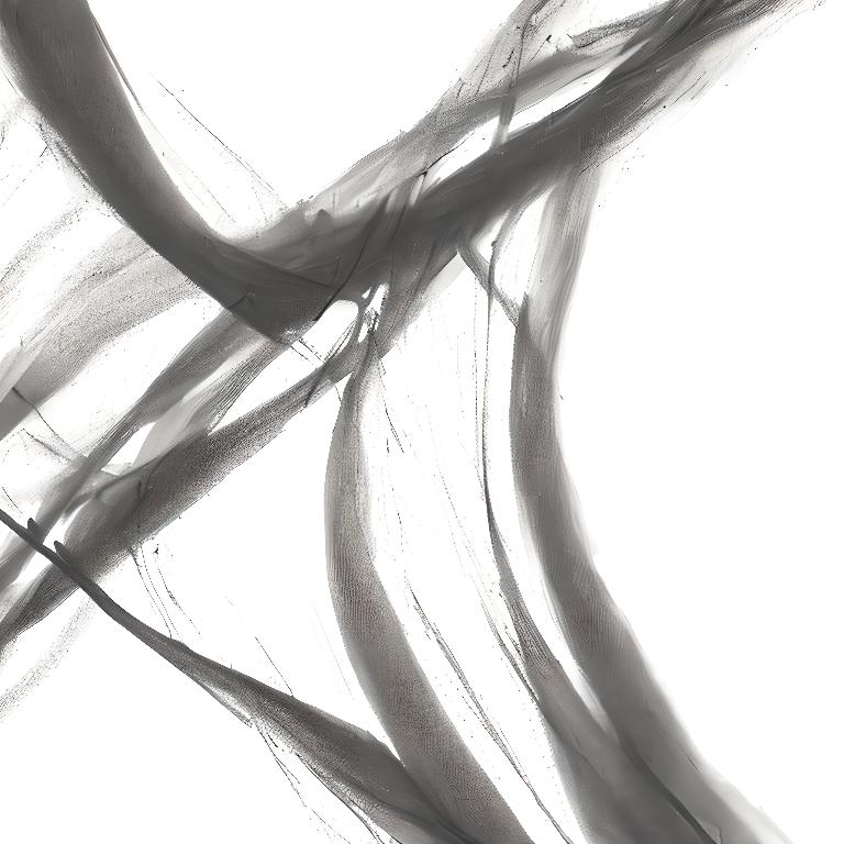
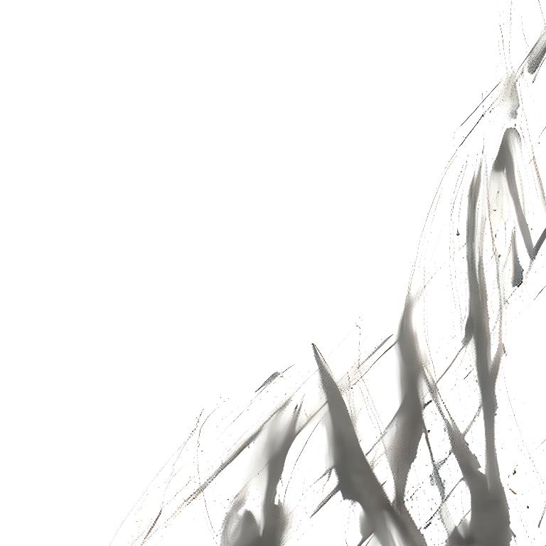

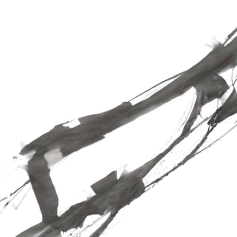


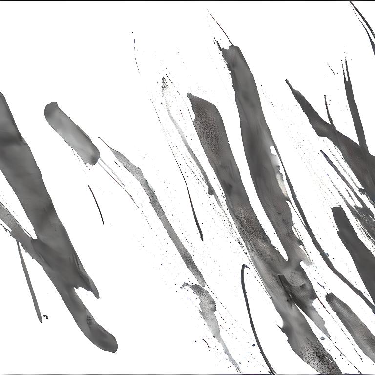


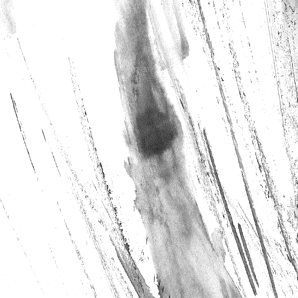
using the default prompt “mark” for these images letting the machine generate marks based on my own. As I used ink for these marks it can be seen the AI marks have the same qualities.
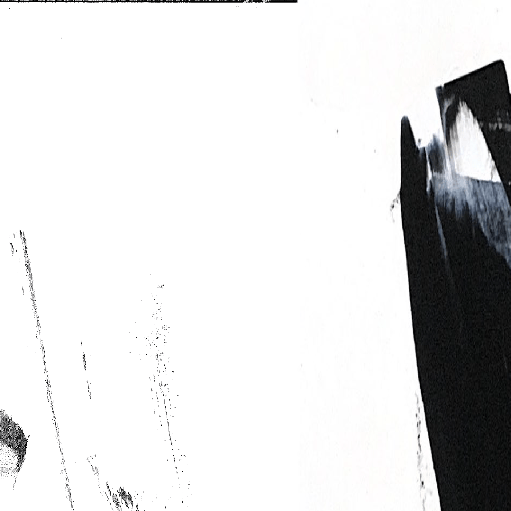
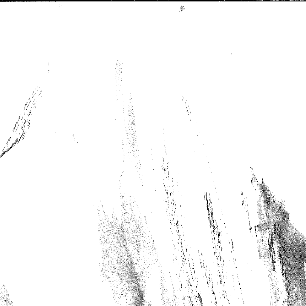
I also used RunWay’s frame interpolation feature and I found it very interesting that the transition animation has the same qualities as the physical process I used to generate these marks.
I’m at this point unsure where to take these videos. I feel the marks themselves will be useful however as they can be used in further capacity in photoshop as brushes or serve as the basis for any digital enquiries.
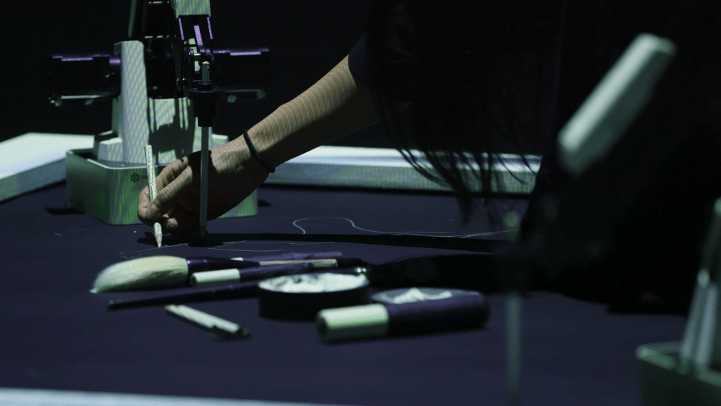
Looking at artists like Sougwen Chung and her series of works “Drawing Operations”, I first discovered her work in 2nd years control project and it has always been of interest to me. Her technical drawing skill is much better than mine, however I feel it is of the same beginnings, with her work being more focused on the idea of collaboration.
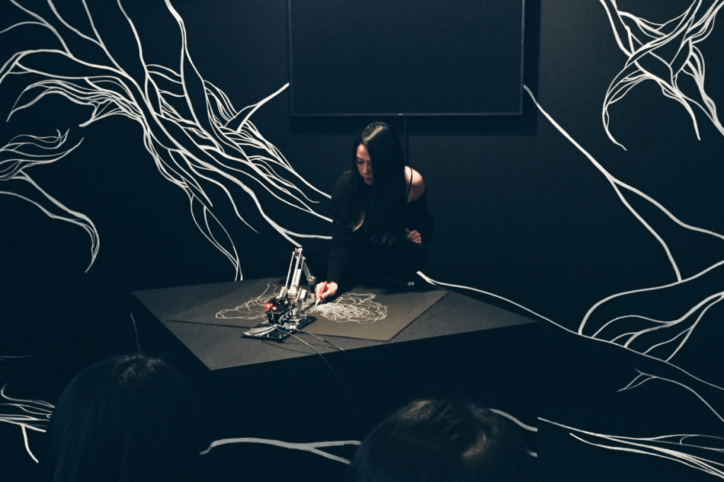
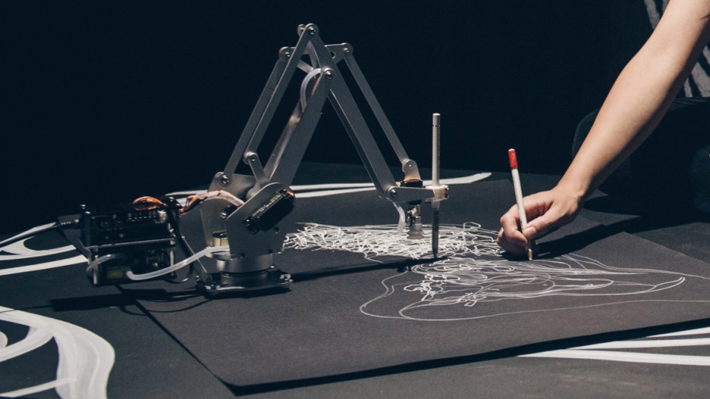
This work was then built upon, with drawings being stored in the machines memory bank.

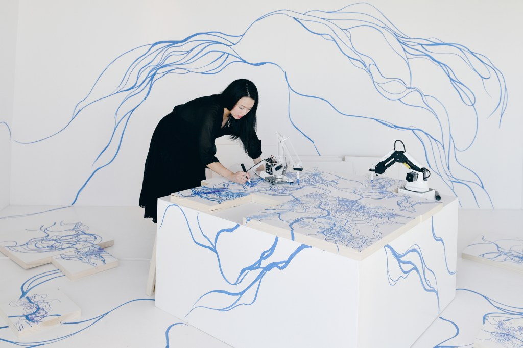
The machine interoperates the style of the artist and they draw together in a collaborative setting.
These processes are then combined into an immersive performance,
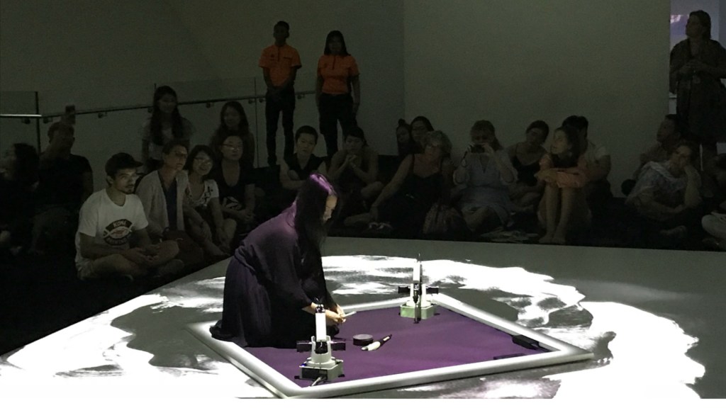
I really like her more large scale recent works, especially the emphasise on immersion with her installations. The projections I feel enhance the mechanised nature of her work.
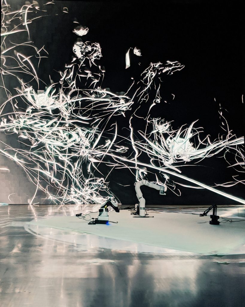
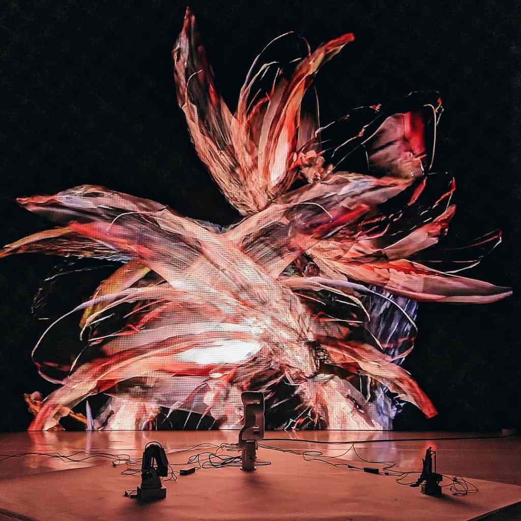
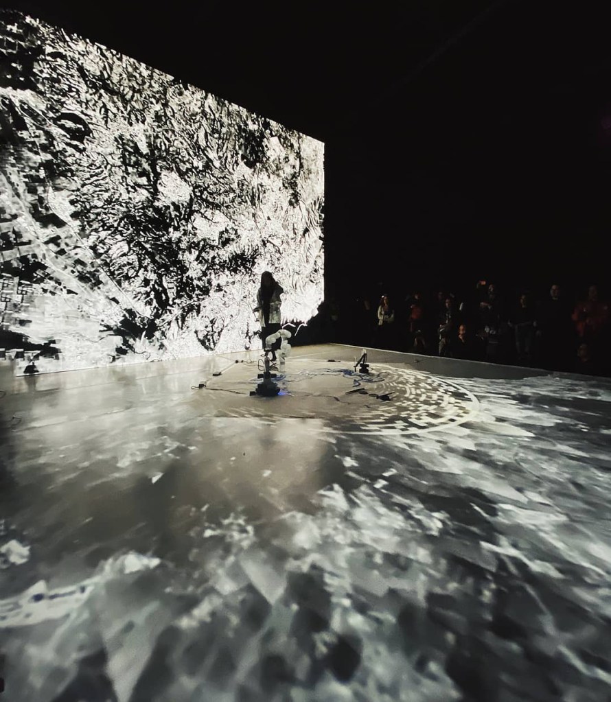
It is something that I feel works well with her theme of human and machine collaboration. I have kept these images to refer back to at a later date as I feel like it is too early to consider such things at this stage of the project.
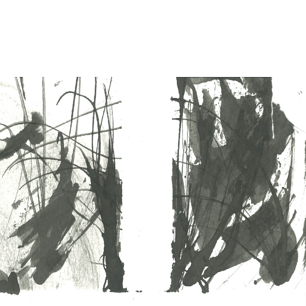
Graphite Marks
I also decided to do some marks with graphite. Instead of letting myself just go with the materials I decided to listen to music of various genres and mark with the music, how it felt listening to and different parts of the music itself.
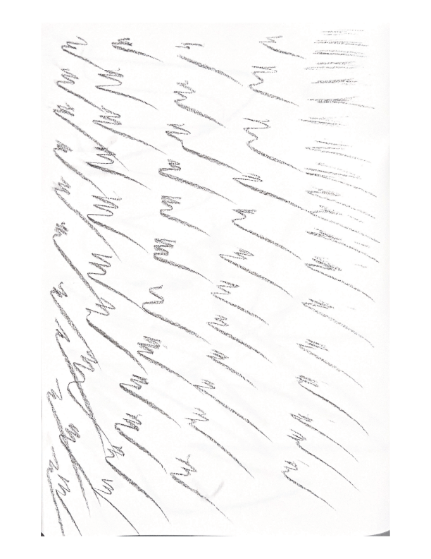
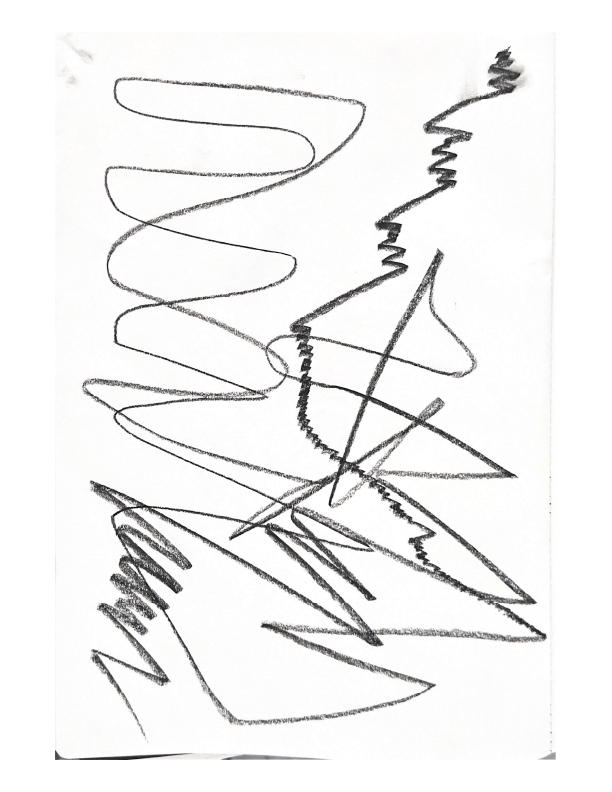

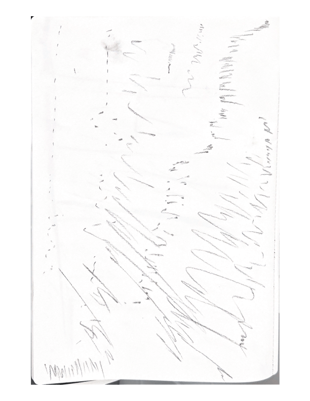
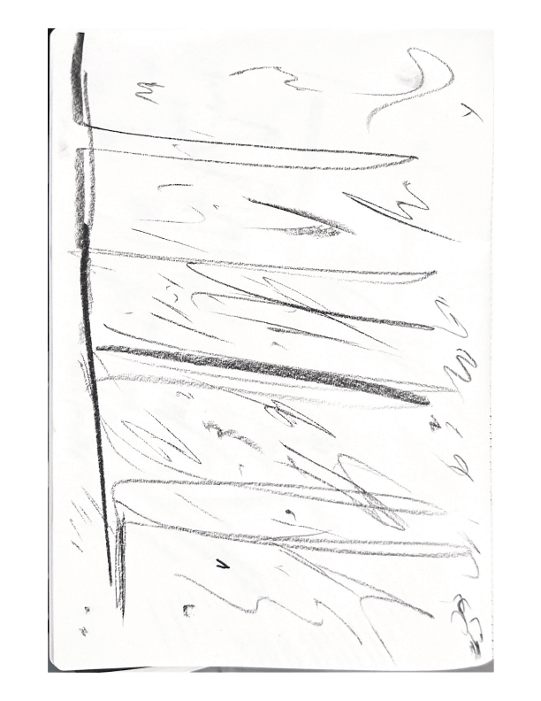


I feel like with these marks there is more scope to open this out to have other people that they can create their own marks that I can then use and compare common themes. The only thing about this direction is that I don’t want to fall too deep down the “Action Painting” rabbit hole. Using thing such as runway to further these explorations.
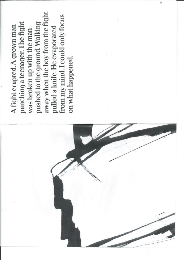
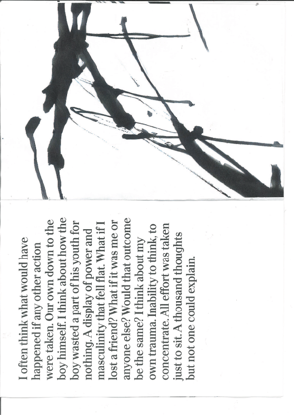
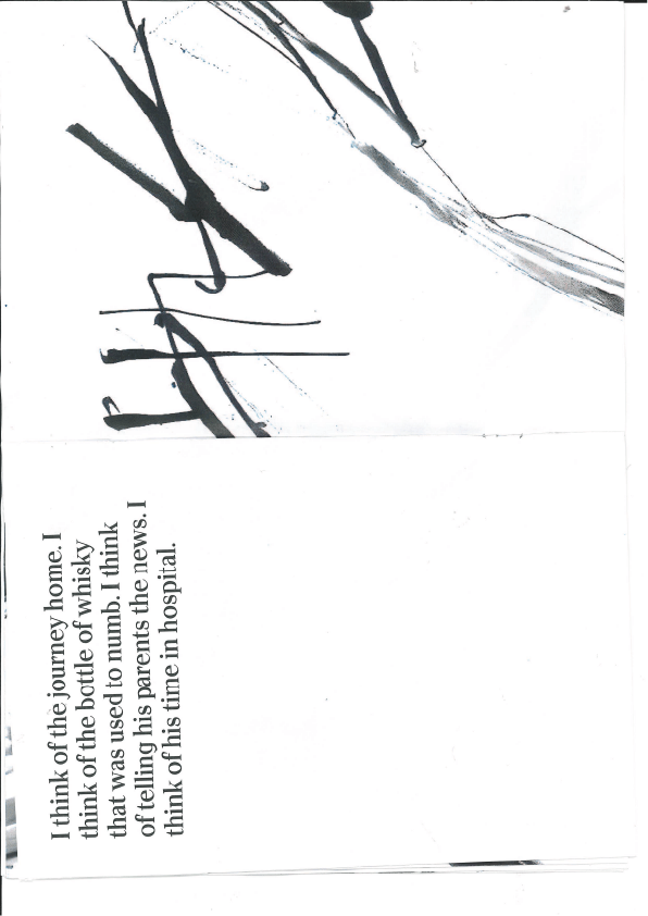
I wrote about my experiences, putting myself back into the time when it happened. Thinking through the event as it went on.

I purposefully didn’t include any names, in my mind still it could have been anyone it happened to, it was just a matter of circumstance.
During the summer I worked on placement at Imaginary Friends, A Graphic Design / branding agency based in Glasgow. During this time I gathered a great deal of fonts and typefaces with the express intent to later use them in my studio work this year. Of these new fonts I decided to go with apoc normal in a heavier weight to balance out the darkness of marks.

While looking at videos of mark making I came across a video about making zines. To which I thought I may as well combine what I have so far.

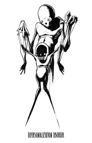
Visual Research – Feeling/ Depersonalisation

These visuals of a visual migrane is something I felt very strongly about my experience with depersonalisation. Initially not knowing the term for the feeling but I stumbled across this illustration that did it well.
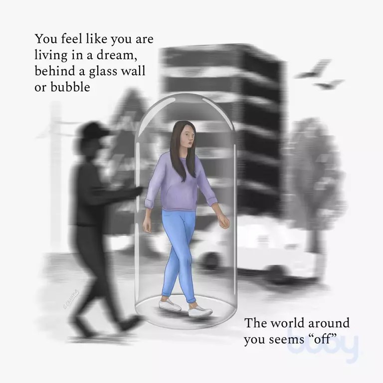
This allowed me to put a name to what I was feeling allowing me to search for artwork based on this. Some of these aren’t to my taste but I like the way it conveys the feeling of being outside of your body or that there is some sort of miss-wiring and your brain isn’t functioning properly.

A specific artist I thought was of mention is Edvard Munch his most famous work The Scream is of note for obvious reasons, it depicts an almost primal representation of anxiety and fear.
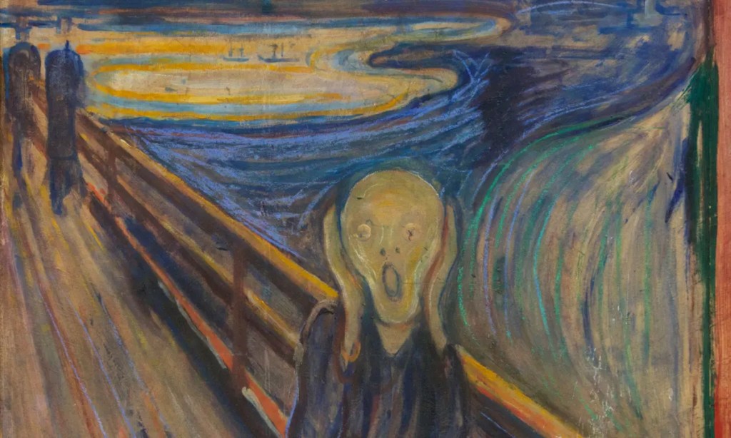
However this is not the only work by him I find interesting. His work The Sick Child, a child on a bed with another person, perhaps her mother, kneeling next to her.
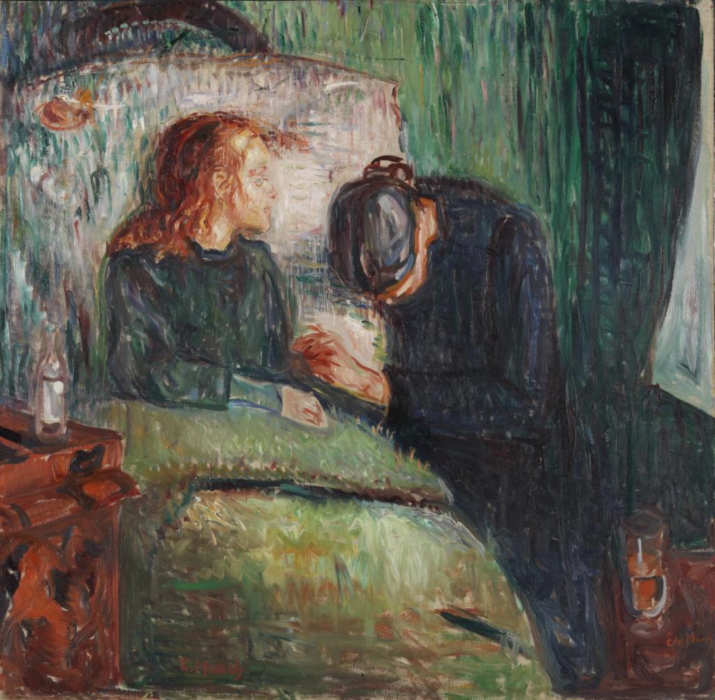
This work I feel is a much better suitor to my own feelings towards my traumatic experiences, they aren’t black and void of colour, they are vivid, real and alive. This work deals with the Munch’s memory of his sister, who died at 15 from Tuberculosis. It revisits his own guilt as he too suffered from Tuberculosis. Why him? why did he survive and his sister die. This particular version of the painting is the 4th version, he made several over the course of 40 years. I feel this in and of itself speaks to me personally as these feelings of guilt and trauma also revisit me from time to time, hence my theming of this project in the first place.
Another work of Munch’s I find especially of note is Two Woman on the Shore.

This work depicts two woman, one looking out to sea, dressed in white seemingly oblivious to the other woman, kneeling (or sitting) dressed in all black with her hood up with dark features making her look sunken and old, she is also not looking out to sea but looking directly at the woman in white. This fits with depictions of life and death. As the woman is unaware about the figure next to her, it can be assumed that she is some sort of spectre of death, the woman is not aware of it but it is a part of her and follows her even in moments of expected tranquillity. Accounting for Munch’s other works this may not be death itself but rather a personification of his own feelings such as anxiety or guilt.
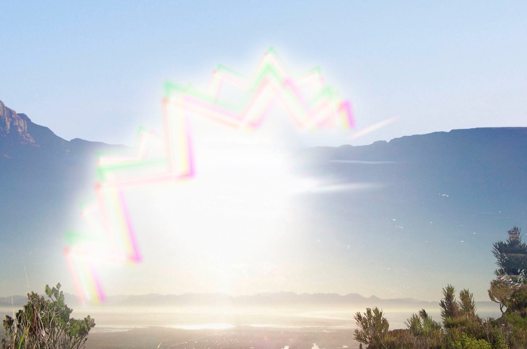
One of my main feedbacks from my research was to look into artists ways of expressing emotion. This work explores aura taking users emotional state and projecting it like a curtain around them. This reads the users brain activity and maps their emotion as a colour. As can be seen users are lying down creating a greenish-blue light, aside from one user who is a vibrant red.


I feel this work is inspiring to me, not only because of its wound like shape, but because of the use of depth and the feeling of a “void” behind the canvas. The artist Lucio Fontana is also the founder of Spatailism. This work is a way for him to transform the 2D canvas to a 3D artwork.
https://www.goldmarkart.com/blogs/discover/brief-history-german-expressionism


Looking into german expressionism as it was formed as a rebellious movement against their society at the time, “austerity and prudishness of state-sponsored art and religion; and, above all, the predominance of conventional representation in art and the ideology of realism.” And is described to “emphasized the artist’s inner feelings or ideas over replicating reality,”
I also looked into Automatism, Paula linked me the article after discussing each others work in the first week and I realised that my process for marking was very similar to Automatism. A branch of surrealism, Creating without conscious thought.


As mentioned above I feel like my marks that I fed into runway were similar to this idea of automatism, just without realising it, the same with my writing, that idea of switching off and not dwelling on certain thoughts or feelings, for me it was just letting myself flow directly onto the page. I feel that it also relates to what I was saying about the nonsensical nature of the event.
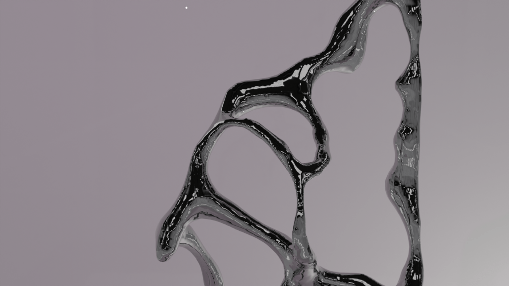

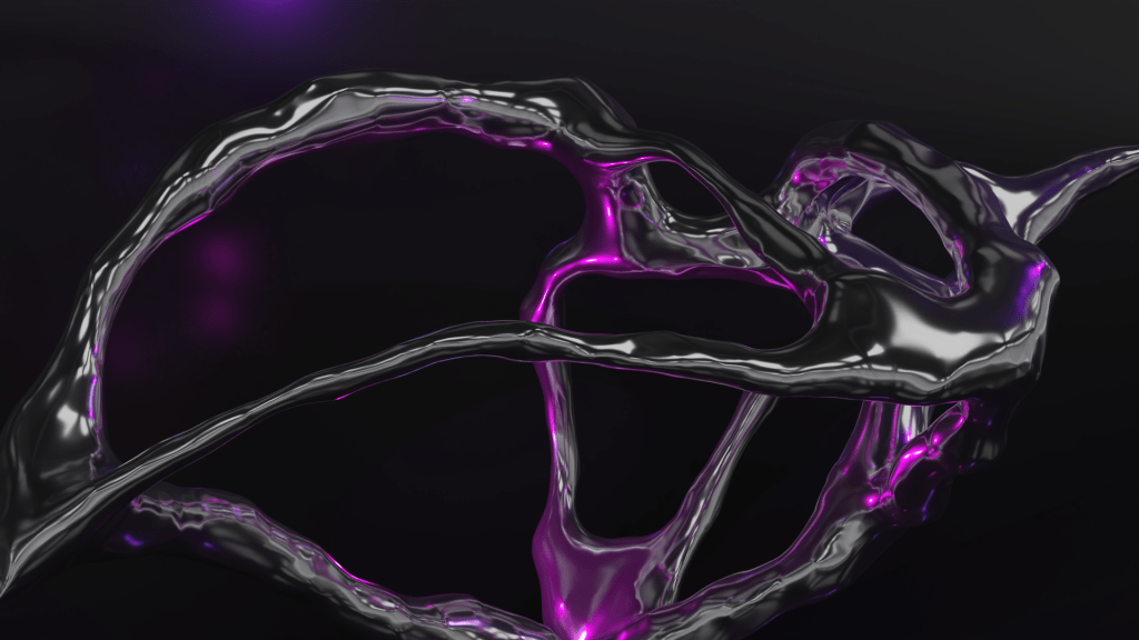
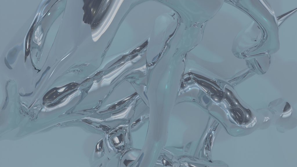
Experimenting with different forms and shader settings, above is metallic to full vs slightly lowered to help cast more light on the 3D sculpture.


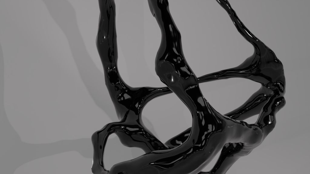
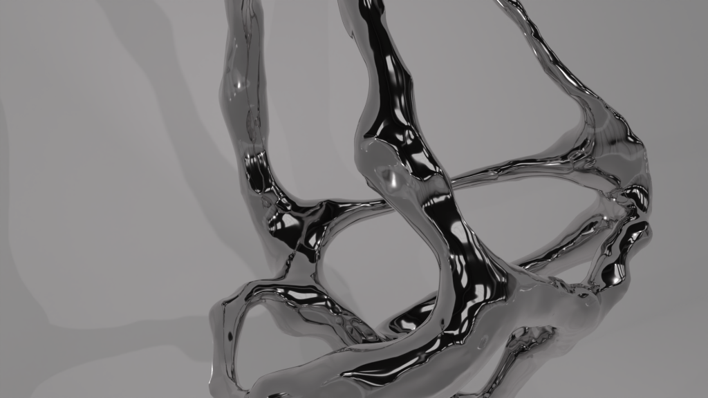

experimenting with different modes of lighting and HDRI maps


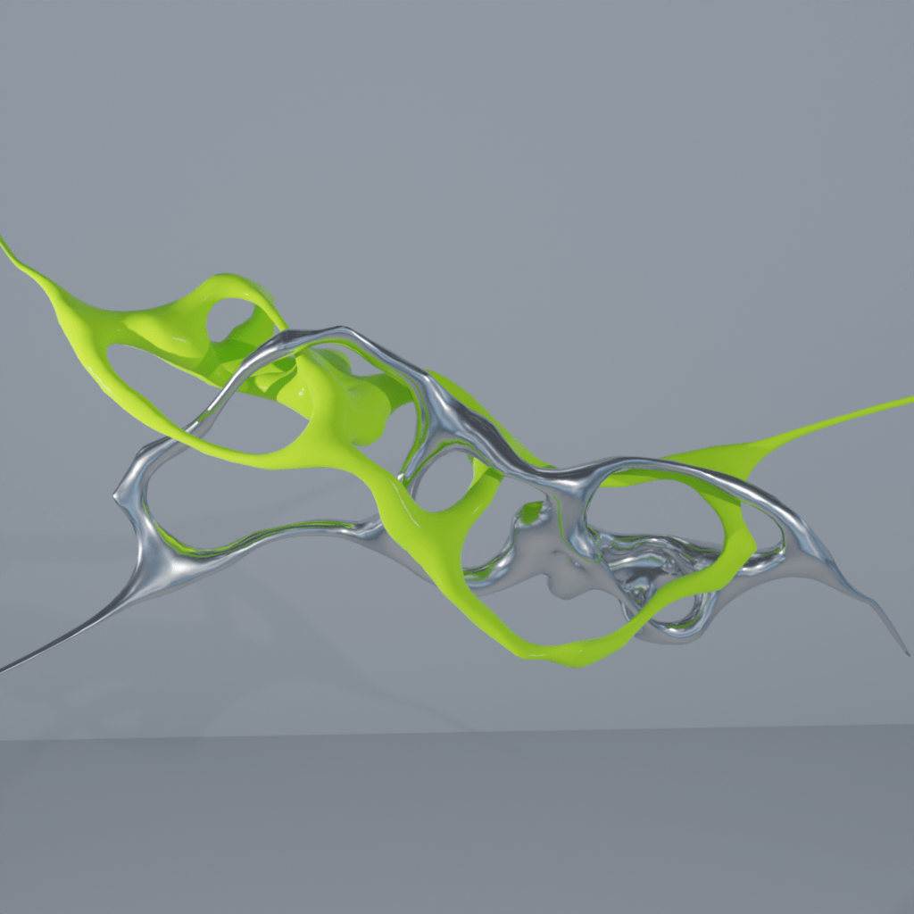
MATORO
With these sculptures and animations I wanted to capture the spirit if waht I did with the marks and also taking into account automatism that I linked futher above. Creating without thinking and expressing directly onto the page or, in this case, screen.
These videos can easily be taken into touch designer and looped or taken into processing to be used with audio or tracking code.
I decided to include this post as I feel that it bears resemblance to my 3d structures. It is also an interesting peice of work in its own merit, I believe it is an electromagnet controlled by audio output to interact with the ferrofluid. However the intricacies and exact way it works I am unsure of.
I created some more studues and recorded my process for making and shading the 3D sculpture, this time I used a texture similar to my Y3 Design Domain work to see the differences between a more metallic vs a shiny plastic surface to see how they interact with each other.

I formatted these to post on instagram, I have decided to take some studies etc I find interesting and share them due to my connections with designers outside of art school. This is also an exercise for myself as I dont tend to post a lot of my own work, especially recently.
I used this tutorial to get to grips with cloth simulation as it is something in 3D that has always interested me, it however demands a lot of computing power so I think it will only be possible to develop these from home.
I had multiple issues with this process, with crashes being very common as I limit tested my machine to get the best possible results, balancing quality with efficiency, which I feel blender does very well.

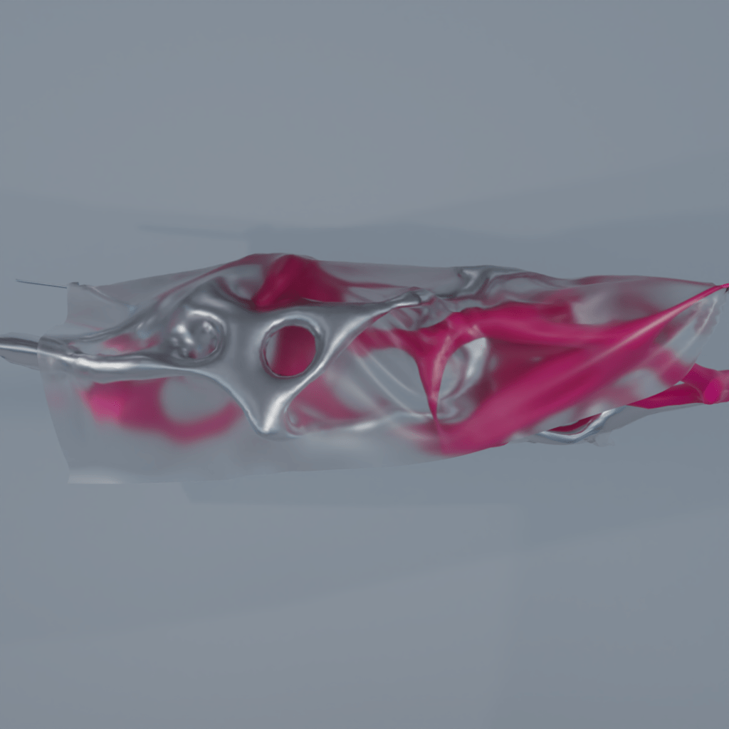
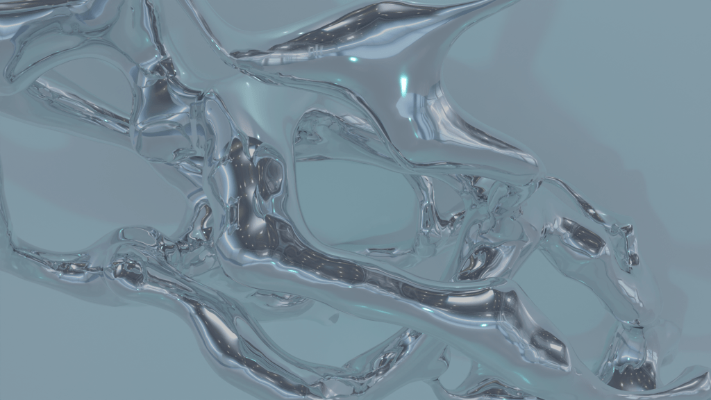
These studies I focused on getting to grips with cloth simulation in blender. My machine was not happy with this slowing right down due to the high memory and CPU usage. However the outcome I feel is one of a kind and worth the effort. In these two photos I experimented with the roughness material slider as it made the plastic look more or less transparent. However the difference is so little that it is hard to notice in this case, I will showcase maximum and minimum below here to illustrate the change.
A before and after as the renders were very dull, I used the levels adjustment in photoshop to brighten my render.
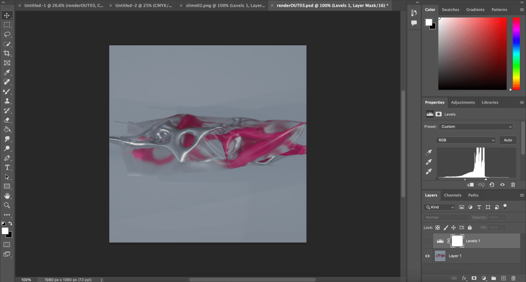
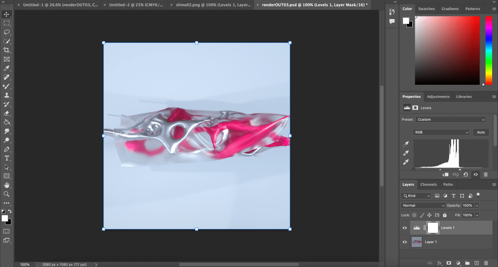
One thing I have noticed in these renders is that the output can be very dull, however in cases such as this it can be rectified in photoshop, however I will try to get this problem sorted at the source, due to different lighting settings this process may be time consuming for different renders.
