3D Continued
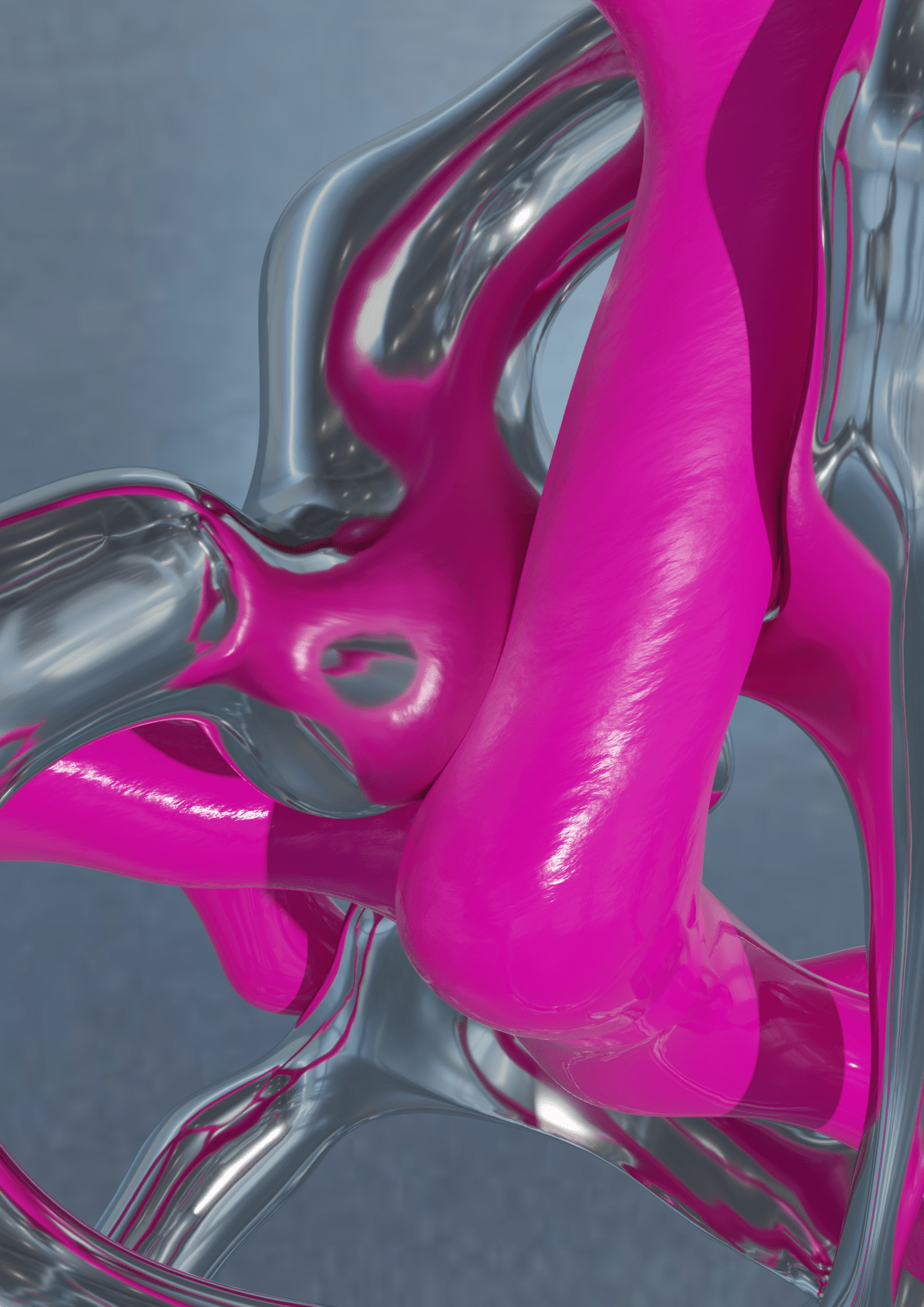
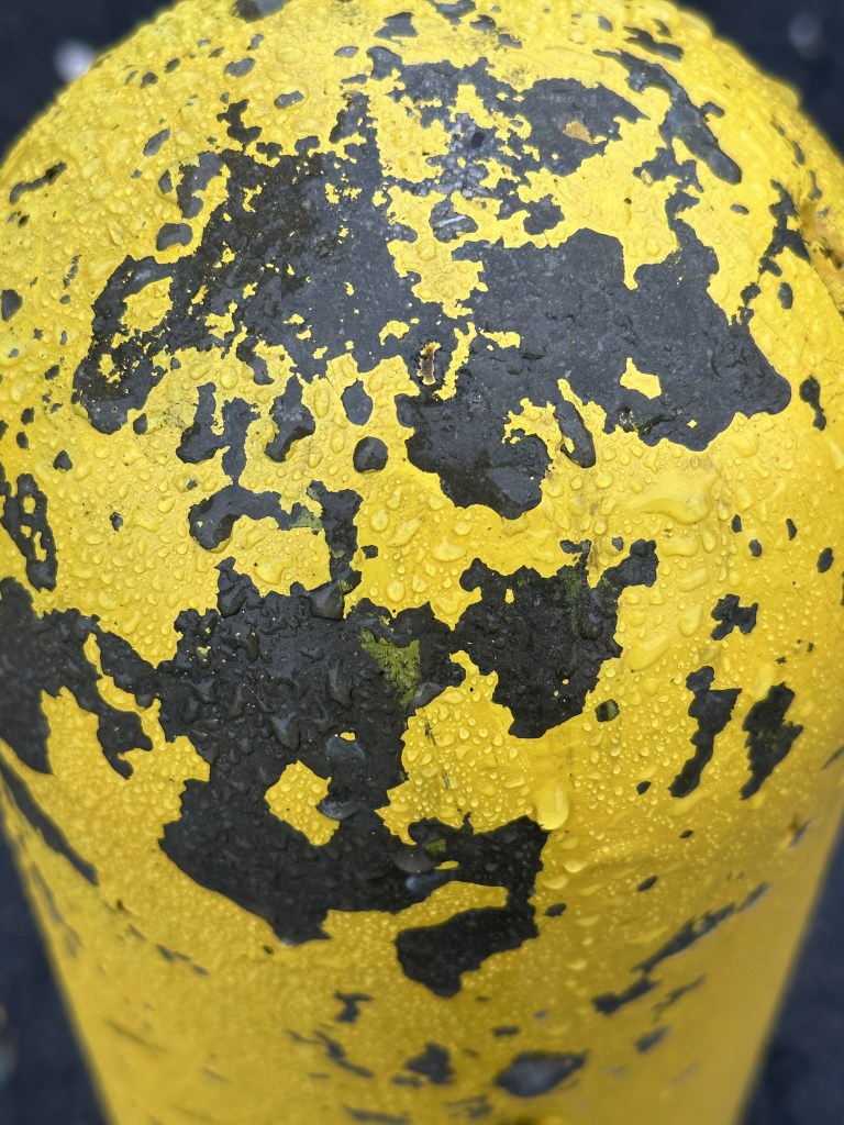
On and off from writing my extended essay, I have also been trying to keep up with my 3D experiments, focusing more on how to get much sharper images and create more interesting textures that bring more life to my shapes as opposed to being so flat. Reflections are fun and there is a time and a place for them but I feel it is better to explore more textures to breathe a bit more life into these models.

Using things such as noise, mapping these to the shaders in blender and ramping them up and down allows me to do this, the process for both materials is very similar however with just some subtle changes to create the more liquid plastic effect for the coloured material and the more metallic lamppost-esque materials.

I have also continued to generate animations with the intent to use them later in any touch designer / processing driven outputs. There may be use for user to drive animation etc so will be of use to keep a hold of these in order to refer back to in the future.
INTERNATIONAL ASSEMBLY
This month some of our year got together for INTL INTERNATIONAL a fka Graphic Design Festival Scotland. The festival ran over 2 days at the start of the month and featured a number of greats from the creative industry such as Zach Liberman, Yuri Suzuki from Pentagram and Studio Dumbar among many others. Some work I found extremely inspiring.


This work by Yuri Suzuki in Haneda Airport, is designed to welcome travellers into the space with the intent to create life in a usually soulless place where travellers would just be moving from one place to the other. It keeps human voices at the centre of the experience with a choir like song emitting from the striking trumpet like speakers, there is a struggle for a focal point in the audio but that helps create an almost angelic and etherial tone to the work.
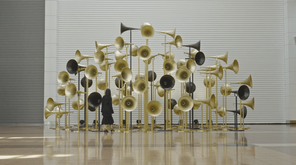
https://www.yurisuzuki.com/projects/crowd-clou
The scale also allows viewers to in a way explore the work, creating this bubble of sound that fills the space. I feel like this work is similar to ideas that I have discussed in tutorials about having audio be part of my work with no particular focal point but a mix of ambience with the occasional event to catch interest. I feel like this would be an interesting avenue to explore given the chance.
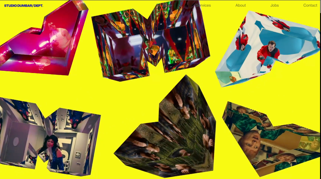
Studio Dumbar also had an interesting presentation with a focus on generative type using it for posters and more recently motion design

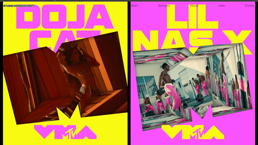
Working with MTV for the VMA awards focusing on space, using shapes and motion to immerse the viewer in the artists music videos.
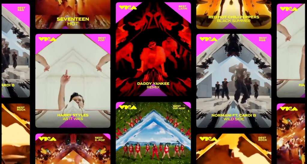
They also have a strong focus on collaboration with work for North Sea Jazz being created by the creative team aka “The Band”. I found this talk extremely interesting as it shows how someone who does what we do to slot in to a creative team, they created a tool to generate typography for motion graphics and posters
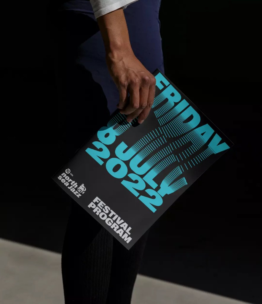
With all members of the creative team utilising the program or as they call it “the tool”. They created a unique and strong identity across all branches of the festival.

Posters, lineup announcement and stage graphics were all generated using The Tool.
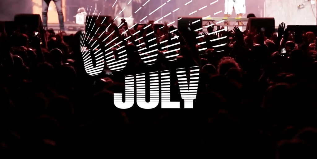

They also mention in the talk that it saved a lot of time to create using the tool as with illustrator they would have to go in by hand and select all the lines individually and it became cumbersome if there were a large amount of text present on the screen.
Concrete Poetry
I will focus more on the direction given in my show and tell feedback. I found this of great use with some really interesting work. Out of all of them I find the reference to concrete poetry very interesting, I feel that I already created work similar to this in y2’s typography project but it’s nice to have a callback and finally put a name to the technique.
Some artists references that I really enjoy from this idea of concrete poetry is George Herbert.
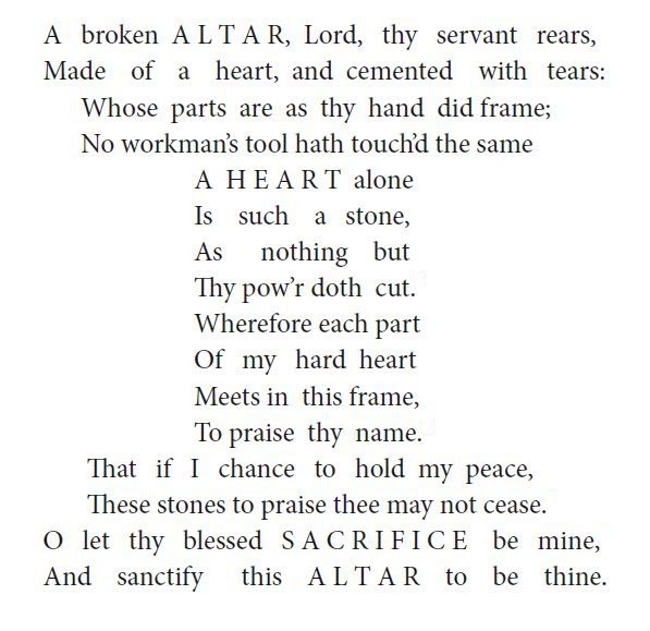
His work I find extremely interesting with works almost looking generative over 400 years ago

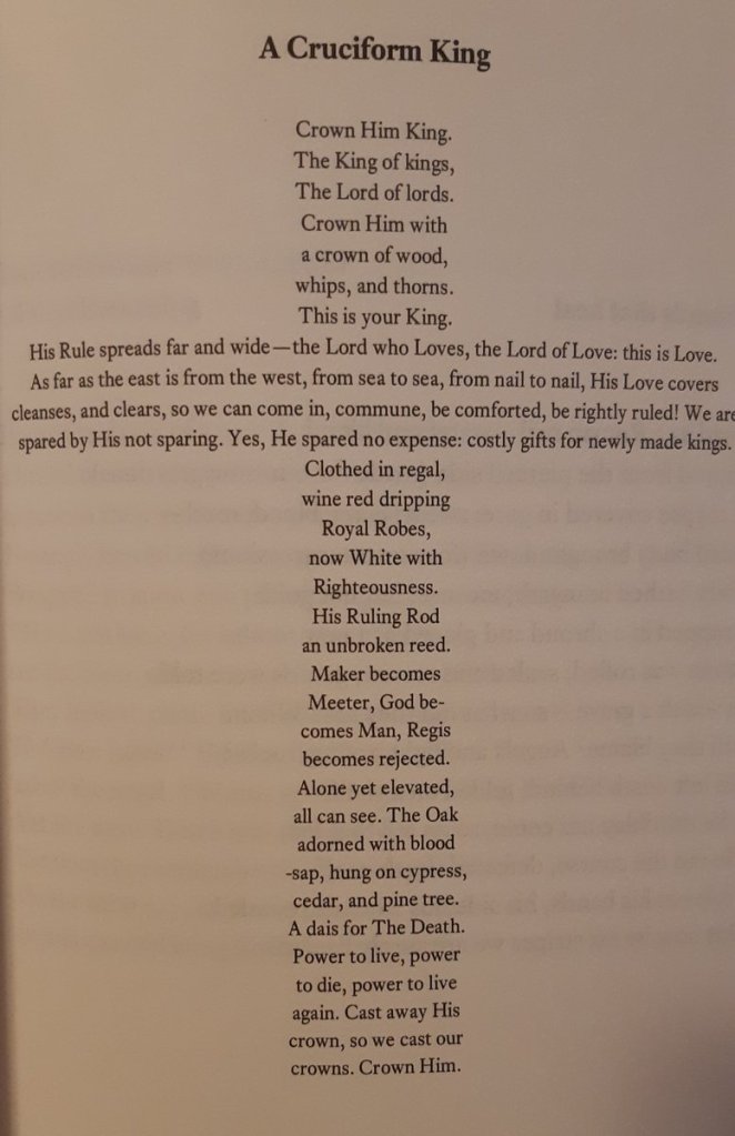
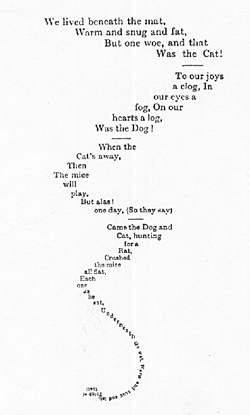
With all work being hand set there is a real tactile feel to his work, with much of the work, when being imported to digital loses that feel.
Typography / Graphic Design Research
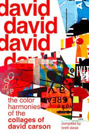
Other than this idea of concrete poetry I feel that its a good idea to focus back on type. Type is something that I deeply enjoy working with. With one of my biggest inspirations being David Carson.
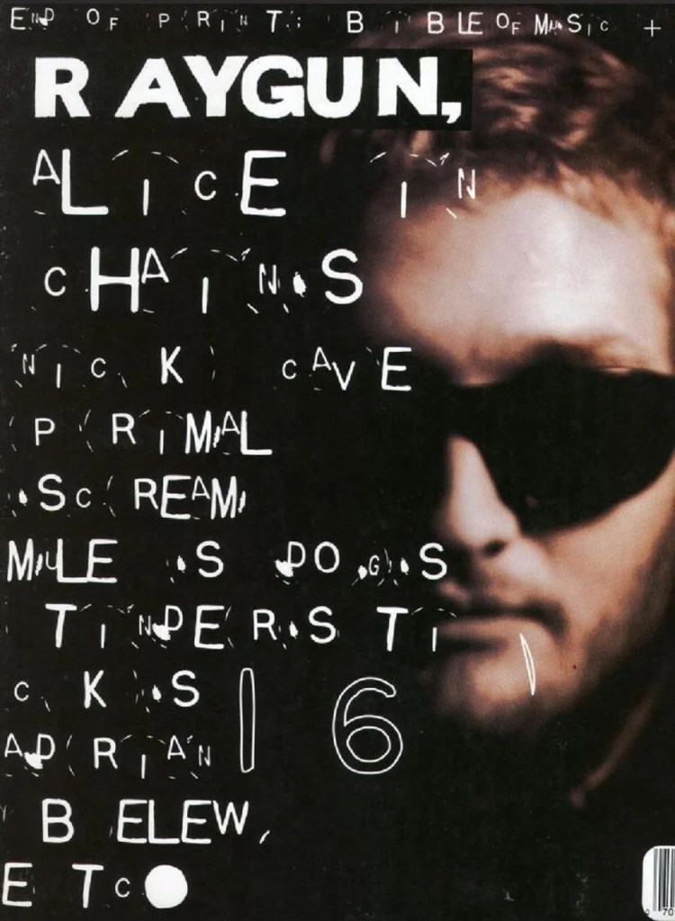

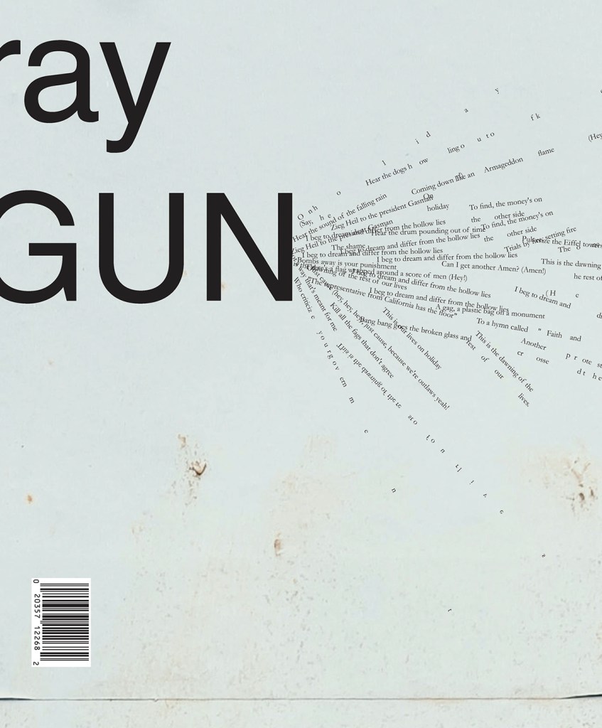
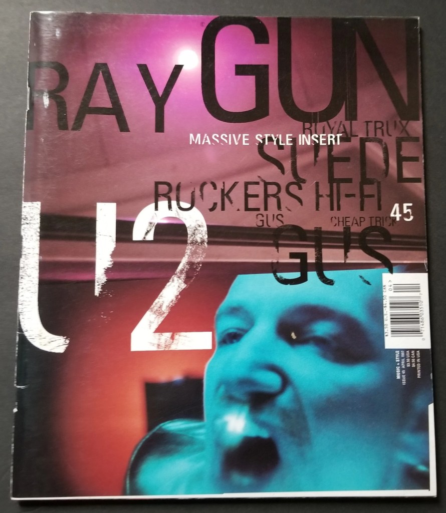
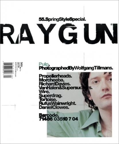
His work with Raygun Magazine, I find, is some of the most interesting work with type, photography and other mediums such as ink etc.
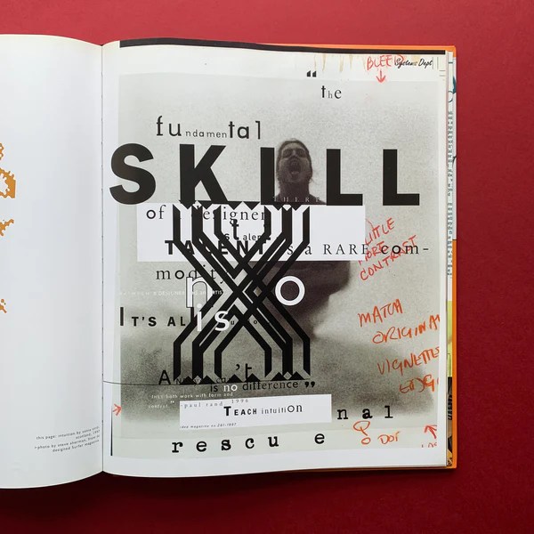
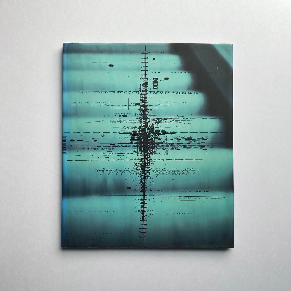
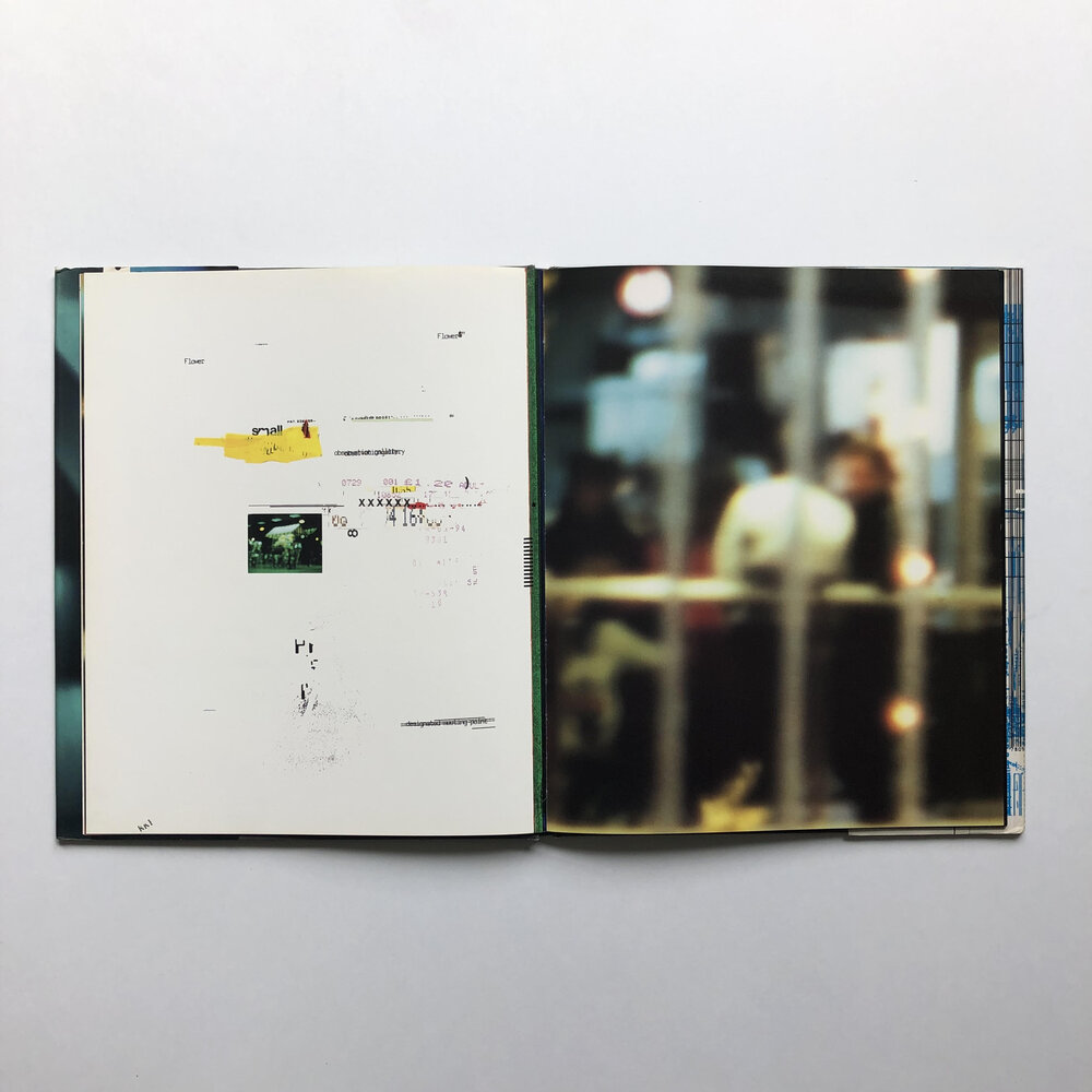
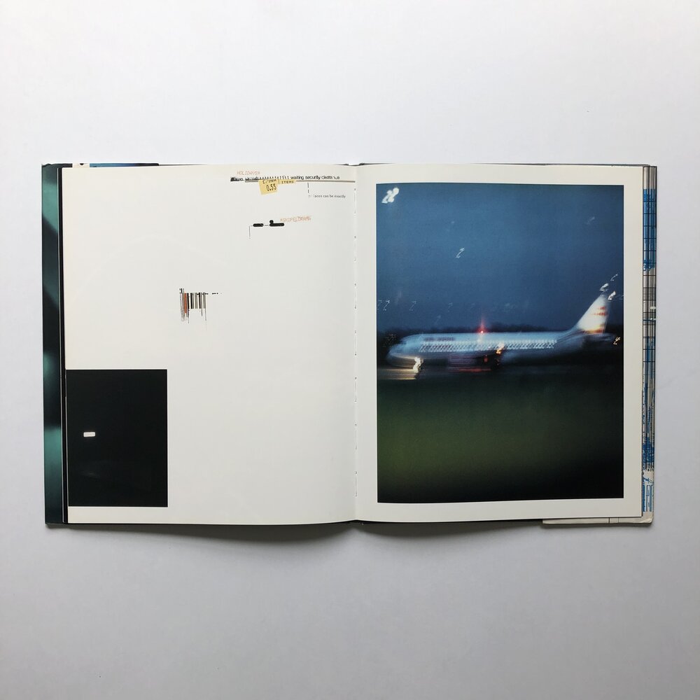
Another designer that I really enjoy the work of that lives in a similar vein as David Carson is Chris Ashworth aka Swiss Grit.

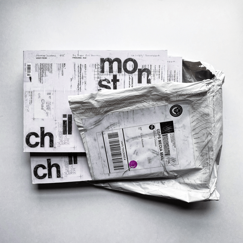


I feel like exploring work such as this is the next logical step with my ink work. In this interview he mentions found type of inspiration as well as hand distressed type, taping type to his garage floor, his kids shoes and exposing them to the elements outside in the snow or even in the washing machine.
Below are some of the examples on his website

Another designers work I feel is of note here is Chris Bigg

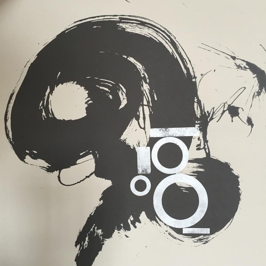
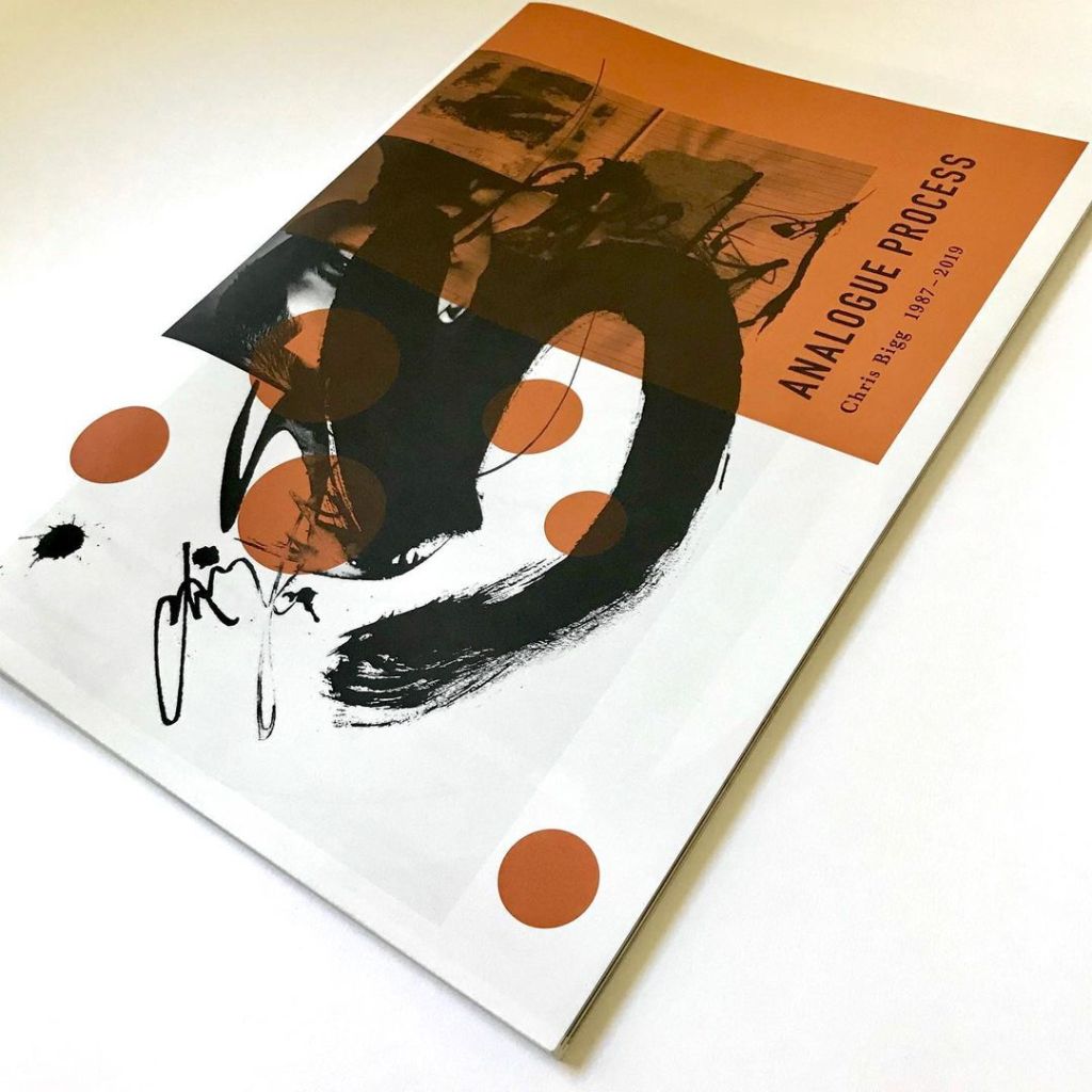
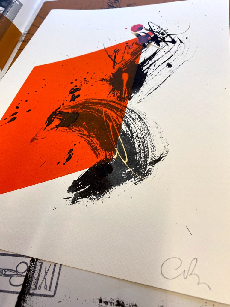
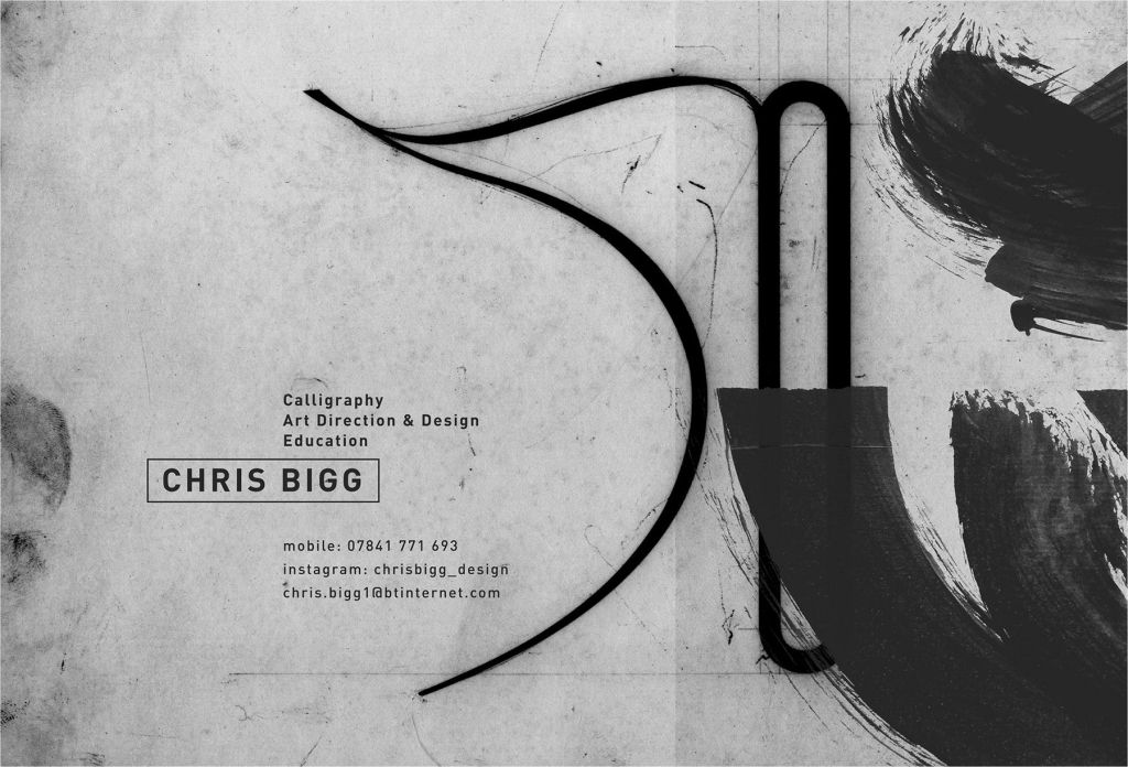
His work with ink and paint I feel is so rich combining rigid set type with the flow of ink and more calligraphic forms.
With all these artists not only do I love the combination of physical and digital works, but the tactile nature of the final outcome, it feels like you can pick it apart and in the case of the raygun magazine you can physically interact with it, turning the pages to read what was has been printed.
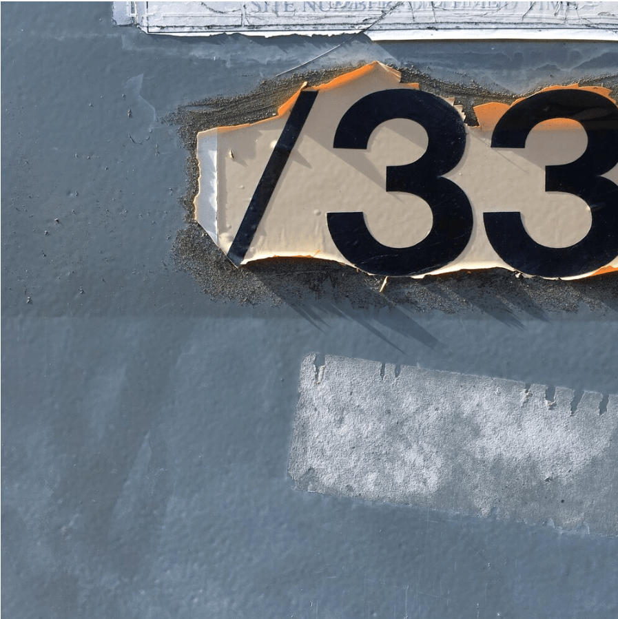
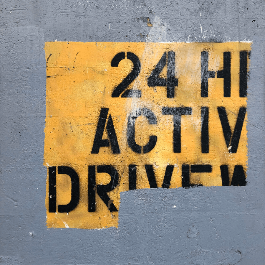
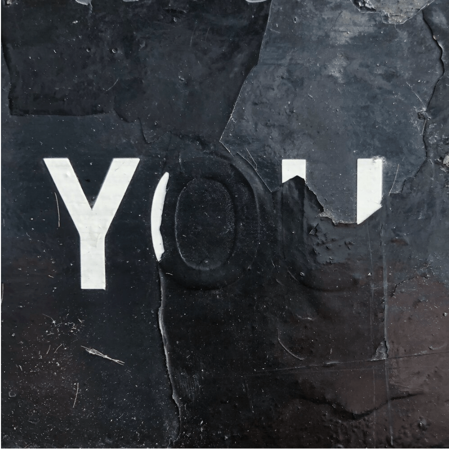
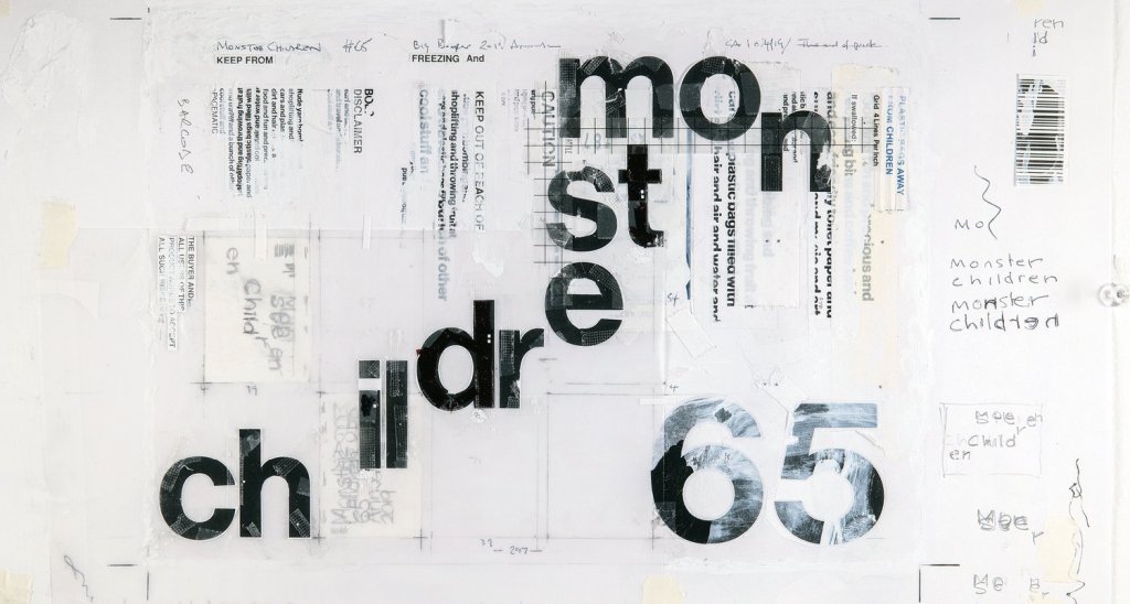
Found Type – Primary Research
I decided to explore into the idea of more “found” textures and type, creating a bank of textures and work to refer back to when creating work or perhaps even scan in myself to use at a later date, what I find the most interesting about these textures is the fact that they are worn naturally, not with a brush in photoshop or something of the like, where often the wear can look over done and unrealistic, whereas using the likes of these for inspiration will breathe more life into the process


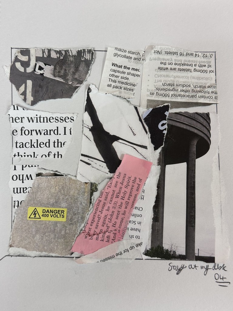
Using my Cricut machine I then took some thicker sketchbook paper and cut the word “Found” into it. An on the nose reference to these images being found in my surrounding area.
I then printed some copies of the large water tower as a test print, however when I printed them they came out green and had quite glaring imperfections in the print as the printer was low on black ink so everything was essentially a negative image, however I ended up really appricating this look, another “found” unique texture borne of experimentation.
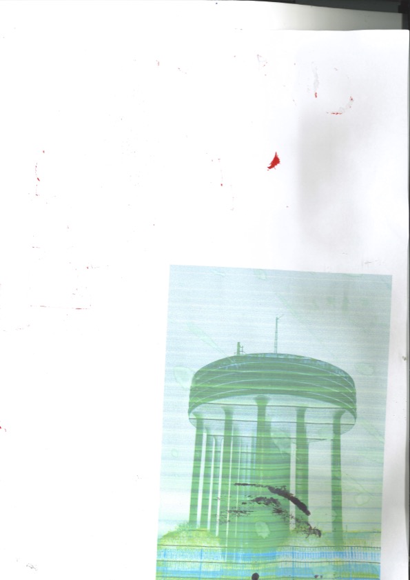

Although I really do appreciate this new effect, I feel like it is unrepeatable and would be difficult to create anything more than the limited amount of images that I already have.
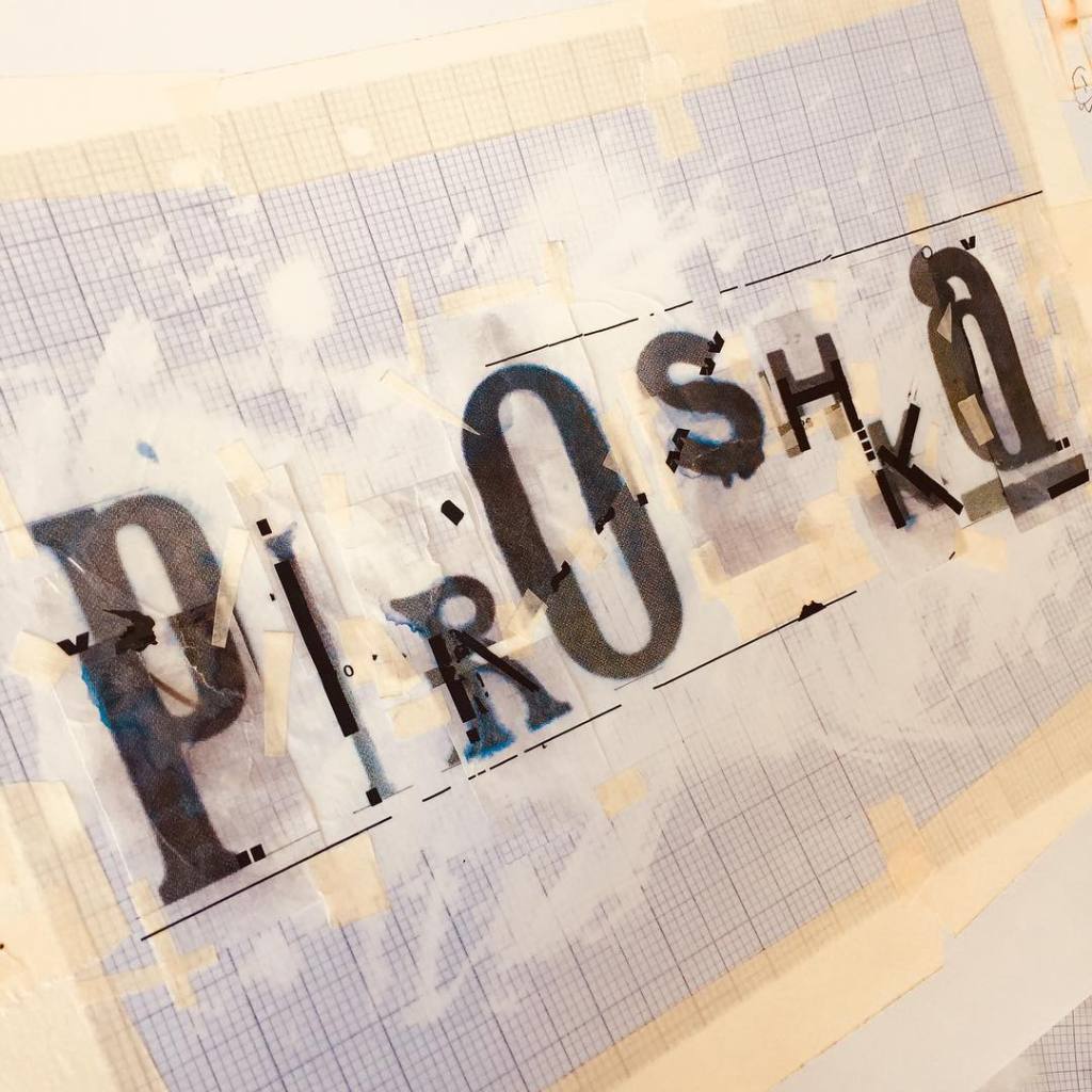
I also created a booklet, taking inspiration from Chris Ashworths published work, however some elements printed flipped on the paper, I am not entirely against this but as there are no other elements on the booklet other than the images it looks like unintentional (even though admittedly it is) , I may add some type or other contextual tools to offset this issue and take a slightly more considered approach.
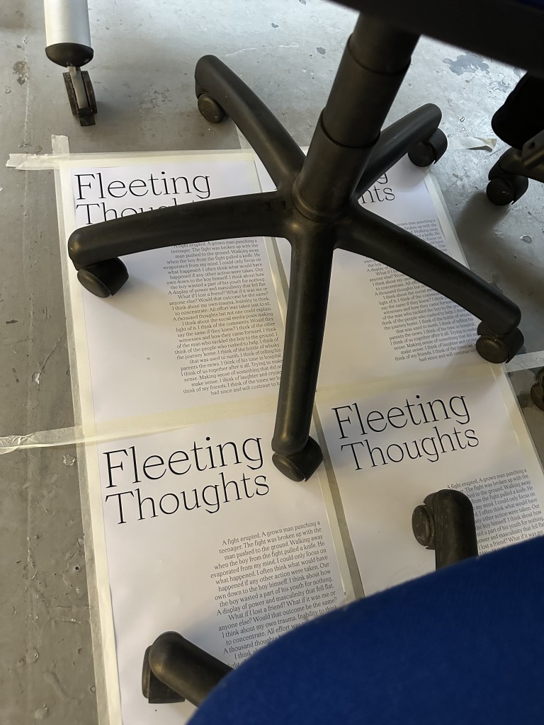
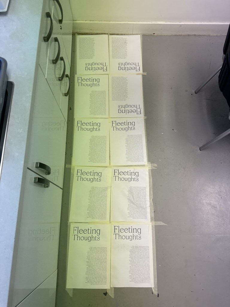
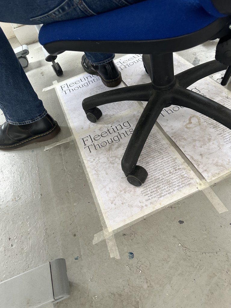
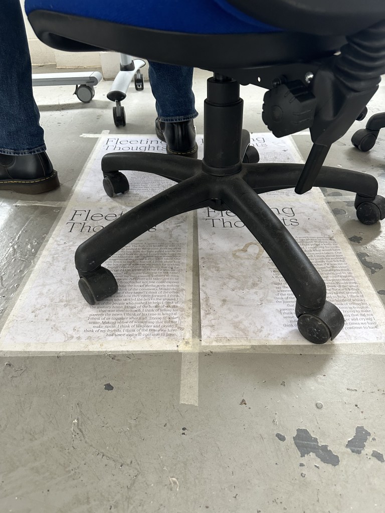
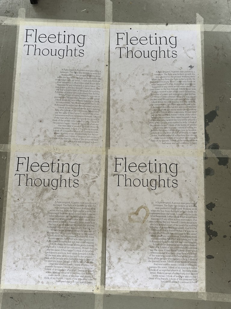
Taking inspiration from the processes of the designers mentioned previously I have printed out the text from my book last month and put them in high traffic areas (kitchen, desks, y4 studio) to get different marks on the type.
https://drive.google.com/file/d/1jhl2W0LnHFvMw9WbDs9RRpQyMQHd6Iq8/view?usp=sharing

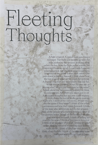
Ill include the link to google drive to access all the scans of this work as there quite a few of them and would most likely fill up my wordpress’ upload limit, the PDF’s also allow greater inspection vs an image on the blog. I find this work really interesting and feeds off my ideas of mistakes and designing without intent very well. With tears and different marks present from chairs being wheeled over and the imprint from shoes it serves as a great look into degradation over time and time based processes.
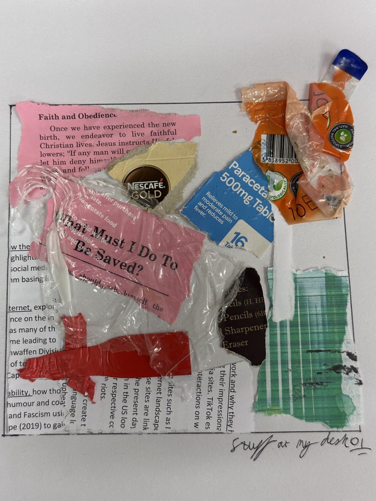
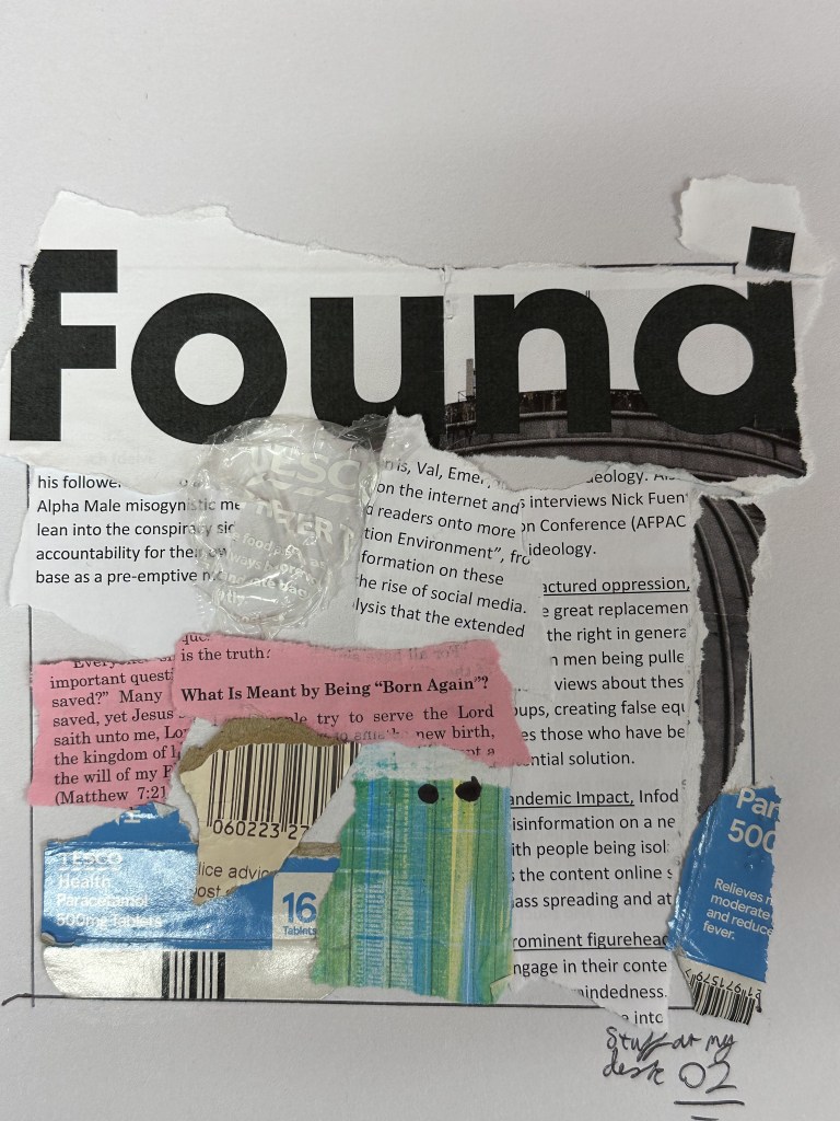
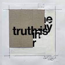
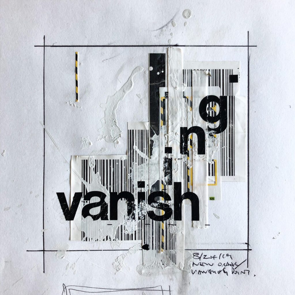
At the end of all this printing and making I had a great deal of scrap paper on my desk, I then decided to make this of use creating a series of works based on creating without thinking, using textures I have also explored in the 3D world such as clear plastic. For these studies I copied chris ashworths style of creating a box and trying to limit myself to be more inside the box, with acceptions spilling out over the edges. I however challenged myself to not create anything new for these studies and just use what I had available to me, this again links back to my idea of agency as previously explored, limiting myself with ink and graphite in the previous mark making sessions, however I still managed to essentially create my own shapes, using materials such as these, although varied still has that element of restriction to look no further than directly in front of me. I at the moment have 4 but can expand and perhaps even find my own format, however the squareness of each collage is something I appreciate and will make it easier if I ever decided to take these into runway also.
Collage Experiments

It can be explored more clearly physically, however I really like the layering effect that this brings to the collages.

I took up the paper that I had stuck down from the various locations
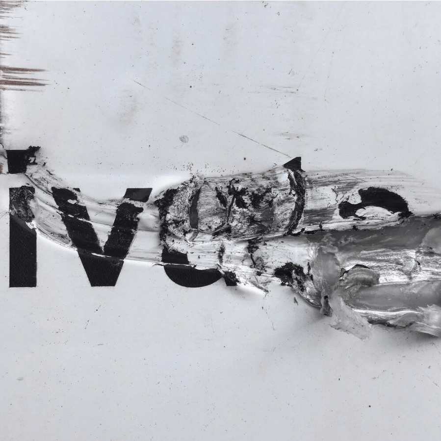
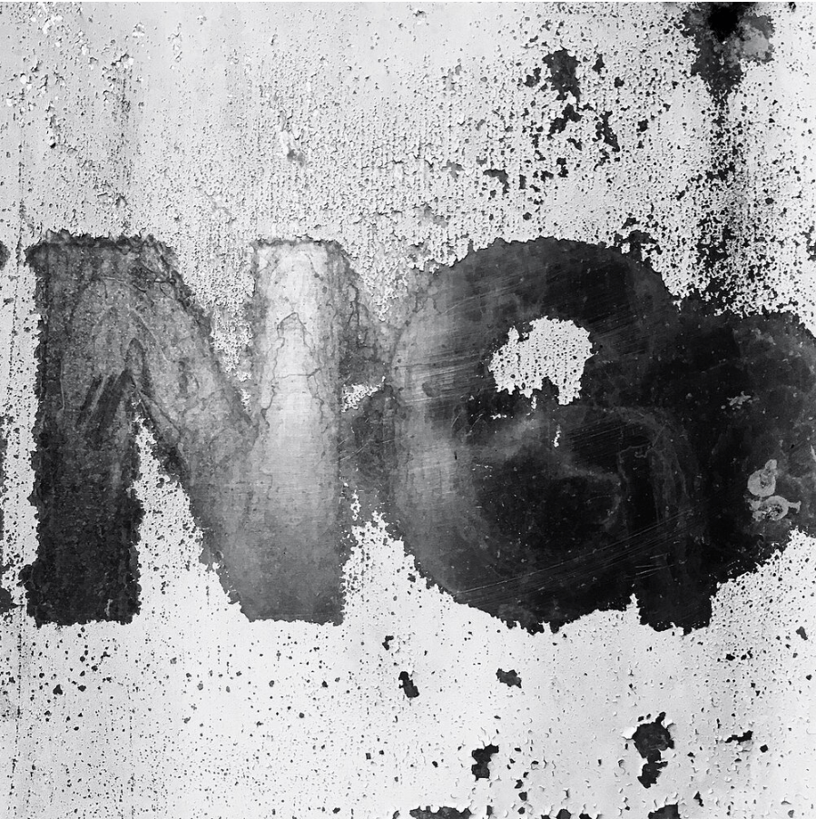
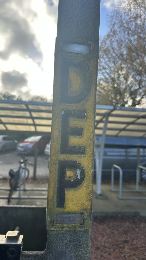
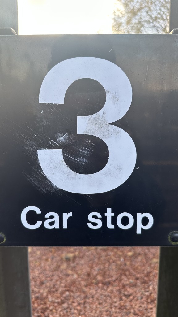
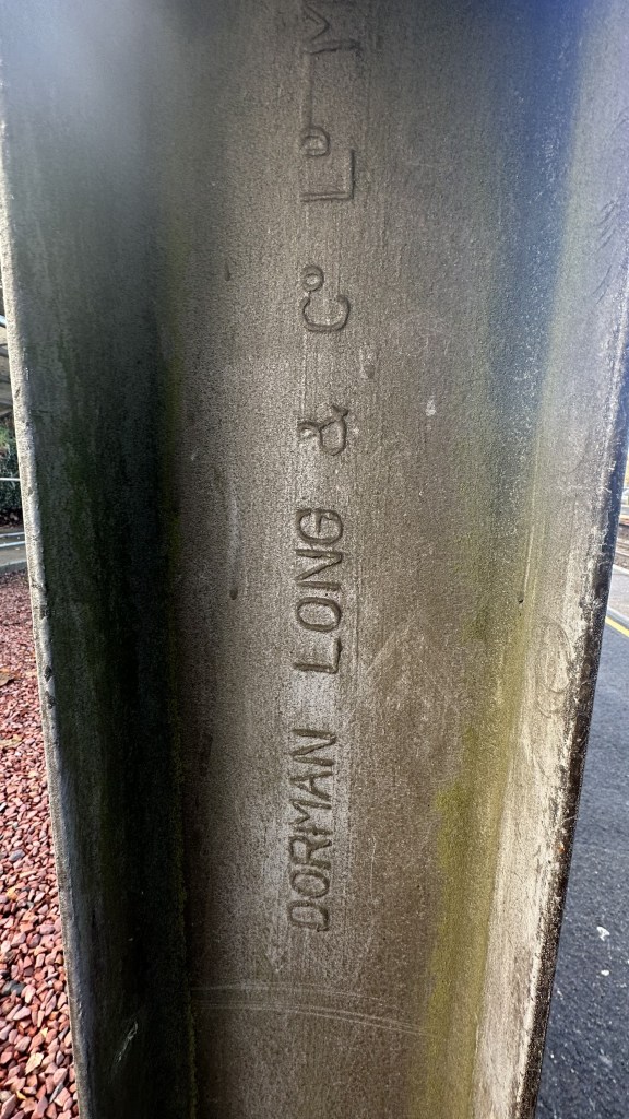
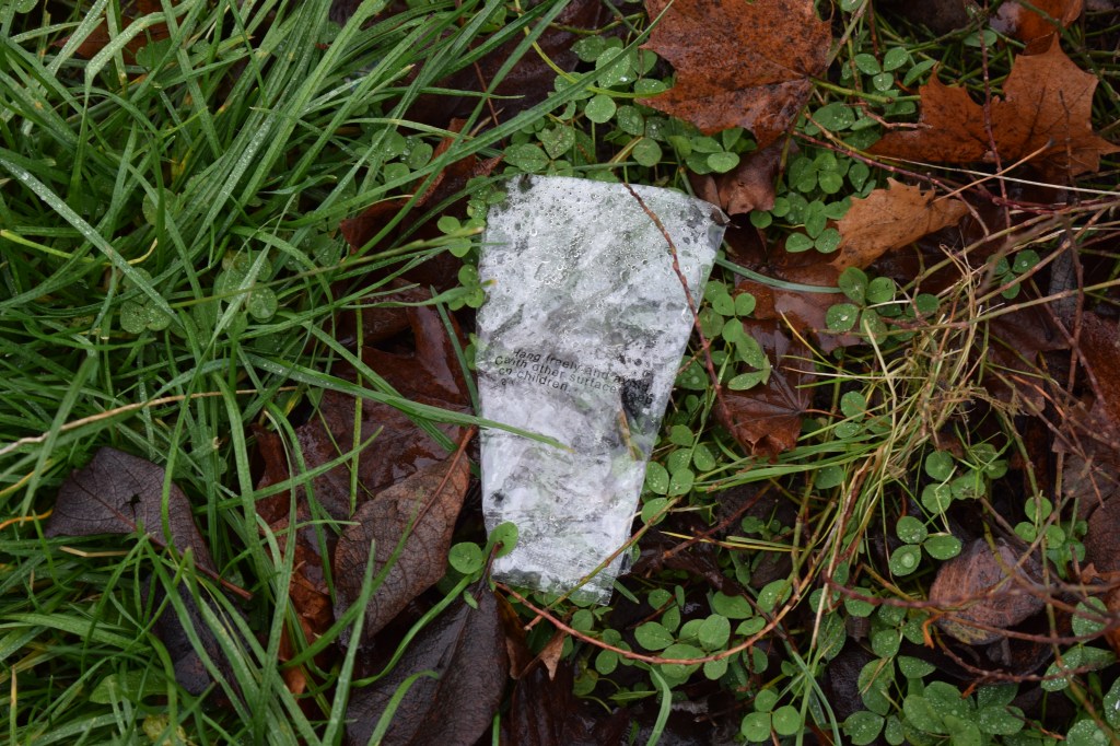
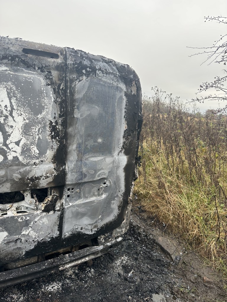
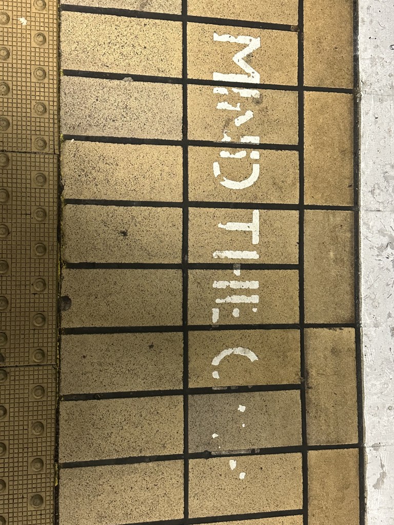
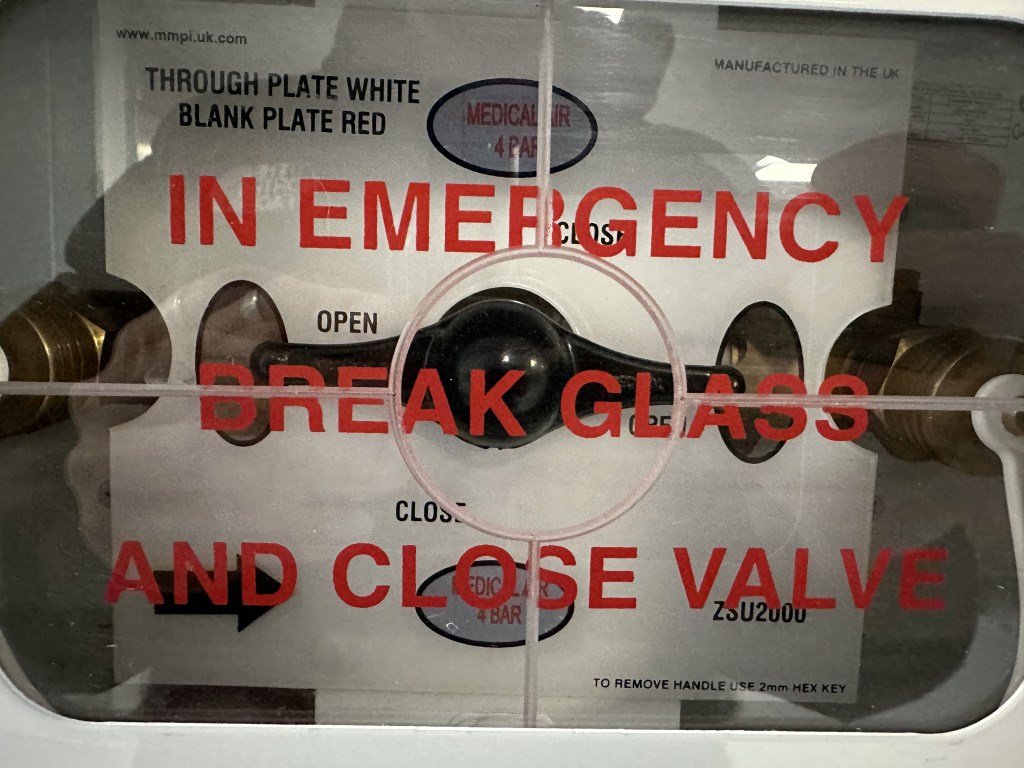
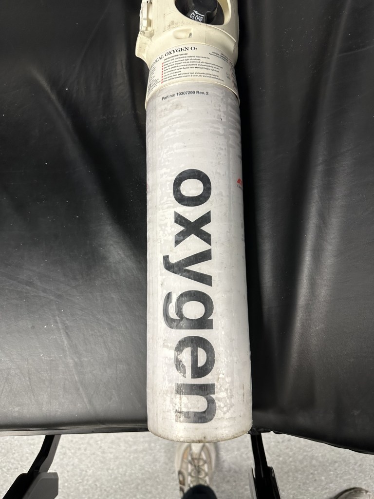
I also took time, while this was in the process of being created, kept a continual eye out for any potential textures in the real world, things like a burnt out van I found on a bike ride, remnants of tape being left behind, the worn away mind the gap at Glasgow Central Station and various signage at Queen Elizabeth Hospital.


Using my Cricut machine I created a bank of letters from vynil to include in my collages, the vinyl was bought for a previous project so still fits into the idea of reusing my materials, however this time I decided to use materials from my room.
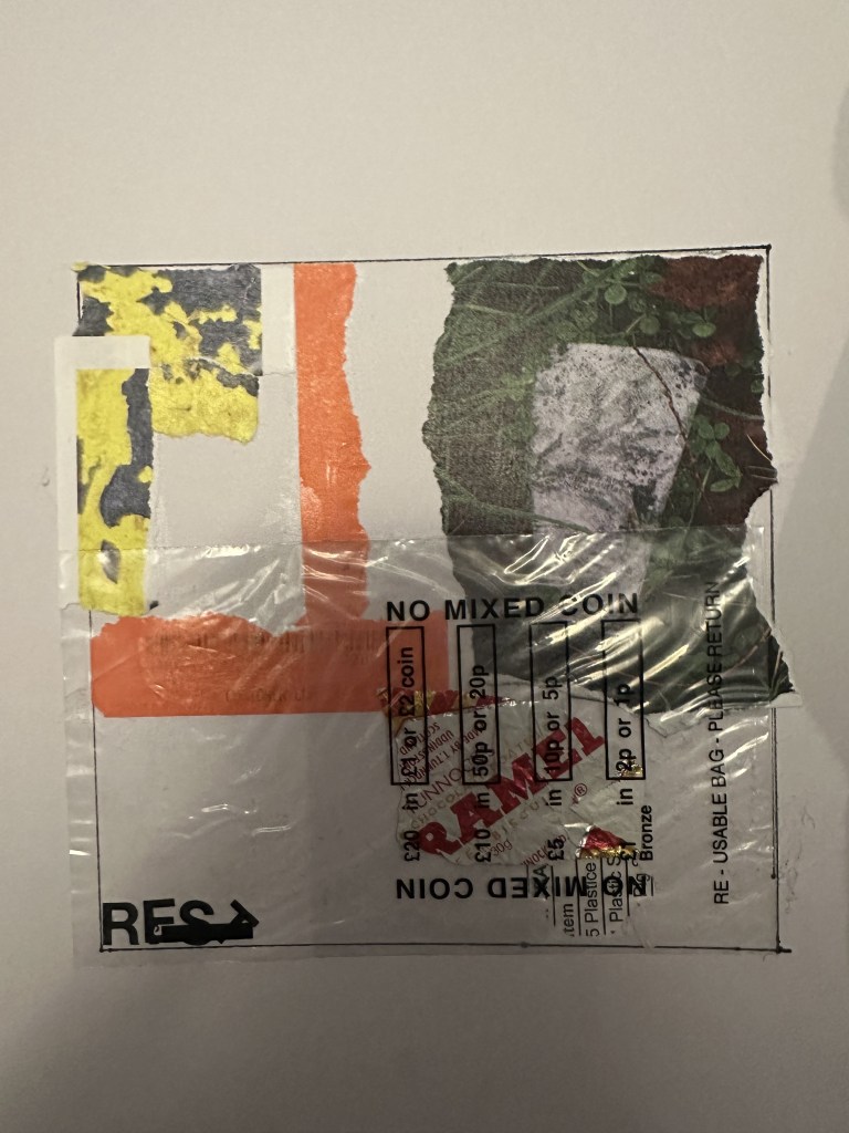
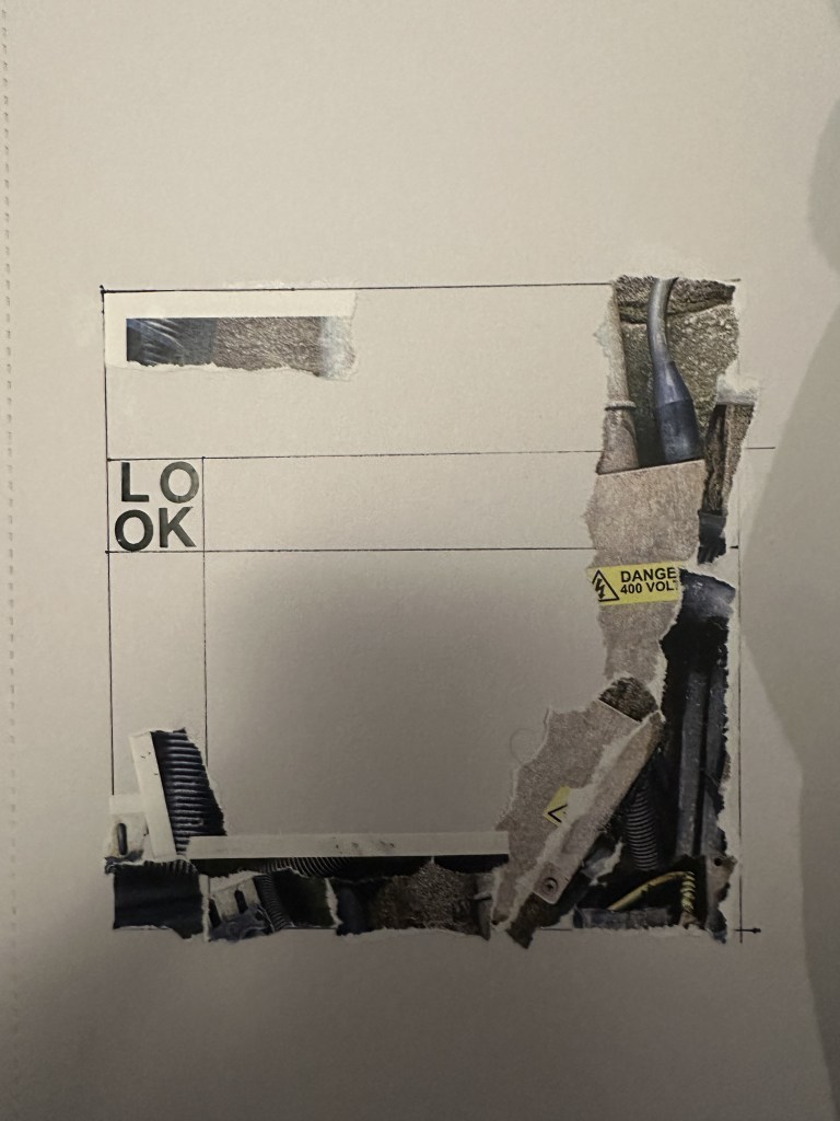
Restricting myself to using the materials around me allows me to essentially eliminate part of that consideration from my mind, going with whatever I reach for first rather than putting too much thought into what I am using. This further reaches into the concept of automation that I touched on in October with my research, allowing an element of chance to take over while also keeping slight control over placement and composition.
I hope to continue these collages throughout the rest of the year and hopefully will end with a large bank to take from using things other than paper and layering is of great interest to me and helps further inform my practice over this year utilising my digital tools as well as physical.
