For this project we are challenged with exploring type, this is a project I have particularly been interested in as I gained an appreciation for it in college studying Graphic Design.
One of the people I take great inspiration from, who was mentioned by Paul in the overview is David Carson.
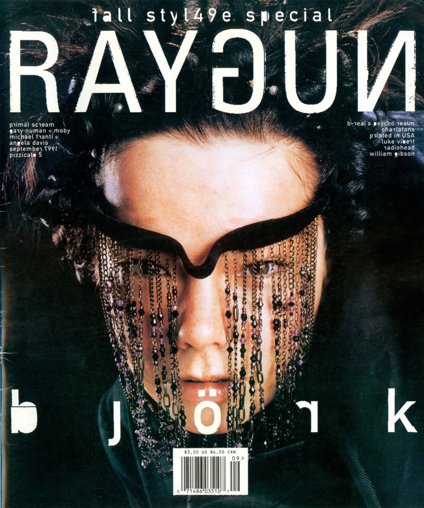
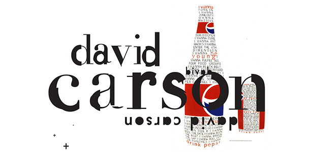
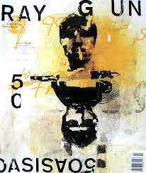


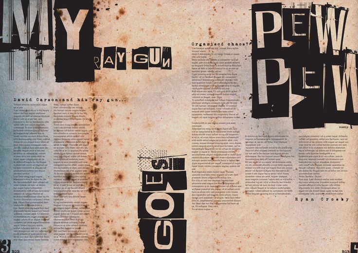

His work really got me into the idea of typography and how to manipulate text and really take it out of the computer and be more physical with it. “print it out and tear it up” being an extremely common phrase and technique I made use of.
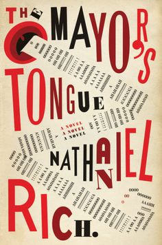
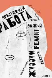

Also briefly looked into dadaism as I really like their collage approach to type.
At the weekend I also watched “The Alpinist” a documentary film about Marc-André Leclerc’s adventures free soloing various mountains round the world.
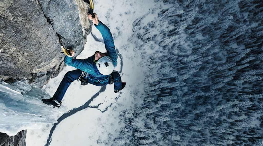
I also watched “14 Peaks” which has a definitely more positive documentary about Nirmal “Nims” Purja a former Gurkha and mountaineer and his challenge to climb the 14 highest peaks in the world in the shortest time possible.
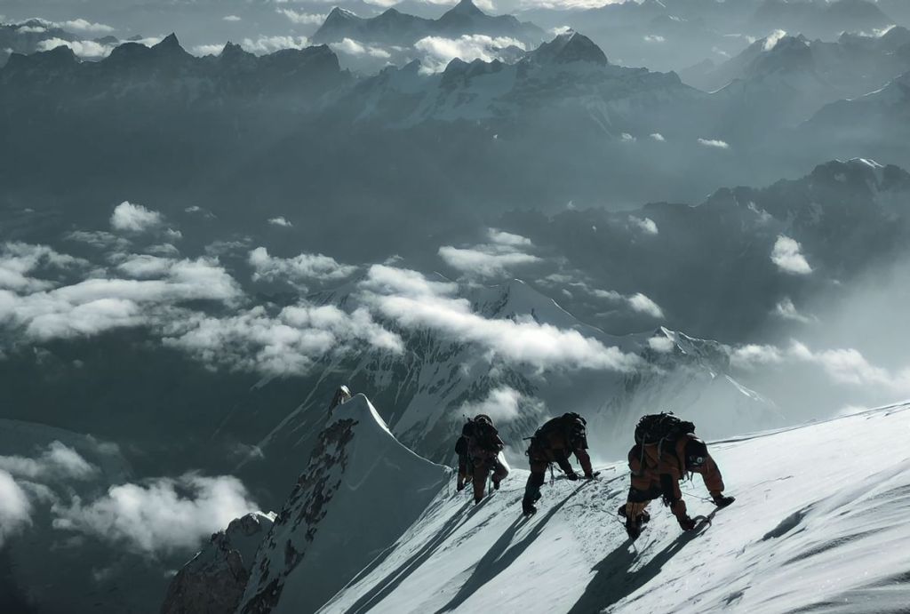
Being interested in climbing myself, spending a lot of time at the climbing wall and on mountains in Scotland I found these documentaries so interesting but unbelievably daunting. Highlighting the mountains grand scale and in many ways treating them as if they are alive. I feel like you can draw a lot of parallels to the natural world, I discussed this in my Design Domain project so want to take it a slightly different direction but I still feel it is a very interesting avenue worthy of note.
I also really enjoy the Chrometype Scene, a bit of a guilty pleasure since to a lot of designers its seen as quite stale.
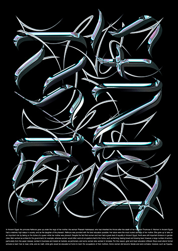
However artists like guccimaze really hold it down and constantly create interesting and unique works of type.
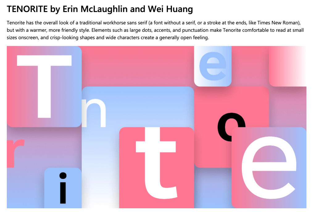
Designers like Eric Hu and Wei “coolfontguy69” Huang are also of great inspiration with their work in type and graphic design. With both making waves in the industry with Wei having a part in designing Tenorite one of the runners for Windows new default font and Eric being the creative director of online retailer SSENSE.
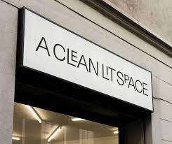
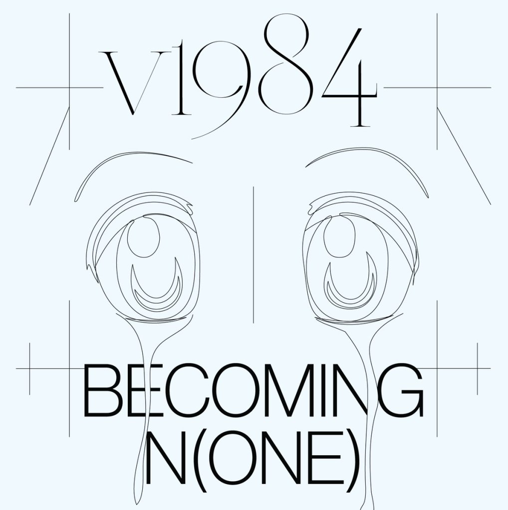
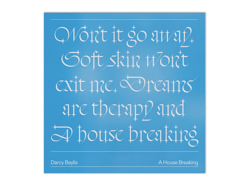
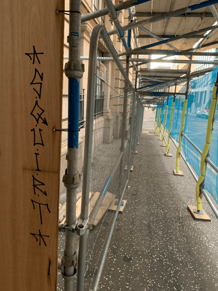
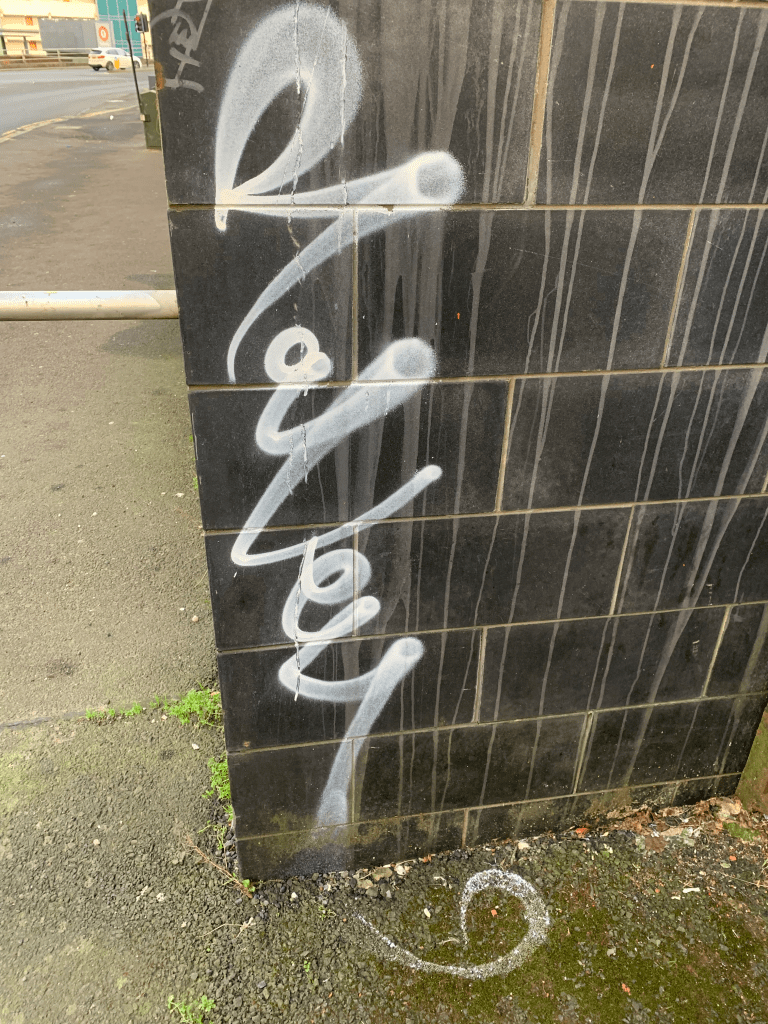
I also on my way back from the studio had a look at some of the graffiti around the place just to get some inspiration for more abstract letter forms also a poster stuck outside the studio which I found fit the context of the project very well, the unique letter forms you can produce with the paint are very interesting.
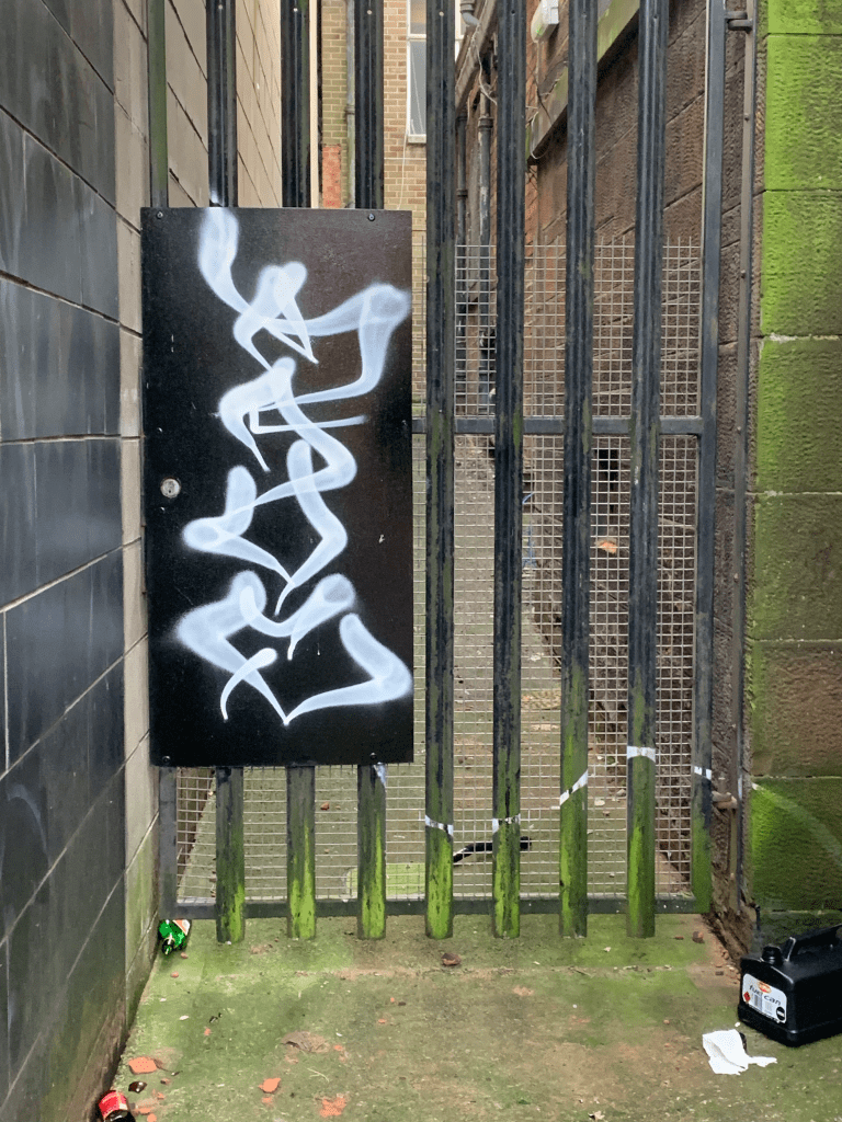
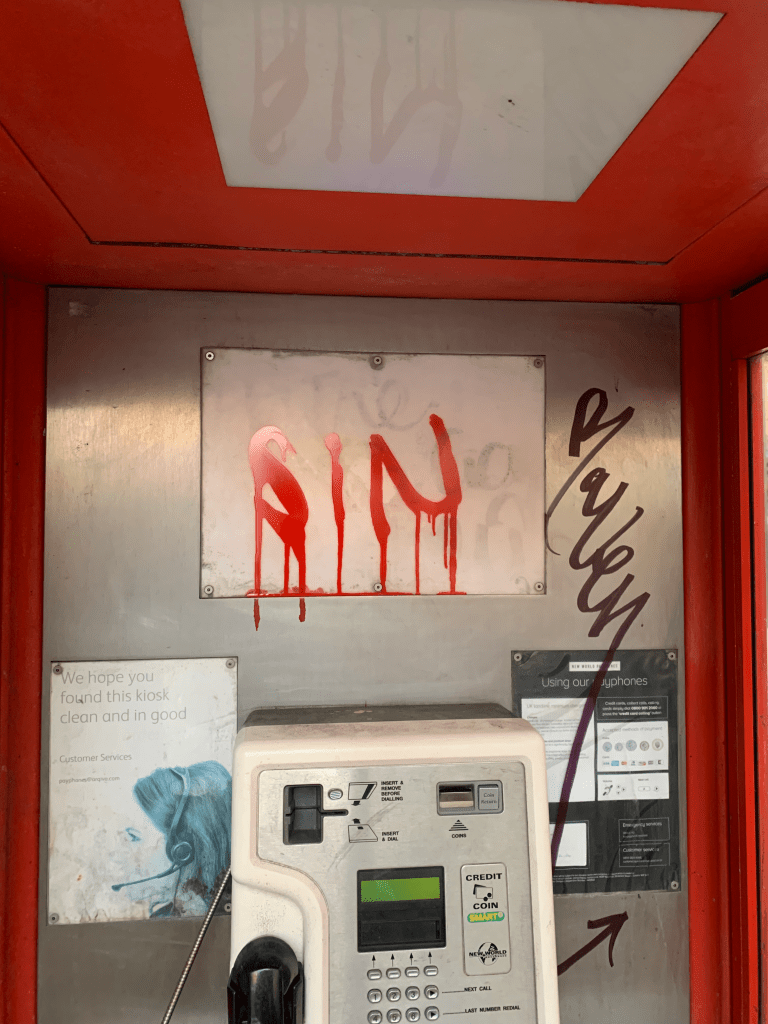

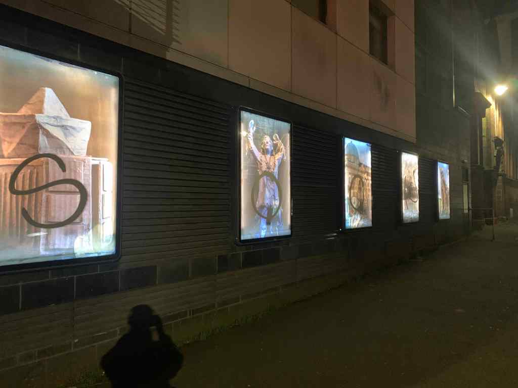
I found the poster especially interesting as it just so happens to fit the project, using black and white and making good use of dot line and shape it creates a visually impactful poster.
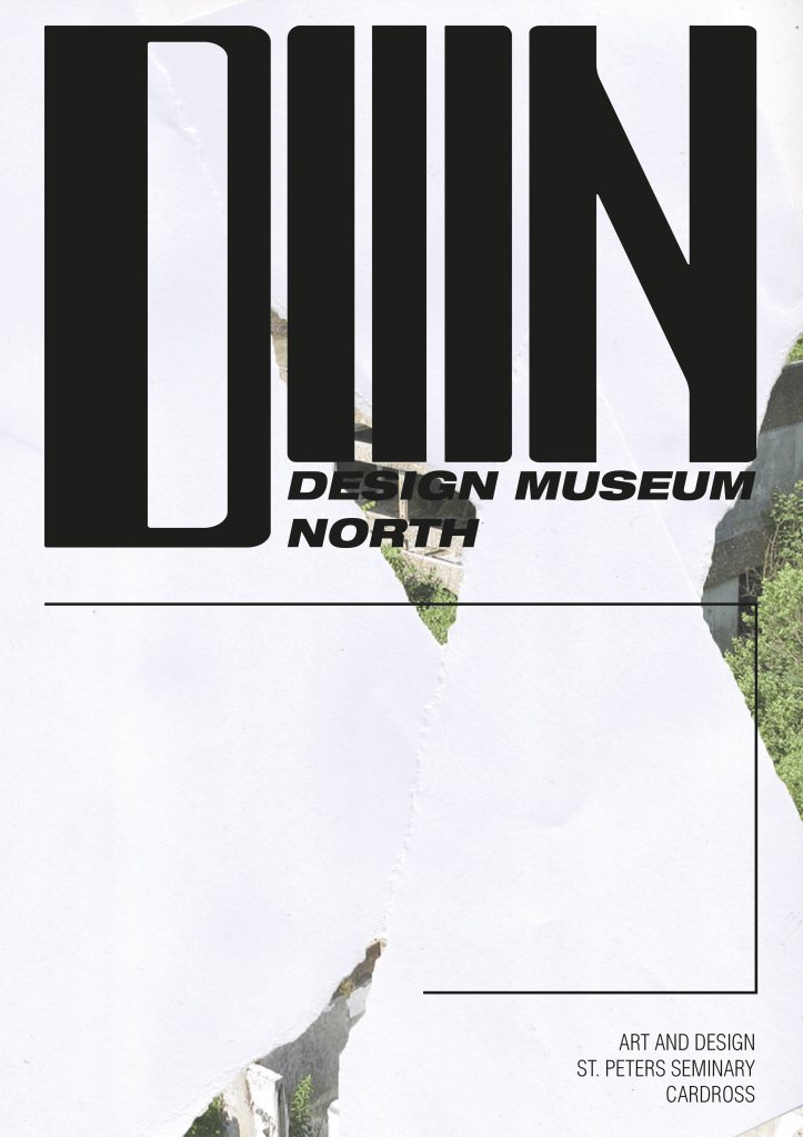
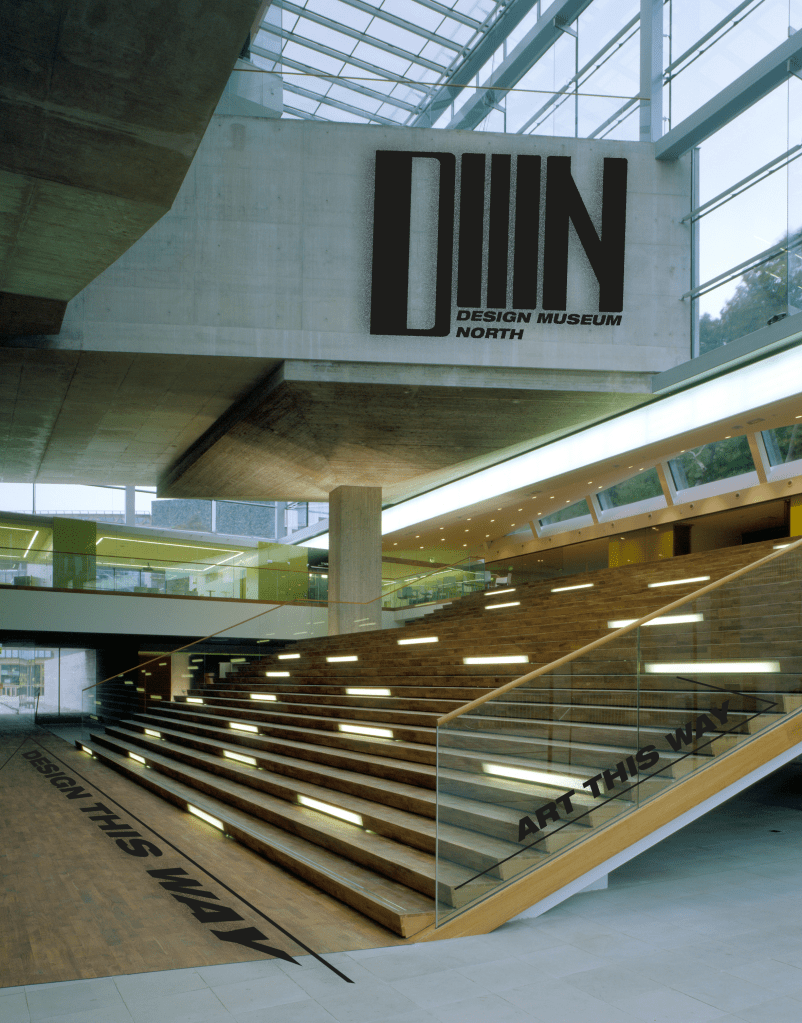
Looking at work I have done previously with type, I re did a college project a while ago for a new museum in St Peters Seminary, Cardross. I designed the lettering myself focusing on the Brutalist architecture the building is famous for.
In terms of processing and type as mentioned in my design domain brief I have recently came into possession of a kinect and I am keen to use it for a project, I came across this work – Mirror Darkly, in which a poem is revealed by the user. I found this work extremely interesting not just from a technical standpoint but the way it is used with revealing different parts of the poem as you move across the screen.
I also decided to look up how to use the kinect with processing which is exciting as it has scope for P5.js having a model 1414 kinect also seems to be an advantage as the 1473 has some bugs with the processing
using the examples from the open kinect library I began to explore different things with the kinect, such as depth and using different cameras.
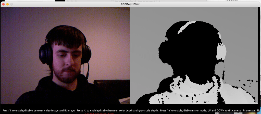
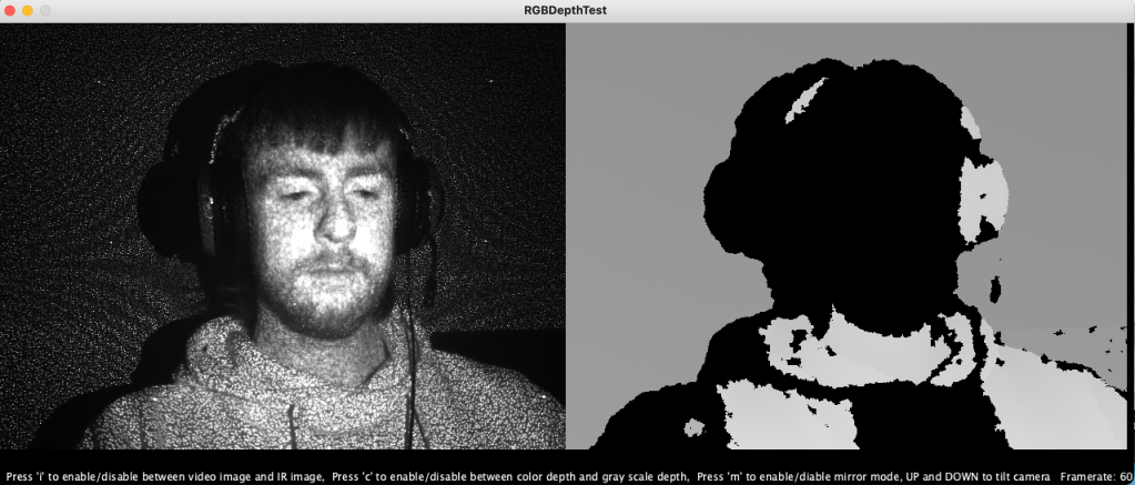
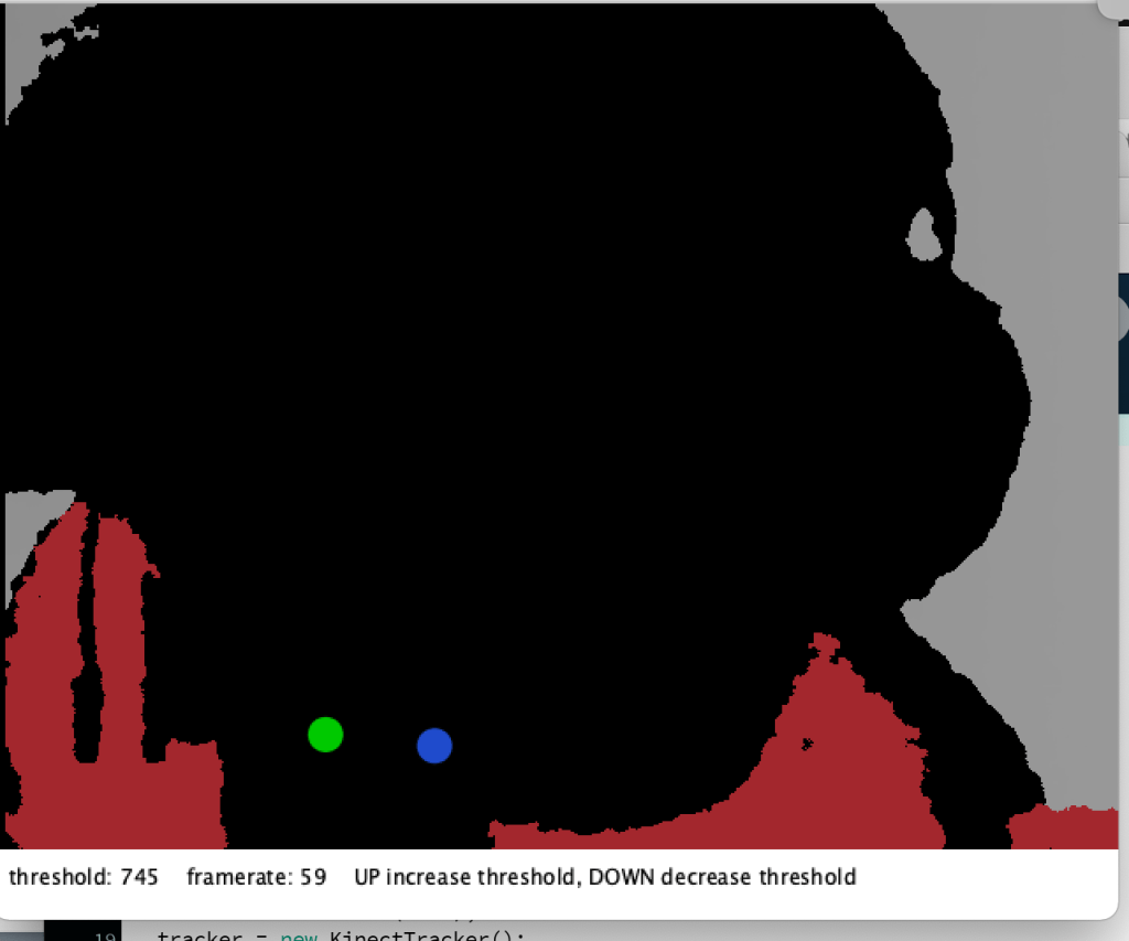
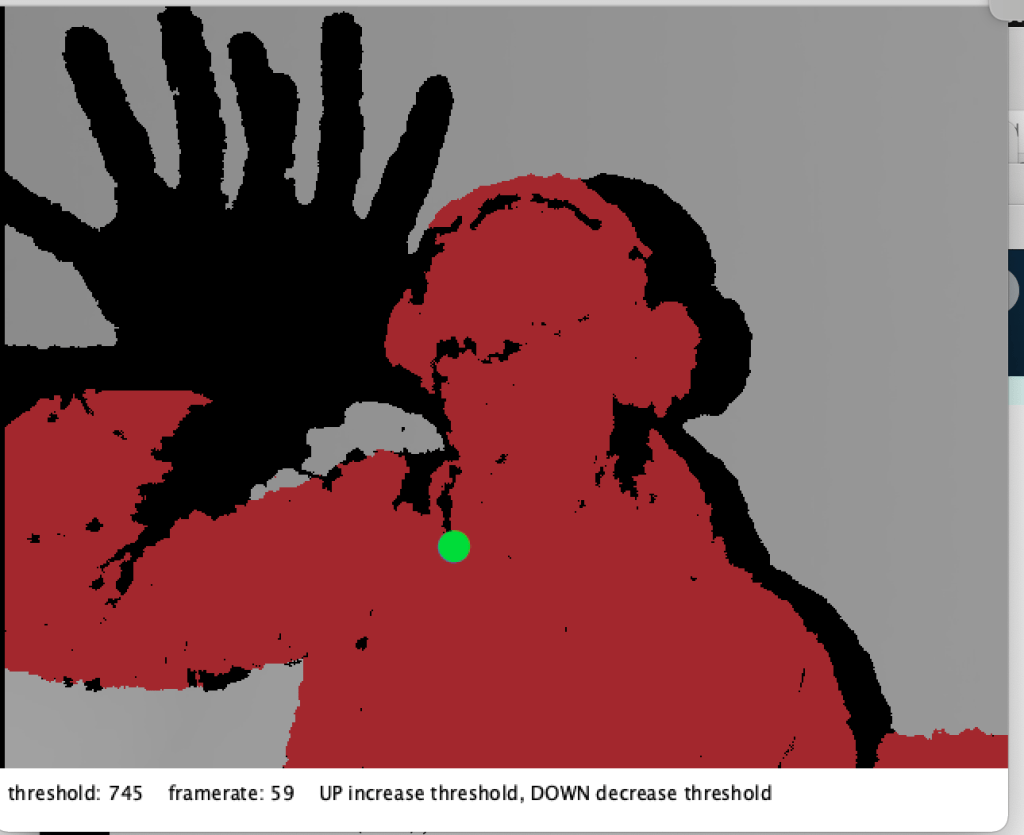
I may not go down this route but ive been itching for an excuse to use this for a project so thought I might give it a shot.
To start with mark making I decided to create some in VR, experimenting with just drawing my name, letters and shapes using Steam VR just to see how they would look in a 3D space. I feel like there’s definite scope here to create 3D sculptures in real time using tools similar to this, however it is not for me to do.
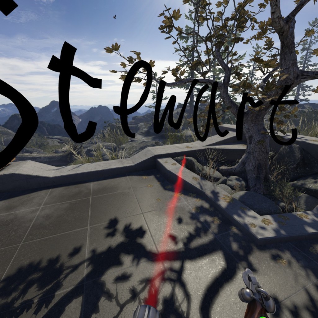
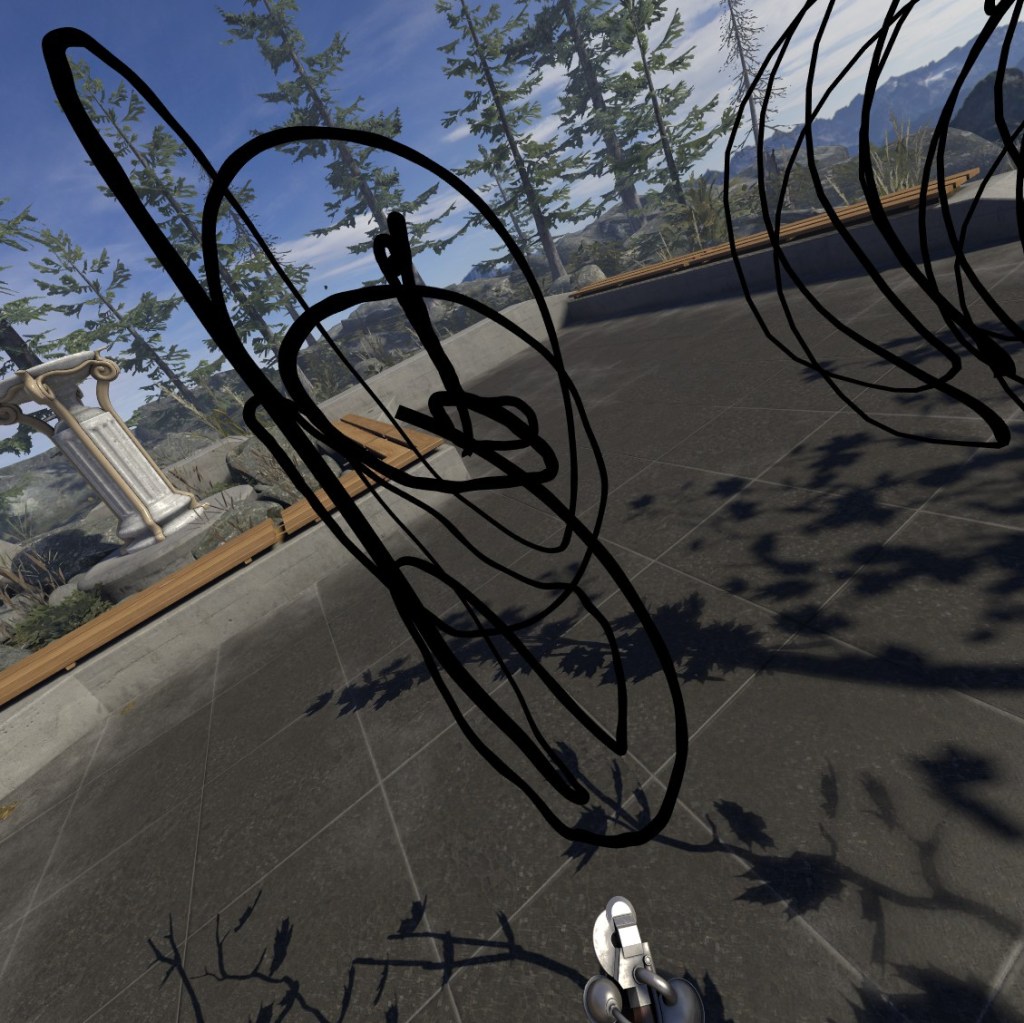
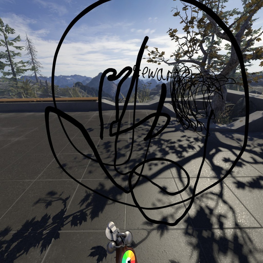
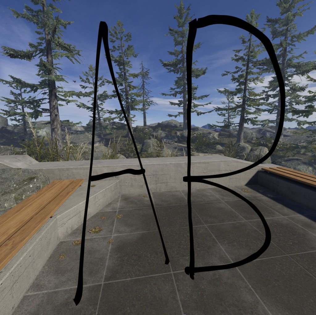
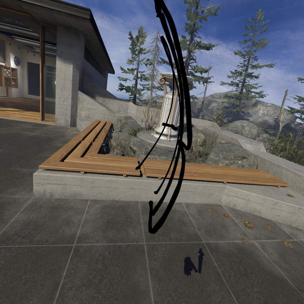

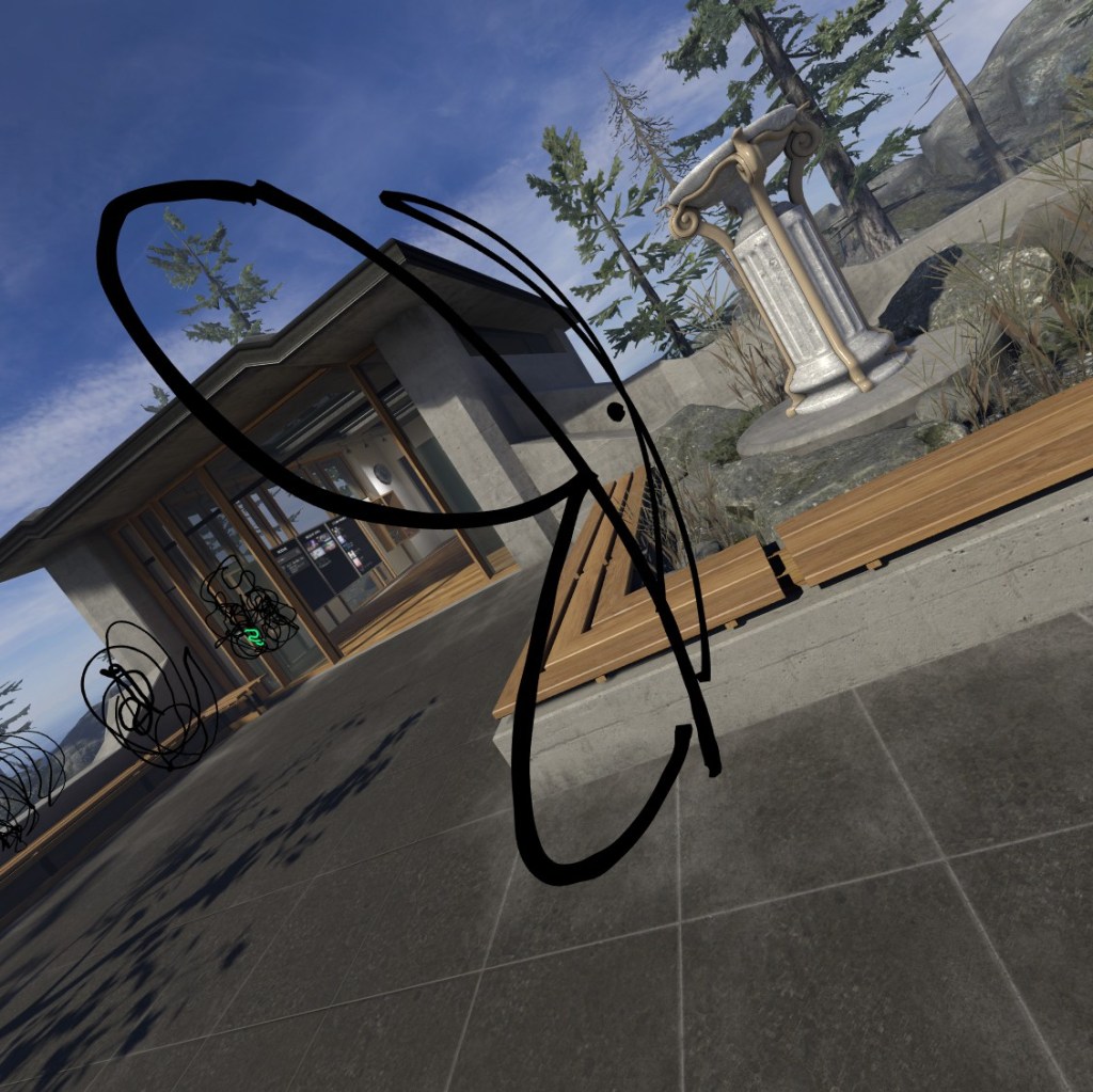
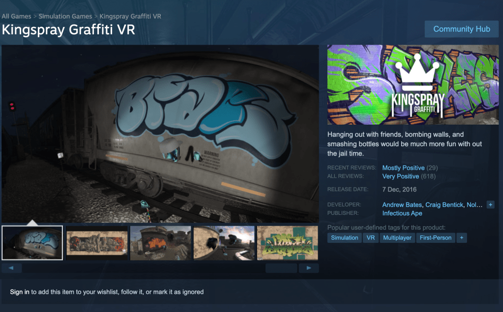
It has also just came to my attention that there is a VR graffiti simulator that may also help me get some interesting letter forms on scales not possible unless I actually tagged a wall myself.
I particularly found the natural curves in the AB to be interesting as we are used to doing these motions digitally and having a straight line but in the 3D space it is in fact an arc.
I also looked into TypeLab’s Weave Experience, an virtual 3D experience intended to highlight our extended connection due to the pandemic.
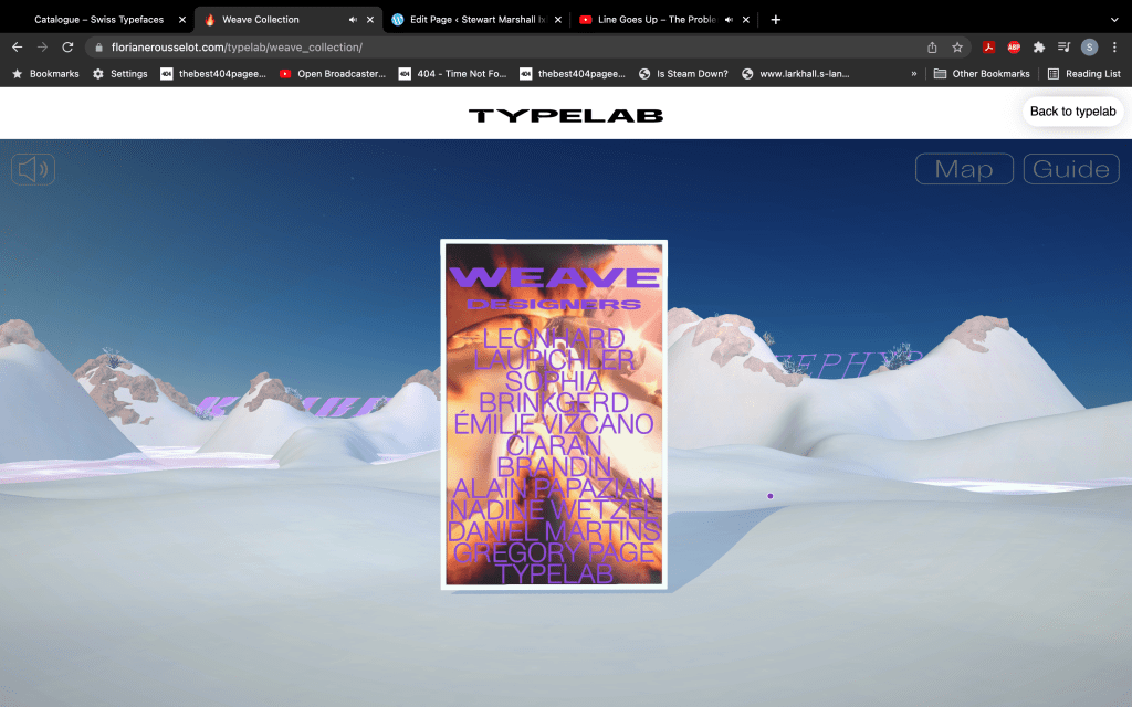
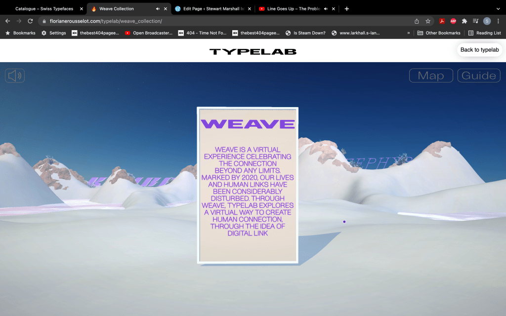


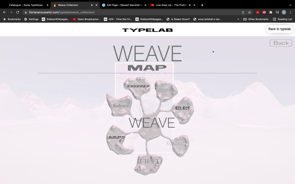
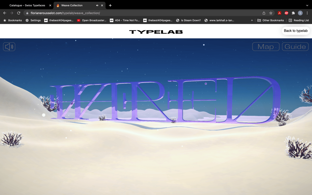
I found the environment of the experience very interesting as it had changing weather cycles and the idea of this mystical island in the void and you’re exploring these bits of type, I feel like this would be really interesting to explore in VR but then again what wouldn’t.
I have the book, “The Visual History of Type”
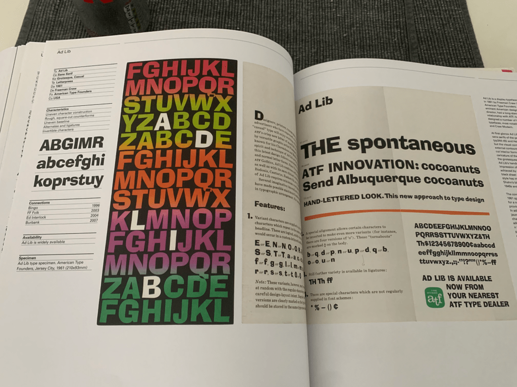

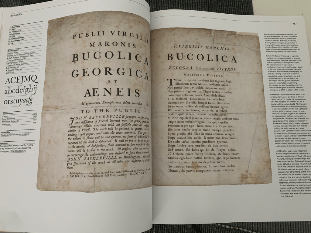
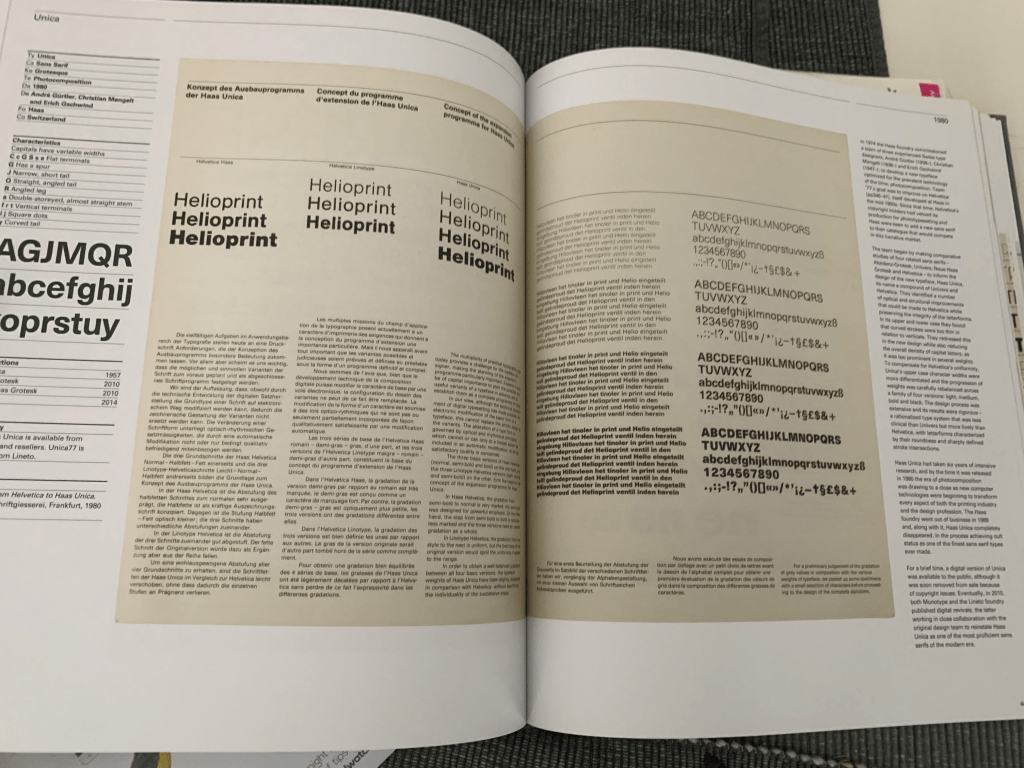
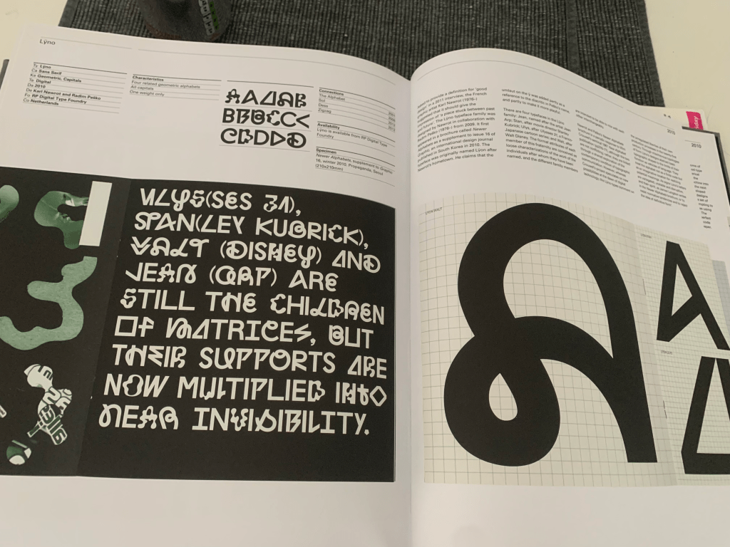
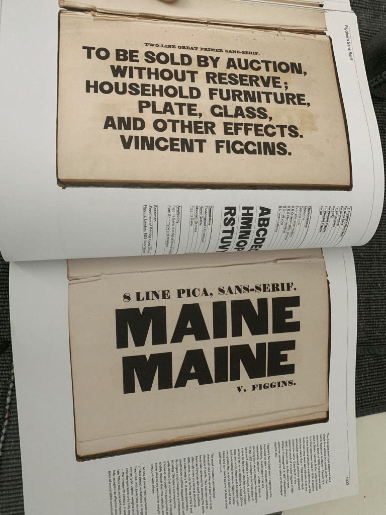
It is an insanely extensive book with various typefaces detailing how and why they were made which is really interesting to see the likes Baskerville that was made all the way back in 1757 still being used today in system fonts. Even detailing Ariel which to most is a boring font but it serves its purpose with the creators stating that it was intended to be a plain sans serif font interestingly being made for IBM not Microsoft.

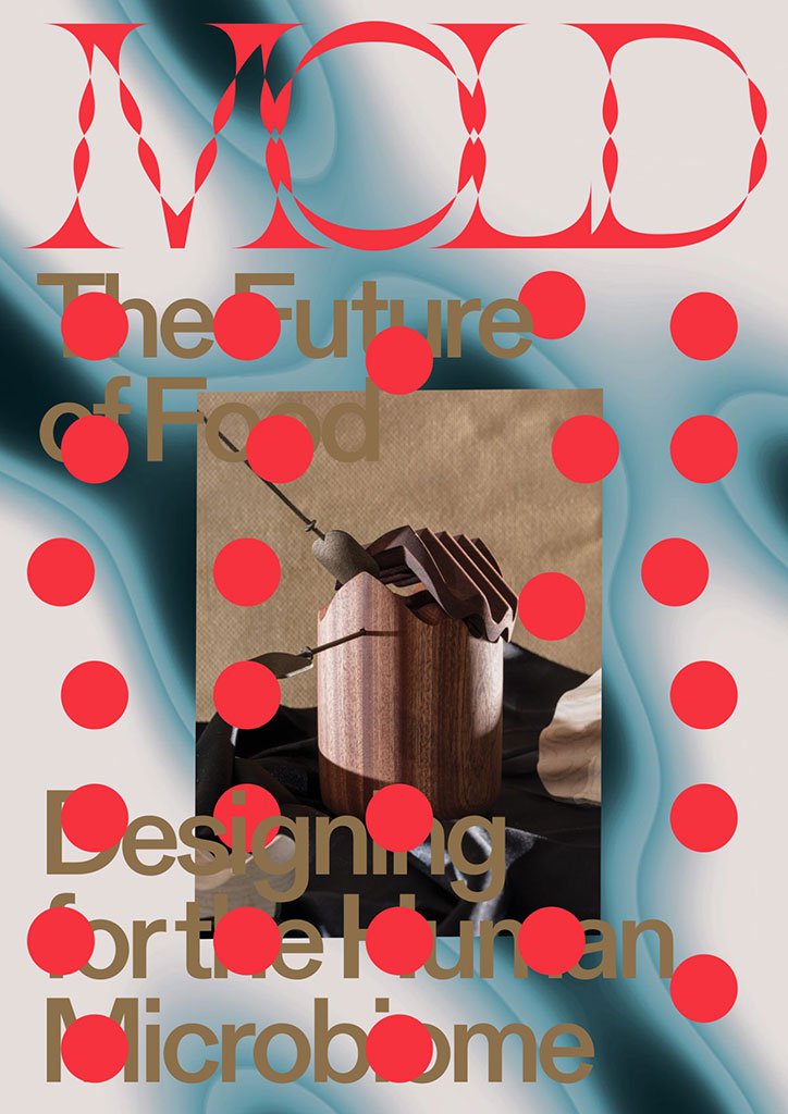
I also on the way into the studio saw this poster which I found really interesting, with the repeated text and bright colours really drawing your eyes, the varying size of the text also gives a good sense of depth, amazing what you see when you look up.

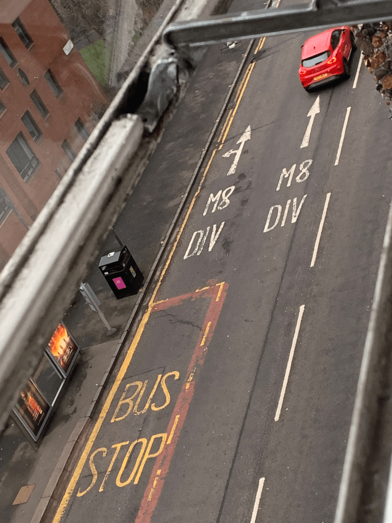
or look down
Expanding on my digital mark making, I used some words in processing to try and re create layered printed text, turning the opacity up to try and simulate when the ink dries especially if it has extender mixed in. I also intend to slightly expand on my marks using various different mediums such as charcoal and ink but I haven’t had the opportunity to do this yet. I feel this also fits in well with a few quotes I like by different artists and designers, such as “Sometimes you sacrifice legibility to increase impact”- Herb Lubalin and “every act of creation is first an act of destruction”- Pablo Picasso. both informed various aspect of my work over the past few years.

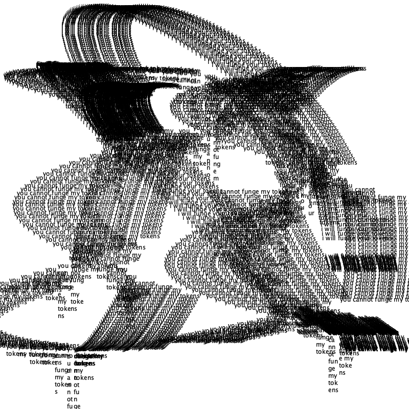
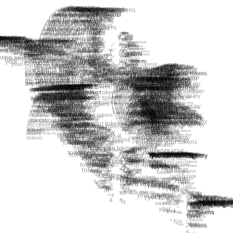


Here I have included the effect I am referencing a mistake on my part but this then turned out to inform my outcomes for CoLab1. This was also something highlighted in the guest talk yesterday by Edwin Pickstone where he highlighted the idea of happy accidents and using things that would be normally discarded such as the bin type.
I also found the restrictions of Edwins work really interesting the fact that the printing press is the only thing being used and his specialist knowledge of it leads to him knowing exactly how to “play the system” and get outcomes that would otherwise be difficult or less impactful such as sprinkling petals on the letters or the dust used on various posters. This also gives them a unique 1 of 1 feel. A similar feeling to adding randomness in processing (I don’t have images yet but I will insert them when I do).
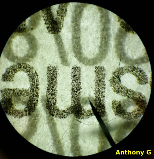
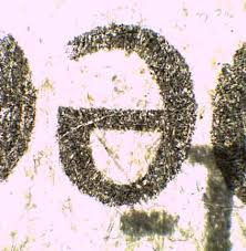
I also remember back to high school in science we looked at various things under the microscope, one of the things we looked at was letters, thinking back now, seeing the imperfections in the letter print was really interesting as you can see the marks in the paper and the minuscule amount the ink bleeds out.

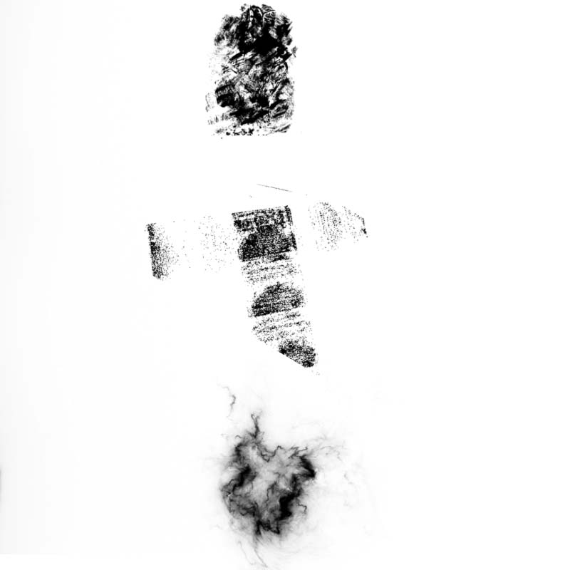
I also have a collection of brushes that I have developed over time, some found online and some made myself, top one is from a wall if i remember right and the middle is from using ink rollers. The third is from a brush pack online, these things I may or may not use depending on if i bring it out of processing or not.
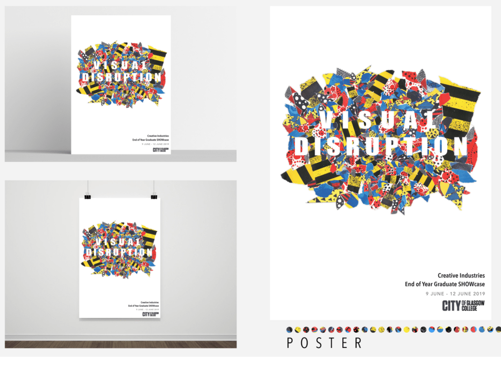
Looking at things such as negative space with the idea in this being to bring clarity to the chaos.
Thoughts for the project
In terms of what I actually want to do for this project I wanted to do something for my Gran. She passed in December but she had a love for poetry, collecting, copying and writing her own. I wanted to use some of her poems as the words used in this project.
I have not entirely decided exactly what I want to do with it yet but I like the idea of either scrolling text or having the words being slowly revealed one way or another. Perhaps staged on 1 or 2 vertical screens to simulate paper/ pages of a book. I am however, excited to try and use the kinect for this project as its a good bit of kit for things like this.
I also feel this project quite challenging in a way as a lot of my usual references have been used for design domain, however, thats not a bad thing as it forces me to find new avenues to go down for my work.
Research cont.
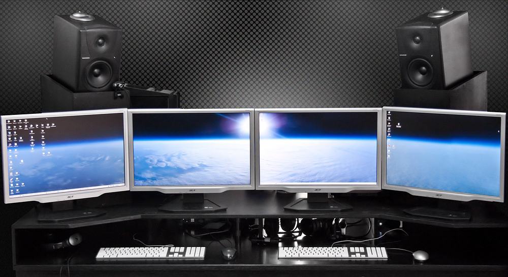

Looking at multi screen setups in relation to what I want to achieve for this project, id love to do something with loads of screens of different sizes shown above but its not really feasible I like it as it doesn’t show a full picture and you need to place it together in your mind.
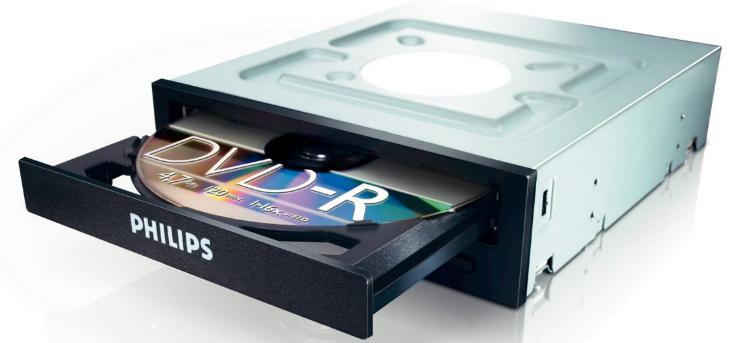
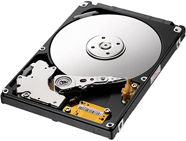
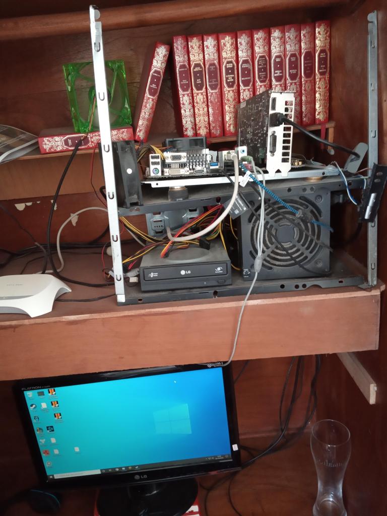
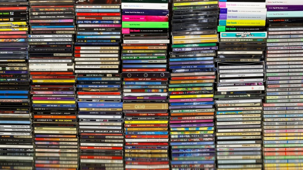
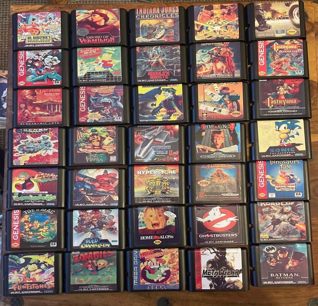
Looking into more physicality with digital technology such as hard drives and optical drives. Also a rather unhinged looking caseless PC.

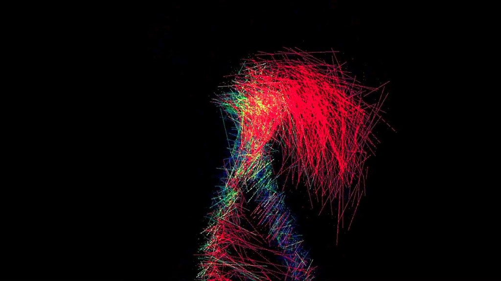
Again looking at work with the kinect and motion tracking with processing.

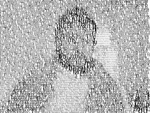
Also returned to processing re appropriating some of my creative coding 2 sketches.
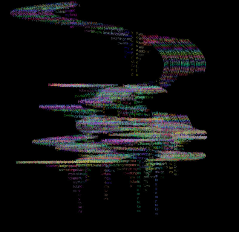
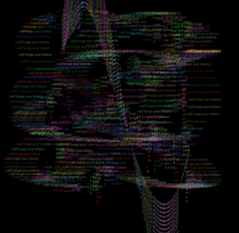
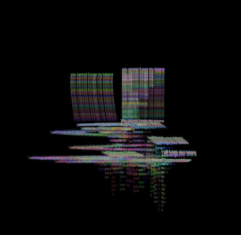
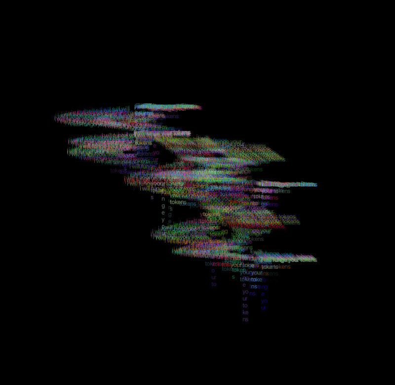


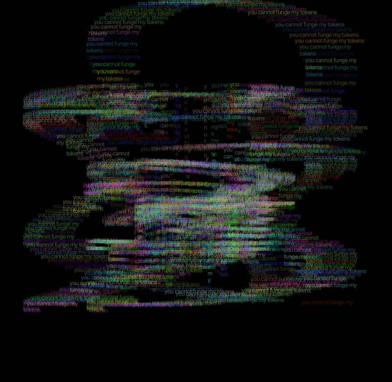

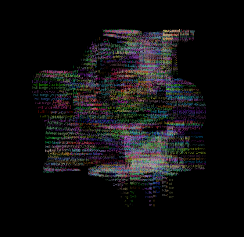
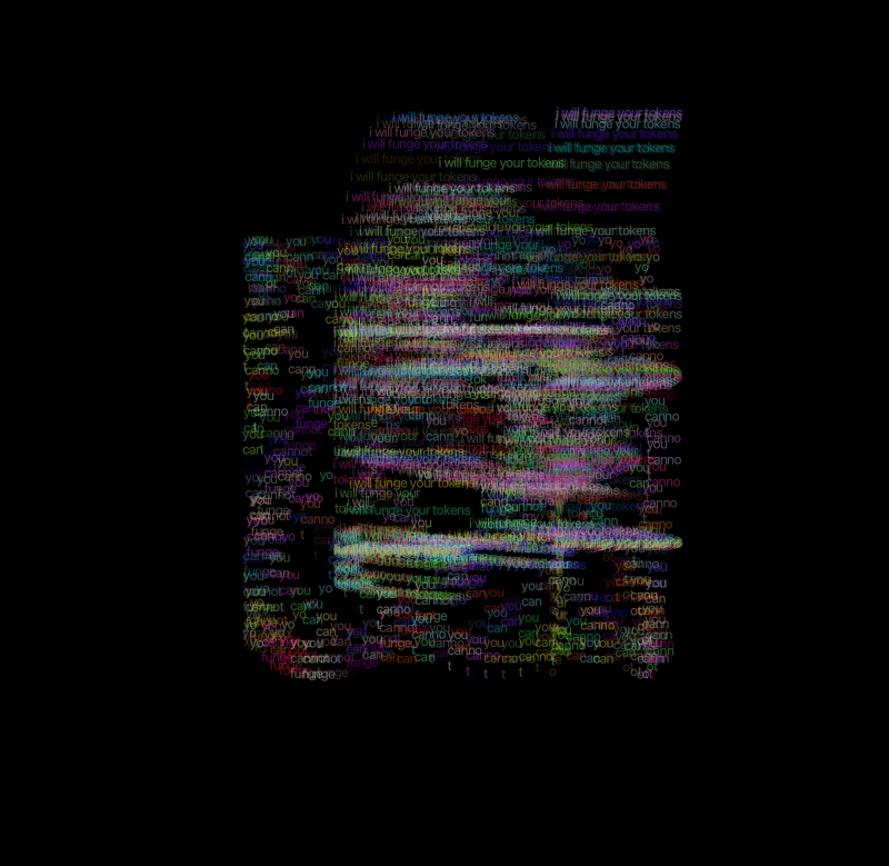
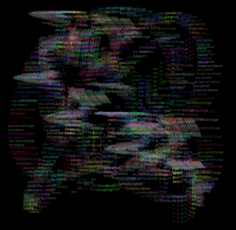

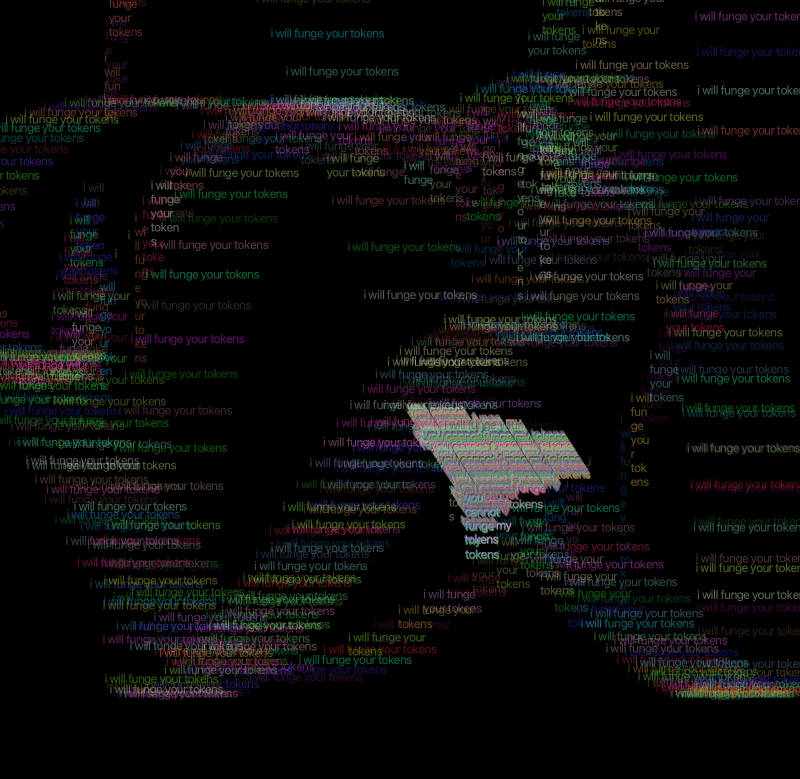
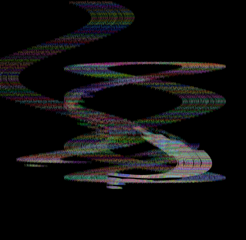
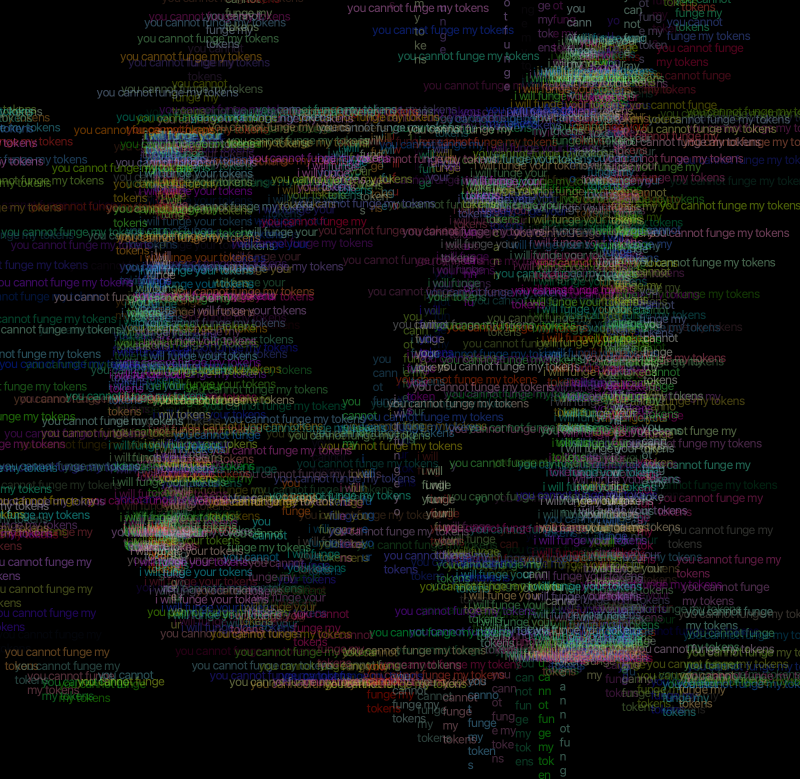
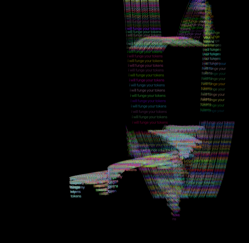
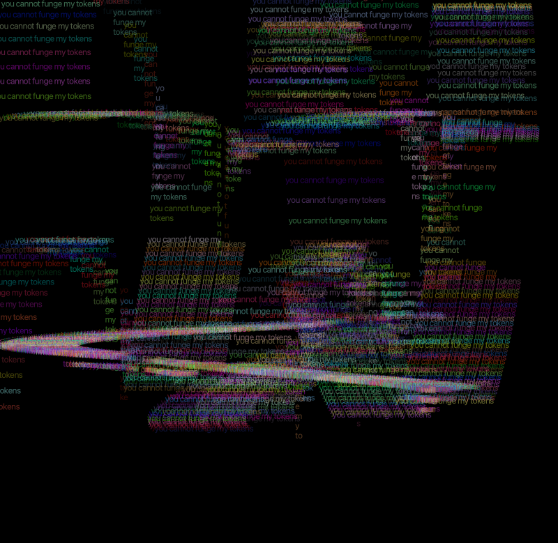
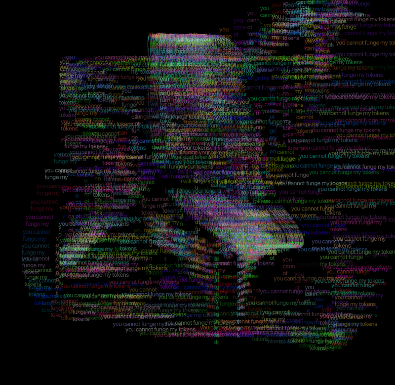
Again did some further studies using processing with type using sin waves etc.
I also took some refreshers with text from the control project. Using the mouse to manipulate the text along with key presses to change the colour of the text.
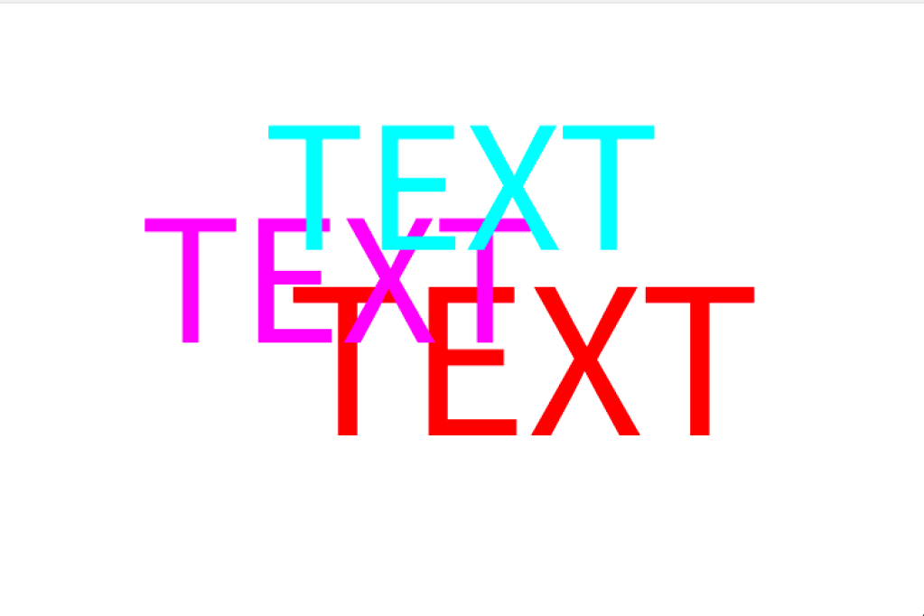
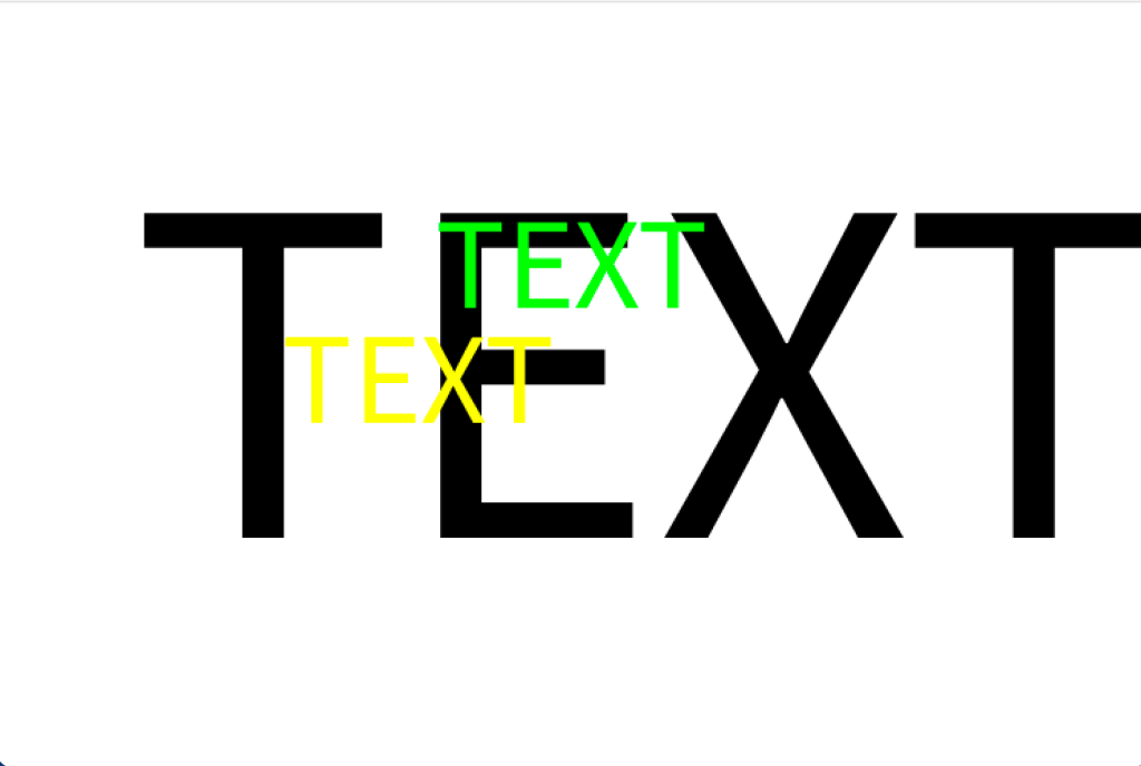
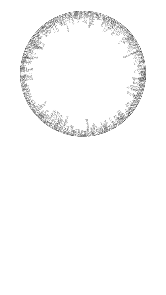
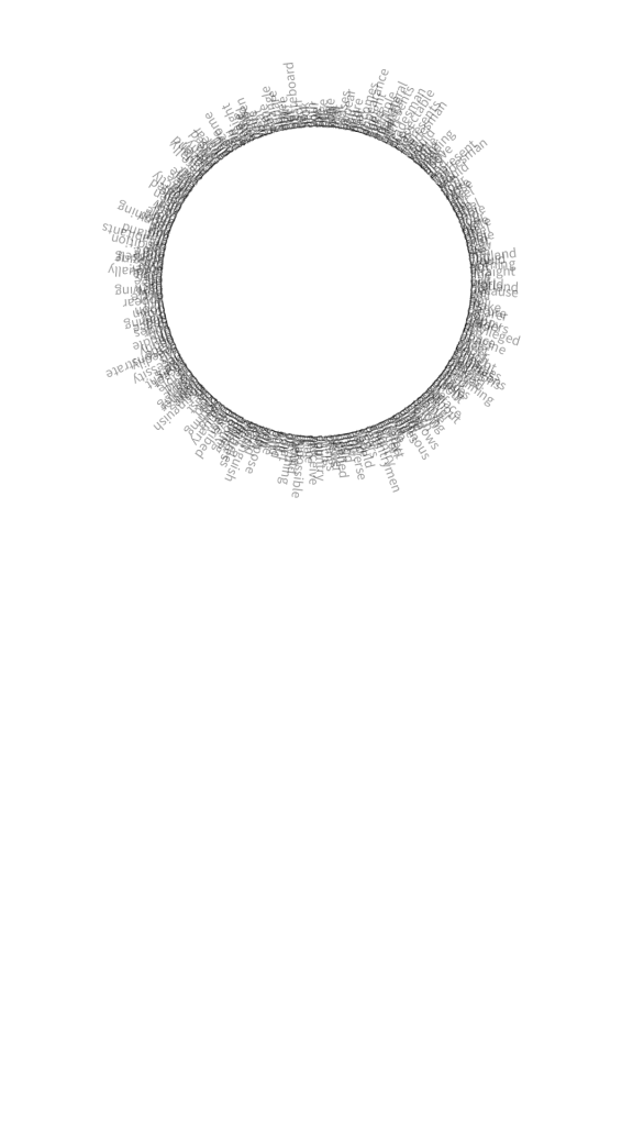
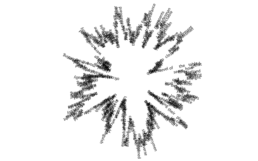
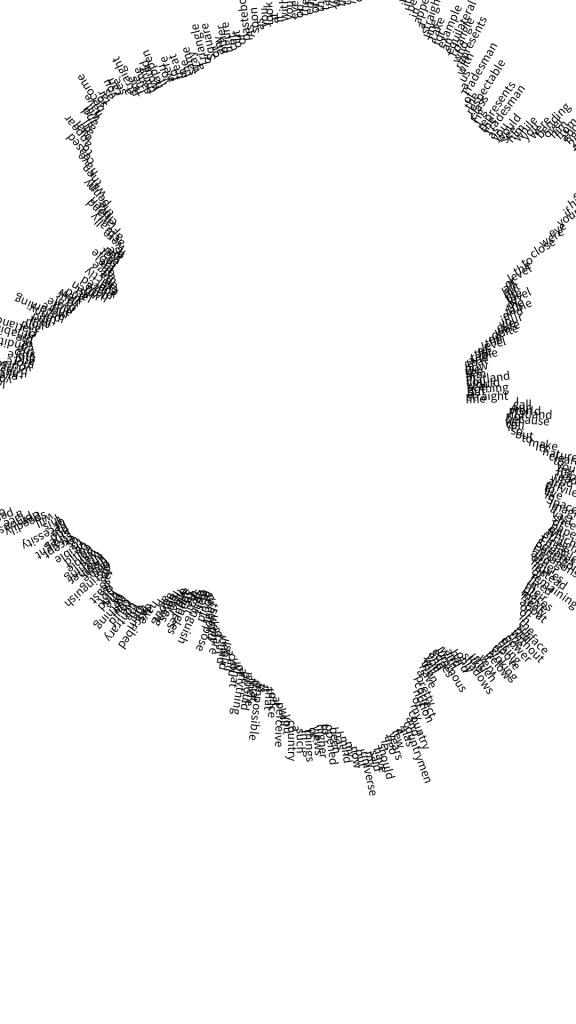
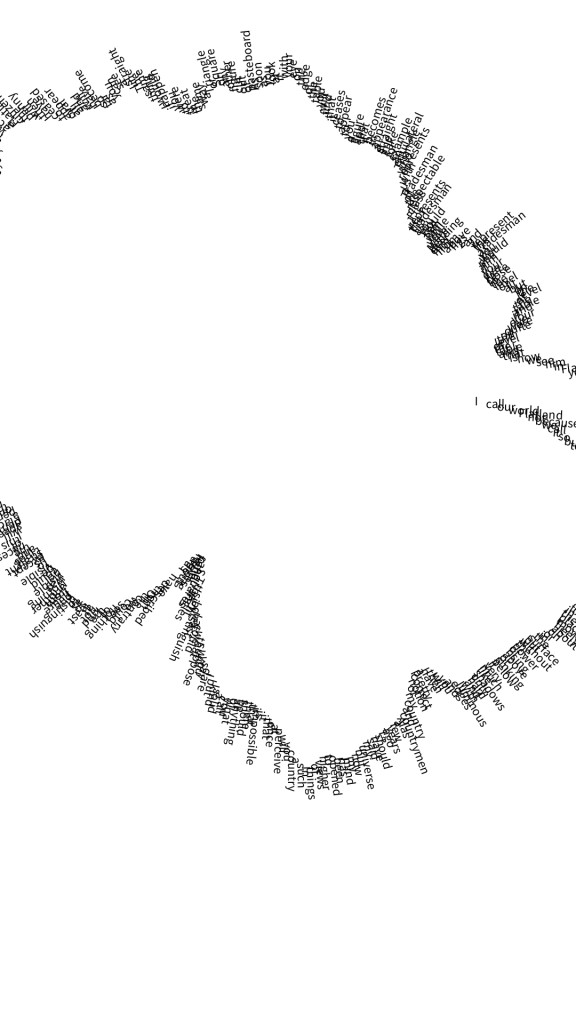
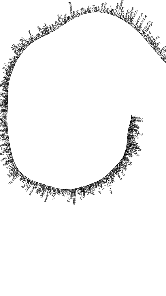
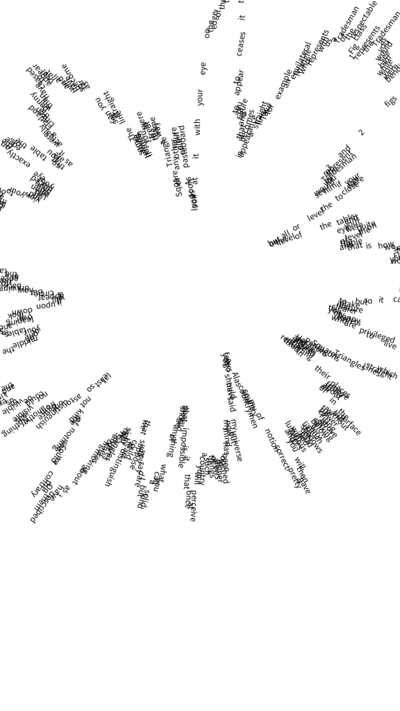
Making use of the workshop on Monday I decided to take the circle example further, I conducted multiple experiments using the mouse and things like noise.








Staging
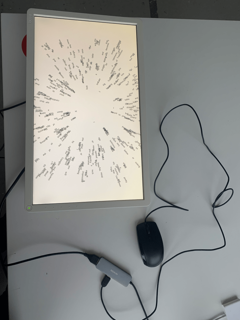

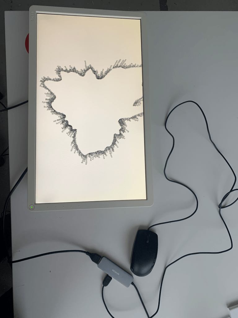
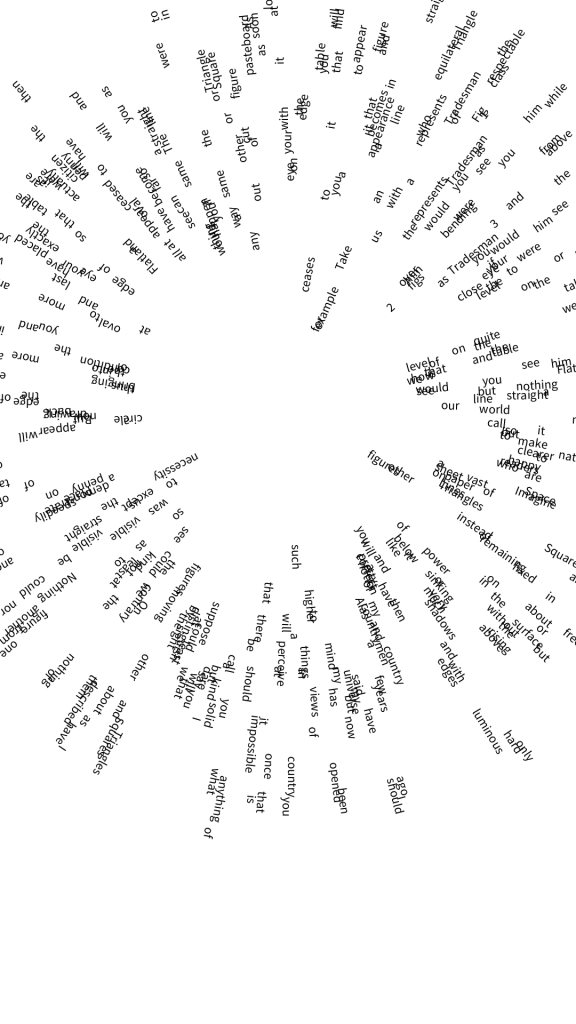
I then went on to experiment with a lot of trig values in this format, using frameCount and then the mouse to advance the sketch, however due to me using two monitors, there was some difficulties getting it to work as I wanted the two sketches to move in unison, which is allowed by frameCount, but not by the mouse.
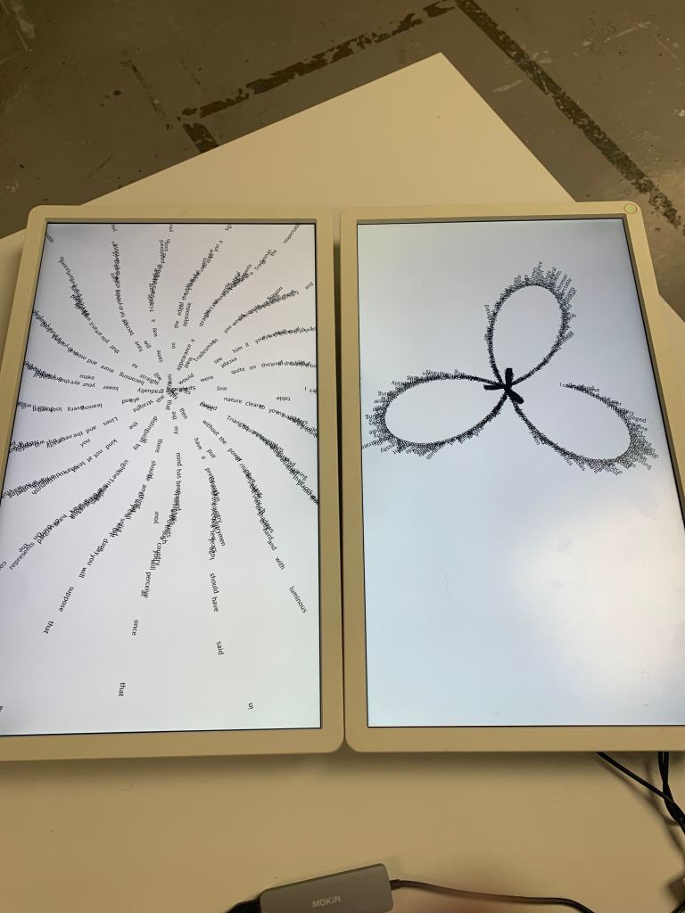
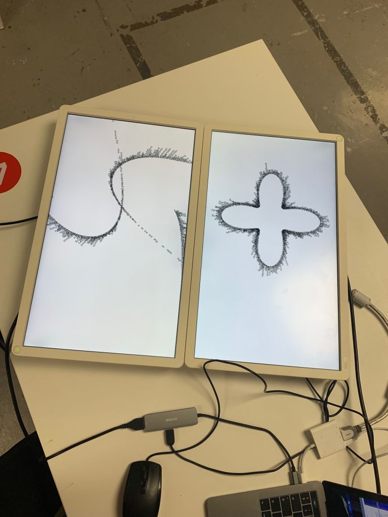
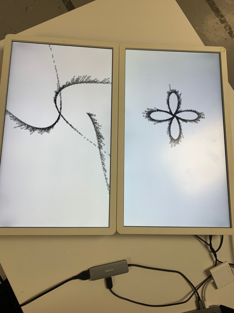
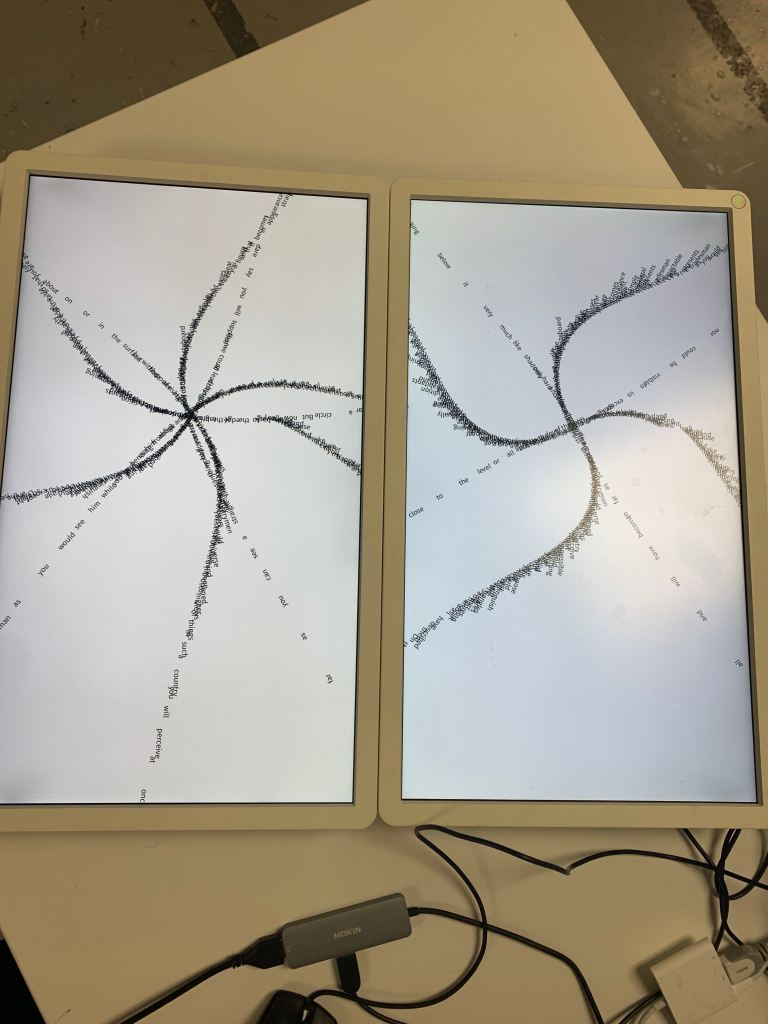
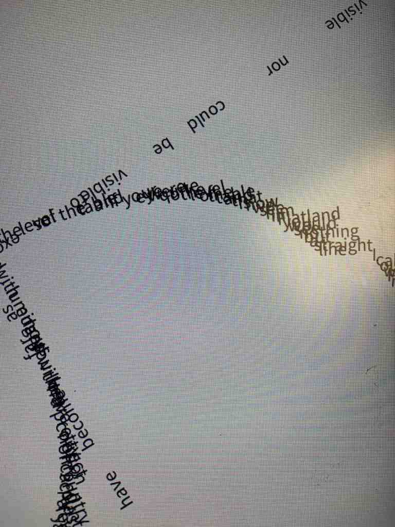

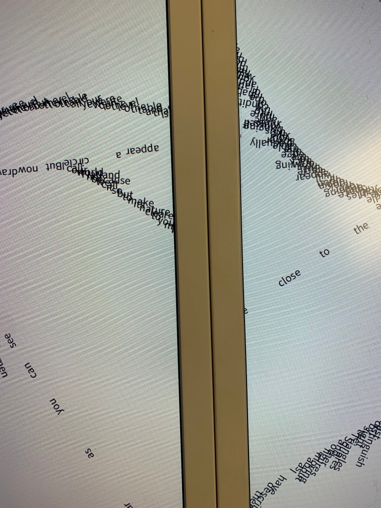

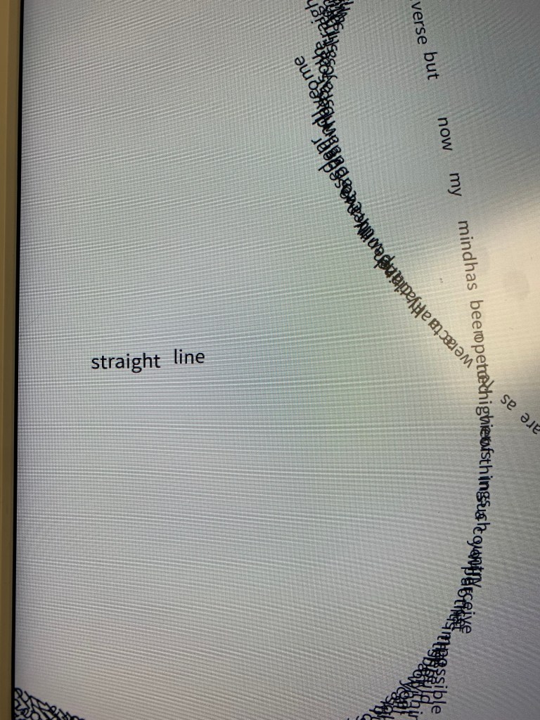
I did quite like the idea of using two screens like a book, its a unique approach for me having two running at once, however as mentioned before there are some technical bumps I need to work out before taking this forward. I also intend on sticking with black and white for my sketches as it again creates the same effect that I was going with when I decided on the monitors in the first place. It is also the most legible to the most amount of people, contrasting the jumbled up look of the sketch.
I also liked the amount of wires that I had to use to get this setup working, would give me the fear normally but I feel like it fits given my research into the physicality of digital technology, I call this “fire hazard chic”.
I would have liked to use the kinect but I feel with the time constraints of the project that this is the more realistic option, however I still do intend to at least make an attempt with the kinect using tutorials that I have found online. However these are not intended to be seen as my own work in any means.

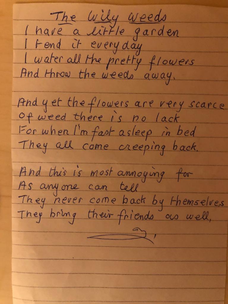
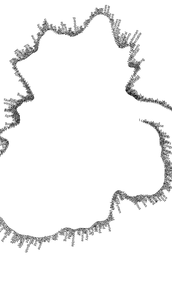
I managed to get a hold of some of the poems my gran wrote, one was a poem as part of a speech from when she was the Captain of the Ladies golf club in Hamilton and the other is about her gardening.
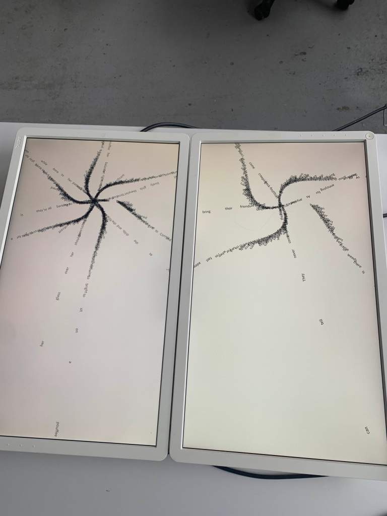
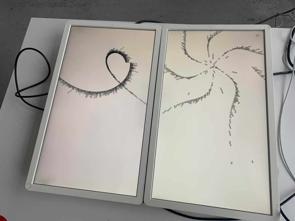
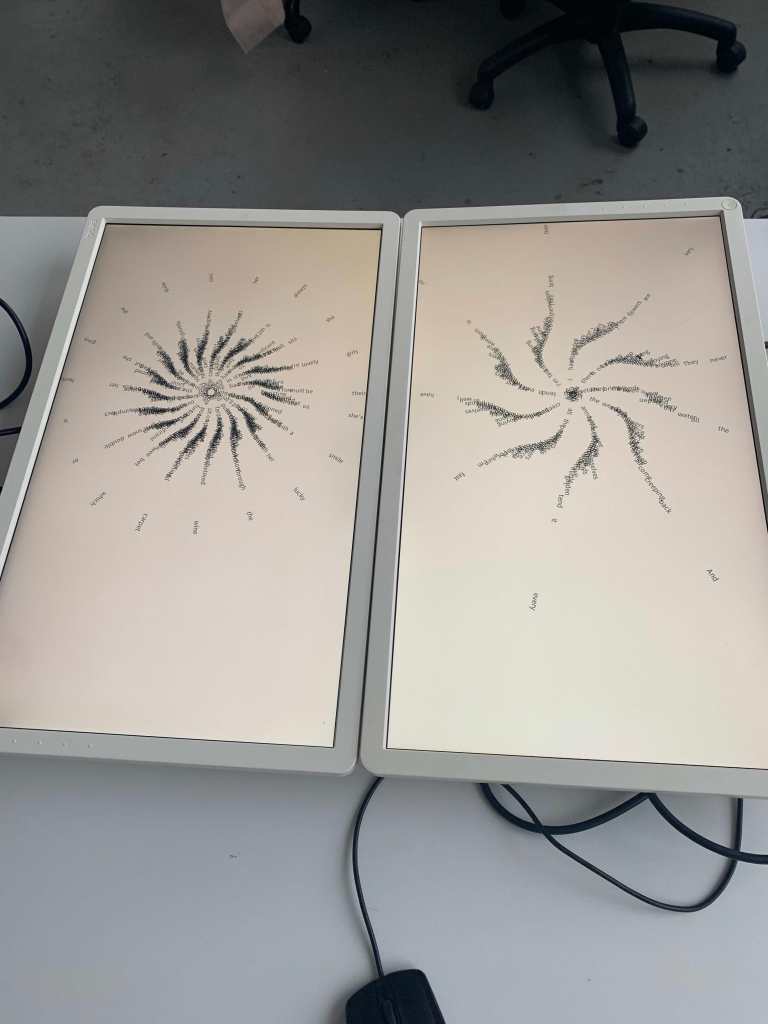
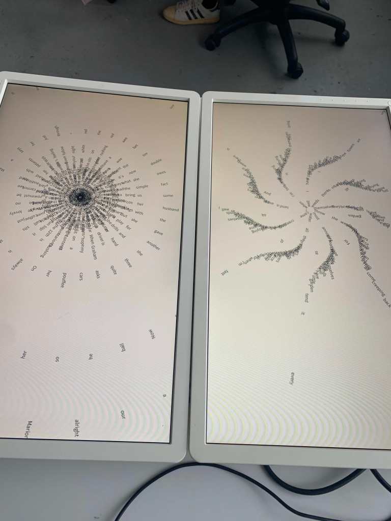

I decided to take some of the randomness out of the sketch to make it a bit more reliable, as the need for randomness isn’t really there considering how its staged. I also noticed that some of the outcomes it was producing could be seen as having quite unsavoury patterns, as seen above. But I suppose thats an insight on tan waves political views.
I also decided to make the outcomes look more similar to what the poems represent, a circle for golf and a more flowery look for the gardening poem.
Font
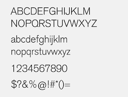
I realised quite last minute that I spent this much time trying to do the code I completely forgot to actually consider the font that I will use for the outcome. However I don’t believe it will matter as much as it usually does as the texts readability isn’t as big of a priority as it would under normal circumstances. However I do want it to be a more plain sans serif as I wanted to use a system font to represent my gran always being quite up to date with technology, perhaps Ariel as I mentioned before will do the job as its intentionally a more bland typeface. I at first chose akzidenz grotesk due to its popularity in printmaking, however it didn’t really mean anything
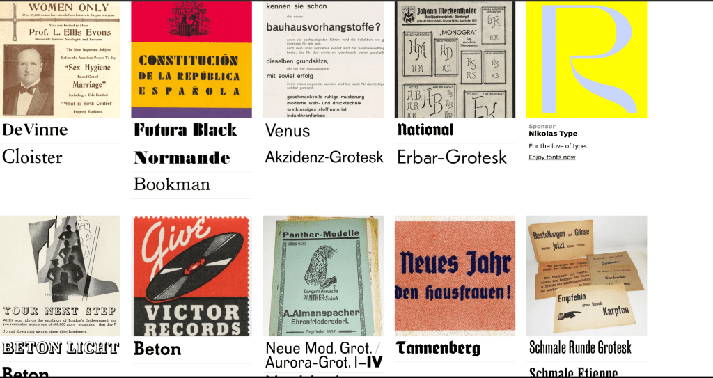
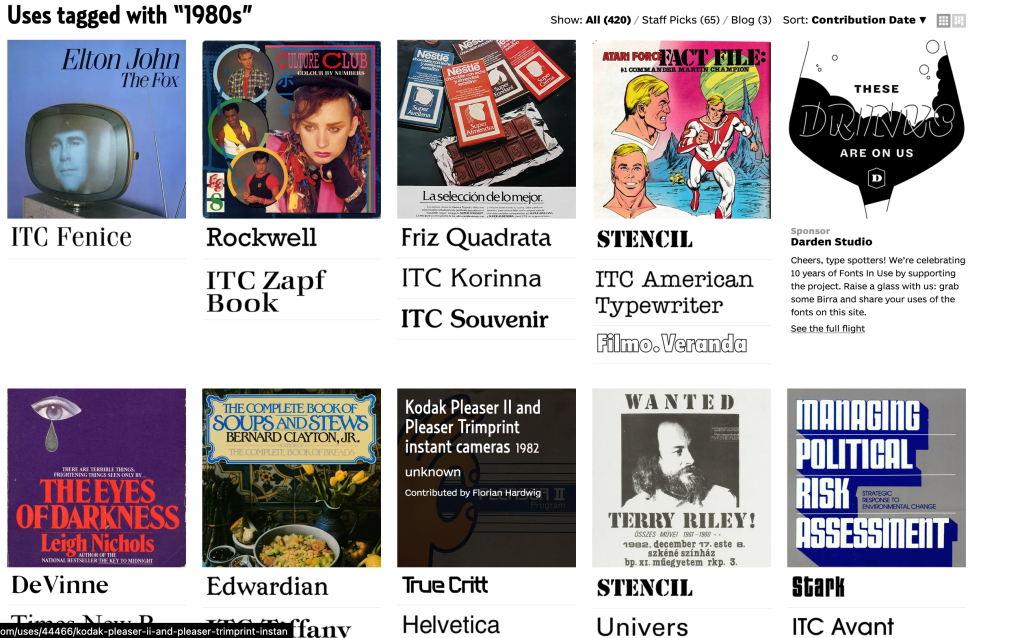
I then tried to find fonts from the year my Gran was born and also the year she was captain of the golf course, however there wasn’t really much grabbing my attention. A lot of fonts fit for the time but not really what I wanted.
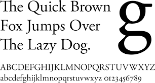
I then decided upon Garamond as it is an extremely popular font with books and my gran was an avid reader, I feel like this gives the work the final touch it was missing, with the font bringing it all together.

Code Videos
Further Thoughts
Taking this project further I would really like to keep experimenting, especially with some of the features processing has to offer such as the span feature to experiment with proper multiple screen staging instead of two separate sketches.
It has also came to light how good processing is for asset generation as I can easily save out any of these outcomes as a PDF or PNG/ sequence and take it into photoshop/illustrator. I even wanted to see if there was perhaps screens that I could use that are the size of small pages however I have not been able to find any, but this isn’t too much of an issue.
I do also wish I could have managed to figure out the kinect for this project in order to replace the mouse movements with physical movements, I always find it interesting converting those physical movements into some sort of animation or interaction with the user. It’s something that you really can’t do with more “traditional” design it misses that interaction with the user.
Paul also mentioned that taking this further, I could make the outcomes look more like animated flowers with constantly forming and withering flowers, I do find this approach interesting as I remember my Grans garden was always extremely well kept with both my gran and grandpa looking after it regularly, however after she passed the flowers in the garden started to wilt, so this felt extremely fitting, Showing the circle of life.