This project we are taking as a full class splitting into different groups, that will then specialise in different tasks, such as graphics, editing, tech, sound etc.
I feel like this project is extremely rich with direction and will be a great opportunity to work with each other to create this proposal. For myself I was either leaning towards doing graphics in the form of type, or sound. I feel that my venture into VR would do me well if I were to delve into sound but I would feel most comfortable focusing on type.
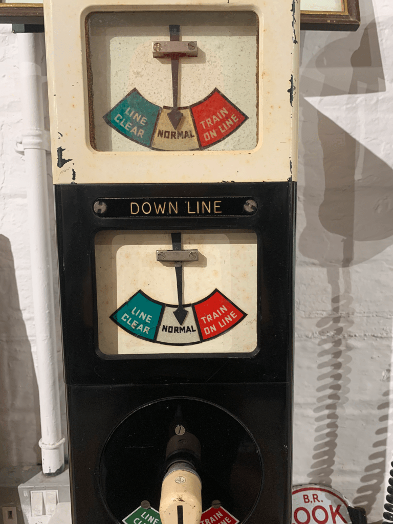
We took a trip to the space to get a feel for the area, take photos get textures etc.

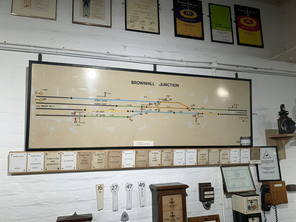


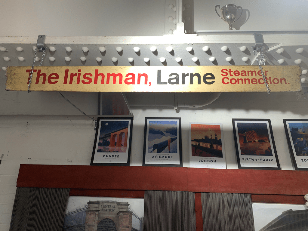
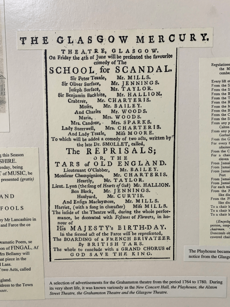
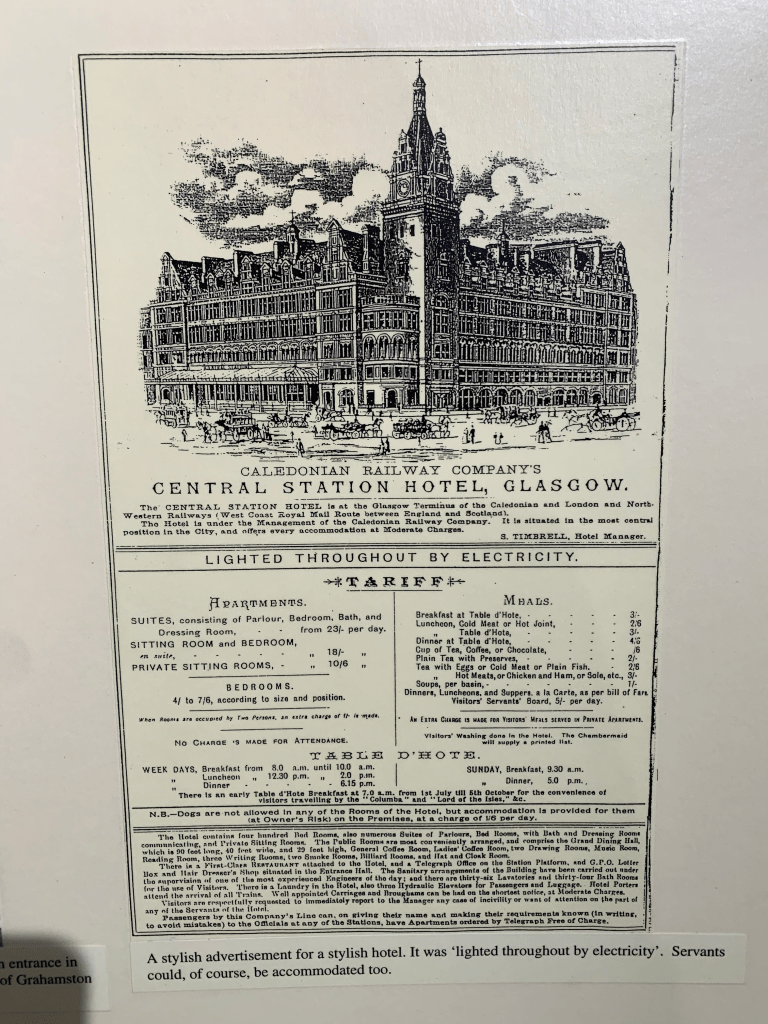


I decided to focus on the type and signage of the space and the museum looking into potential direction with the type design. I looked at hand written letterforms as well as taking an interest in the pasteboard style of lettering, However it doesn’t necessarily fit the time frame of a Victorian station.
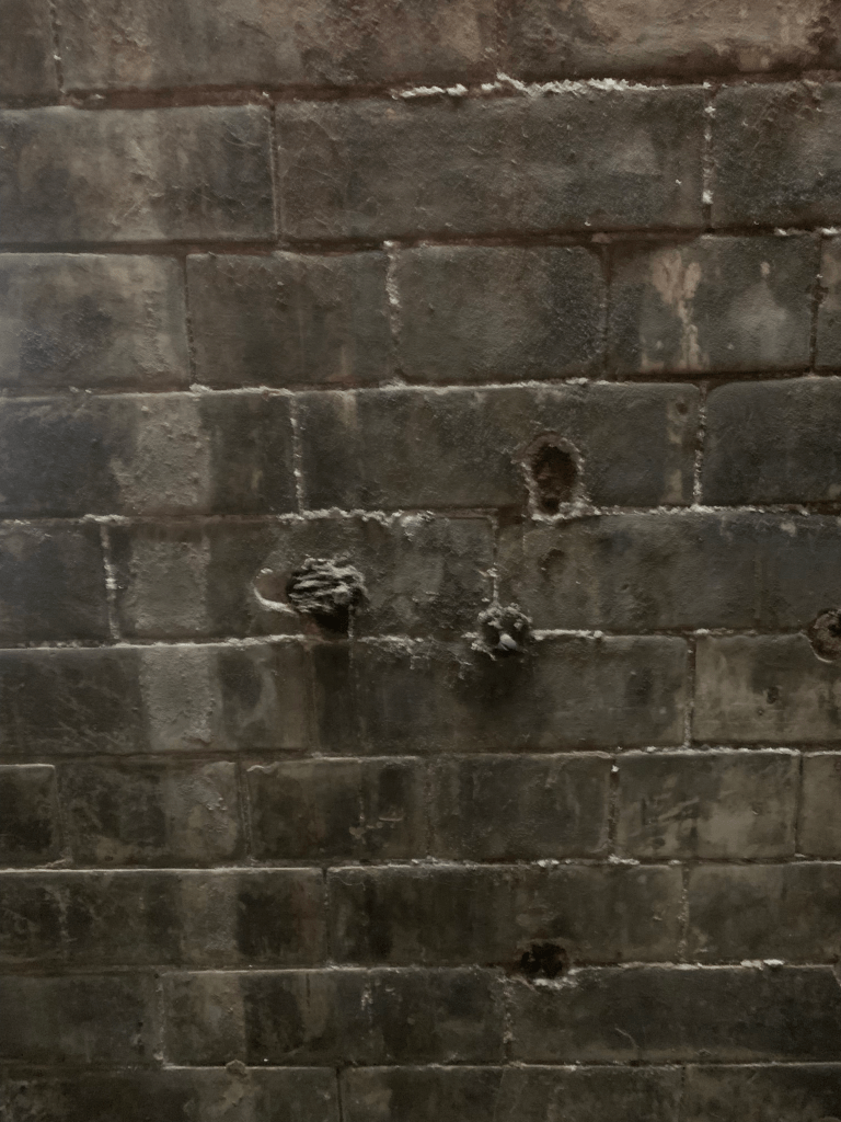
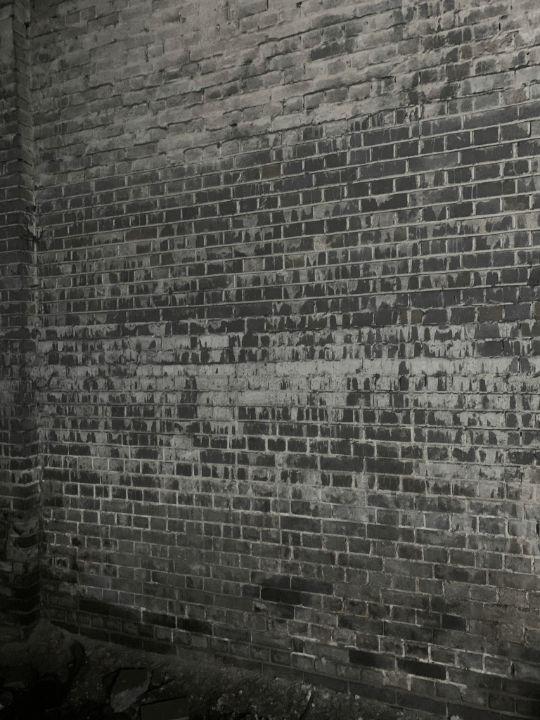
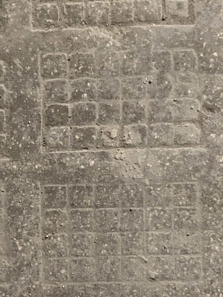

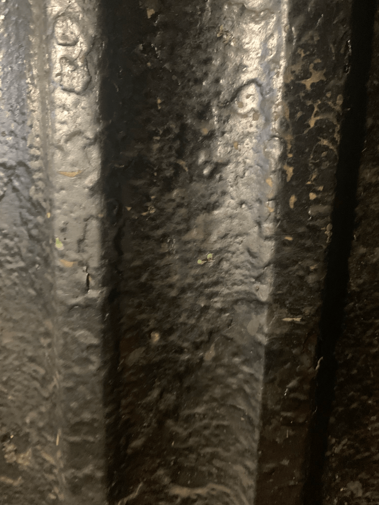

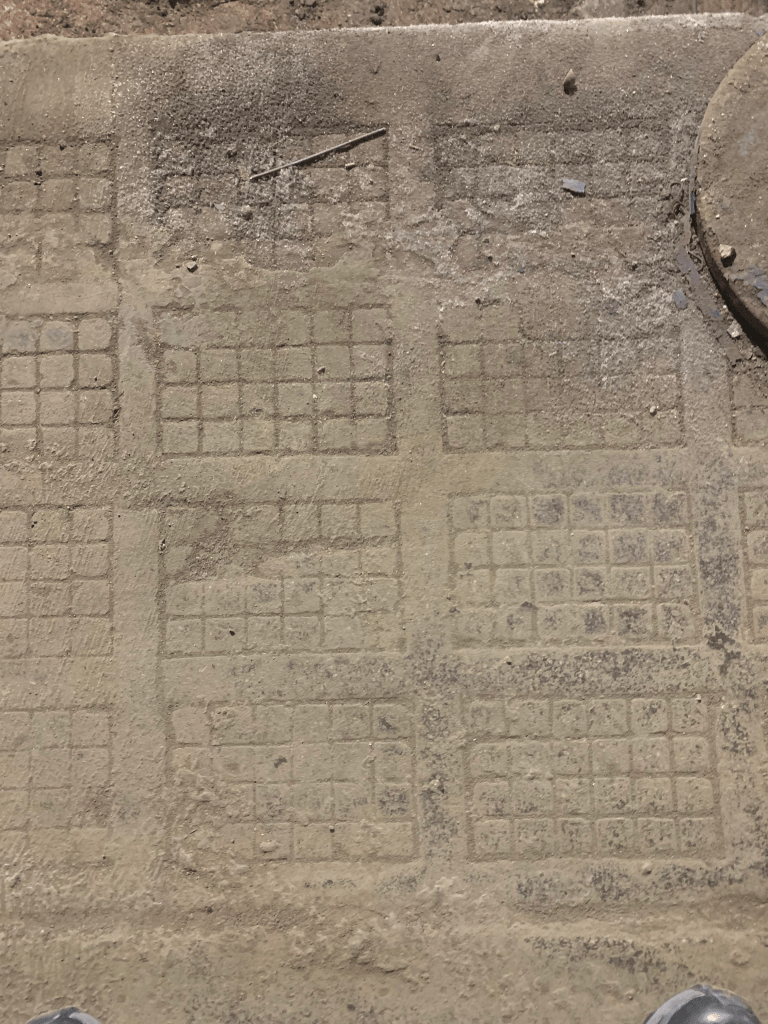

I also took photos of various textures I found interesting around the space it allows designs to have that worn down look as they can all be used as photoshop brushes this will be useful especially in after effects if the text is animated.
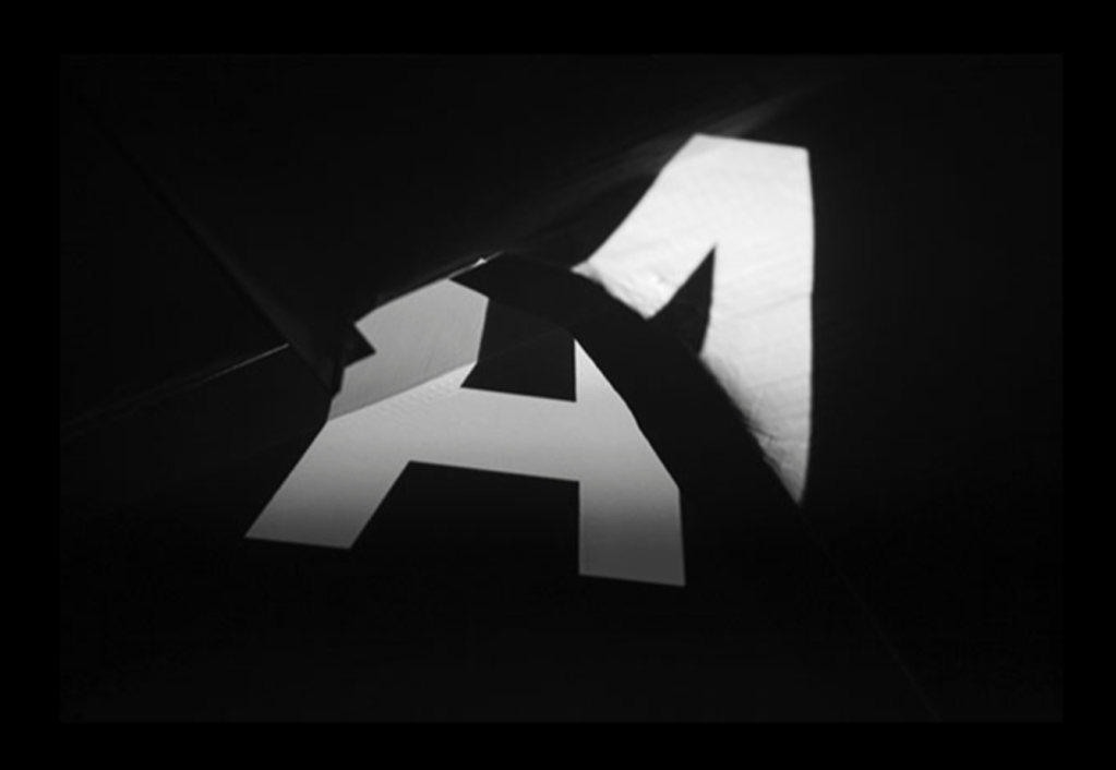


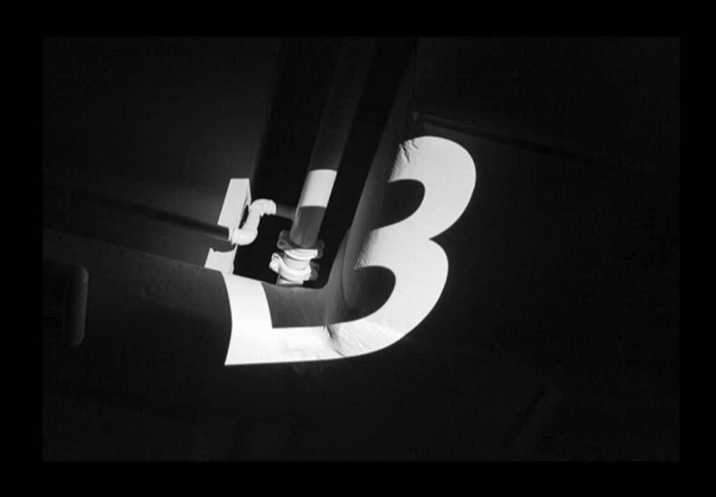
In my research I looked into how projection on different surfaces morphs the type, I found it very interesting especially with some of the areas in the space such as the arches on the roof.
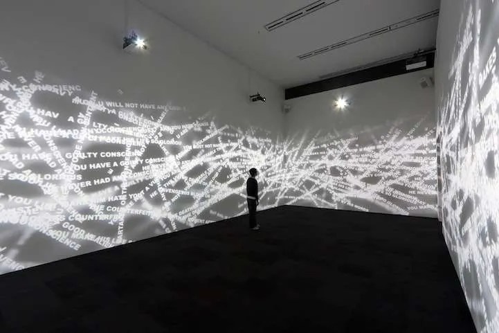
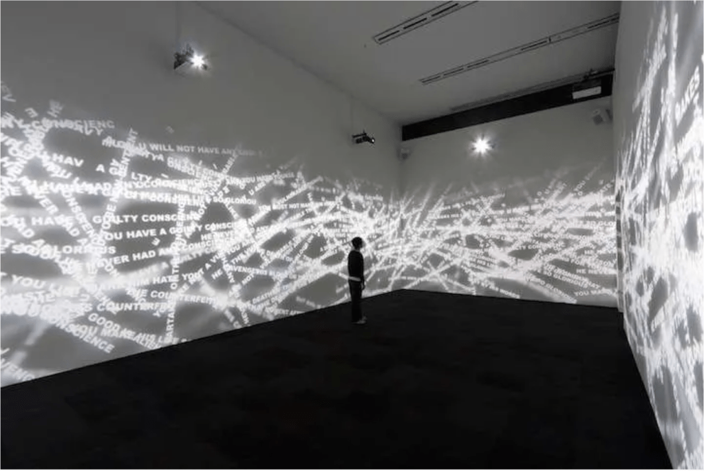
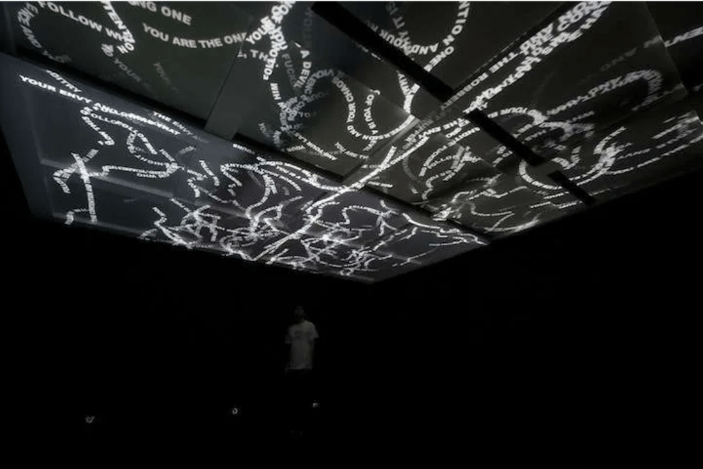

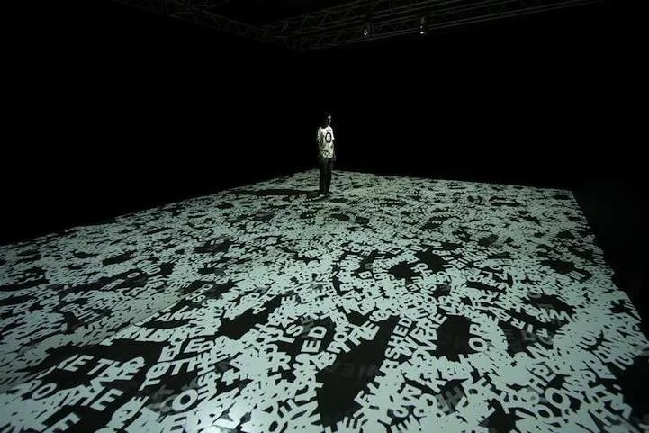

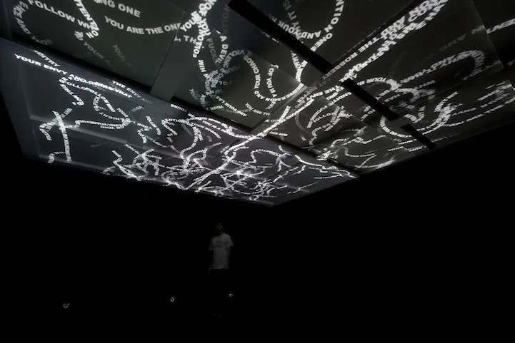
I then also looked into projection installations using type, especially how it effects the area with light, I especially enjoy how the letterforms stack onto each other


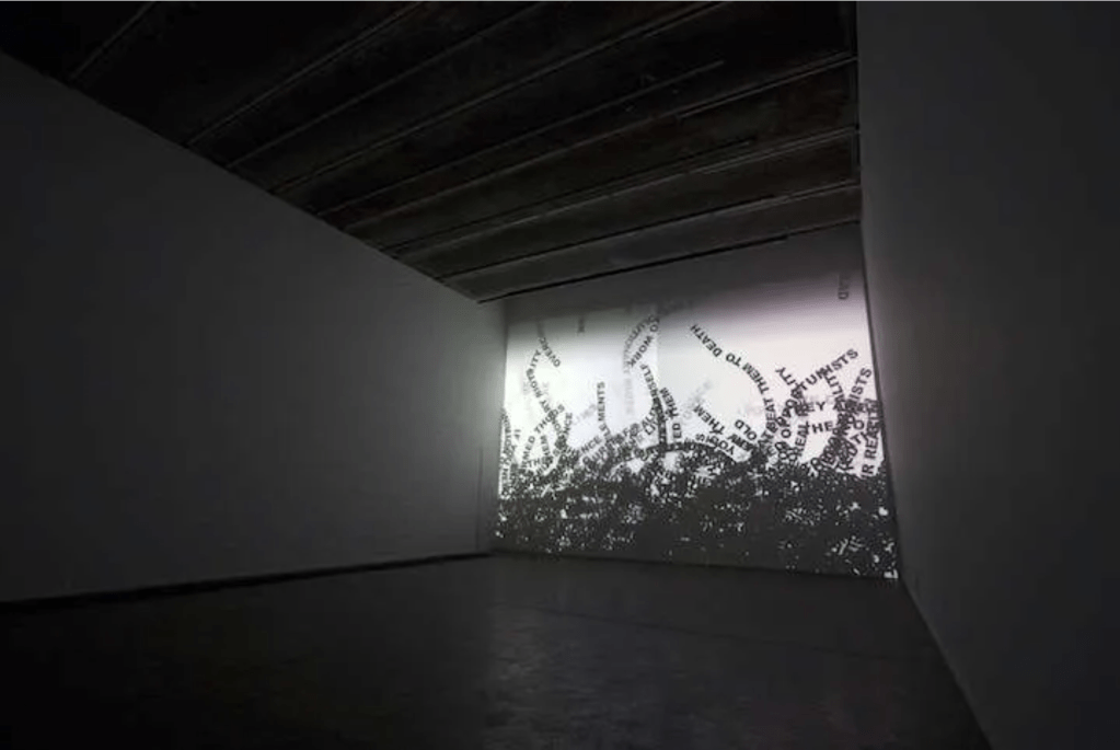
I then looked at other type installations, not necessarily projected but it shows scale, and plays with transitioning from the floor to the wall, I thought this would be something that would translate well to the space.
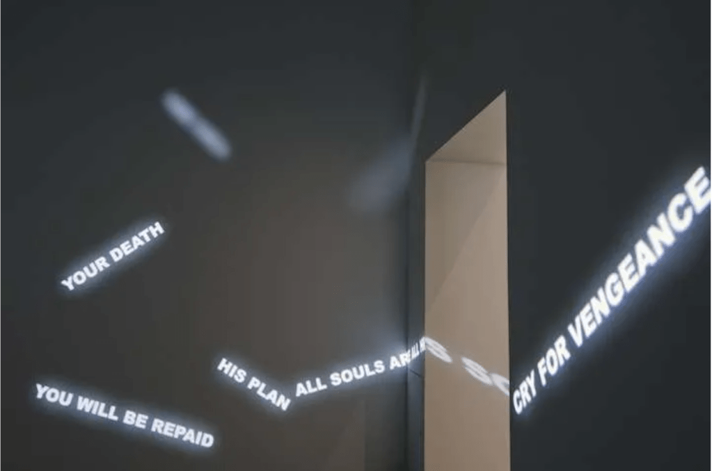
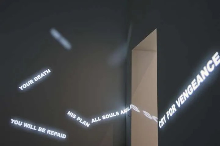
This is a video using projections, projecting through different mediums, in this instance it is projected through water which is an interesting approach, something that can be used in the future.
I also looked into motion graphics and kinetic typography, with this being made in the 50’s by Saul Bass its extremely impressive mirroring what is being done in typography today.
In terms of type, me and Paula are in a sub group of the graphics team. Our main thinking is to create a typographic identity that will unite the experience.
I began looking into period appropriate fonts and typefaces, which I uploaded to the miro board
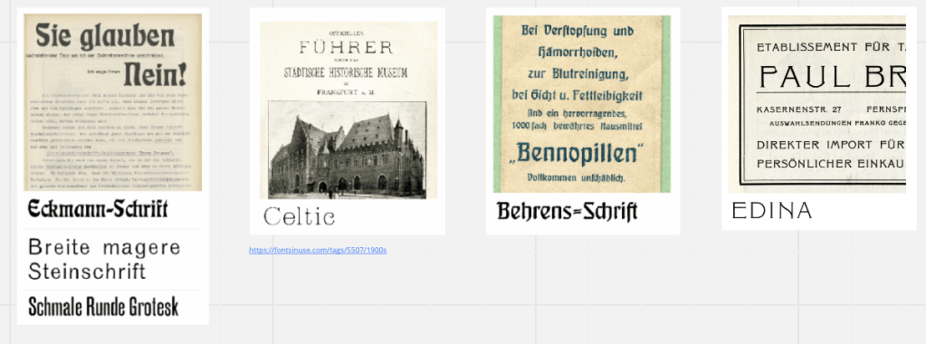
Using the sites fonts in use to get an idea of what they would be like in situ, most of these are very stylised with a very caligraphic style.
Paula then drew my attention to a site with open source type that has been developed for women, we found it fitting to use in the meantime as the station was a very unsafe space for women at the time. In our sub group we decided to divide ourselves so we weren’t working on the same thing etc, Paula put herself forward for creating a typeface and focusing on finer details and I would focus more on the realisation of the work in the space focusing on projections and mockups etc, I was 100% on board with this as I created letterforms for the previous project Design Domain and didn’t think I could do it justice. This also means I can lease with the tech team as well as help the others with their implementations as well.
I then decided to take to photoshop to design some mockups.


Using the vanishing point tool in photoshop I created these mockups using a photo of the space I took on the tour. I slightly darkened the area in photoshop as the space wouldn’t be that well lit when it is implanted. I also photoshopped out the spray paint (badly but if you don’t know its quite hard to tell). Using a combination of blending modes and inner and outer glow I also created a slight glowing effect that the text would have if projected.
I then took a bit of a leap and decided to try and learn touch designer in order to projection map, we have been shown VPT8 however I found it really unwieldy and hard to use, touch designer offers an alternative that looks much more user friendly.
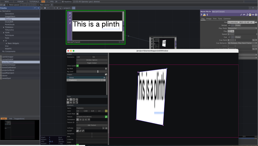
I spent. a day without the projector just to see what was going on and get used to the UI with the hopes of generating a label for a plinth, however upon opening the file on Monday with a projector at hand it. was empty. Nothing is lost though as I quickly figured out how to work the program and generated some maps using some found images from google.

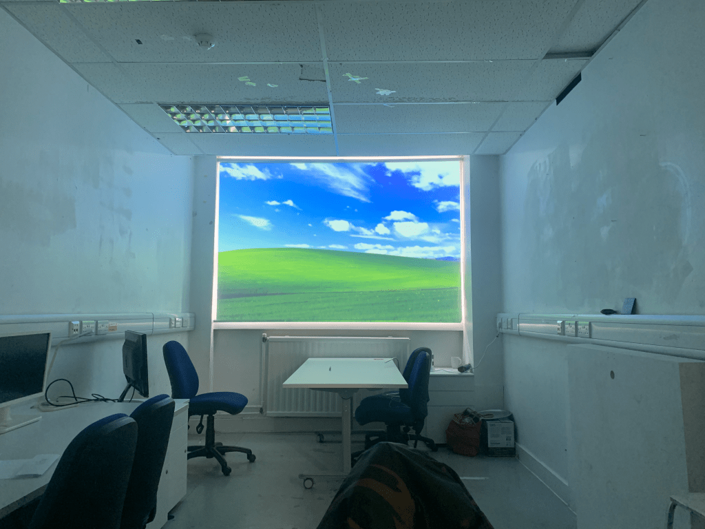
Who doesn’t love a room with a view? This took a lot of tutorials to pull off as my one thing i noticed was that my menu bar was still in view at the top of the screen initially, after some milling about in the mac settings I found out how to turn it off so that its more flush. As seen below
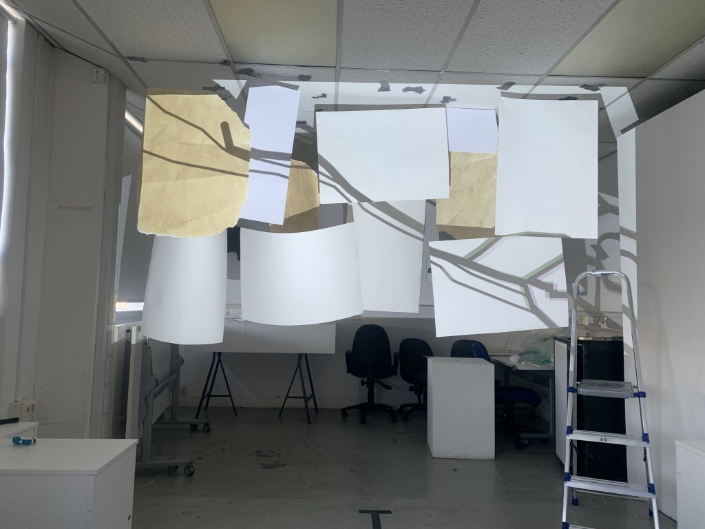
Going off of Jenny’s idea of the hanging tickets, I decided to work on creating a mock up of the installation in the space, using some yarn and tape i found in an abandoned locker I hung some paper from the ceiling, using touch designers kantan mapper I mapped various photos and videos to the scene as placeholders, experimenting with position
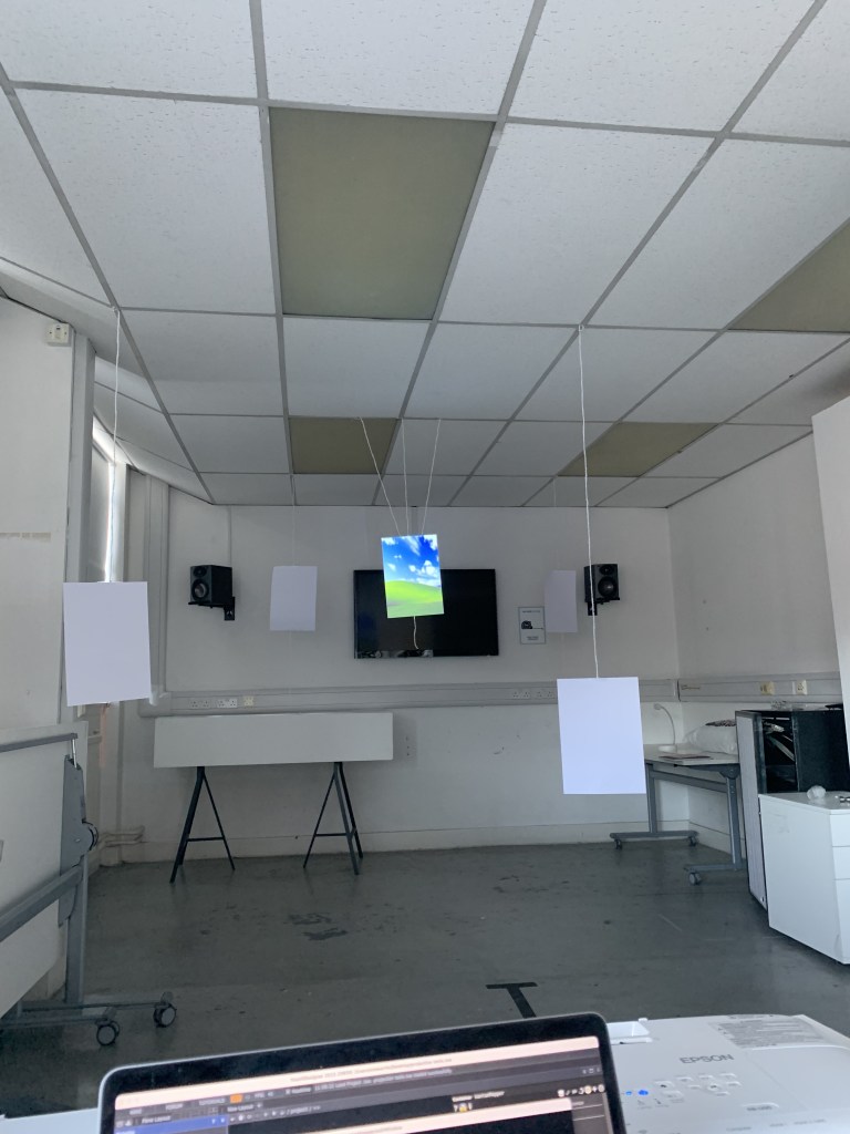

I projected different things that a bit more fitting, image of a train conductor, ink blots, a letter and a map of Glasgow central. We also explored the idea of depth and how potential viewers could walk around the space, perhaps these could be back projected? Something to think about. I also spent a great deal of time discussing with Mathew from the sound team in how sound would best augment this space, we discussed ambient sounds such as conversation and various other train station related noises, in which I was employed to be the voice of a rather not so convincing train conductor.
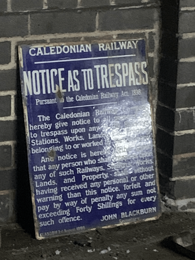
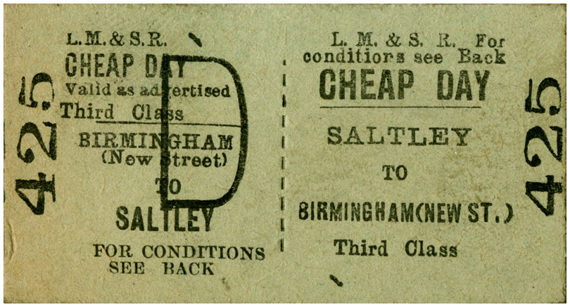
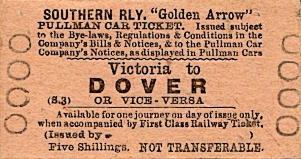
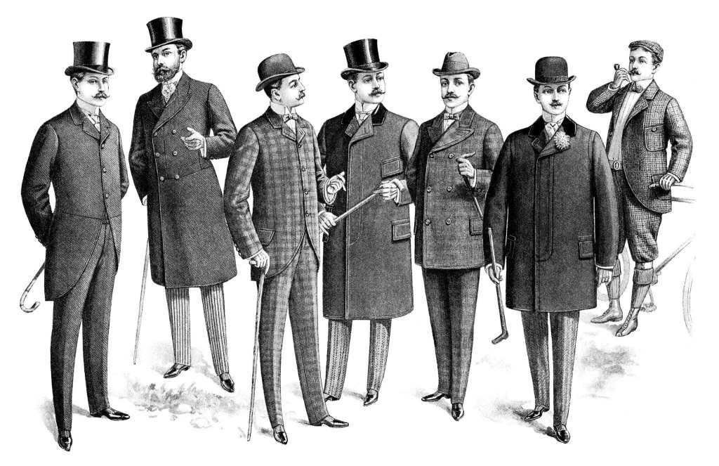
Looking at things such as old train tickets and old suits to get. A good feel for what was available at the time the good thing is that I have a checked suit so could work well. Although they have different cuts, itll serve as a good mockup,

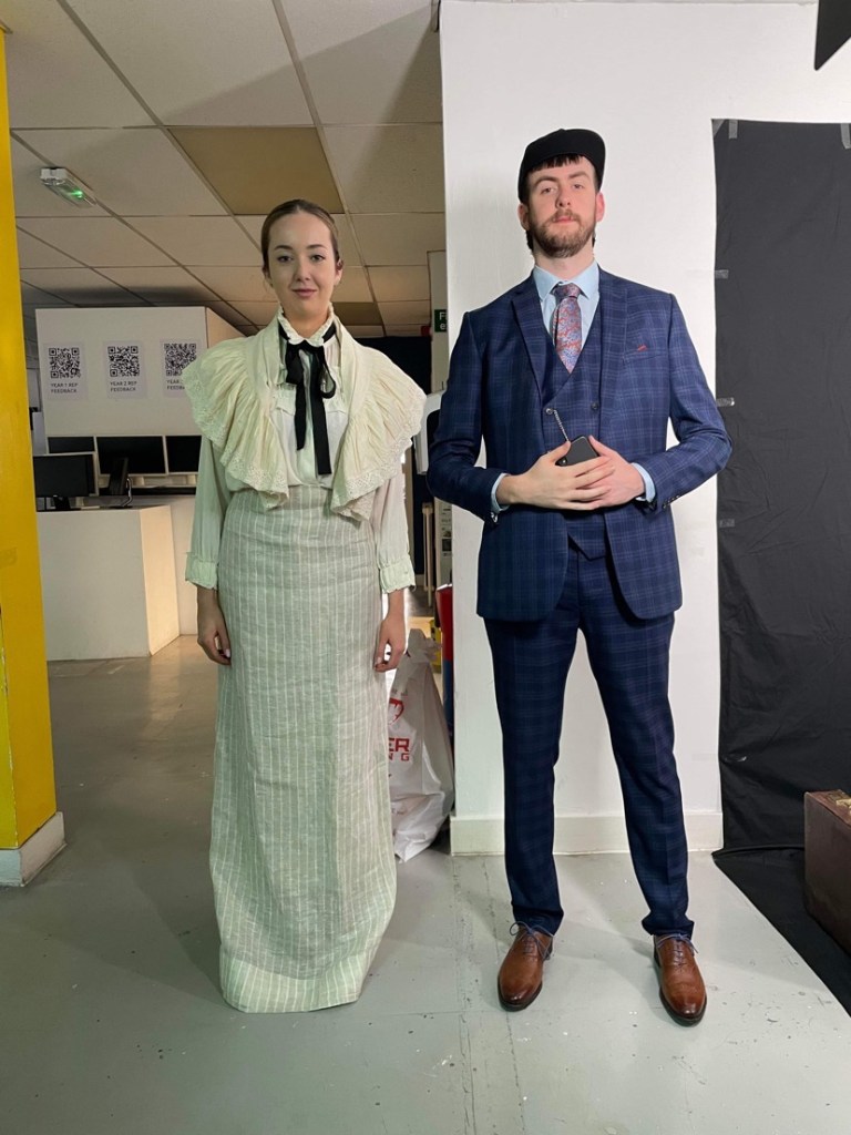
Travelling back in time to the 1890’s in full costume, I have learned a lot from this, that I couldn’t be an actor, im very stiff and wearing a suit under the lights was absolutely roasting, but it was good fun, hopefully it looks all good on the back projected screen.
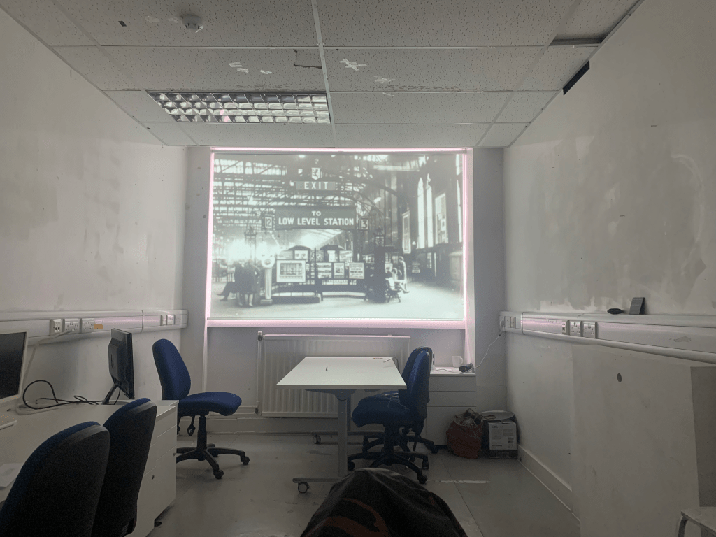
setting up the back projector required a bit if trial and error but it seemed to work ok. Using touch designer also means that more than one video could be played at once depending on where they are in situ this could be useful for the final.
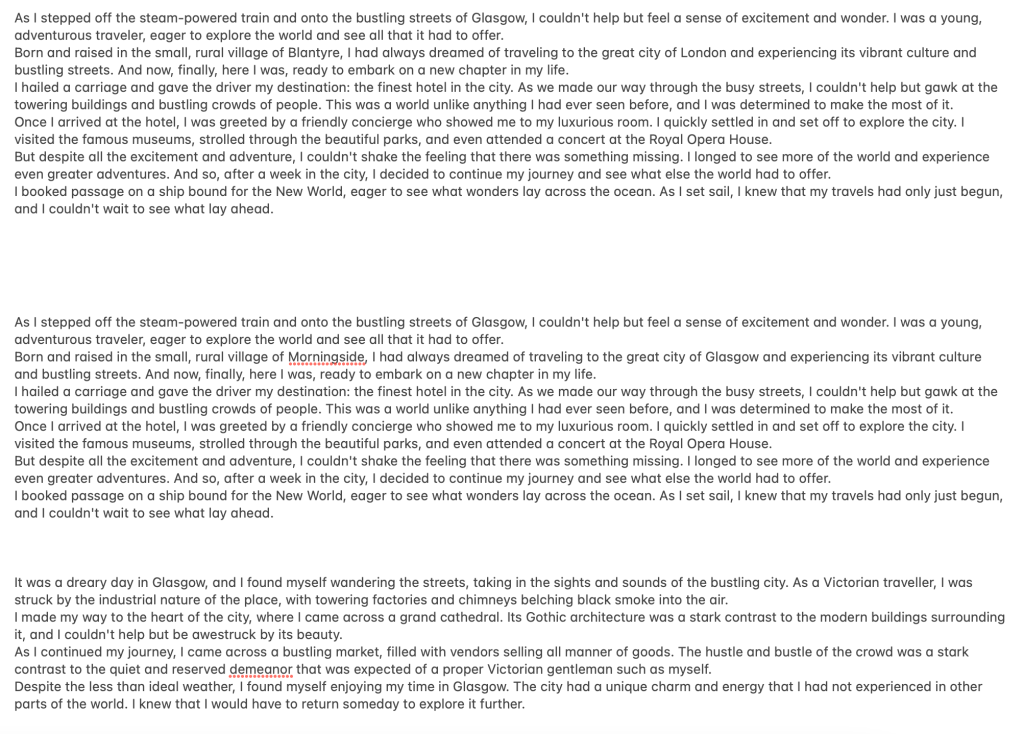
To generate the idea of stories, I have used chatGPT to generate some stories from the point of view of a victorian traveller coming to Glasgow. I was able to generate it in different ways including reducing the word-count The results were pretty convincing and served well as a placeholder.
Using these I generated a mockup with images coming through the stories. As the idea for these tickets was to show stories and journeys lost to time I thought this was fitting.

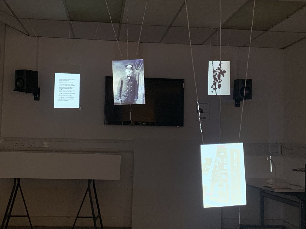
However, the way that touch designer works, would not allow the text to remain legible, it would be warped and distorted etc. so this ended up not being used. However I feel that the direction we went ends up being just as effective. We used fishing lines and tape to suspend the paper to give the effect the paper was floating. Some sheets had been coffee stained with the idea to stain more once we figured out the layout.


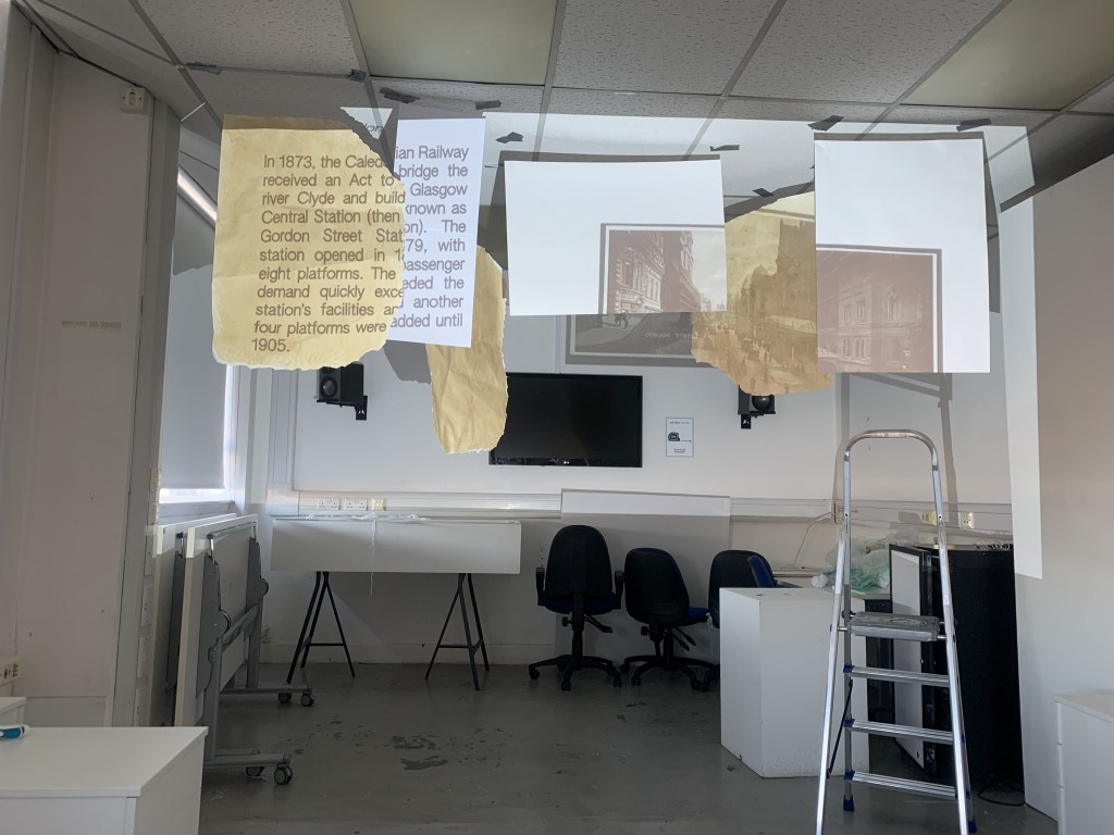
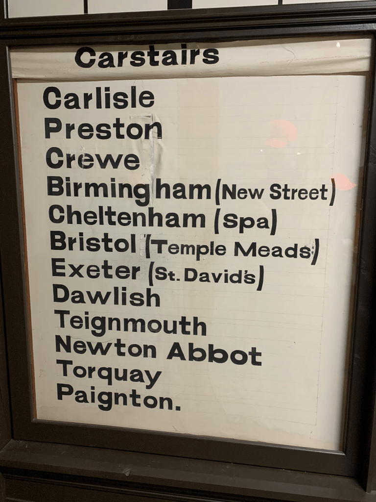
The final ticket hanging went through a lot of iterations building up the paper around the projection, then later tracing around the gaps on touch designer. We projected a short animation that Kamera generated on after effects detailing different stops and destinations around Scotland that a Victorian traveller may have visited.

However tragedy struck and the paper fell down. Obviously tape wasn’t the way to go. So we went with more secure fixings in the ceiling, this also helped create the illusion that the tickets were properly floating rather than being suspended.
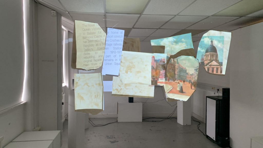

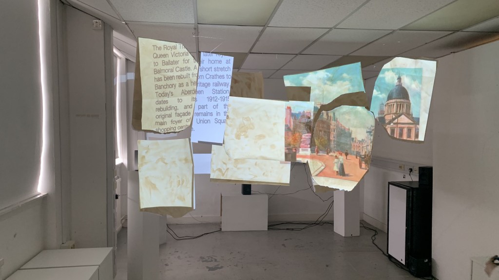
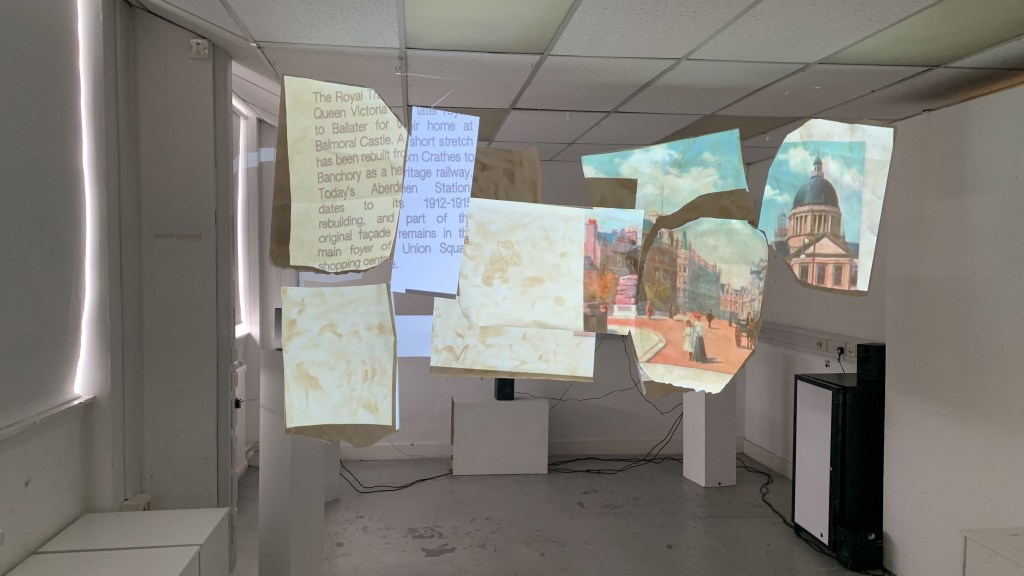
This was the final layout presented to Jackie on Friday, complete with the audio setup behind it. The clips on the ceiling instead of the tape really help sell the illusion.
