For this project I have had to give myself a quick refresher as to what I was actually going to do as it had been a while since I looked back on it.
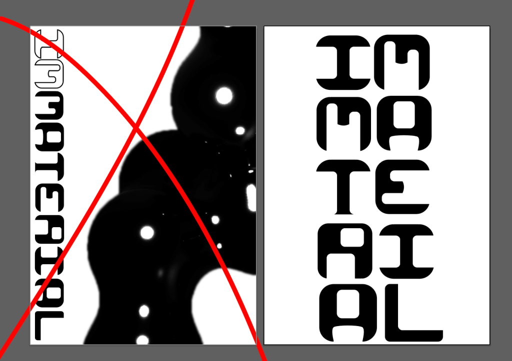
Looking back I noticed I listed titles such as (im)material (im)perfect, I feel like this is possibly the biggest summary of my theme. How the material impacts the immaterial and vice versa. Using digital and analogue workflows to create a combined output.
During the Buchanan Galleries project I ordered some UV pens and heat reactive ink to ensure they were here on time for the project starting. My research for DDpt1 was thorough meaning the BG project didn’t hinder me too much, I had also already created the letterforms and most of the animation I needed for this so it was more focused on the actual materials
I also ordered paper from G.F. Smith based on my sample book I ordered for DD1
I have tried many different poster iterations however I have decided to focus on the typographic nature of the poster as it will be easier for both the axidraw and the screen printing process, slimming this down will save valuable time that I have lost with Audio Visual. Refining the text ensuring that each letter is a single path.
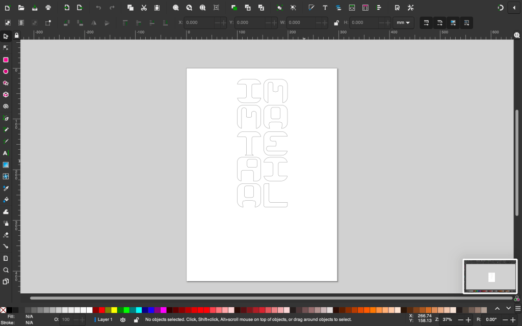
Since I had never used the axidraw before, I had to fiddle around with the settings to ensure they would work, I did some experimenting with my fine liner pen.

Before using my proper paper I ensured I knew exactly what settings to use what / size to make the text.
I had to do this as it was nearly impossible to see the outcome once the ink had dried.
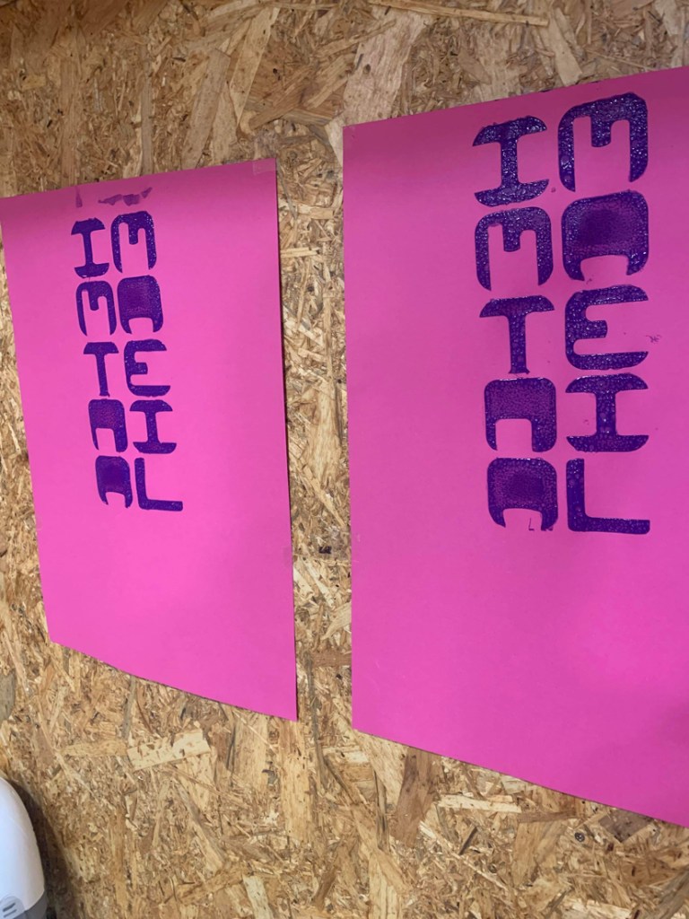
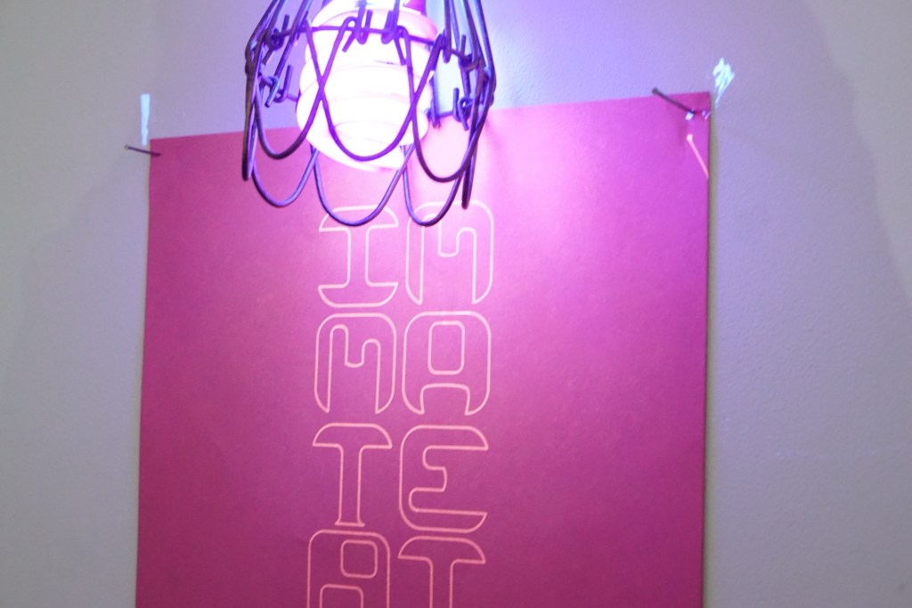
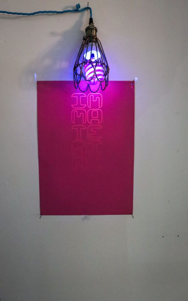
However under the blacklight I feel it looks very effective, It is however very dark so I experimented with the different paper I ordered to see the effects. I found that the pink paper works extremely well with the UV ink in producing a bright glow.
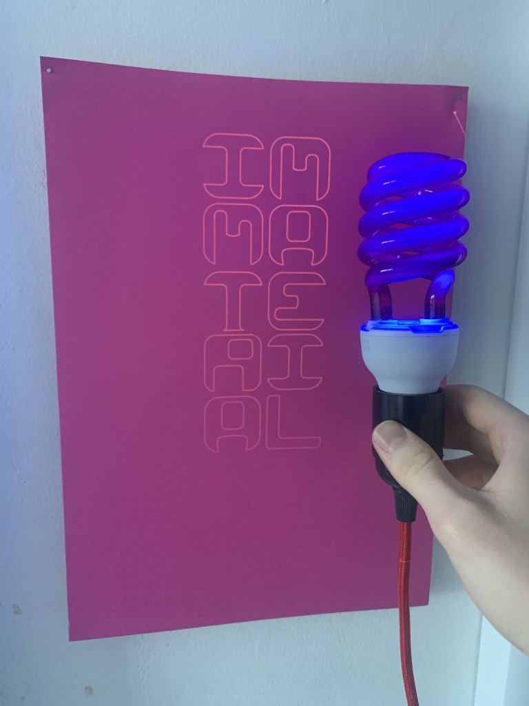
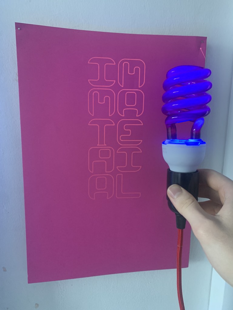

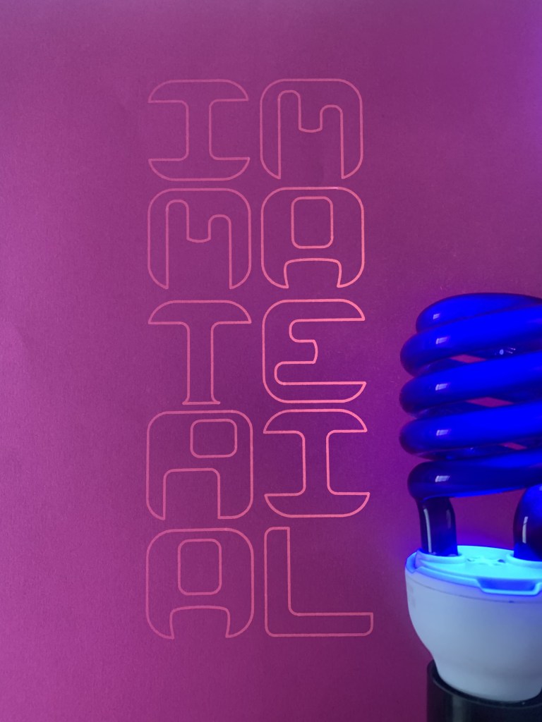
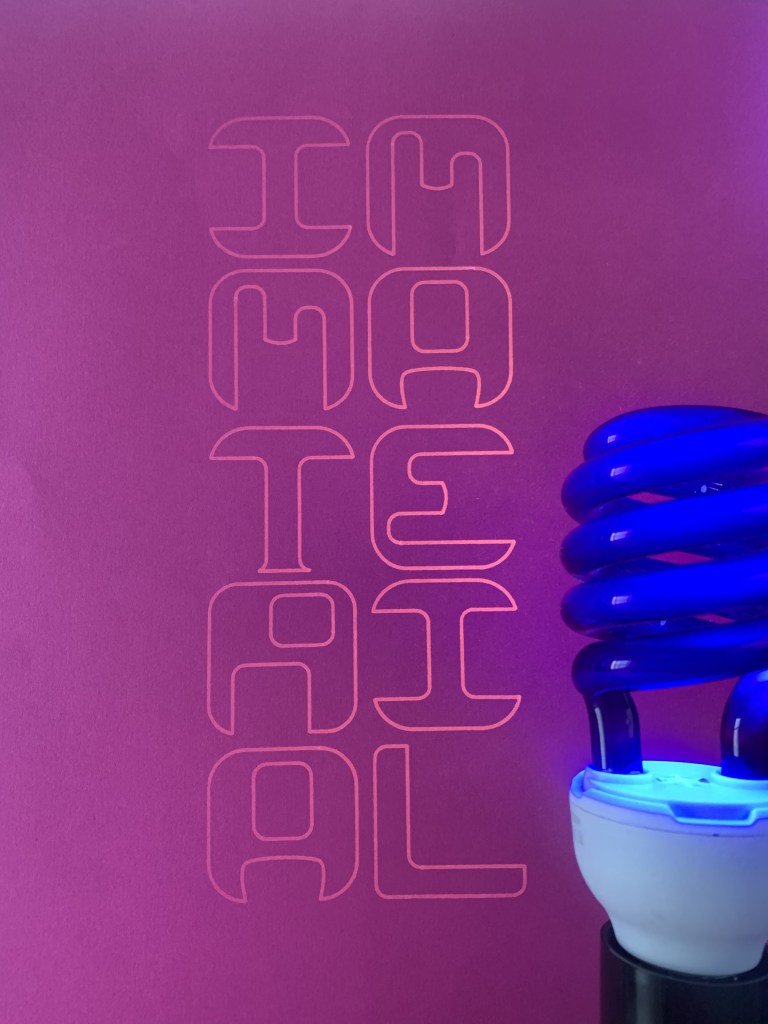
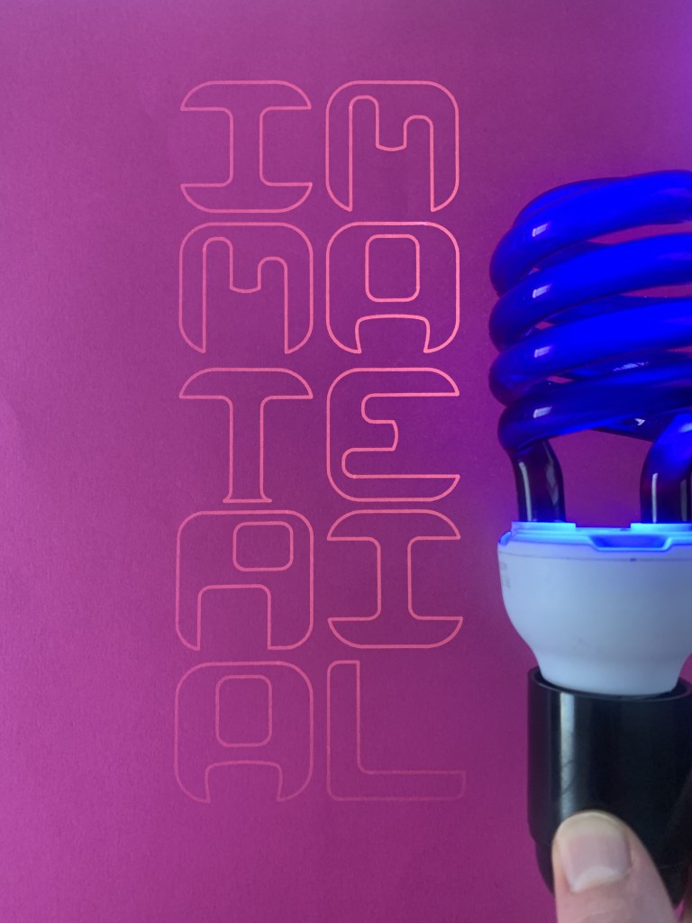

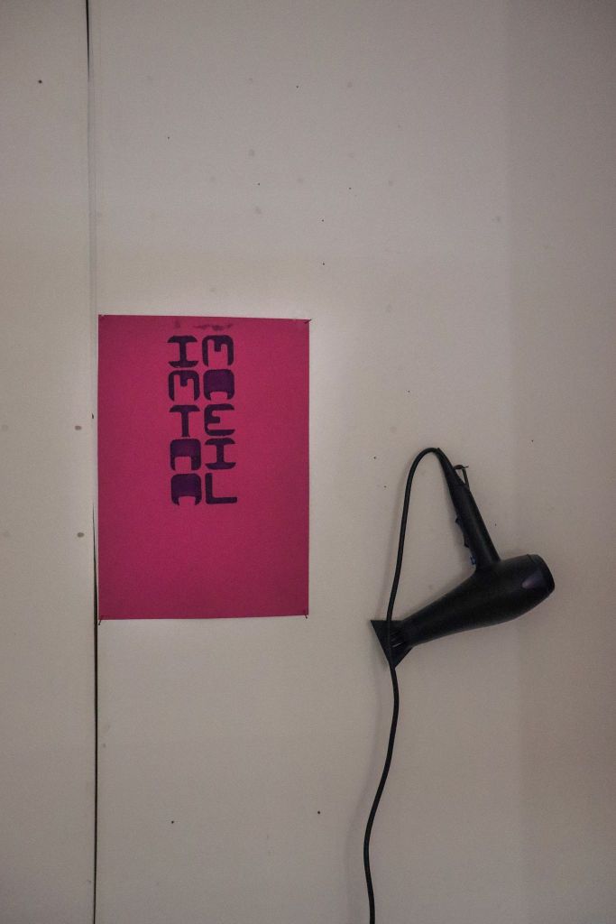
I feel this will also look more uniform with the rest of my work as I intend to print the screen print on pink paper to play with the tonality of the paint that I had organised. For my screenprint I can either use photo emulsion or cut out a template with my cricut this will give a filled appearance rather than the stroke outline of the UV.
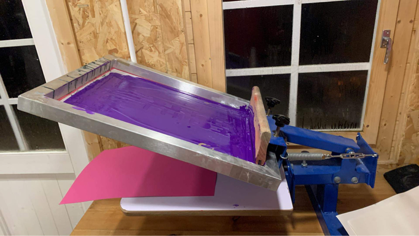
A long haul process up late in the shed screen printing, realising that the thermo chromatic paint isn’t actually the best for printing, as its so thin, I added some printing medium to it but it didn’t really make much of a difference and I was afraid it would make the paint dry too transparent as I wasn’t sure if it would lose the effect.
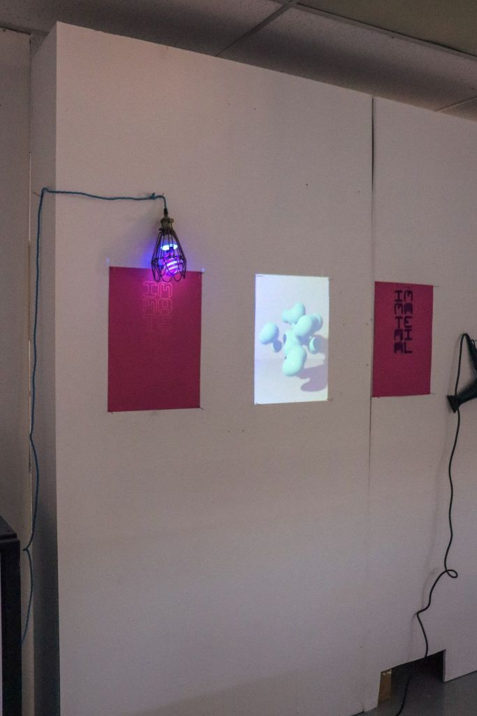
Installation + setup


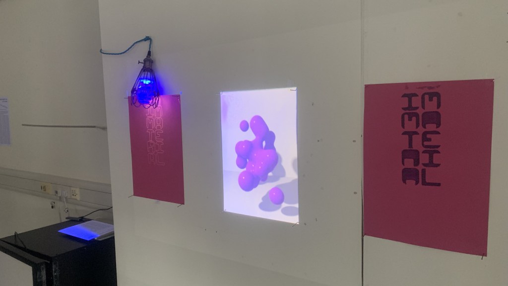
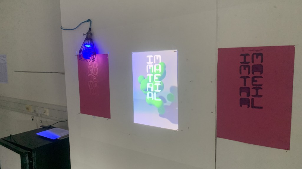
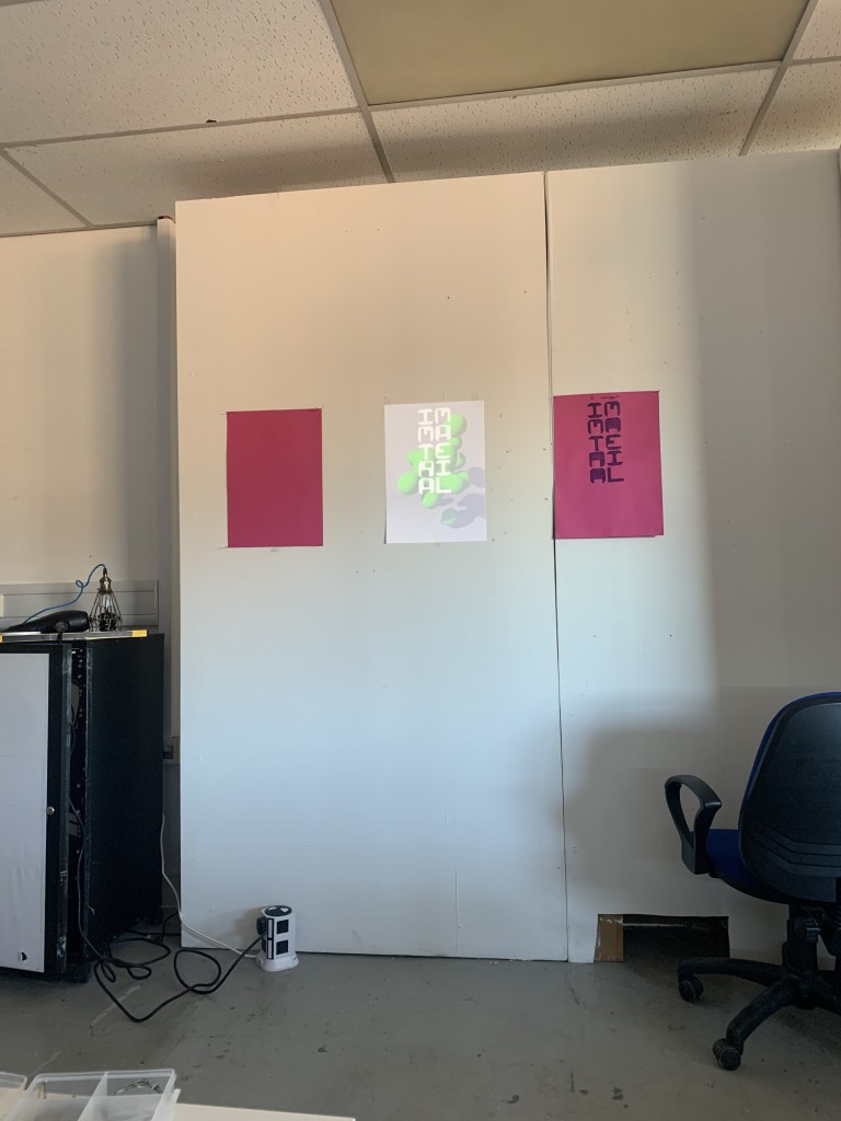
Pure material

As can be seen, when only the material elements are present it looks almost empty, with the immaterial bringing the full experience together. The way the projector is positioned serves as a reminder to this, that the immaterial is key to the work and in turn the process of making the work.

Big thanks to Dom and Matt for the photos
