For this part of design domain we need to create based on our proposals in part 1.
For this part of the project I am feeling confident enough with what I need to produce, however the timing of the project is the only thing that concerns me. Less than 2 weeks to create just feels so quick of a turnaround.
As I have been thinking of how to make this interactive, looking at these various interactive letterforms.
These are all things I find really interesting, their interactive elements introduce a lot of variability to them. However I am unsure how they would translate to projection, something to experiment with.
I have also been editing and revising my Typography projects outcomes to optimise it for dual dial controls.
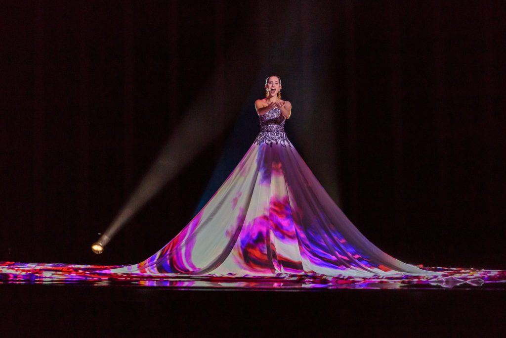
Looking into further projection mapping and I found this really interesting. With arduino you can create an interactive wall, however this isn’t really something I want to create with my final it would be really interesting.
I found this really interesting how it creates depth with the projections, and the movement is really captivating. Extremely complex but good inspiration.
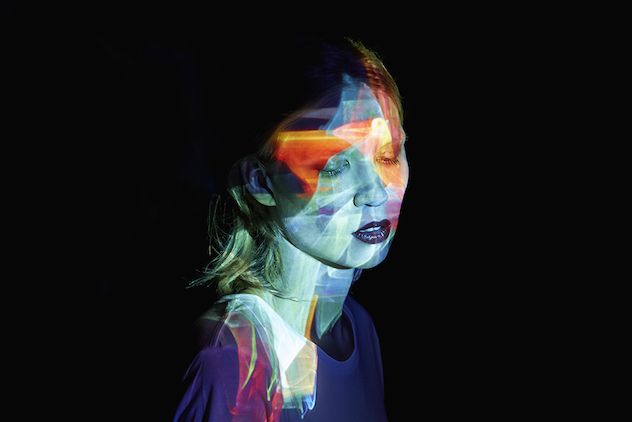
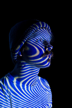
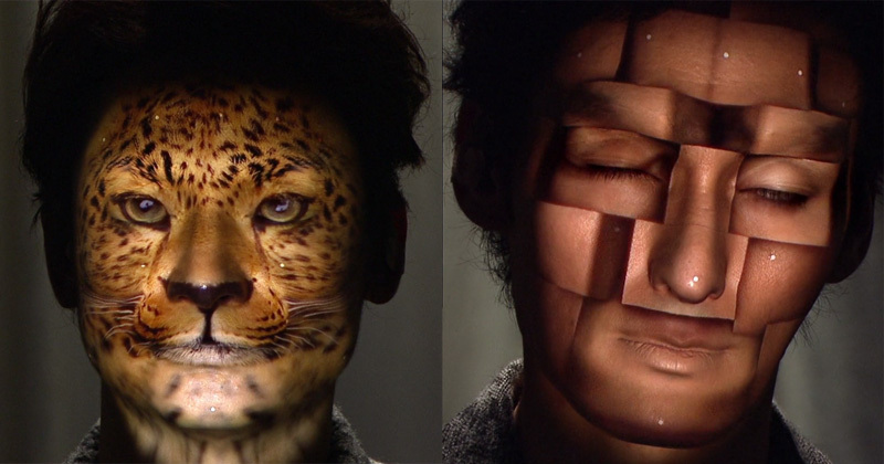
I also found these really interesting due to its projection on human form.
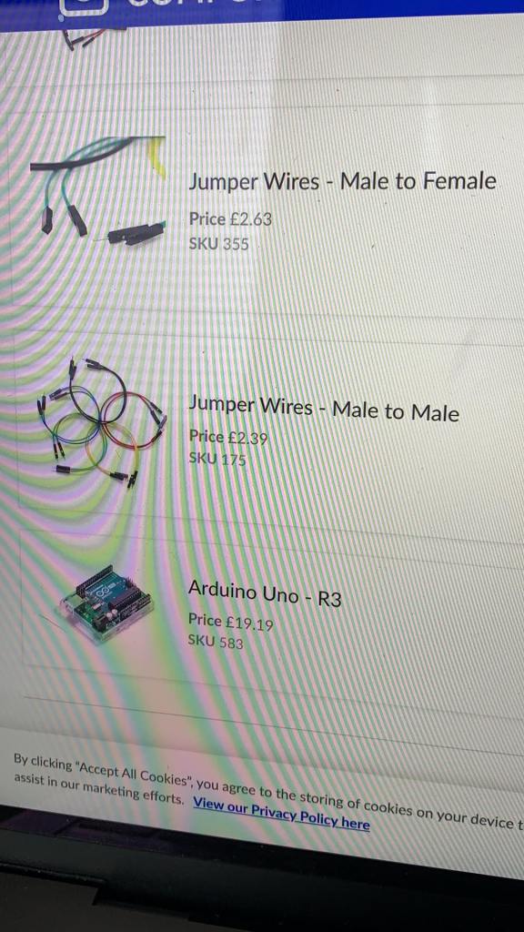
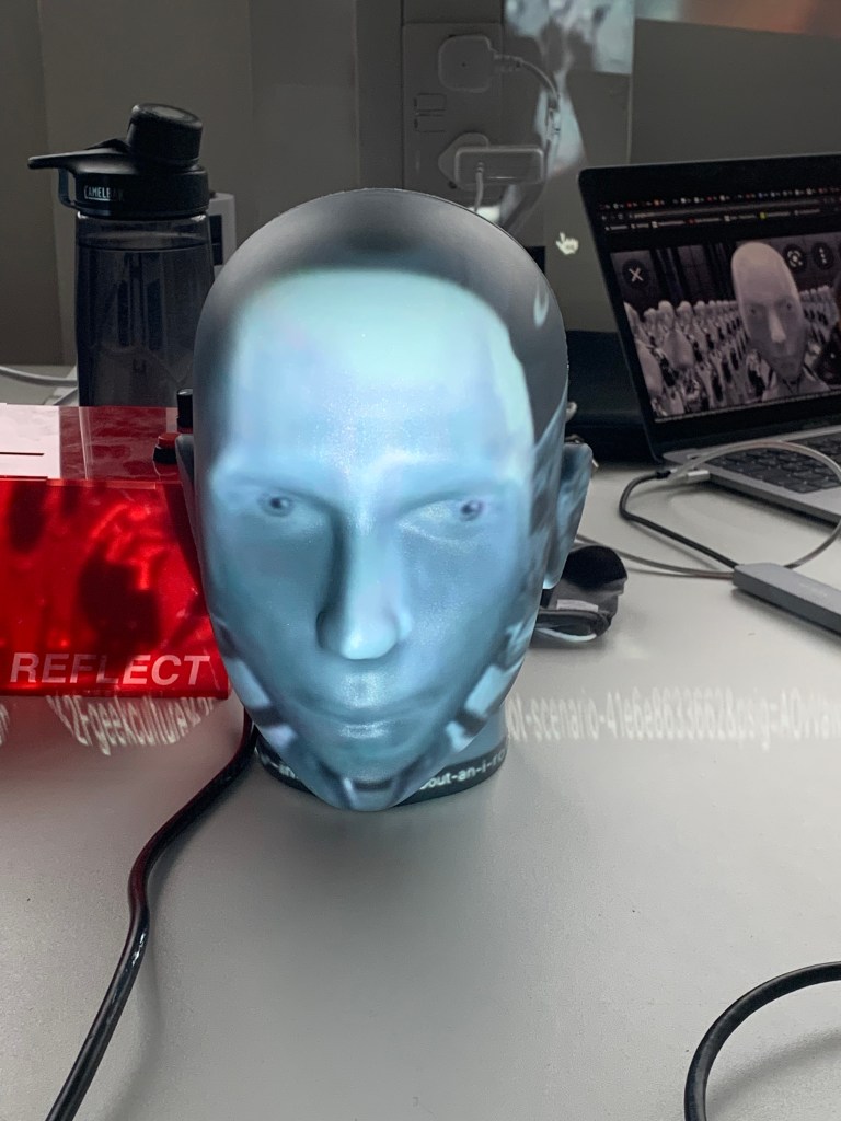
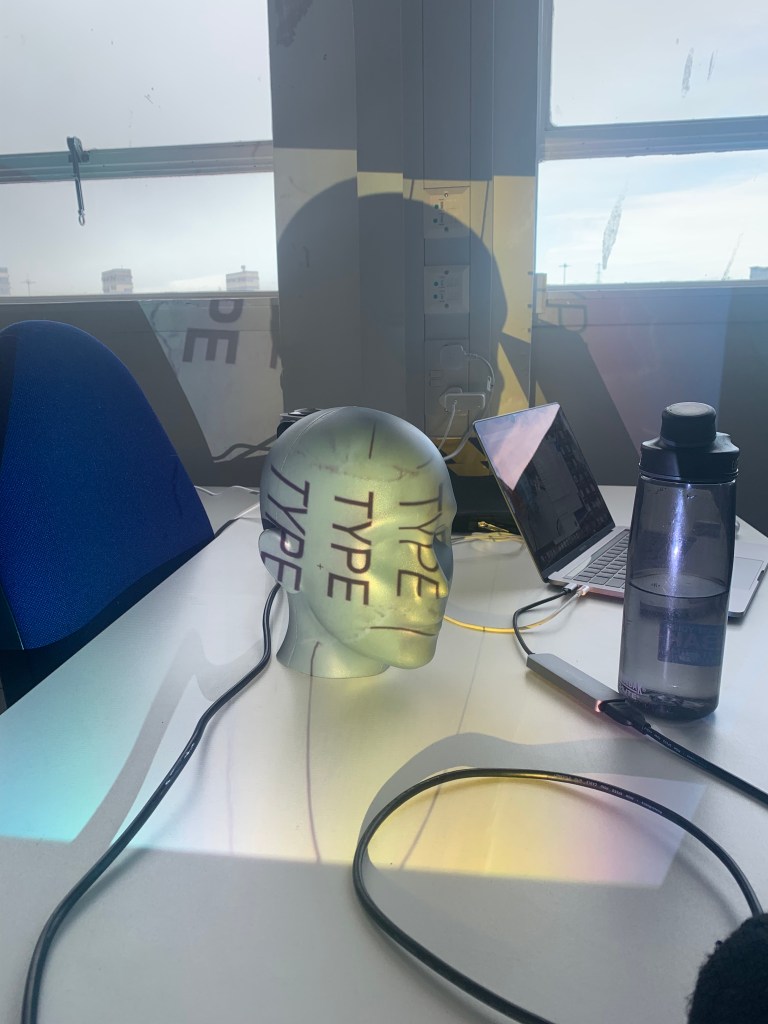
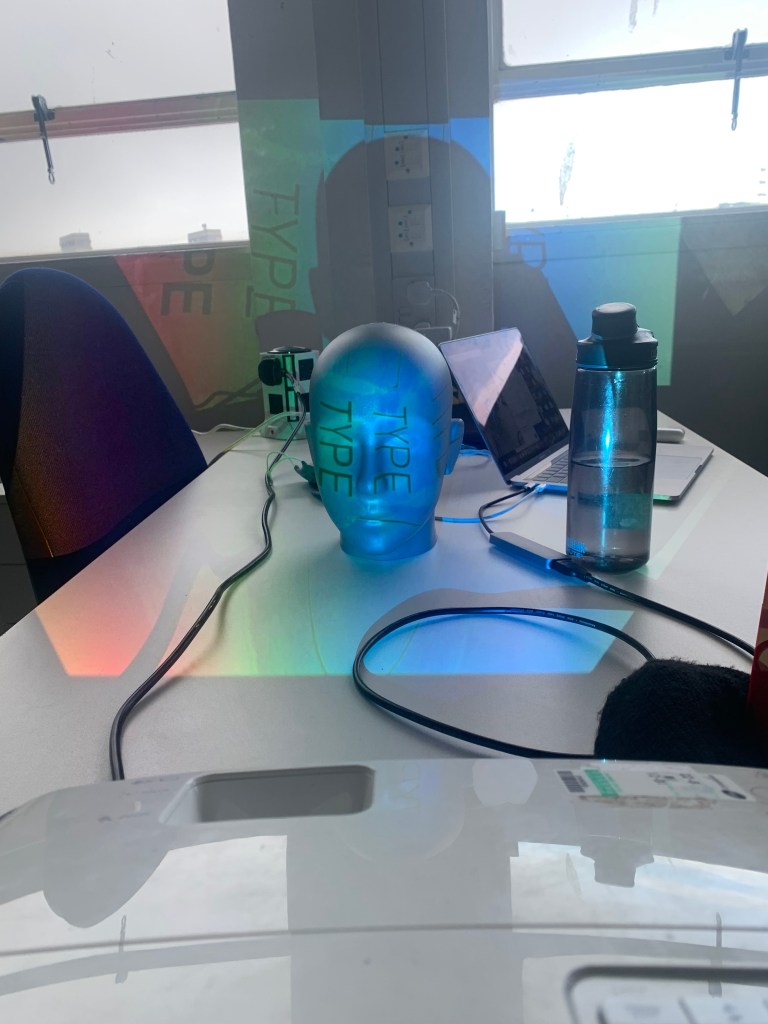
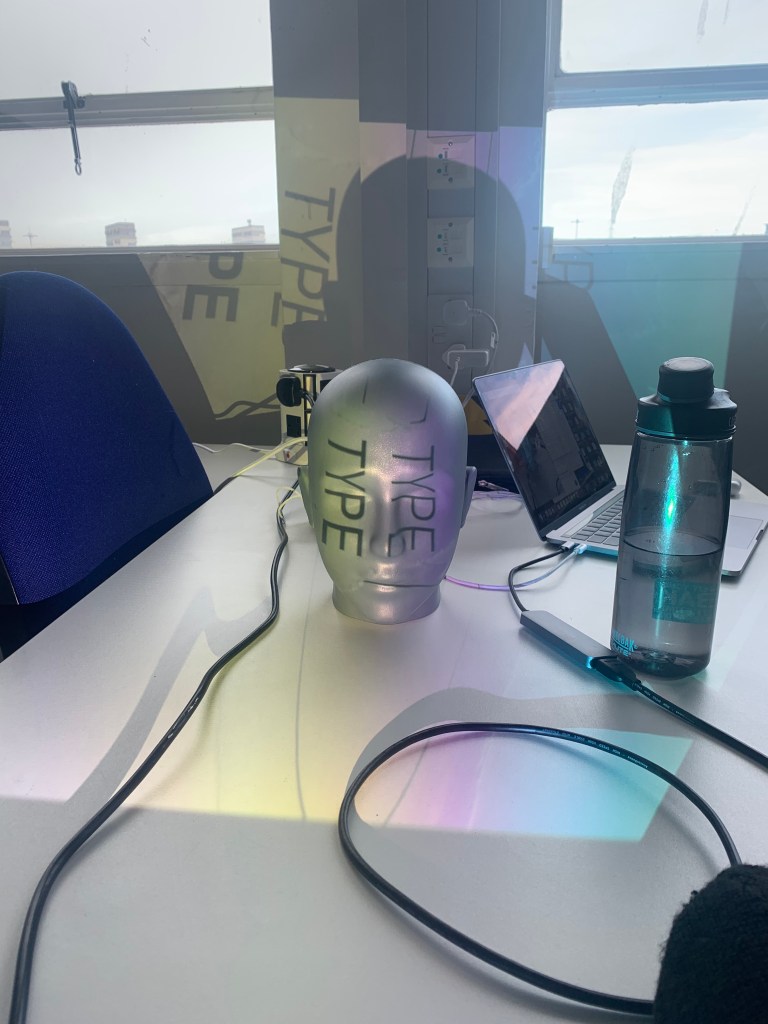
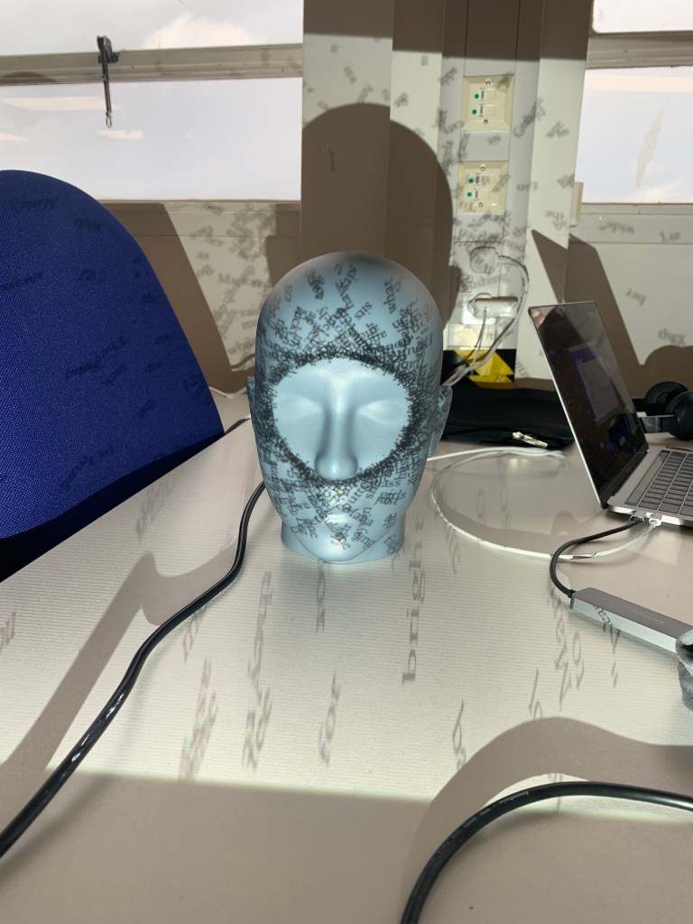
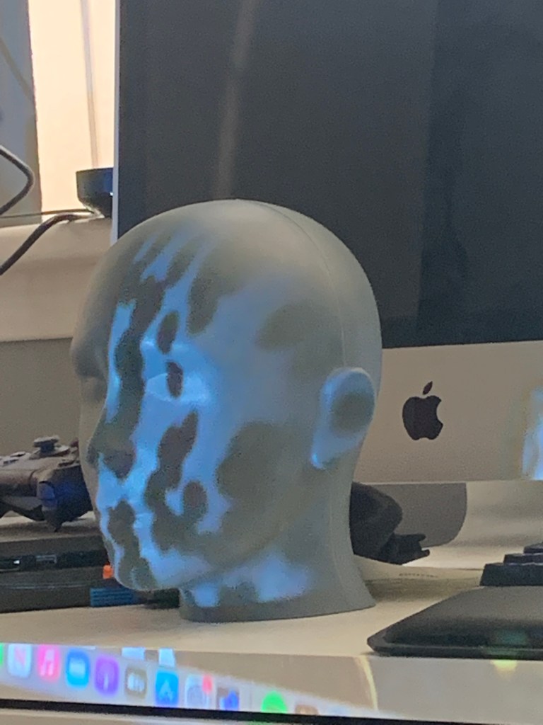
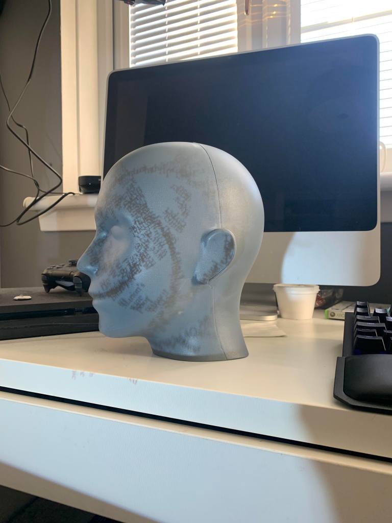
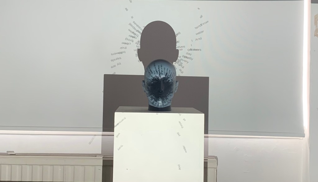
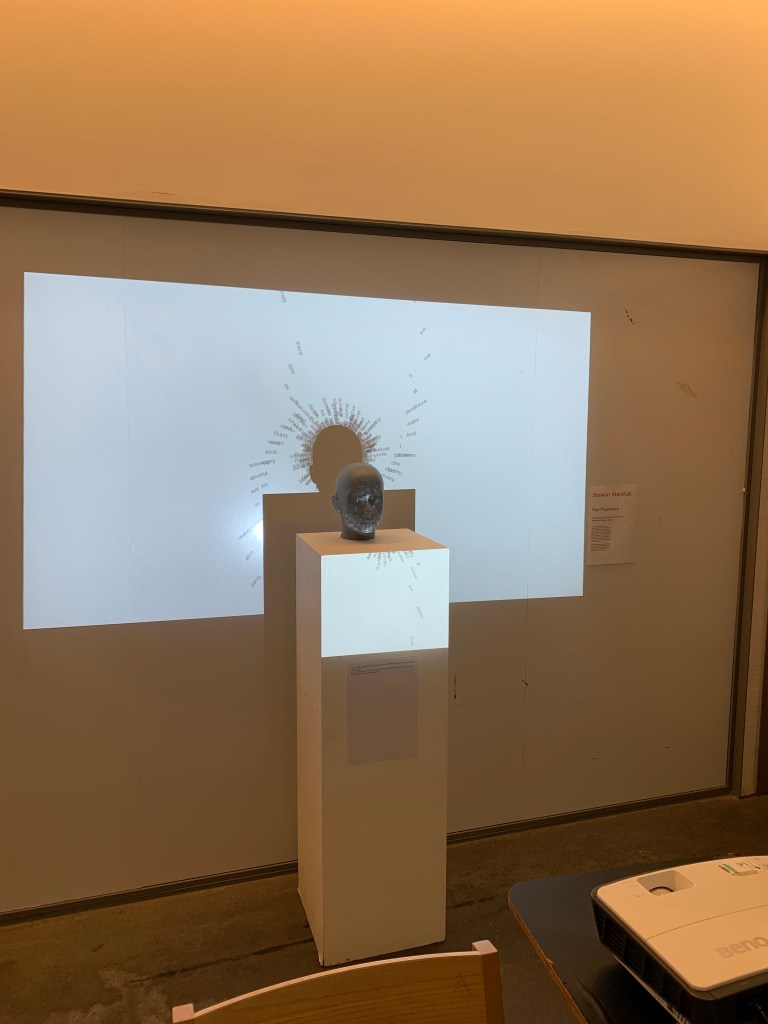
I also bought some components to aid in the interactivity of the piece. I will start experimenting with the projections etc soon as I have a projector at home and managed to get a head from my work.
I have only chosen to go with one head at the moment but will possibly look at multiple, including hands, feet etc. However one is a good place to start.
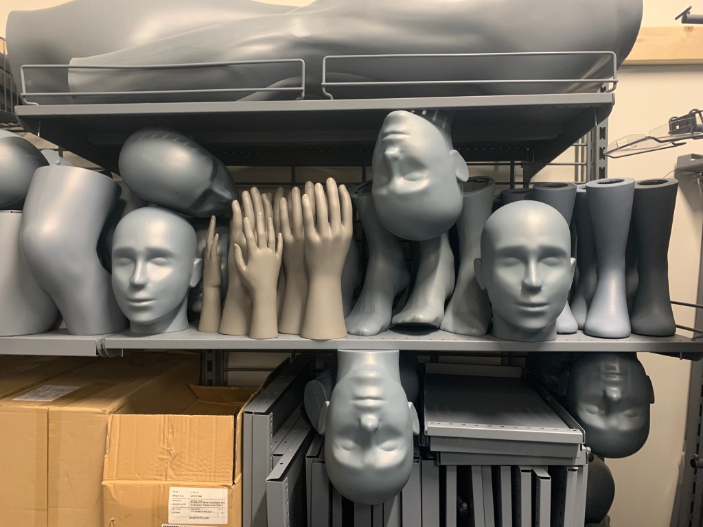
I have decided to only use one head for this in order to bring a sense of focus to the work and time constraints wouldn’t allow me to realise it properly however I do feel that it has some great potential for a future refinement of this project/concept.
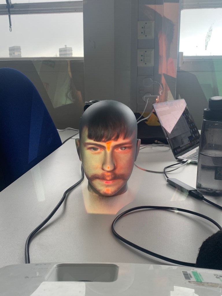
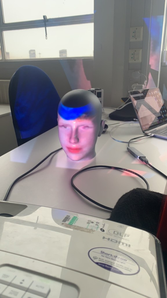
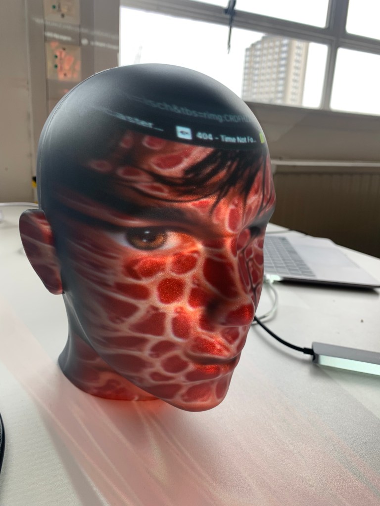
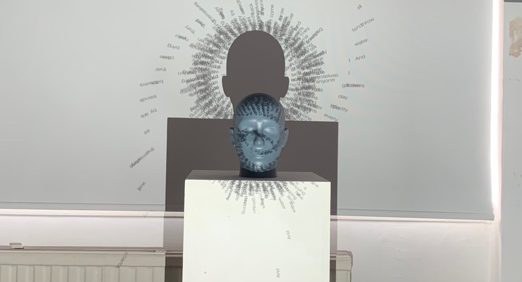
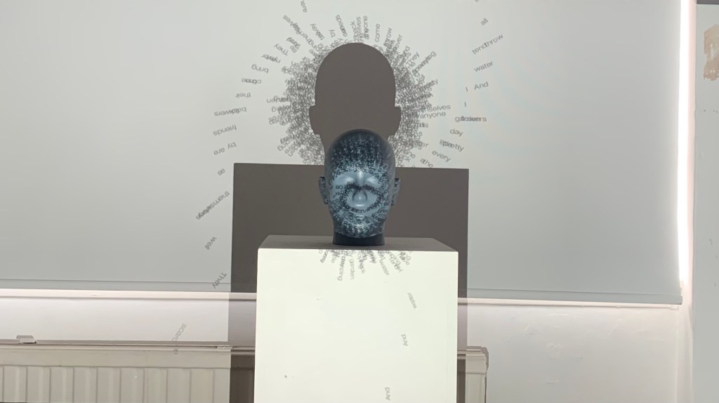
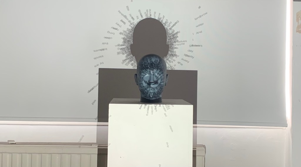
Just using the projector and my head I decided to look back and project different things onto the head just to get a feel for how the face distorted it. Using things like faces, text from my typography project and text from my development in the previous section of this project.
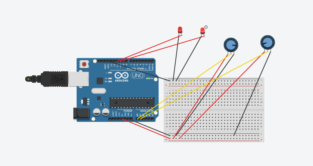
making a quick mockup of my circuit with arduino, I would’ve just made it in real life first but I forgot to purchase a cable for my arduino but the circuit works in in the mockup and served as a good refresher for arduino and physical computing.
I am now attempting to make my processing sketch communicate with VPT8 however I’m finding this part challenging and not as straight forward as I thought.
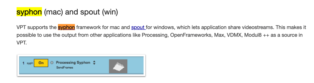

I did some research and it seems like Syphon is the way to go to get this to work. I downloaded the simple Syphon pack to see how it works.
The tutorials that I have found all seem to use an old syphon library that is included in processing however, it is not included in processing at the moment. I found this Github page from the creator stating that it works with processing 3 or higher but I cant seem to get it to work and don’t want to downgrade too much incase my code isn’t compatible.
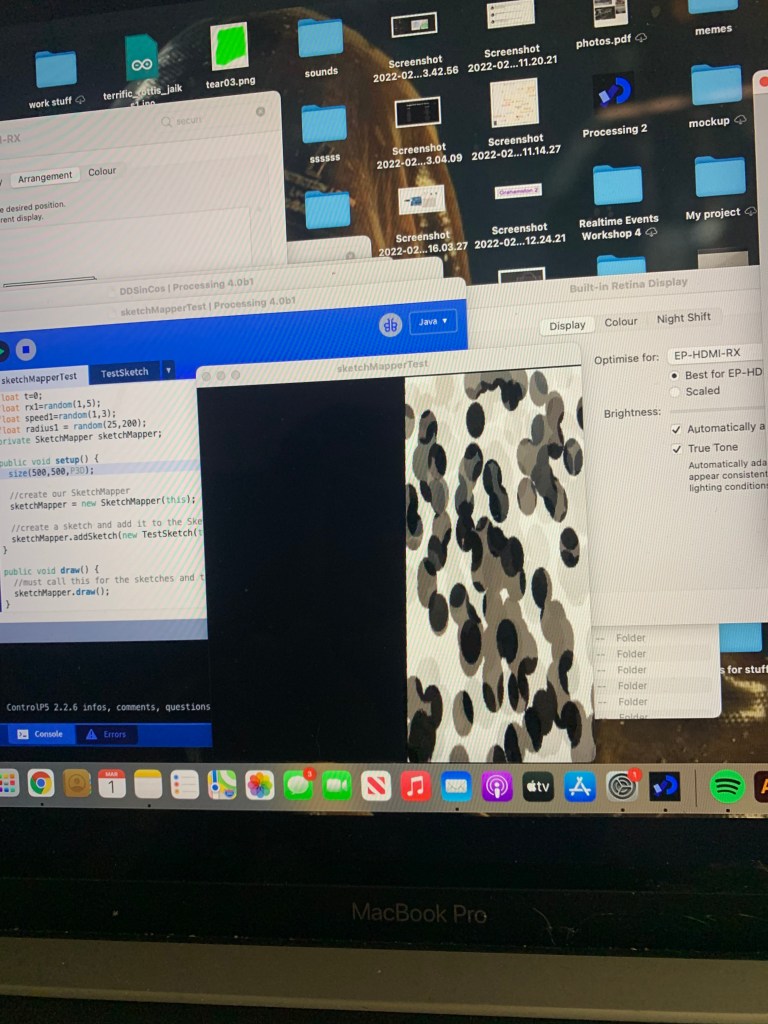
I found a library on processing that allows for mapping but I came into some issues with putting my own code into that as well. It worked with the default example but not with my own code.
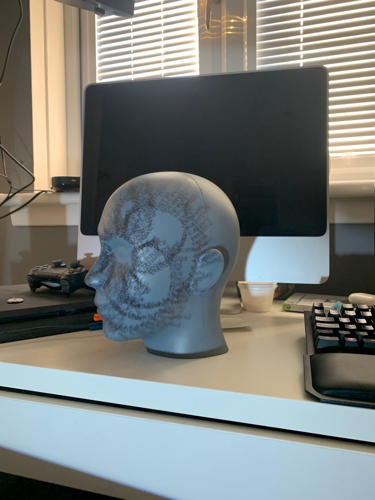
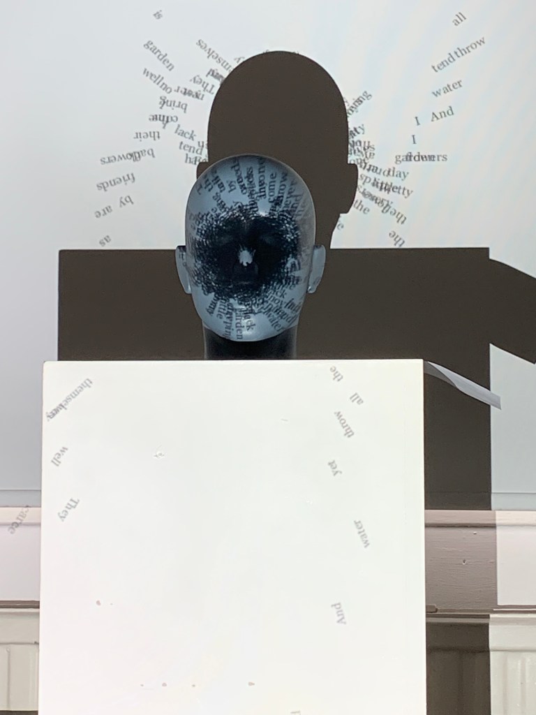
Heading back to the studio I made use of the department projector to create better documentation of my work. I also took some time to refine my code, making it look more like an eye, one of the many common terms used with type. The closed counter of the lower case e.

I also experimented a lot with projection mapping, however, it seems to not work at all with processing and Im not the only one having that problem, I abandoned the idea as I also think it looks better without it, the words shrink down with the window and ends up being totally illegible, although thats what I was going for I do want the viewer to still be able to tell they are words. I with the movement I have also added a subtle noise function to both the sin and tan waves in order to get them to gently pulse, just do further the effect that this is a real time thing rather than just a still image being projected. This also gives a feeling almost like a heartbeat or breathing, a callback to the personification of type I mentioned in part 1.
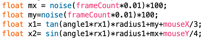
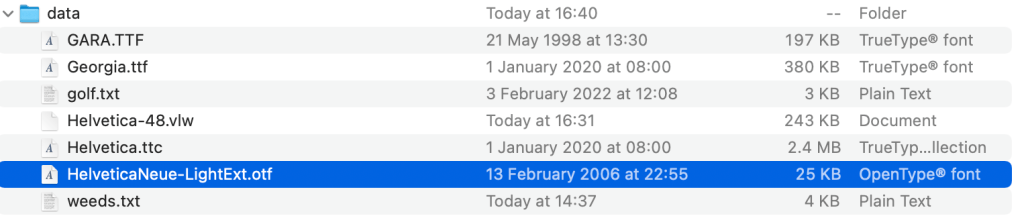
I also made some changes to the font, with some in depth research (2 websites) I decided that the average easiest to read font was Helvetica, I chose this as I wanted to build a sense of irony within my work, a commonly extremely legible piece of type obscured by itself, I then took the creative liberty of using Helvetica Neue due to some technical issues with the normal Helvetica being a ttc font not recognisable by processing and the VLW fonts not loading properly.
I experimented with a number of different fonts but helvetica seems to be the best one so far. The extended letterforms of this font also acts as a callback to my research and inspiration from y2k and 90’s revival graphic design I touched on in my proposal in part 1.
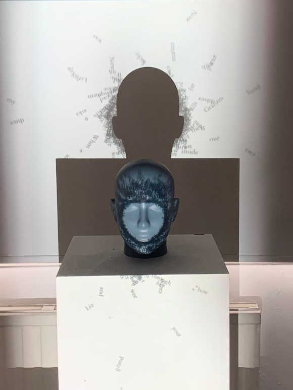
I used my control box however I wrapped it in black vinyl in order to better mach the project, with the ability to re use the control box instead of using more plastic, its going to outlast me on this earth so may as well get my uses out of it.
I chose the black vinyl as it fits a bit more with whats being projected, white plinth, grey head, black box. Just seems to fit in a lot better.
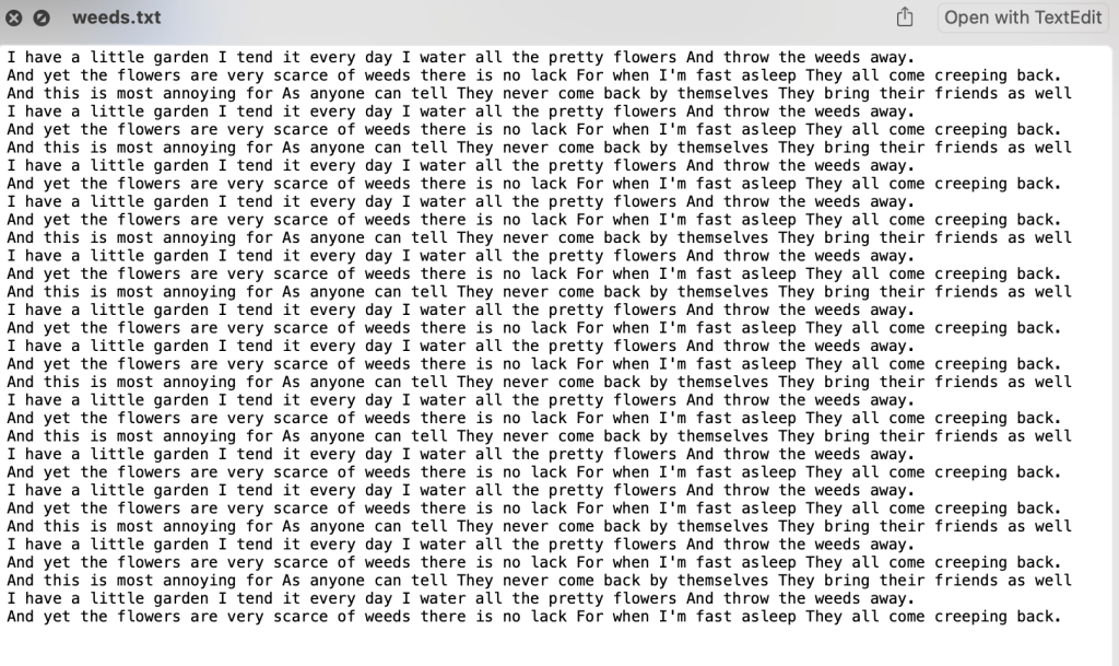
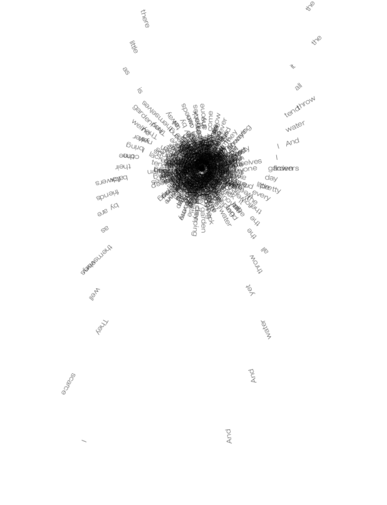
My supporting statement as well as the poem used, I had to repeat the poem multiple times in order to get the right amount of text necessarily fit the screen.
My piece in the flesh in the Reid. I really enjoyed seeing my work in a installation setting, its something I’ve never really done before, I’ve had my work up in college before but to actually see people enquiring about my work and having a shot on the box to manipulate the words was brilliant. It’s something that I think Ive almost feared in the past but with the amount of work I put into this I really just wanted to get it out there and it felt so rewarding, I just wish it was there for longer because it felt like just as we got it set up we had to go. I suppose It’s just the result of having it linked up to the laptop but it would be interesting to use some sort of mini pc in order to not have my laptop connected up. I also really wish I took more photos of it in the Reid the timing just wouldn’t allow for it, however it did actually look better set up in the studio as the lighting in the Reid wasn’t the best for projection.
