Initial Thoughts
For Design Domain this year the theme is Materiality, I feel like this will be an interesting theme to explore, especially in the realm of analogue vs digital and how they can work together. I also found the idea of immateriality interesting by using light etc to project or visualising something that may not always be visible.
In terms of the talks, I did find them interesting as the main theme was sustainability and using found materials, although I don’t particularly see myself dumpster diving for my materials I think it would be good to keep an eye out.

(im)materiality
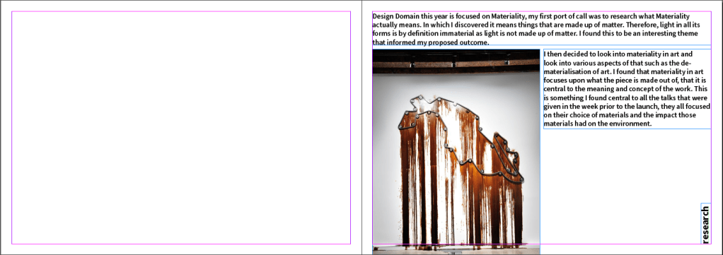
I looked into the actual definition of materiality, that being something that is composed of matter. Therefore, light is immaterial as it is not considered matter.

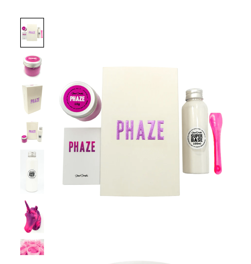
I like the idea of using light (immaterial) to impact change that exists physically (material). Using things like Stuart Semples SHIFT or PHAZE colour changing paints, these are both heat reactive and will potentially react to the heat of people in the room.

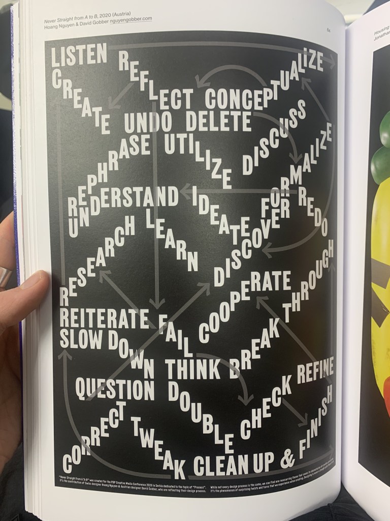
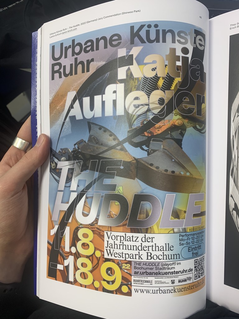
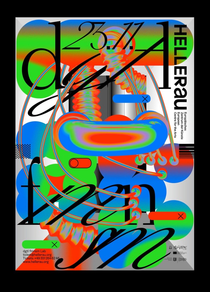
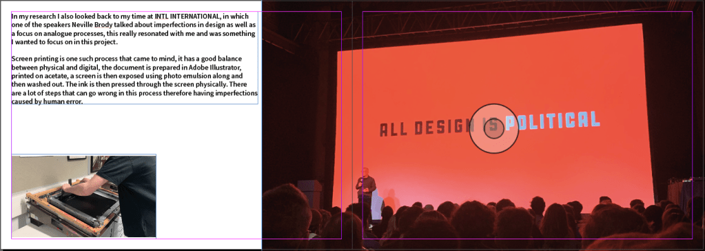
Last week, I went to INTL INTERNATIONAL (previously Graphic Design Festival Scotland). It was very insightful and I found it very inspirational in terms of creating and designing. There were some very interesting posters on display as well as the talks being inspiring with the creative process, displaying hardships and struggles that come with being a creative.
One of the main speakers was Neville Brody, with his talk mainly focused on the analogue process of design, a very much “back in my day” style of talk but inspirational none the less, theres something to be said about the physical process of designing and imperfections that really resonated with me.

(im)perfect
I explored this idea of imperfections in design in first year for Co-Lab, exploring the punk DIY aesthetic.

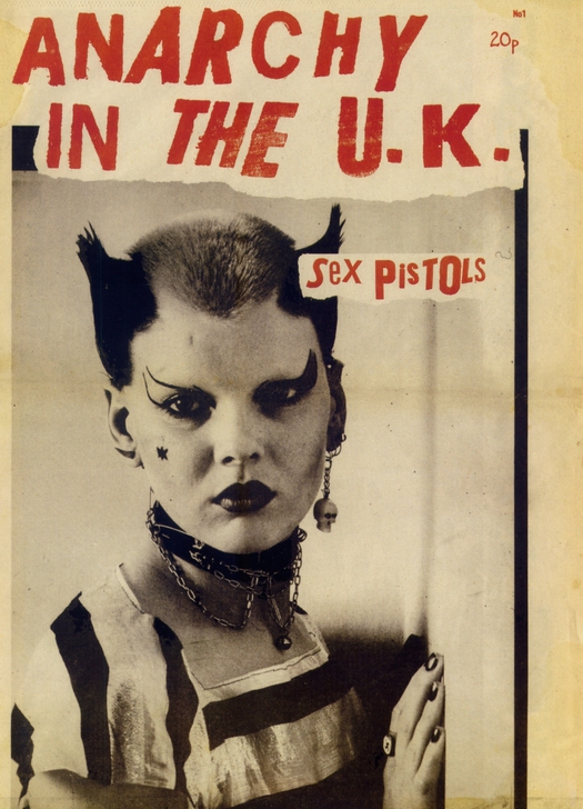
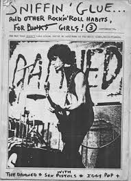
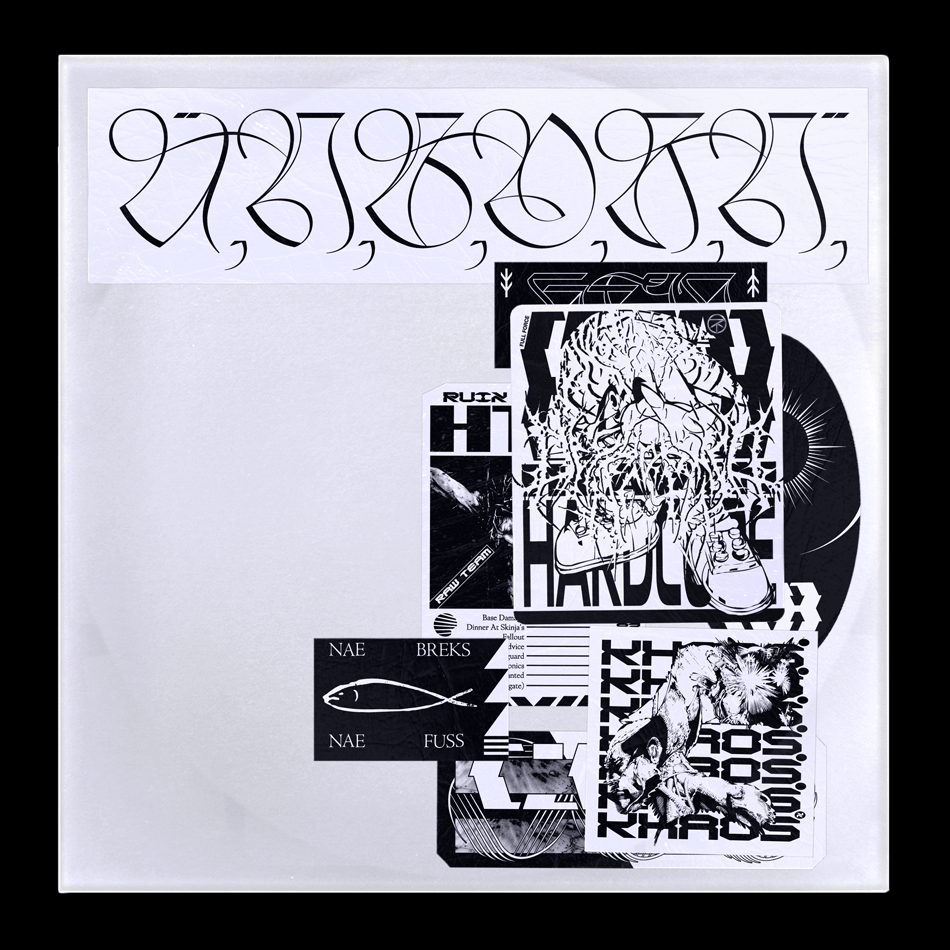
I looked into the sniffin glue fanzines with its collage appearance and hand drawn text it screams the idea of imperfections. With squinty misaligned text it fully conveys the idea of punk and then some
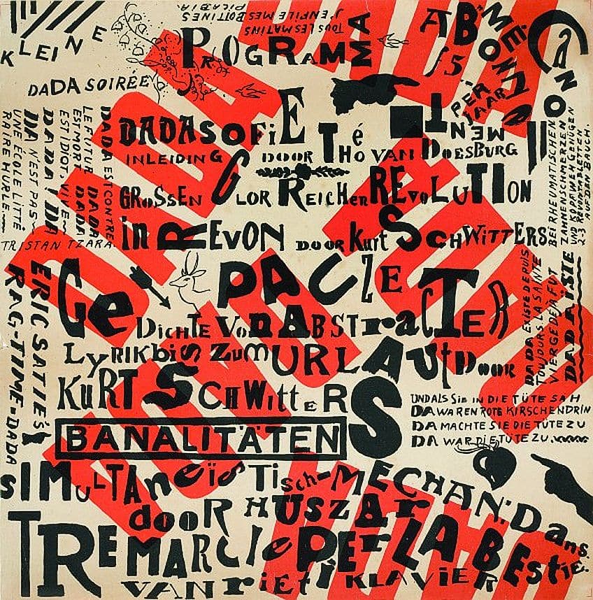
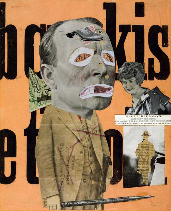

Design movements like this have lived on throughout recent history, especially with things like dadaism and montage.
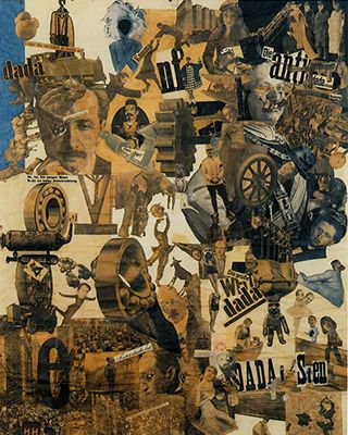

I would like to think that if I was about during this time id be aligned with the dadaists.
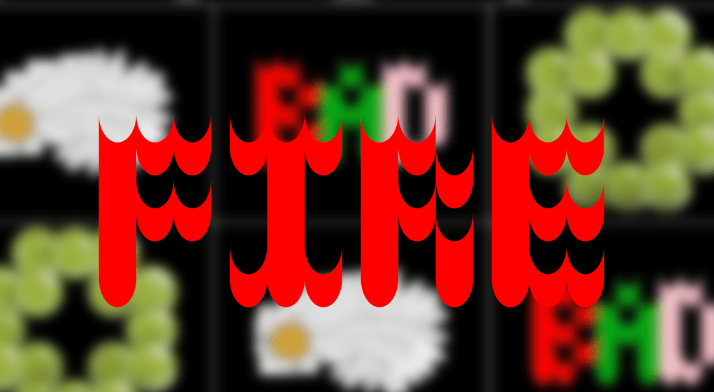
In more modern times, this trend lives on in Anti- Design, a style I appreciate deeply. With a sensory overload of colour, scale and typefaces, whats not to love.


Like all counter culture things defined by their seeming lack of rules, theres a rule book.
I think theres a real charm to movements like these, especially when at this moment in time design is extremely function focused. Logos are slick, easy to read, look good at various sizes, essentially vector icons, websites are 3 columns and very rigid, the worshipping of the grid etc. However I do not discredit this work as I believe there is a place for everything.
https://fkwartin.medium.com/anti-design-what-why-698bff0d4c9d
I found this article very interesting, stating that after the world wars it was artists job to help build the world back together, modernism came with a cleanliness that during the 1960’s cultural revolution was eventually seen to be a front, covering up corruption in the world, anti design rejected this facade embracing irony and intentionally designing / making things that go against any sort of pre established values. The site uses https://metahaven.net/ as an example of modern anti design, using clashing colours and cliches to express the same intent. With its talk of the role of designers in the world, especially in these times of struggle, it makes me wonder what our role will be as designers / artists especially with the financial crisis over everyones head.
For me I feel the best example of this I have seen recently is the website and work for atelier brenda, the website is deliberately difficult to navigate with work being displayed with very 90’s\y2k transitions between the work.
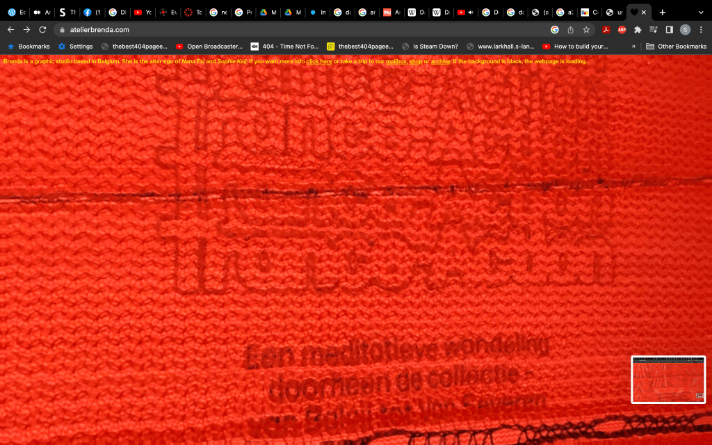
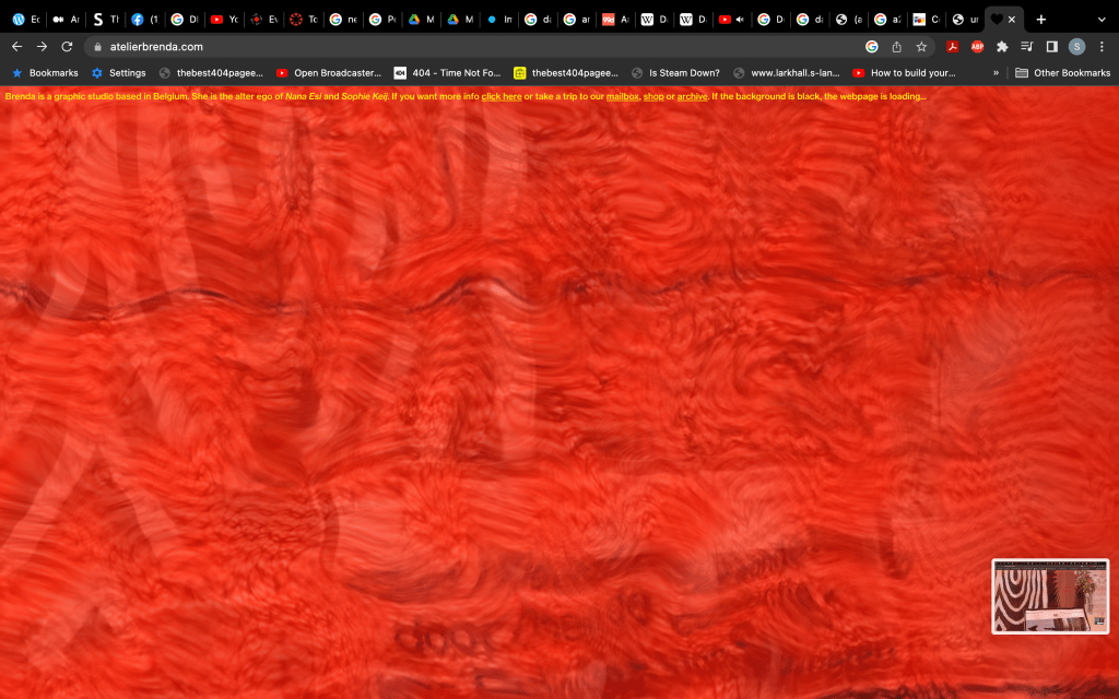
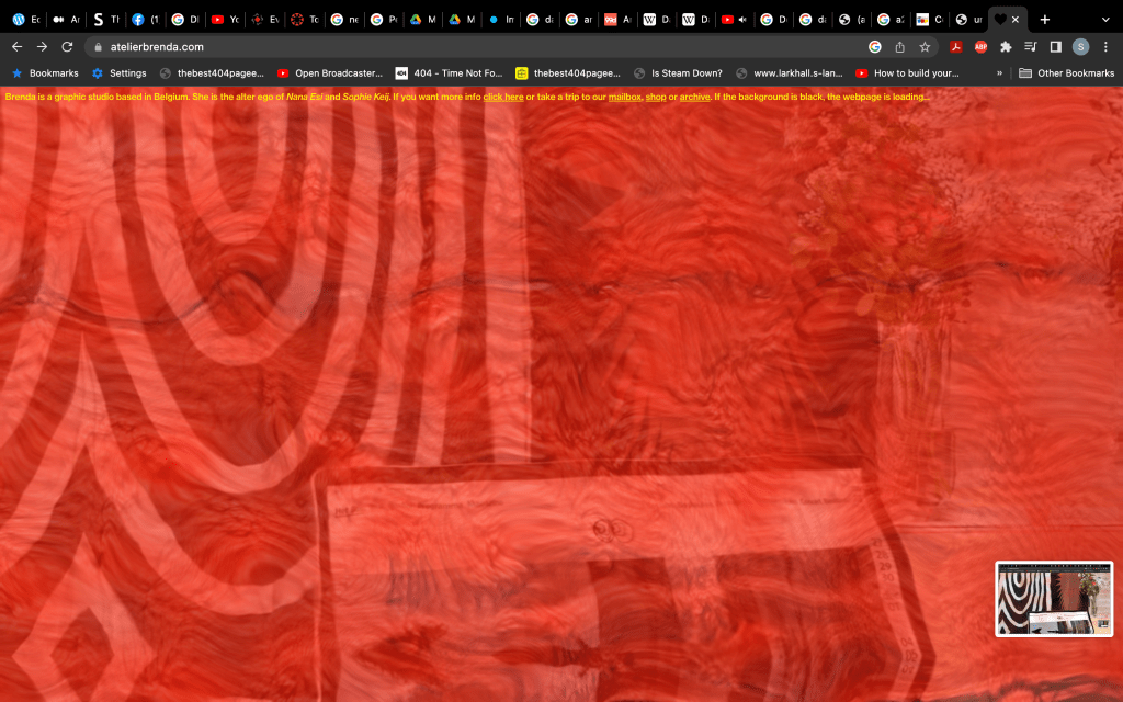


Its hard to show but even the cursor for the site is an animated heart, it very much gives myspace / 2014 tumblr.
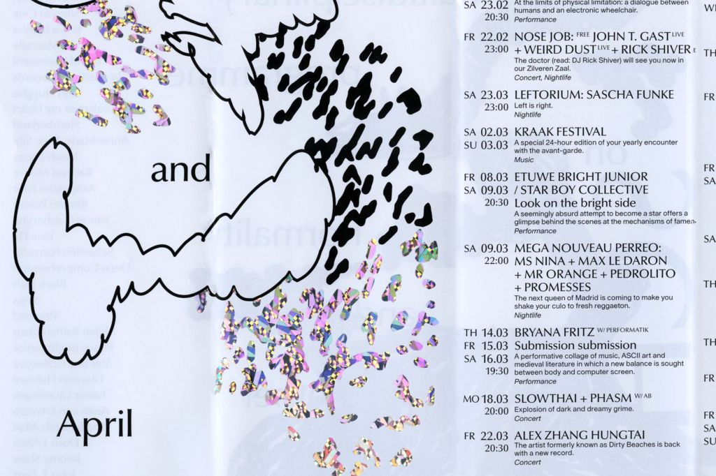
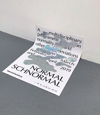
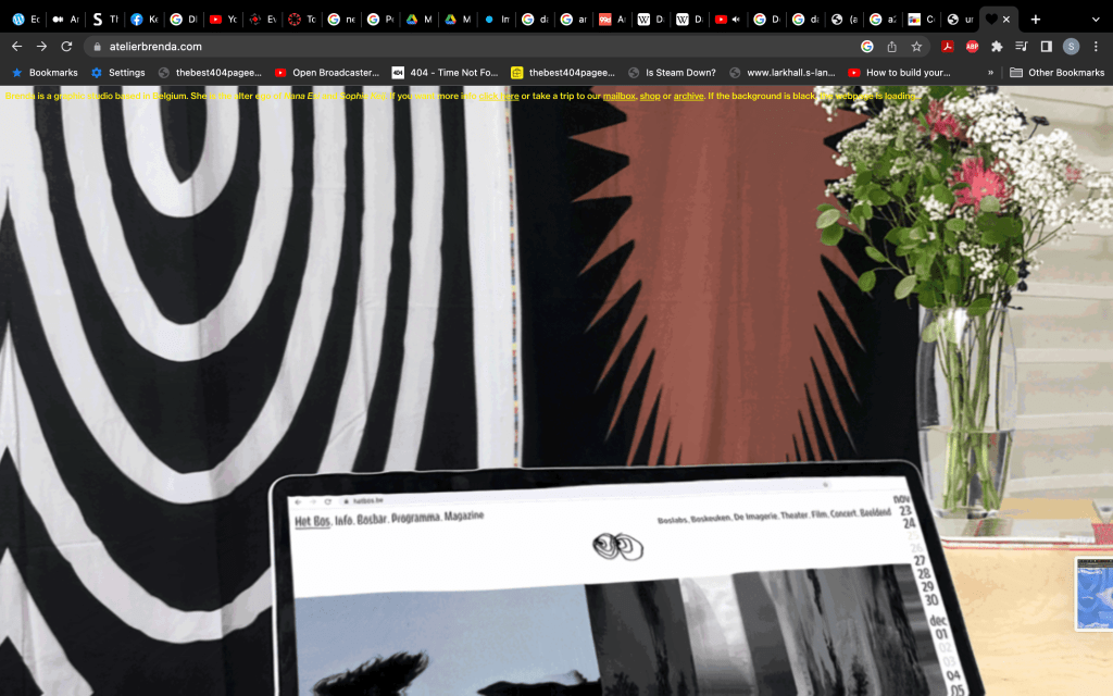
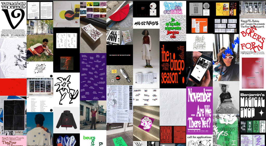
Their work for Normal Schnormal very much fits into our idea of materiality, an inclusive event at the beursschouwburg thats branding changes every 5 months, to reflect this constant change they conveyed it in their materials, using reflective paper throughout their posters.
I also looked at this article https://medium.com/@erjlee/imperfection-nostalgia-1a66cc3fbe37 , that details the nostalgia of the imperfect through the lens of photography, it focuses on the writers relationship with their equipment, detailing that the imperfections were what they were used to seeing when they were younger, so therefore they have a nostalgia for things such as the dust being on the scans and things being out of focus. It seems to be that there is a nostalgia to the process, the article details going to collect pictures that were developed and it was a surprise when photos turned out well that it was almost an event.
At this point I started to create my padlet, this has reference to my desired final outcome in part 2, I had the idea to create a series of posters, one digital then two physical each showcasing the material and immaterial. https://glasgowschoolofart.padlet.org/smarshall217/96lrkda5c0fcs018
Experiments
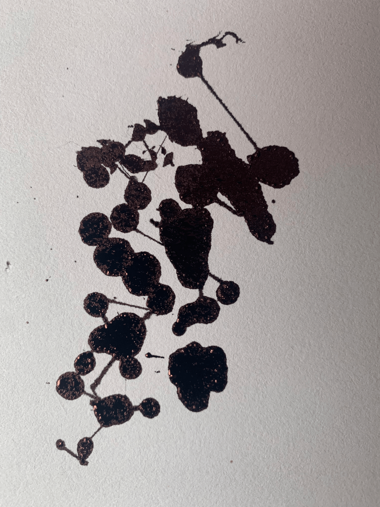
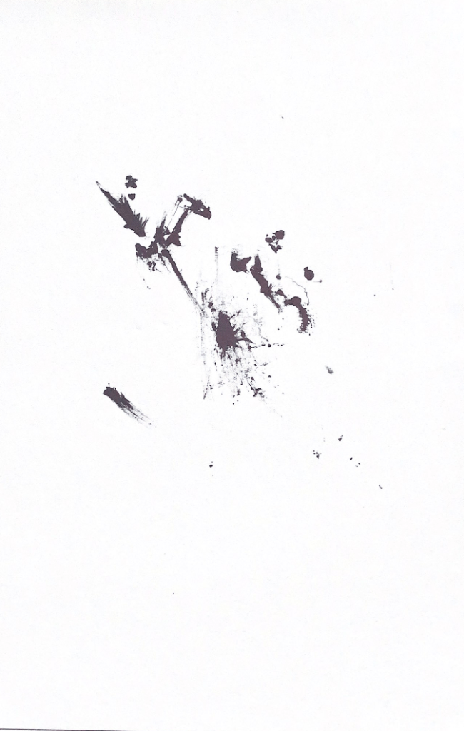

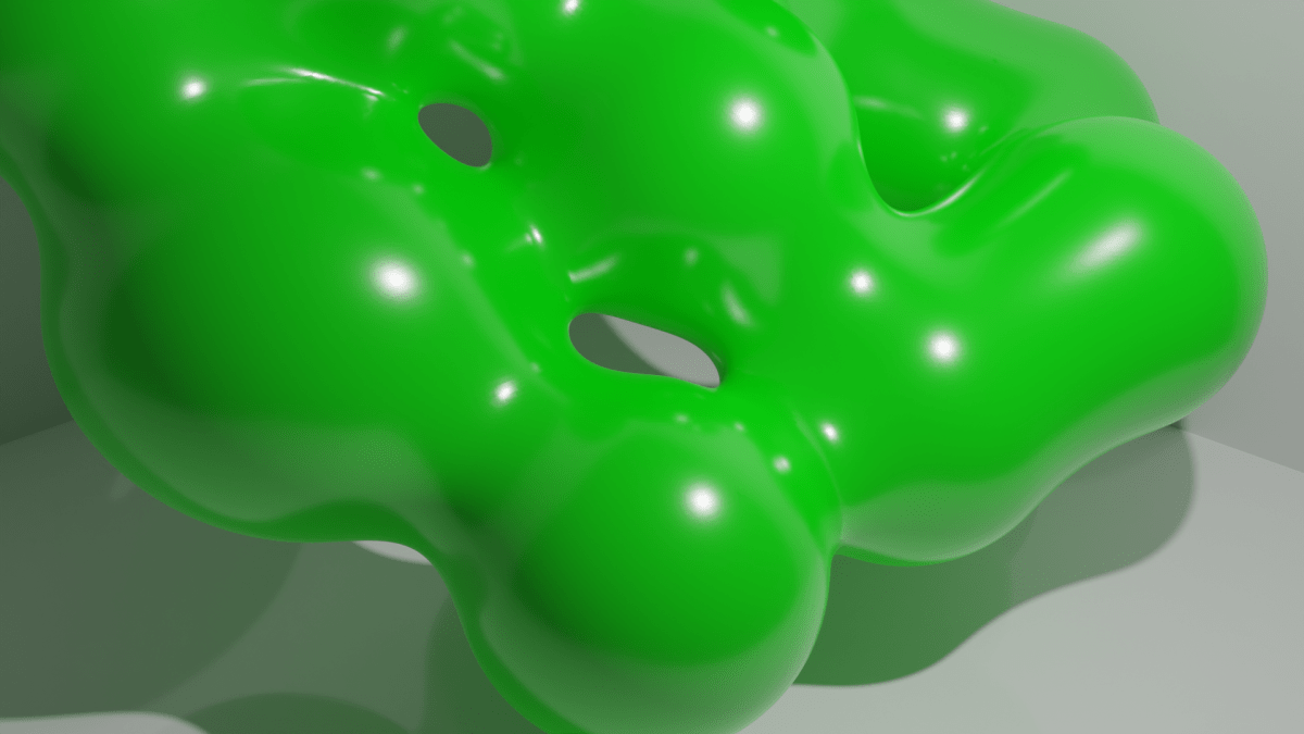
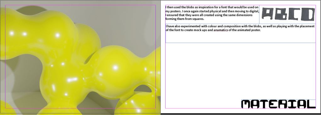
I have decided to pursue both analogue and digital forms of experimentation, I have made this animation focusing on organic forms morphing from one another. I took inspiration from dripping ink on a page to create metaballs, this was something I wanted to include in my final.
I have also experimented with lighting and texture using metaballs, I really like the idea of animating them in my poster similar to that above, it reminds me of non newtonian fluids, like corn starch mixed with water. This fluid is solid when impacted hard and soft when something passes through it slowly, it inherits characteristics of both a solid and a liquid in a sense that it takes the shape of a container but is at first hard to the touch.
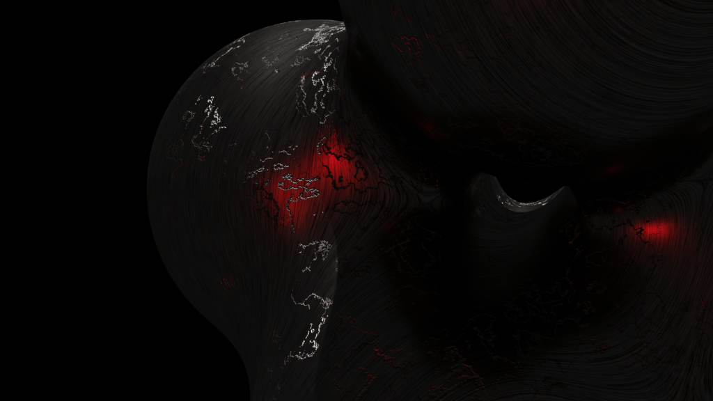
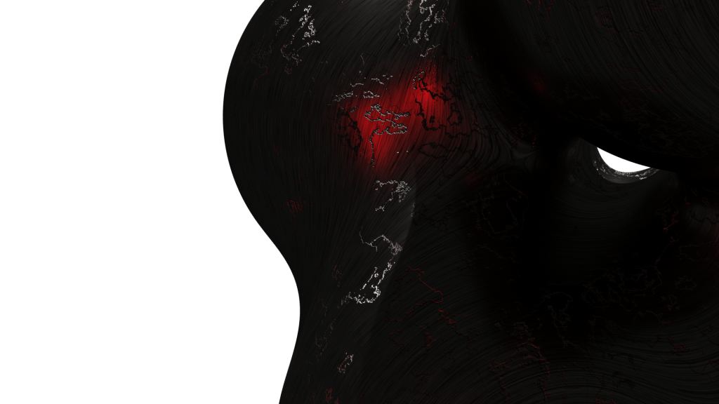
I have however decided to stray away from the dull black and metallic and go for a more shiny plastic texture.
Looking at different album artwork I was inspired by SOPHIEs approach of having a white background with just the plastic slides visible.

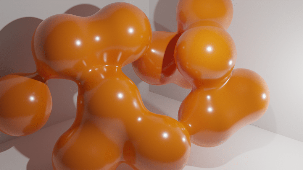

Im a big fan of the clean plastic feel of this render, I was going to experiment with C4D as well but I feel like blender is the quickest way to work at the moment. Using colours like yellow, orange and green for the metaballs to morph through, creating the idea of these manufactured materials. I also took great care in crafting the look of the materials, actually receiving the feedback from people that they look real and haven’t been computer rendered.
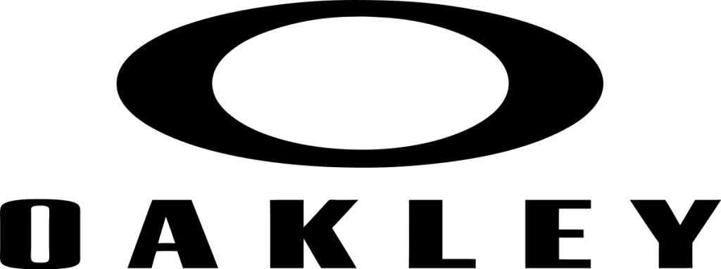
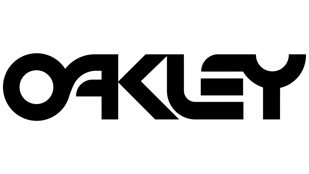
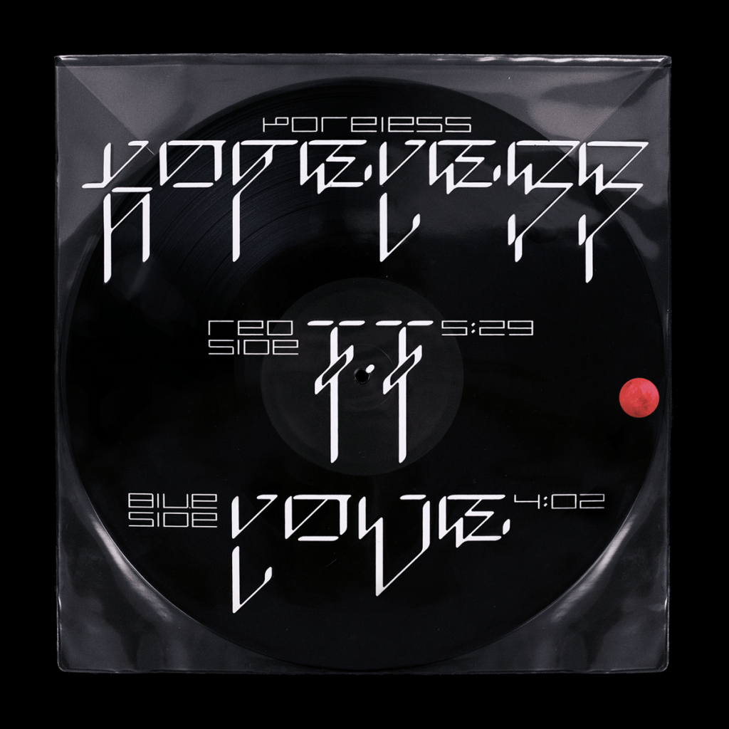

I also started experimenting with generating my own lettering, I took inspiration from brands such as Oakley, designers such as David Rudnick and Nam Huynh. I loved the blocky letterforms present in the Oakley branding, the stretched and curved form of the O inspired me greatly with the creation of my letters.
Even taking inspiration from their products,

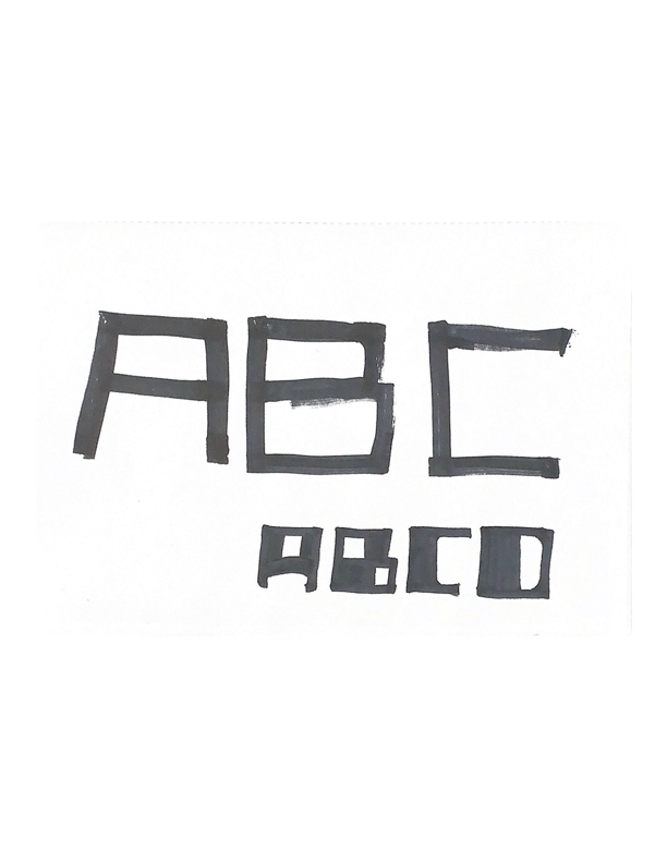
Using thick black markers to create the letter forms then taking them into the digital realm to tweak them and develop the rest of the letters. I wanted to keep the forms from the ink splats and the metaballs etc. I found it helpful to continually re write the word just to keep myself right.

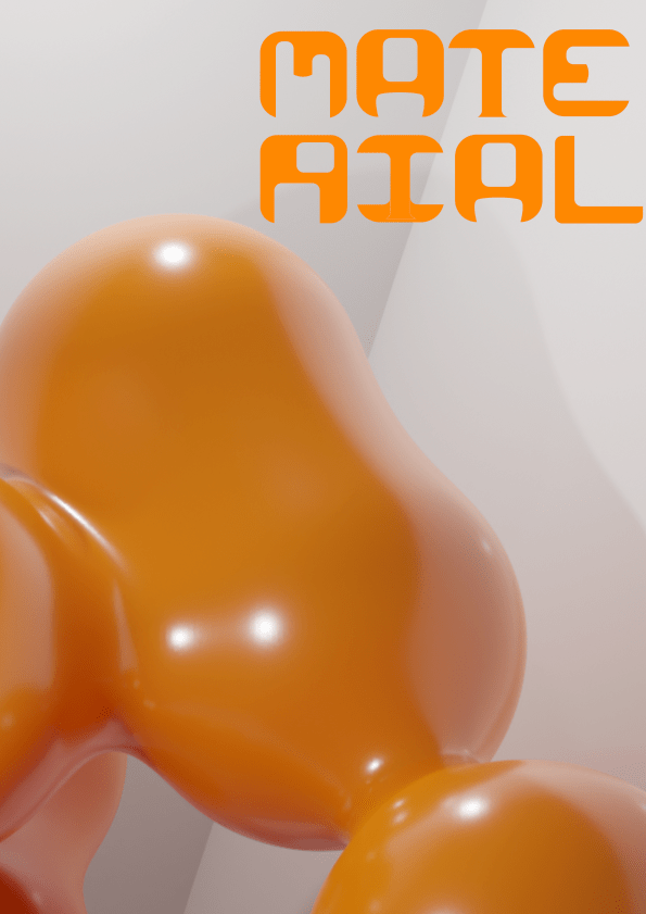

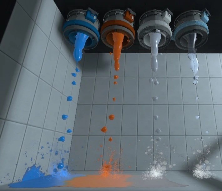
I then used the font implementing them with my renders to mock up stills for the digital poster. These are zoomed in parts of the larger metaball sculpture, I feel like including this in the liquid like animation will pair very well together.
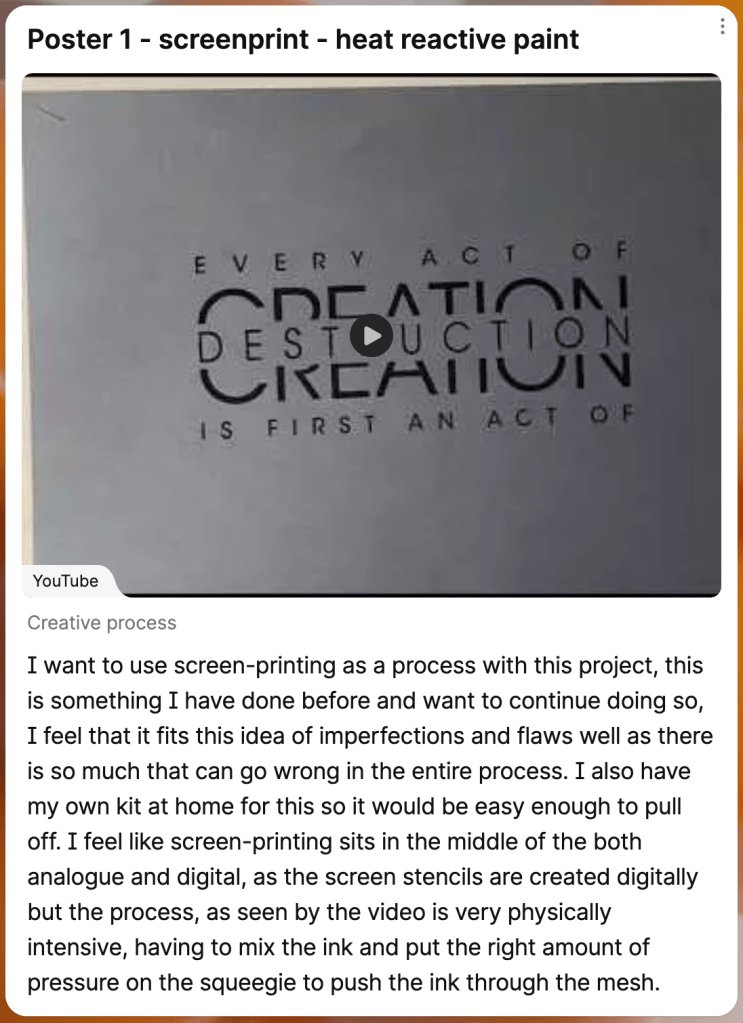
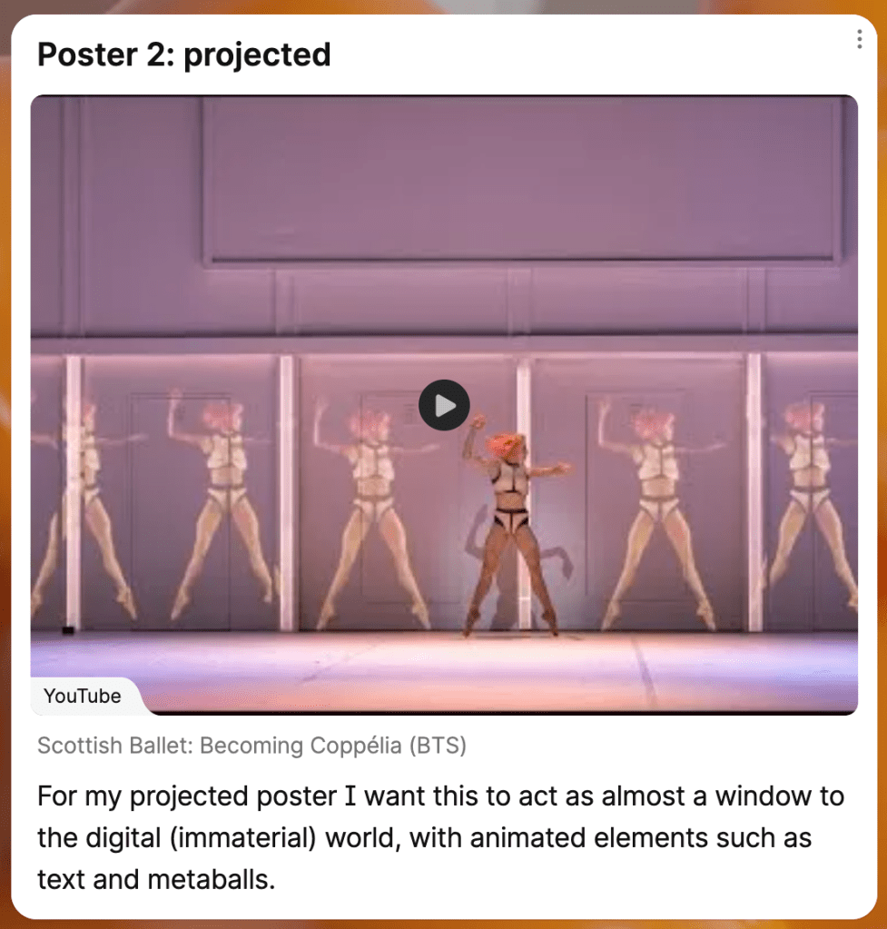

Screenshots from my padlet detailing what I want from my final, with 1 digital and 2 printed physical posters.
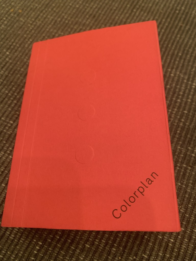
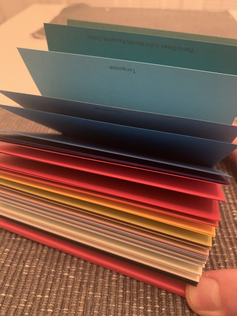
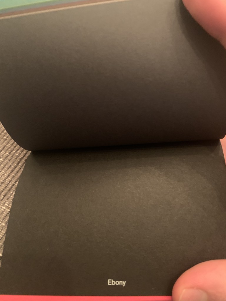
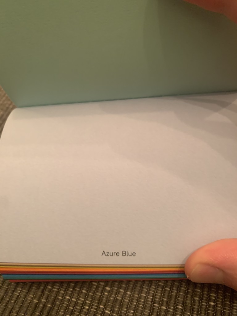
I also sent away to GF smith for a colour plan book, with some extremely interesting colours and textures, these will all be considered on the run up to DD part 2


Proposal
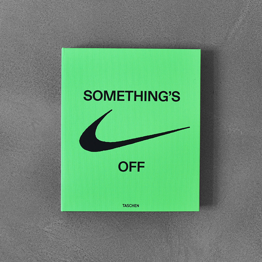
For my proposal I wanted my proposal to follow the general theme of the rest of my research and dev. I took inspiration from anti design, especially Vigil Abloughs book, “somethings off”.

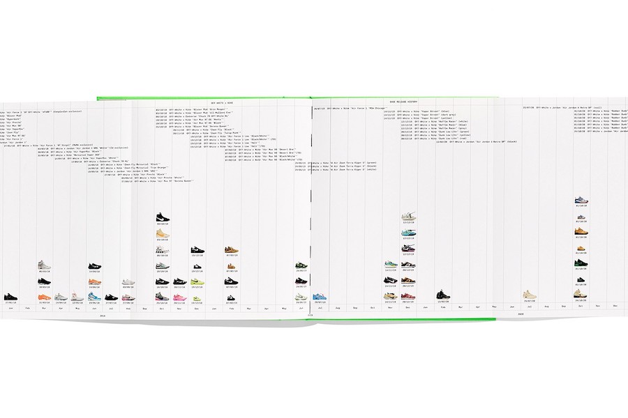
I found the cross page spreads really interesting, especially with having the text go across the page, this isn’t something I want to do for now as it still needs to be a readable professional document, but it is something I want to focus on.
I took key images from my research and development in order to create the visuals such as images bleeding off the page and across the page spread to immerse the reader in the information and work.
Open Studios
For open studios I created a mockup, using blender I animated the metaballs to create a fluid and organic motion, I feel like this really emphasises the digital realm as it is something that can only really be created in 3D software. I created this render to be the size of an A3 sheet of paper, however this wasn’t really needed as I was displaying on screen, however, I thought it would have been good to do.
The animation reminds me of the slime from portal 2.

This work will be displayed along side my proposal to give viewers the idea of how the final will look.

I feel like this proposal does well in showcasing my focus on materials as well as my look into the digital world vs analogue. I wish I had got more time to create mockups of the physical posters but the digital was the most feasible in the time we had, however I am happy with my explorations in mark making with different mediums, charcoal, ink etc.
