For this project, the first week anyway, I have been isolating with covid, its really been causing me bother but I am hoping to get on with this project as normal as possible.

Using my covid isolation as a sort of springboard for inspiration, at first I wanted to use a database of steam games, however the file was massive and wouldn’t do me much good.
Also not a .csv file so unsure how that’ll work.
I then went into the specifics, during my first time having covid I played A LOT of videogames, specifically League of Legends and Rust. I looked at some Lol datasets however they didn’t really mean much having things such as player account ID’s maybe not the best avenue. However, that left Rust. My friend linked me a youtube video last night of people doing a “code raid” on a base, a usual brute force method in which players attempt to guess the codes on peoples bases. However the people in the video had this csv file. This video also contains some pretty blatant racism, not from the creator thankfully, which is quite on topic for the subject of my DHT essay that I am writing.
SecLists is a security testing tool with lists of popular passwords, digit codes etc.

I have also been playing wordle, not a lot to be fair, I tend to give up if I can’t get it but a lot of my friends and family have been playing it also and its a good way to keep in contact and always have something to talk about in these trying covid times.
https://web.archive.org/web/20130409083826/http://textexture.com/
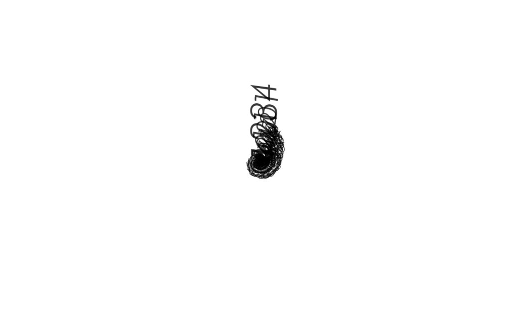
I have decided to go with the 4 digit codes as I feel like it means a bit more to me and I can do more with it.

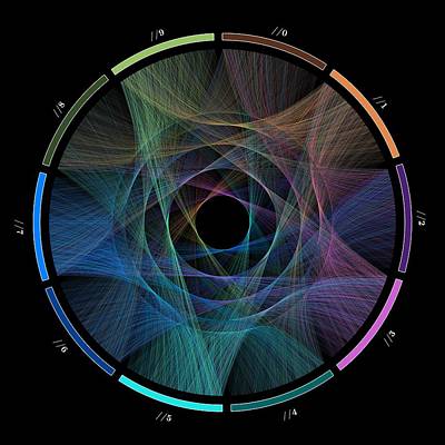
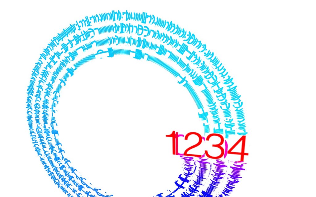
I have constructed with the help of Paul a simple way of visualising this, with the text lerping between the different values of the codes, with the scale displaying their frequency of use while their rank in the top 10000 are displayed

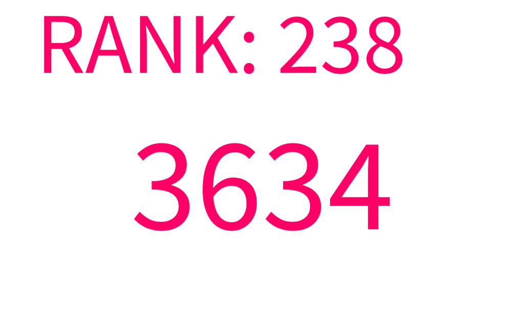
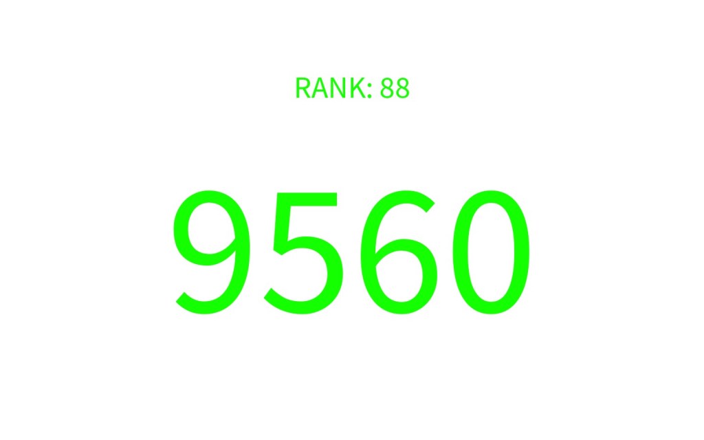

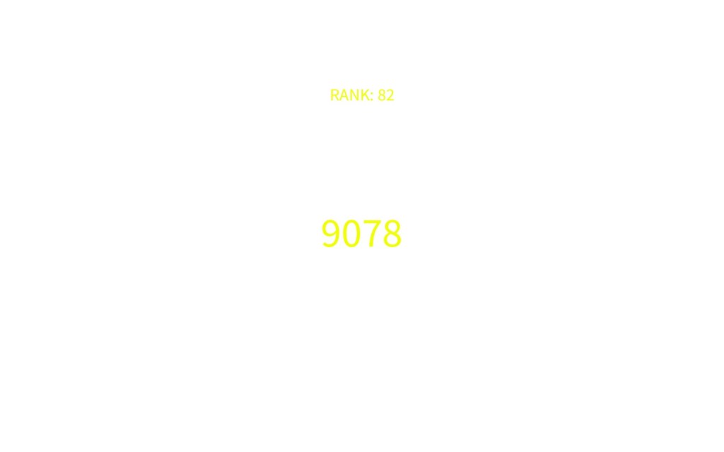

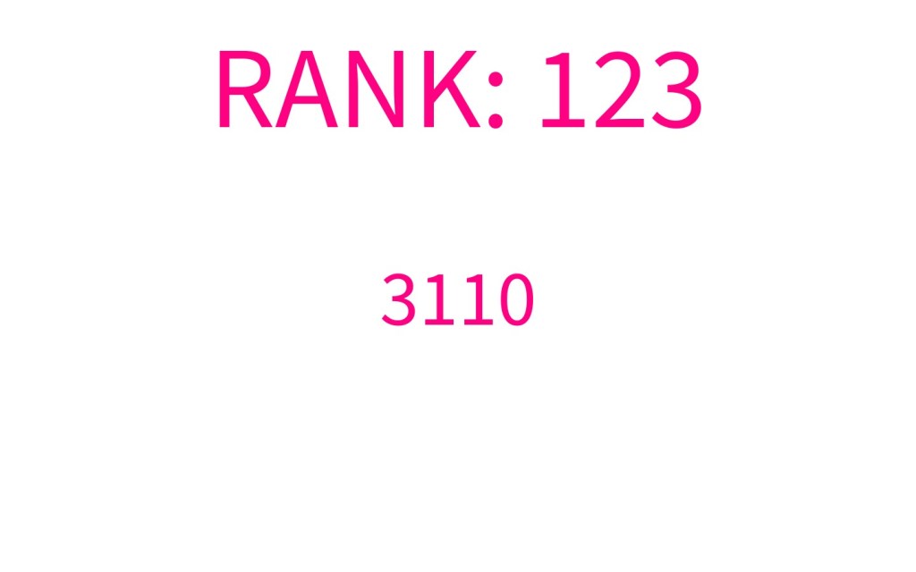
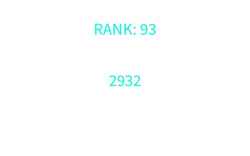
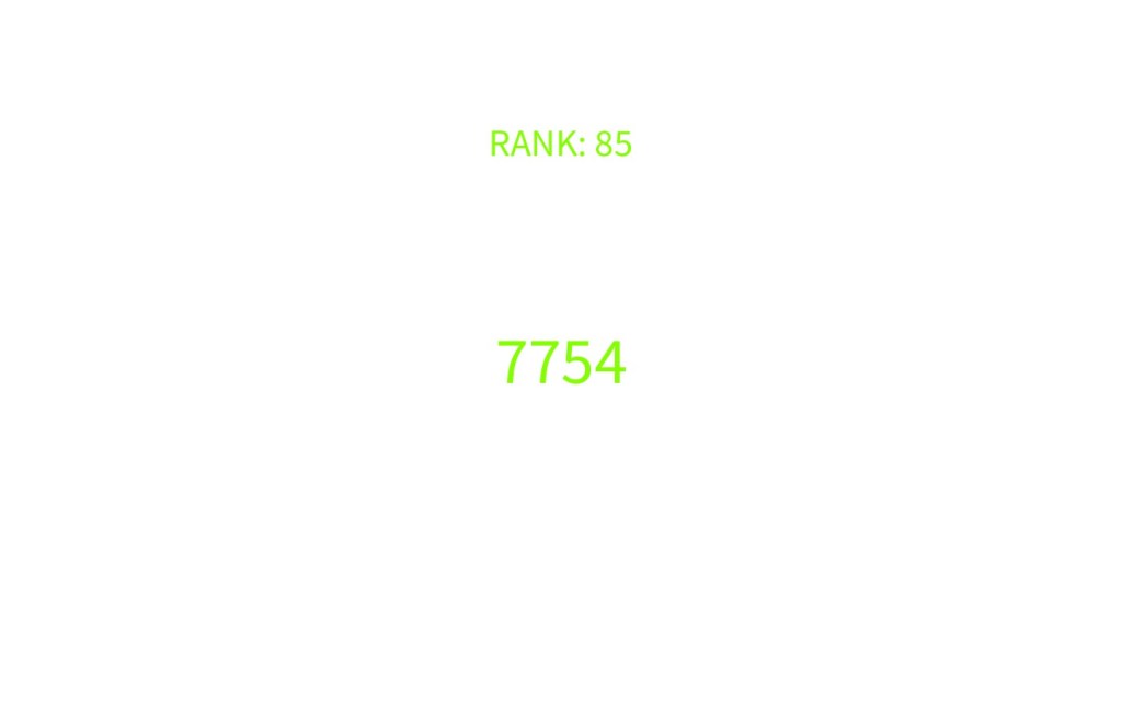

I then implemented my own code and scaling of the text to go with the ranking of frequency used given in the csv sheet
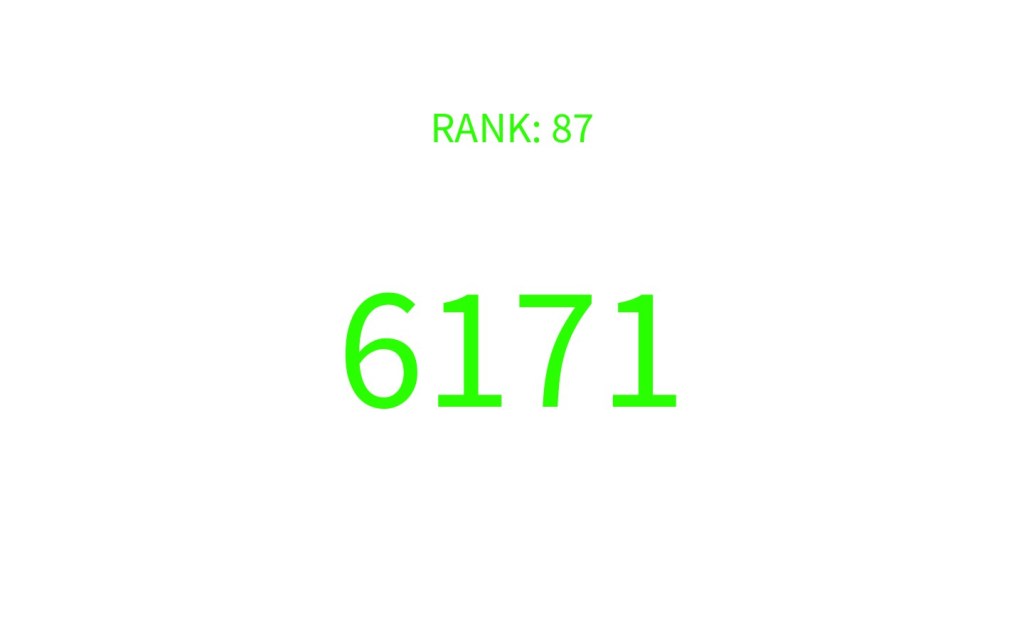

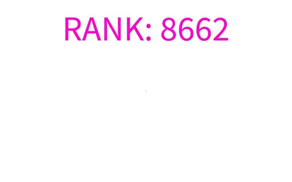
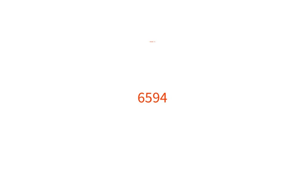

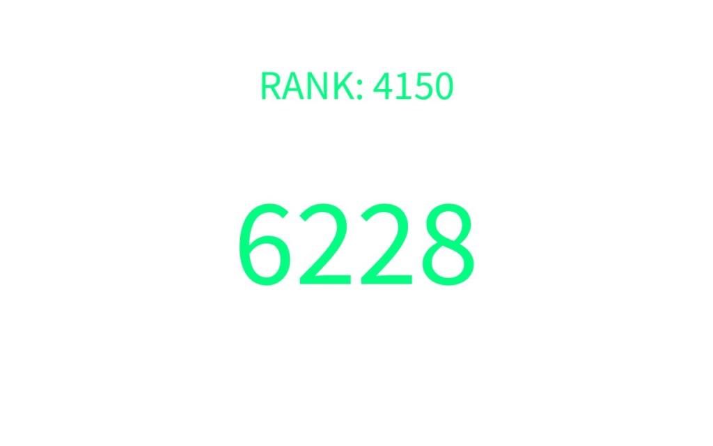

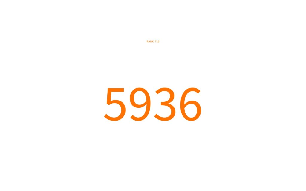
Then for the rank section I changed it to their actual placement in the top 10k. I feel this flows better with the format of my data being able to show the data intentionally obscuring the rank of the less secure numbers and obscuring the rather nefarious. I did this due to my initial inspiration, in wanting people to choose these more common codes.
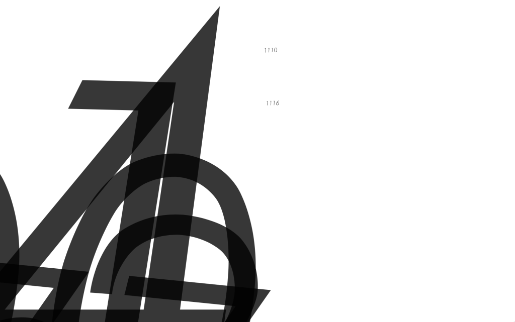
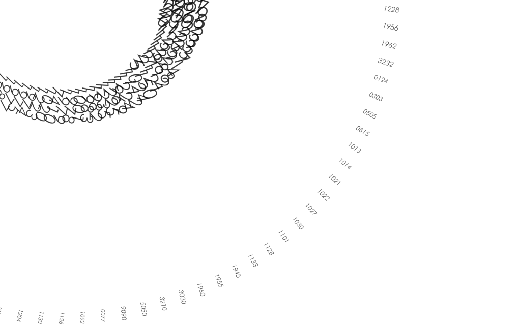
I then decided to take a slightly different approach to another outcome. I decided to try and display all the numbers at once, using scale to display their popularity as before however you can really compare their scale. When the things are all together it also creates a bit more of a visually pleasing outcome. The red of the HSB also comes in handy to try and reflect the danger and chaos of having one of these larger passcodes.
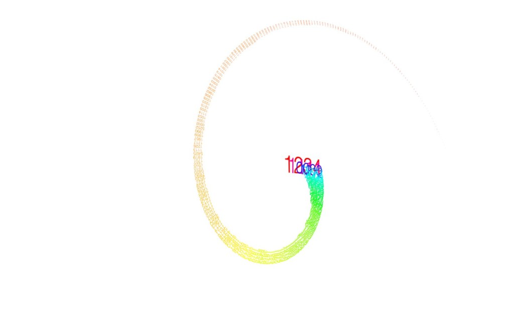

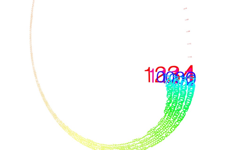

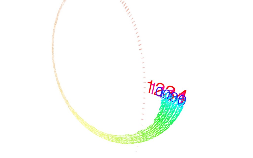
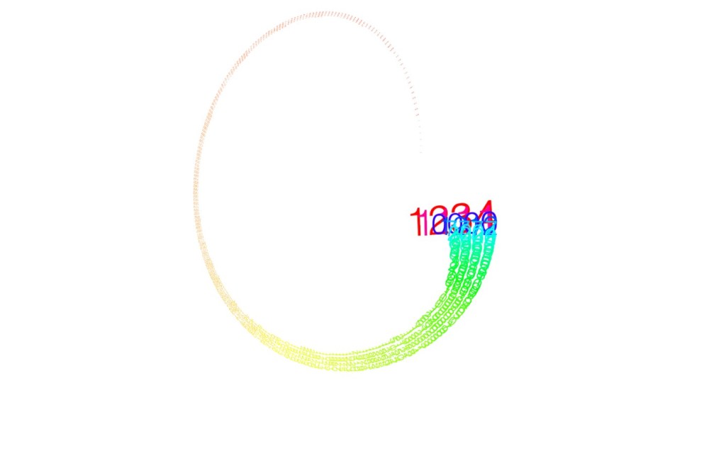
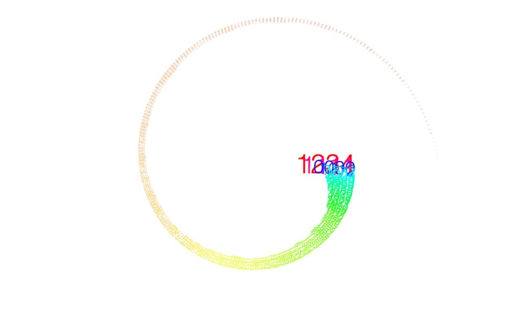
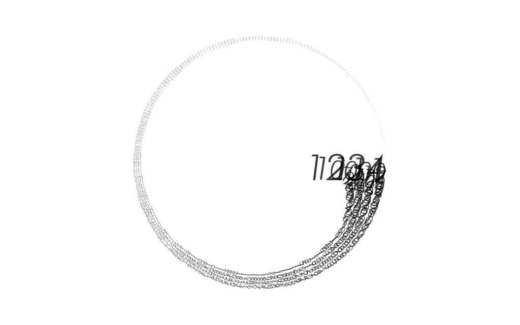
Sadly however the 10000 didnt really fit into this sort of format. However this is one of the best ones I came out with using all 10k.
As can be seen it is too cramped and barely legible. Im sure given more time it would however, due to outside circumstances (illness due to covid and the DH&T essay) I couldnt refine this as much as I would have liked. However I did enjoy the interrogation of this one, users can navigate using the features of peasycam. I also decided to choose futura light for the font here. However, the reason I chose this was because I was sure that the rust code lock font was Futura but it just wasn’t and I didnt realise until too late.


I also wanted to be able to export this as a PDF, however due to some complications this was not possible. As I had the colour mode in the original set to HSB this did not translate well when captured as a PDF (would turn blue) and the 3D peasycam part of the sketch was clashing with the PDF renderer. I do however, love the detail that is captured here. I again wish that I could keep the 10000 entries, perhaps using a spiral continuing into the middle would be the answer to this, however, as there are only 250 in this current sketch, I think 10k is a bit too ambitious.
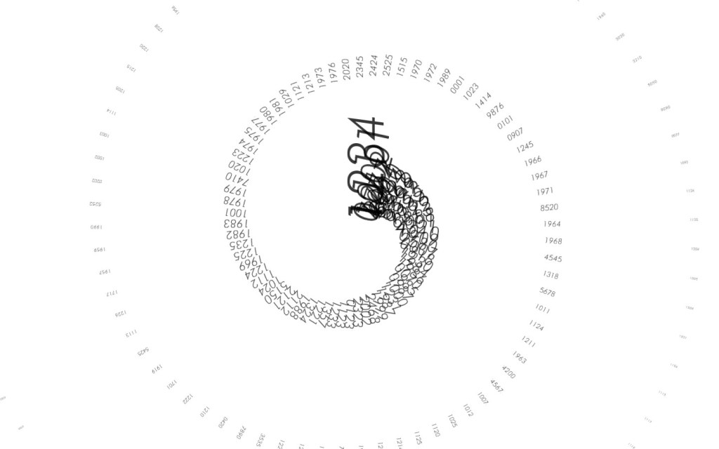

I then attempted this and still really liked the outcome, however, that is still only with 250 entries adding any more would ruin the look of the piece. This I feel represents data driven artwork rather than Data Visualisation, however you can still interrogate the work and see the data for yourself, perhaps if people see their password for their phone etc on this piece they will think to change it.

To achieve these I had to really combine some code and hack away at it for it to work, especially with the added pressure from the essay packed so closely to design domain, both summative assignments, and being a bit out of it from covid I don’t think I got to really realise this project fully, I know thats not the idea but I dont feel like I got to put as much time and energy into this project as I would have liked. However I am very keen to go back and touch it up in the places it needs for either open share or for the summative deadline in may.
I decided to incorporate the spiral into an animation. Even though this isnt to be seen as any sort of particular outcome I just wanted to use the frameCount to push the text along for a viewer to actually be able to see the more popular numbers, in the later part of the animation, the size of the text makes it seem as if the animation slows down and focuses on the numbers, an interesting illusion, almost reflects the frequency at which these numbers are used.
