For this brief we are tasked to focus on the theme “Being Human”. The brief was very loose as we just had to create something that reflected this theme and what it meant to us. The only condition we were given was to start using analogue techniques.
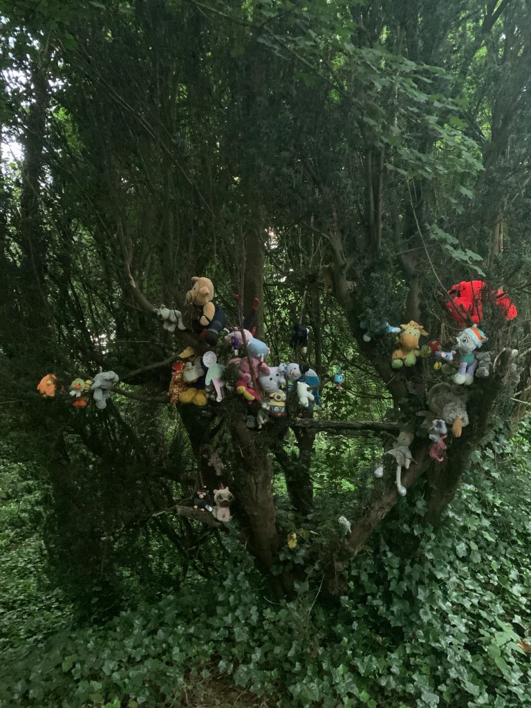
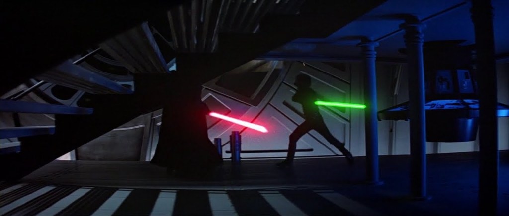
I started thinking about things that brought the theme of humanity to mind, over lockdown I watched a lot of films such as Star Wars to re live the nostalgia, it brings forwards the themes of humanity and family, especially in the final fight in episode 6 where Luke pauses before killing Darth Vader realising that he is on the road to losing his humanity and becoming more machine than man if he continues down this path. I also thought about humans impact upon nature brought to mind during a dog walk seeing this tree filled with stuffed animals, seems like a good idea until you think about the plastic etc, in the stuffing of the animals.
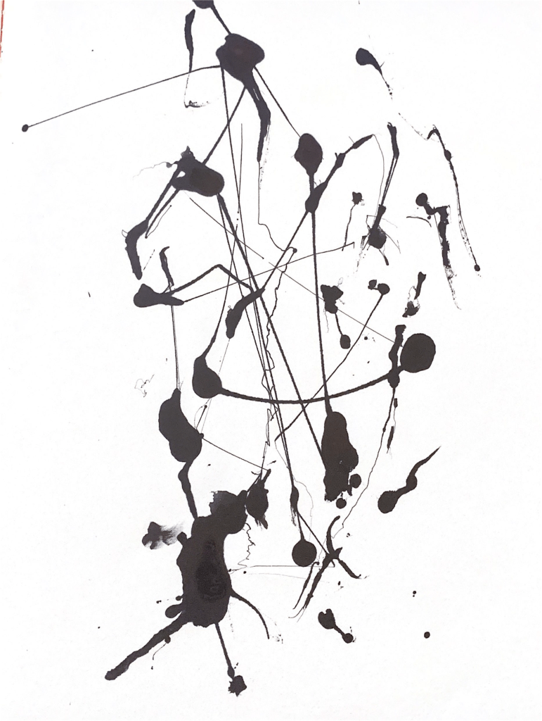

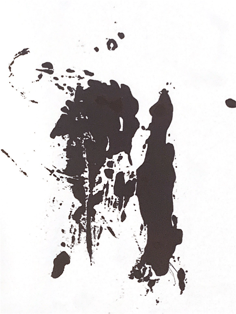
For my mark making I decided to start with something relatable for this I used a coffee cup staining paper as well as a pen bursting on paper.
I then realised after creating these that they are part of being human, its a mistake when your pen bursts and its a mistake when you spill coffee. I then thought more about human input etc and how that impacts the creative process. How there is a keen market for things created in analogue traditional mediums. Processes that came to mind were the printing press, it would leave a dent in the page of the paper it was pressed on and that was seen as a flaw but now the idea of embossing or debossing type is a design feature sought after to give things a more rustic feel. The same can be said for serif typefaces as the serif’s were parts of the chisel used to carve letters into stone tablets. I then started thinking of our strive for perfection in the digital world especially with design and type.
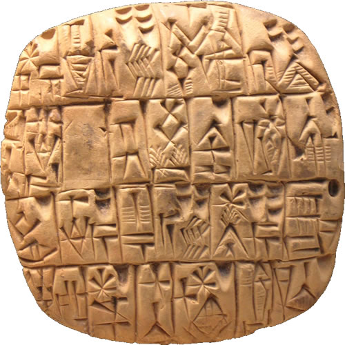
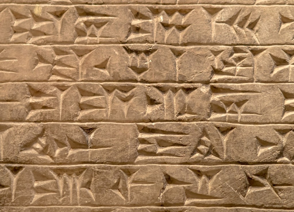
I researched ancient Sumerian type and how it was pressed into a clay tablet. This is widely noted as being the oldest written language.
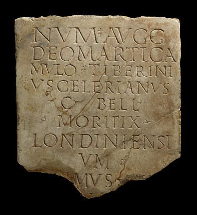
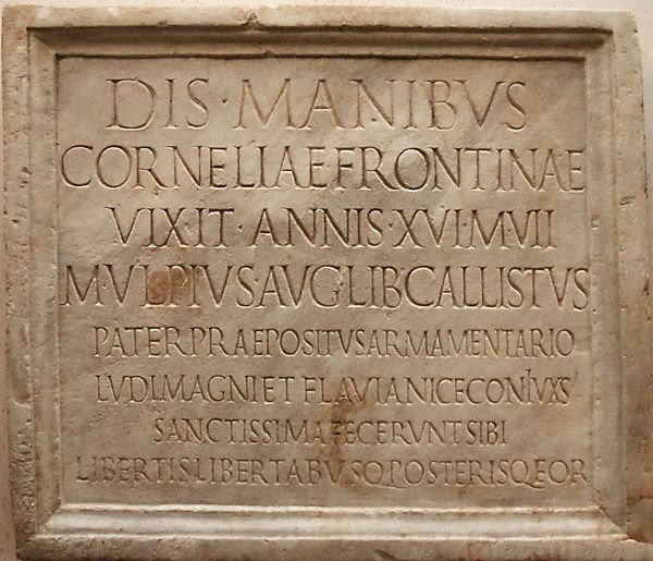
Carved Roman on stone tablets.
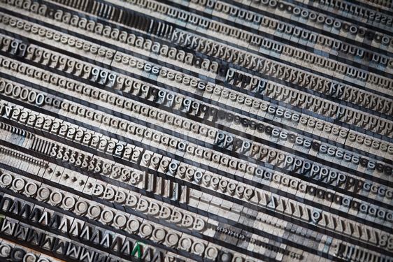
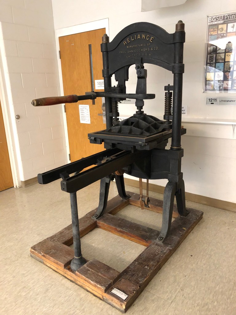
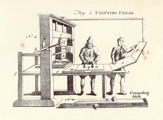
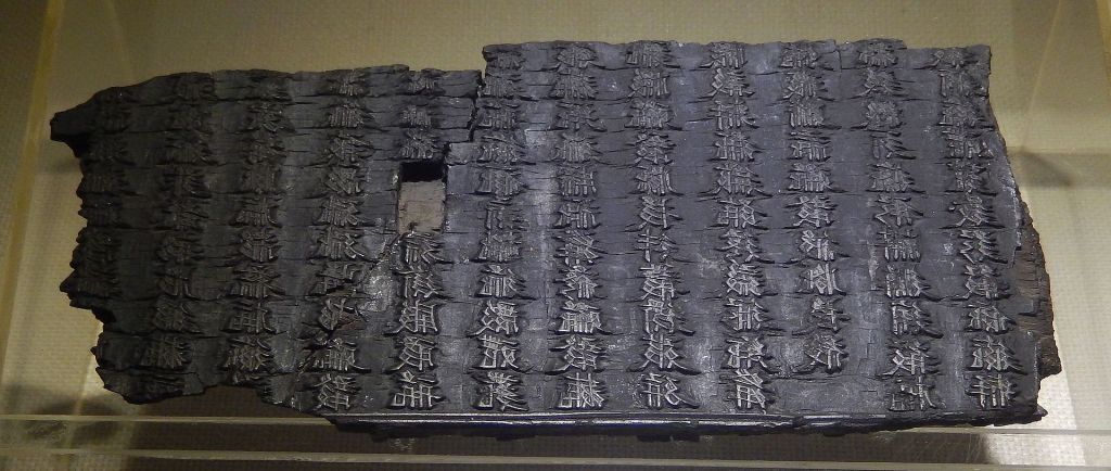
Researching the printing press including how woodblock printing was invented in ancient china in around 200 AD and was the first instance of printing to a paper medium.
This format of printing was later refined by using different metal alloys in Europe where our modern idea of the printing press was created.
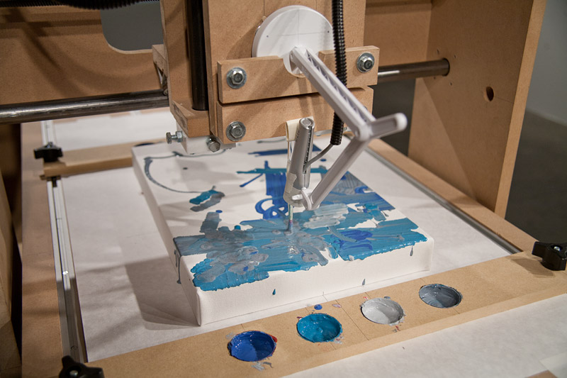
I also took this time to look into the Rhizome archive, this particular work took my interest. The Interactive Robotic Painting Machine, by Benjamin Grosser. It’s a robot that paints, however it is fitted with a microphone so that whenever it picks up audio from its surroundings, such as a conversation in the background or someone talking directly to it, it will be influenced by the audio and draw differently accordingly. It is intended to mimic humans listening to criticism and no two paintings are the same.
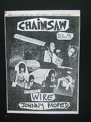

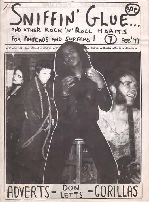
I also looked into punk fanzines from the 70’s as they have this hand crafted collage feel that is inherently human, flawed and very DIY. They were shunned at the time for being amateurish however their unique style is why people remember them to this day. I feel like the look of a flawed screen print also gives off this feeling of DIY as if the prints are flawed it is often done by hand, not using a machine.
I decided that screen printing is the perfect combination is the perfect combination of digital and analogue methods as to expose the screen you need the clear acetate print created on a computer but in order to get a perfect exposure you need to dry it properly, expose it for the correct amount of time, after that you need to ensure you have properly taped up any holes and apply the correct amount of pressure to the screen. If any of these are done incorrectly it can impact the final outcome of the print.

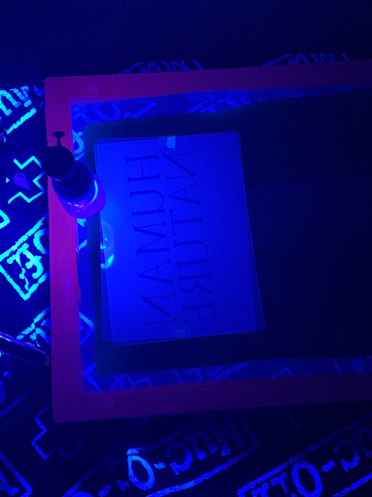
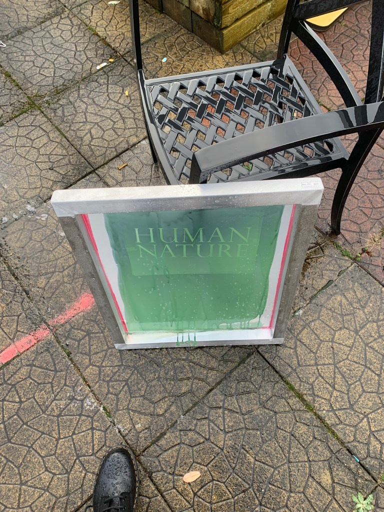
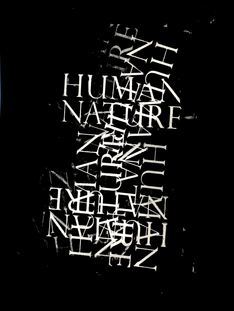
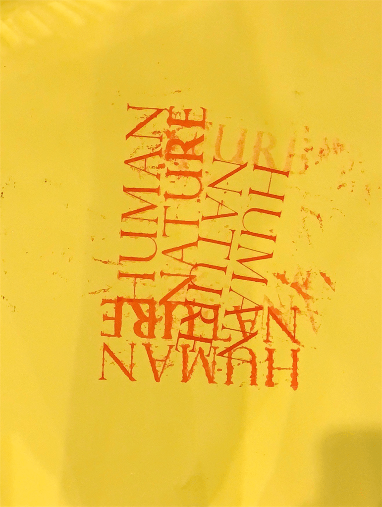
These pictures are a documentation of me creating my first screen along with some mistakes along the way. I decided to hammer down on the imperfections on print by repeatedly layering the type on top of each other in the “final” pieces.
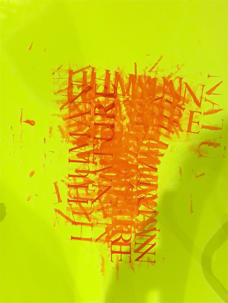
Creating these posters I wanted to experiment with the different stocks of paper on offer, such as a more glossy paper that the ink didnt dry as well into, a more textured paper so that the ink bleeds as well as regular paper for a better more “refined result”.
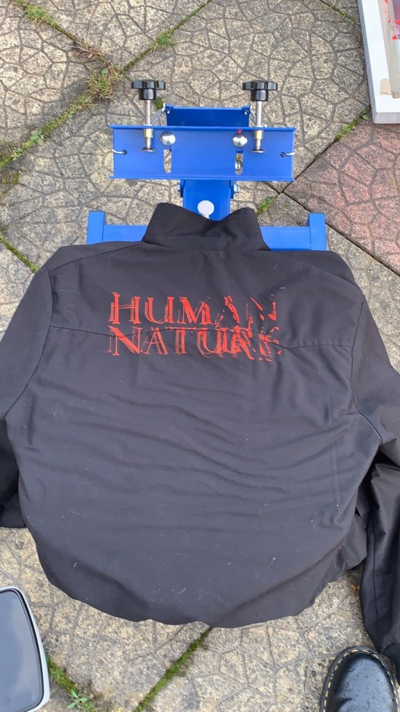
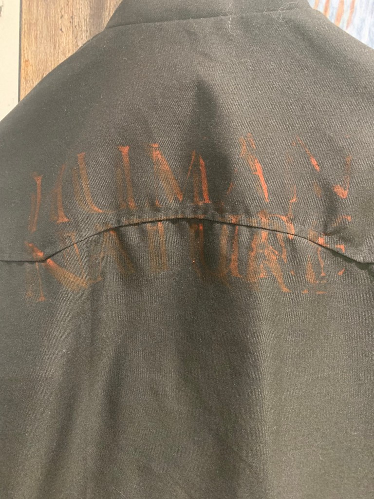
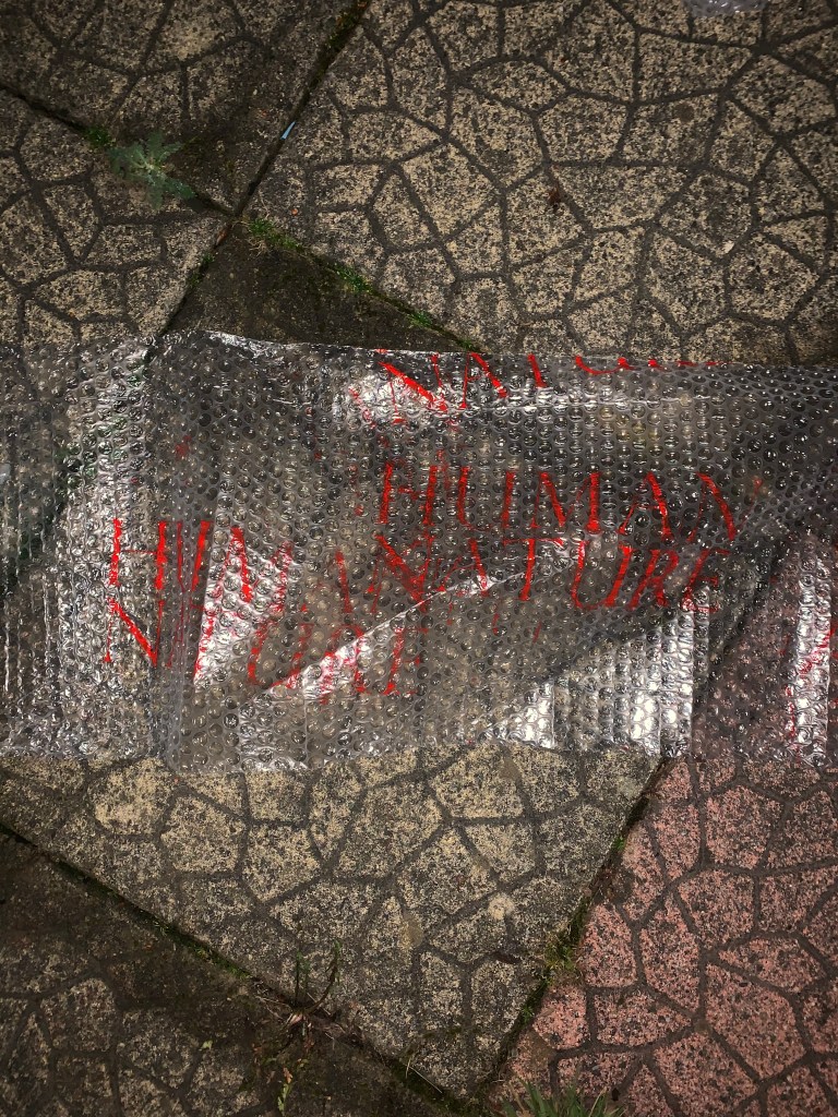
I also experimented by printing on a jacket and also on bubble wrap, however due to the paint drying too transparent on the jacket it didn’t turn out the way I wanted and the bubble wrap didn’t dry at all and washed off in the rain. However this again fits very well with my theme of human error.

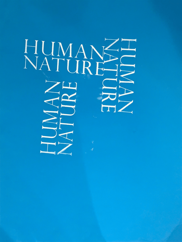
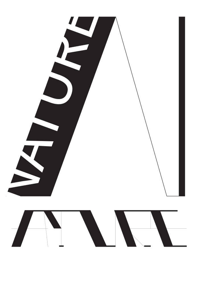
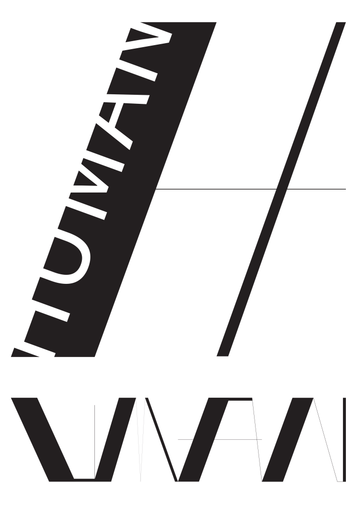
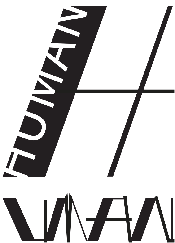
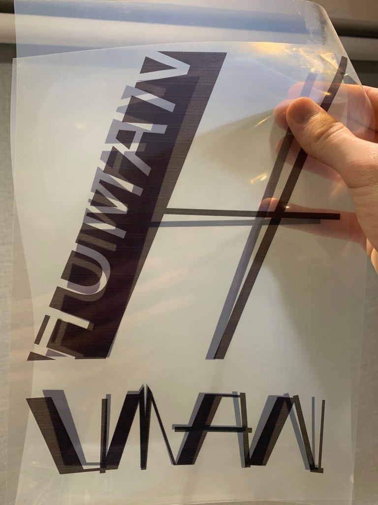
I decided to experiment with creating a series of typographical posters with this font created by my friend Scott Smith ( @essgordon_ ) as it was created using the same inspiration of ancient Sumerian that I showed earlier in the journal. These posters were created purely digital using adobe illustrator. My intentions of using this font was to demonstrate that it couldn’t be screen printed due to the ultra thin lines.
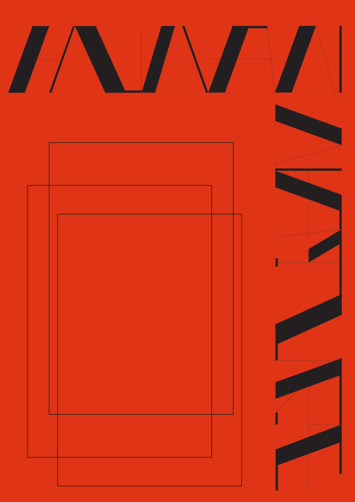
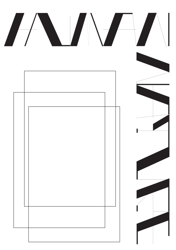
I also created ones focusing on the words HUMAN NATURE

I then chose after feedback to make the font compatible for screen print. I did this by thickening up the lines by 10pts as shown below
The changes to this font almost ruin its original appeal however I did this in order to show how much it would have to be changed in order to properly articulate this without altering it in any other way.
wasn’t as badly misaligned as this I did this to show its two films 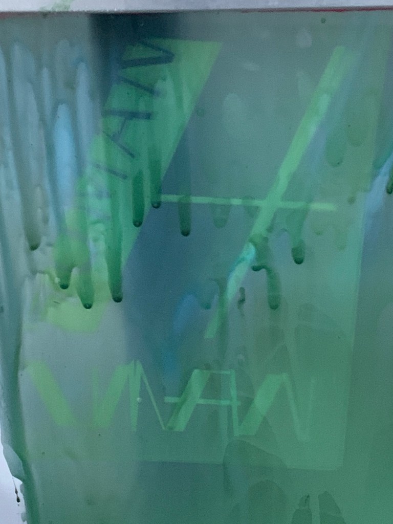
Due to my printer not printing in the best quality I had to print two films and tape them together, doing this I misaligned the pieces without noticing until after exposing the screen. This helped created the various flaws that can be seen in the final prints below.
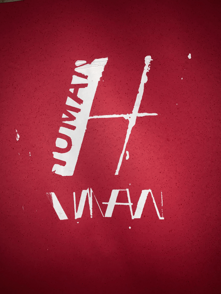
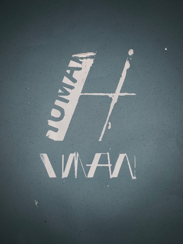
These are not perfect by any means however it fits with the theme that it was my mistakes and errors that caused them, it was me not exposing the screen long enough, it was me not washing it out properly that caused these issues. It perfectly fits with my theme as with the films you can see what it is intended to look like and although it is not what I desired I feel that it successfully demonstrates my concept it was the human side of the process that went wrong, everything else did its job properly. It is almost a critique of the process as well as I had to alter the font so much in order to even get it to this stage.
